3. BIZLOG
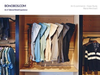
BONOBOS
Bonobos’s Unique Selling Point (USP) is that they manufacture and
sell men’s clothing Zappos-style. That is, it’s online-only, with awe-
some customer service. The clothing is upscale, positioning them-
selves on style, fit, and service.
They are however, not alone in this business. It has some quite a
few competitors such as JHillburn and Indochino based on the same
model.
The premise of this case-study is to bring to light and self- review
two particular task processes. First is to as a potential customer,
find a certain item that the store does offer. Second would be book
an appointment. All the task actions and other pages have been
reviewed on their desktop version on a 15inch laptop.
Two classmates at Stanford Business School, Brian Spaly and Andy
Dunn, launched the men’s apparel company, Bonobos (bə-ˈnō-bōs),
following graduation in 2007. Their mission was to provide better
fitting pants for men. As customer demands grew, they have added
shirts and accessories including bags, shoes and belts to their stores
since 2010.
Their marketing has always said Bonobos was not just about pants
but, more broadly, quality products for men. Now Bonobos is one of
the largest online-only menswear brand in the United States. The
store offers suits, shirts, belts, swim trunks, sweaters and Bonobos’
signature chinos.
Their sixteen ‘guideshops’ nationwide are bricks-and-mortar stores
where customers can feel and try on products sold online. Instead
of customers leaving with the clothes they buy, they order them on-
site and wait for the products to be shipped to their homes.
Their main target market seems to be the hip and hep Millennial
(Age 18 to 34).
BONOBOS Introduction
3
5. BIZLOG
BONOBOS
This is J.Hilburn ‘s landing page as shown on the right.
A minimal and simple to follow main navigation would
please a user most likely. It includes a sign-in placed well
next to their cart/bag link and also features a search bar
below it on the far right. An upfront signing in is sug-
gested as a priority to the visitor.
Their branding seems to have a tone of sharpness with
a slight tone of cunningness showcased in their words
marking the words ‘Revenge has never been sweeter’.
Three broad categories are well prioritized and shown as
click-able links. There categories highlight the essentials,
one that include their main showroom, a guaranteed fit
feature and one of their best products section.
The breadcrumbs here beautiful disclose the
process to be followed using their services, which then
beautifully leads to one of their main call to action: ‘Con-
nect with a Stylist’
An artfully laid-out footer comprises of almost
everything a visitor would wish to visit without compro-
mising on a clean sophisticated look. A subtle disclose of
the news -reporting icons adds credibility.
Over all, J.Hilburn has managed to cover many attributes
on their page just like a good cover and back design of
a book. They have also avoided the use of drop-downs
which can be considered a huge plus.
BONOBOS
5
6. BIZLOG
BONOBOS
Indochino’s website shows a slightly different flavor
on its home page. From the first look one knows its all
about finding the perfect suit. Their main navigation
seems to be quite closely placed to their logo. Just a
phone number placed in top right banner seems non-
plussed. It might seem as a help line number to most
visitors.
Their branding is as crisp as their suits are. Giving a code
for new comers right below their ‘Shop Now’ button is a
neat idea.
Like J.Hilburns’ page Indochino also has three catego-
ries. However their categories are more task-friendly as
each of them has its call to action links of booking an
appointment, joining and contact us. Yet again, they have
emphasized ‘calling’ them.
In this undefined extra space they have added two sec-
tions of information that is highly important to visitors.
It could work better if these were mentioned near the
header instead of visitors finding this key information
only if they scroll down.
That is an extensive footer that is a full fledged menu in
smaller font size and also has a form field and social net-
work - links. The items get underlined on mouse-over.
Below the footer is also a helpful feedback form -link
and the copyright on the right side. Over all the footer is
non intrusive and functional.
BONOBOS
6
7. BIZLOG
BONOBOS
Analysis & Overview: The landing page of Bonobos has a tone of fun
and casualness on the first look. The main navigation bar on the top is a
simple clean layout. The
“Hamburger” menu sign is a drop-down that opens as a long sidebar.
They have avoided an overload of text which has made the cover page
look elegant. Large product images are showcased slide by slide with dif-
ferent call to action buttons. Even the cart sign on top left is an illustrated
bag.
As one scrolls down an illustrated menu bar of their products are
showcased. While it looks non intrusive and blends well with the
aesthetics, mouse-overs and clicks over any item is not signified clearly.
During a mouse-over or a click the item text changes just a swatch darker
in black. This particular menu bar appears only on the home page.
Bonobos guideshops section is introduced as one further scrolls down.
The layout is crisp and functional. A brief two line description sums up
their message. The illustration on the left goes well with the casual tone
of imagery.
Next is a secondary cover page section. This section throws more light
upon their identity and branding. Again their casual look is maintained
and an alternate text-image pattern is sensed.
Similar to Indochino’s landing page, this section contains two key pieces
of information vis-a-vis ‘free shipping’ and their popular ‘Ninja’ customer
service. This could be a key deciding factor which may go unnoticed if the
visitor does not scroll through the long page. The length of the page is
another factor that separates them from their competitors.
The footer is well alluded as the end of the page with links to their
magazine, help pages, contact and a form field to sign-up for their news-
letter. A lot can be improved in the layout. For example, the magazine
logo should be slightly more prominent and click-able(Fitt’s Law). Column
headings (‘Need Help?’ and ‘Our Newsletter’) are not at all prominent.
The description attached to their mailing list form is too long a sentence
and nearly illegible due to the small font size.
BONOBOS HomePage
7
8. BIZLOG
BONOBOSBONOBOS MainNavigation
The website provides two different systems of menu
items. Unlike their competitors they have not placed
their product categories upfront in the top bar.
The hamburger drop-down menu (as shown here )
mainly intended for the mobile
screen versions of their website.
There are several main
categories amongst which tops,
bottoms and tailored have
further sub categories. This
showcases a well structured product catalogue.
However once a visitor lands on any product page a
secondary menu bar(slider) is showcased horizontally
below their banner image. This slider consists of same
categories in a different order. Sub-categories are shown
in a sub menu bar upon clicking.
The developers of the website have thereby provided
a couple of routes to reach a certain product category.
While both of the menu systems have their own advan-
tages, they have their own issues too.
The vertical menu bar does not fit it the screen without
scrolling. Secondly the ‘Sign In/Out’ and ‘My Account’
are not accessible easily due to the scrolling. The social
network links open on the same page which might be
intrusive to the visitors task.
The horizontal slider version of the same menu items
also needs horizontal scrolling which accessing products
such as ‘Shoes’ and ‘Maide Golf’. The `Filter By Fit’ and
‘Filter By Size’ are different task buttons embedded in
the same bar and are found to be intrusive.
8
9. BIZLOG
BONOBOS
One on the primary functions of an e-commerce website is to allow one to
find a product of their choice.
The item shown here called
‘The Seacroft Golf Cardigan’
was found by a random perusal
in the product. Since there was
no option to save in a wish-
list of items on the store’s site
itself, a screenshot was taken
to duly note it.
A few weeks later the user wanted to find the same item and commenced
a search within the website. One of the first instincts is to search from the
sidebar menu. The closest category to the desired product was ‘Sweaters’
under the ‘Tops’ category as shown in Screen-1. This lead to a product
page of the Sweaters where the black horizontal slider menu showcased
a sub-menu. The sub-menu had four further categories under sweaters
namely ‘Wool blend’, ‘Cotton’, ‘Merino’ and ‘Golf Sweaters’. And below
it products were displayed as seen here section-wise tiled in the same
respective order as one scrolls down. Since the word ‘Golf’ matches with
the name of the desired product, it was clicked. This lead to a quick scroll
to the bottom of the Sweaters page. However the product was no where
to be found.
A secondary search was made using the illustrated horizontal menu bar
displayed on their homepage (refer Screen-3 image). Here too, ‘Tops’ was
the natural selection made by the user to find her desired product. On
clicking Tops it lead to the same Screen-2.
Hence both the navigation options were used
using manual word search. It would have been
really useful to have an item/ word search bar.
This is something that J.Hilburn’s website have
included that
would prove really useful in such a scenario.
BONOBOS SearchItem
Screen -1
Screen -2
Screen -3
Desired Product item
J.Hilburn’s search tool placed
in top menu
9
10. BIZLOG
BONOBOSBONOBOS
Screen -1
Screen -2
Screen -3
Two search attempts in finding ‘The Seacroft Golf
Cardigan’ in the Sweaters and Golf Sweaters sec-
tions (see Screen-1 and Screen-2 images) on the
website, failed the user to locate the desired item.
As a last attempt, the user feels compelled to search
in the Sale section.
This is accessed by clicking on the side menu bar
that drops open on clicking the ‘hamburger’ sign.
One clicking the ‘Sale’ category highlighted in the
menu bar, the Screen-3 image is loading in the
website window. Here all the items under sale are
tiled section by section. However there are no sub
-menu/s under the Sale Section.
After scrolling down more than 10 pages, the sweat-
ers section includes the desired product. The user is
most likely to feel exhausted on finding this product
and is also likely to abandon the search process. An-
other possible route that was easier was to Google
search the item and then the first item in the search
results was a link in the Bonobos website. Howev-
er, that step would exclude using any navigational
methods within the website.
The issues faced by the user in searching this item
were multi fold. Firstly, a lack of a search tool makes the task of the user’s
task more cumbersome. Secondly, the on-sale items are not sub-cat-
egorized to prevent long seemingly-endless scrolling. And lastly, the
on-sale items were not found in the same product’s category as most
e-commerce websites do include. For example, an on-sale pant featuring
both in the separate on -Sale only section as well as the respective pants
section.
10
11. BIZLOG
BONOBOSBONOBOS Checkout Process
THE CART
The briefcase symbol signifies their Cart is as dis-
played in the top-right location of the
header of the website. The symbol itself is quite mas-
culine and goes well with the clean look and flat-us-
er-interface of the website.
It also displays a number indicating the
current number of contents. On clicking it
expands as a side bar column to show the
current items in cart.
On the top right of this column they have
advertised by highlighting their ‘premium gift
box’ also mentioning its price. This is a well
crafted device strategically placed for users
wishing to add a gift packaging.
Next the items are showed with a
mini-thumbnail showing the user a quick
preview of the item.
Applying a promo-code in the cart itself is
also a handy tool added. Usually the
add-promo-fields only come towards the end
of the check-out process. This provides an
encouraging discounted value to the user.
However, on sale items or markdowns are
not indicated or signified with any indicators.
With two items in the contents of the cart
such as the thumbnail and texts get scaled
down proportionately. With more than two
items, a scroller gets embedded within the
cart section. A blue pop-up saying ‘Want to
Talk to a Ninja’ shows up sometimes which is
a live chat with their customer service team.
Screen -1
Screen -2
11
12. BIZLOG
BONOBOSBONOBOS
Once we click ‘Checkout’ on the bottom of their ‘Cart’, a three column
page is loaded in the browser window (refer to image S1). The three col-
umns are categorized by 1. Shipping, 2. Billing and 3. Review. Initially only
the first form is shown active while the next two columns are shown in-
active visually (Image S-1). Any other column’s form field is not click-able.
Hence the user is directed to fill the Shipping-form first.
The ‘Use the same address for Billing’ check-box is well known to be
helpful aid to avoid refilling. After successfully filling all the details the user
is directed to click ‘Next’. On clicking so, the second column then gets
activated, within which first is an active window that simulates a credit
card (See image S-2) . This could really work with a user who hasn’t had
much experiencing entering card details and would also prevent mistakes.
Once the user clicks ‘Next’ , the third column of Reviewing the cart gets
activated. (See image S-3). Here the two shipping options are given first
priority. Then the items and details are listed. The items are cascaded if
they are more than one. This may be off-putting to the user when there is
still empty space in the column window.
Furthermore, in the review stage, no further links that would suggest them
to checkout other products are displayed. It does not provide any
‘Continue Shopping’ link. If the user forgets any item, he/she has to go
pack using the browser’s back button or open a new window of the store.
No link to their customer service chat, ‘Ninja’ service is provided should
the user need to ask something.
This on-boarding process is well categorized and not intrusive visually.
However the visible form fields seem to psychologically lengthen the
checkout process.
S-1
S-2
S-3
12
13. BIZLOG
BONOBOS
Guideshops deliver personalized, one-to-one service to those wanting to shop the
brand in person. Additionally, Bonobos has partnered with Nordstrom, Belk, and
specialty retailers bringing its assortment of clothes to stores nationwide
The image on the right shows a scrolled page layout of the website, minus one more
row of store locations in order to show the page.
Each city has been given its own identity based on its popular landmarks. And a
nice additional box has been added directed for users who do not find any familiar
location, saying ‘ Not in your woods yet’ and an even more warm personal touch by
saying, ‘ let us know where you are’. This means that the makers of the website do
recognize people who cannot use their existing guideshops and still invite them for
communication.
Once we click on Make an Appointment, a pop-up window is shown confirming the
location with the map and pointer. (See image below). The rest of the website win-
dow is shadowed gray. The following appointment functions have been provided by
an external company called ‘Selster’.
S-1
S-3
BONOBOS GuideShops
13
14. BIZLOG
BONOBOS
Conclusion
Bonobos as a new generation clothing store has some really great
Strengths: Unparalleled Customer service. The Ninjas on the
other end of the phone or chat are real people who are
knowledgeable and ready and willing to help. They have an
incredible social media presence leveraging community and
technology to promote and sell. Their blog and Groomshop pages
(Image on right) are well crafted. Creativity both in product and the
marketing of their product. A branding screaming smart and fun.
A clean looking website.
Weaknesses: Its expensive. And despite the promo codes and
coupons, it is still an expensive brand. Unlike its old-website,
people have complained about the new site, post 2014 to have
crashed. The website experience can be a major Achilles heel to the
sales of the company and to convert new customers to regular ones.
Their aesthetics seem to work well for the millennial age group. And
they have followed the clean flat user-interface style throughout
their websites. However there are certainly some functional prob-
lems that may have gone over-looked.
Bonobos has build a trustable brand image and has connected with
customers in order to both obtain feedback and fulfill customers’
needs as satisfactorily as possible. Along with the brand image
building they have also established a new paradigm in online
shopping. Only if they address a few issues of their website then
they could still keep an attractive look and bump up the usability
functions.
Bonobos’s Groomshop page
14
Bonobos’s Help page