
Recommandé
Contenu connexe
Tendances
Tendances (18)
En vedette
En vedette (19)
Similaire à Cover page essay[1]
Similaire à Cover page essay[1] (20)
Plus de MorganClough
Plus de MorganClough (16)
Dernier
Dernier (20)
Cover page essay[1]
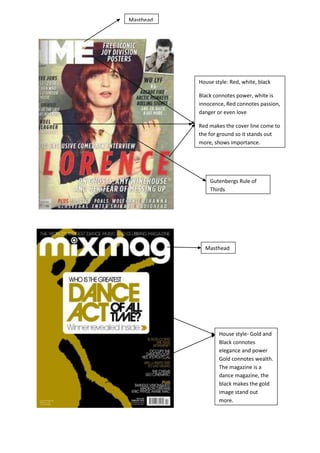
- 1. Masthead House style: Red, white, black Black connotes power, white is innocence, Red connotes passion, danger or even love Red makes the cover line come to the for ground so it stands out more, shows importance. Gutenbergs Rule of Thirds Masthead House style- Gold and Black connotes elegance and power Gold connotes wealth. The magazine is a dance magazine, the black makes the gold image stand out more.
- 2. Masthead House style Pink and Yellow Primary optical area C1-E Scale
- 3. In this essay I will be comparing and showing the contrast between the two front covers of different music magazines. I will be comparing the Target audience and need for the magazines, the house style given throughout the magazine e.g. colour and fonts used, The Guttenberg design principle (Rule of Thirds), the images, the masthead and the lead article and cover lines. The first magazine I will be analysing is the NME magazine. NME magazine targets a Rock/alternative audience this is shown through the use of their house style which on this front cover is red white and black. Red connotes danger which is highly associated with heavy metal/rock genre of music. The red masthead also makes the writing come to the foreground, showing the importance that Florence is going to be the main article in the magazine. Black also connotes danger and darkness. The fonts used are sans serif fonts e.g. Arial, Tahoma. These are used on the front cover of the magazine to show that the magazine is an informal approach to a magazine, and perhaps for a more of a masculine audience. The social scale for this magazine is C1 because it attracts students. The Guttenberg design principle (Rule of Thirds) is used on this front cover on the image of Florence Welch. Her head is located almost at the Primary Optical Area, which is known to be the first place a person looks when looking at the front page of a magazine, and the Terminal Area is located at the end of where it says ‘Florence’ this is the second place somebody looks when they’re looking at a magazine. NME have cleverly put the images and written words in these areas to make sure the audience knows who the magazine is about. The images are dull/deep which shows that the target audience is an alternative rock genre. The image in the top right corner is in black and white which shows the target audience of the magazine. The lead article of the magazine is about Florence, this is shown through the use of her being the cover image and the cover line, the red is used to stand out from the rest of the text to show that she is the main article for the magazine. Other cover lines on the magazine show the target audience and genre of the magazine with artists such as Noel Gallagher, the Rolling Stones and Wu Lyf, this obviously wouldn’t attract a Pop and RnB genre because these artists are an alternative rock set of artists. The second magazine I will be analysing is the mixmag magazine. Mixmag magazine targets a generation of an audience who like dance music. Whether they are old or young. This is shown through the use of the house style of the front cover of the magazine; Gold connotes an old, wealthy, mature audience, and black perhaps a young audience. There are no images used on the front cover of the magazine, which shows that it targets a dance audience because most dance artists songs, you never see the actual artist on the music videos. The gold silhouette on the left hand side of the page looks somewhat like a person dancing which could also show that the genre of the magazine is dance. The Guttenberg design principle isn’t used on this cover because there isn’t an image filling the page, the image is only on the left hand side of the page. The third magazine I will be analysing is another mixmag magazine due to the first one not having enough for me to analyse on. The magazine is a dance genre which is shown through the use of vibrant colours on the front page of the magazine such as fluorescent pink and yellows. Connotations of pink are femininity and girly which perhaps shows that the magazine attracts a feminine audience. The connotations of yellow are perhaps sun, which shows that it is a dance magazine because most ‘Dance’ songs and videos are in places abroad such as Ibiza. The background of the magazine is a sea blue colour which again promotes the magazine for places such as Ibiza and holiday destinations. This will make the audience buy the magazine if destinations such as Ibiza are promoted throughout the magazine. Sans serif fonts are used to show that they attract a
- 4. younger audience instead of a formal, mature audience. If the magazine attracted an older audience the use of fonts would be a serif font because this shows that the style of the magazine is professional and formal. In the primary optical area of the magazine (the place the audience first looks at when looking at a magazine) has the words ‘Free’ around it which promotes the magazine if they are giving free gifts out. This will make the magazine become increasingly popular throughout their audience. The cover lines are placed in the terminal area which is the second place the audience looks, they are placed here because this is where the audience looks at, so the better the cover lines the more the audience will want to read the magazine. This gives the audience an insight as to what the magazine has to offer, it uses the word ‘Plus’ to make it sound like their giving extra for the audience to read. The image of the woman is placed in the strong fallow area, this promotes the magazine because this makes both genders want to buy the magazine because the woman is attractive so girls will envy her and want to be her, and the males will buy the magazine because she is attractive. The weak fallow area also has words such as ‘Free’ around it which promotes the magazine more.