SlideShare une entreprise Scribd logo
1  sur  4
The strap line on the red background in order for it to stand out. Furthermore, the use        The use of the word
   of exclamation mark almost give the effect that the strap line is shouting at the target       ‘Massive’ makes the
   audience. The strap line on this magazine encourages people to buy this magazine by            quote sound more
   offering them free tickets, which the target audience would really want to get                 exaggerated, in order to
   The title of this magazine is                                                                  influence the TA more and
   ‘Kerrang!’ which is always located at                                                          make them want to buy
   the top of the magazine,                                                                       the magazine in order to
   maintaining the brand identity.                                                                get free ticket.
   Furthermore, since this magazine is
   well know, the masthead is placed                                                          The main sell-line is placed
   behind the image, however it still                                                         right in the centre of the
   stand out a lot.                                                                           magazine. This is very
                                                                                              effective because that is
  The quote below the sale reveals                                                            where the TA will look first.
  the lifestyle of Biffy Clyro, which
  will be very appealing to the funs                                                           The barcode and price are
  of this artist. Thus encouraging                                                             located in the right bottom
  them to buy the magazine.                                                                    corner. It is so small and
                                                                                               placed near so many images
At the bottom of this magazine the                                                             that at first sight you would
target audience can see the                                                                    never be able to see it, it is
magazine is offering freebies , which                                                          hidden. Forcing the target
will make the target audience to                                                               audience to search for it
buy the magazine. Furthermore, the
magazine reveals only two poster           On the bottom of the magazine there are a list of other artist which feature inside
which are given free inside the            the magazine. This is very effective as it will make the audience feel that they are
magazine, making the reader                getting more for the money they paid. Furthermore, it also very effective as if the
wonder how the other posters look          reader doesn’t know or doesn’t like the band featuring on the front cover they
like and who will feature on them.         might find the artist of their interest or the band at the bottom, thus encouraging
                                           them to look inside.
The masthead of this magazine is always placed in the same place each           The band which features on
         edition, plus it is also always written in the same font, thus maintaining      the front cover is a rock band,
         brand identity and making it easier for readers to recognise it.                reflecting the genre of music
                                                                                         this mag celebrates. The
                                                                                         leader of the band is placed at
 The name of this magazine is                                                            the front showing that he is
 written in uppercase letters, using                                                     more dominant. In addition to
 big and bold font . Furthermore,                                                        that, he’s got his hood up
 the masthead is not written in                                                          making him look very serious
 solid later, in fact it has lines                                                       and almost evil, thus reflecting
 crossing it, giving it an effect of                                                     the dark genre of this music.
 shattered glass.                                                                        At the bottom of the magazine
                                                                                         the viewer can also see a
The dominant colours which feature                                                       photo of another artist which
on this front cover are red, black and                                                   will feature inside the
white. The colour red is often                                                           magazine. This is a very
associated with violence and                                                             effective way to lure in the
destruction, thus reflecting that the                                                    target audience as if they
target audience of this magazine                                                         don’t like the band on the
could be very aggressive.                                                                front cover, they will always be
Furthermore the combination of                                                           able to find the band which
black and white creates the front                                                        they are interested in inside
cover appear more masculine and                                                          the magazine.
has a more serious tone.
Furthermore, those dark colours also                           The sale line below the photo is very effective as it makes
reflect the genre of music which this                          the reader wonder how and why this specific artist starts
magazine celebrates i.e. Rock.                                 the ‘riot’. Furthermore, as the word riot is placed in the
                                                               speech marks, it makes it stand out more, it also mean
                                                               that it might not be the riot that the target audience
                                                               imagine. Making them question what sort of riot it is.
The title of this magazine is      The use of the word ‘Exclusive’ shows        The strap line is written on the brown
   ‘Kerrang!’ which is always         that this event doesn’t happen very          background, which make it stand out
   located at the top stretching      often, making the reader more                in comparison to white background of
   from one end to another of         interested and excited about this            the masthead. Furthermore, the use
   the magazine, thus                 magazine, forcing them to buy it.            of two exclamation mark gives the
   maintaining the brand                                                           effect that the fact that Fall Out Boy is
   identity. Furthermore, since                                                    playing on K show, is something
   the magazine is well known,                                                     extraordinary and not something you
   the masthead is placed                                                          will see often, encouraging people to
   behind the main image.                                                          buy this magazine.

   The main sell-line is placed on the                                                 On the right of the front cover the
   left so that it would not take away                                                 viewer can see that the magazine is
   the attention of the main image.                                                    offering freebies. Furthermore, the
   Furthermore, the main sell-line                                                     words ‘Free Posters’ is written on the
   features the name of the band which                                                 red background, making it stand out
   is presented on the main photo.                                                     in comparison to the other colours of
                                                                                       the magazine. Moreover, the use of
                                                                                       the exclamation mark almost gives
   The stars which can be seen next to
                                                                                       the effect that this sell-line is
   the sell-line are almost like quotation
                                                                                       shouting at the target audience.
   marks, making it look like ‘anything
   can happen’ was said by a member
   of a band                                                                               The layout of ‘Kerrang!’ is
                                                                                           always the same, thus
The quote below the main sell-line is very      The word ‘Plus!’ just like the ‘Free       maintaining brand identity.
effective as it makes the reader wonder         posters!’ is written on the red            This is very important
what is going to happen. This quote only        background, emphasising that there         because the buyer will always
tells half of the story keeping the best part   is more inside of the magazine. The        be able to recognise the
for the reader to find out, thus forcing        use of exclamation mark makes this         magazine and relate to it
them to buy magazine and to read it.            word stand out more.                       more easily .
The name of the magazine is written in uppercase letters, using big and bold             The band which is featured on the
font, thus making in stand out in comparison to all other writing present on             main image has a very rebellious
the cover. Furthermore, by keeping the colours simple, black letters on the              look, emphasising the fact that they
white background, the masthead looks even more appealing. Moreover, the                  are in control of their lives. This is
masthead is not written in solid letters, in fact it has lines crossing it, giving it    very effective as the target
an effect of broken glass                                                                audience might be inspired by their
                                                                                         attitude and their way of life

 The main colours of this magazine
 front cover are creamy brown,                                                          The band featured as a main image
 black and white. This combination                                                      reflect the genre of music this
 of colours is very unusual for a                                                       magazine celebrates i.e. rock. The
 magazine like ‘Kerrang!’. The                                                          leader of the band is placed in front
 reason for that is because                                                             of the masthead, whereas other band
 ‘Kerrang!’, celebrates rock music,                                                     members are placed behind, stating
 which is often associated with                                                         clearly who is the leader of the band.
 more dark colours, such as navy-                                                       Furthermore, the leader of the band
 blue, red, black etc. The use of                                                       is holding a card with the name of the
 creamy brown makes the magazine                                                        band, which creates the effect as if he
 appeal softer and friendlier.                                                          is giving a business card to the reader.
 However, those colours are still
 dark and masculine reflecting
                                                                                          The barcode and the price are
 more male target audience
                                                                                          located in the right bottom corner
                                                                                          of the magazine, thus forcing the
 On the bottom of the magazine there is a list of artists which feature inside            audience to search for the price.
 the magazine. This is very effective as it will make the audience feel that              Furthermore, it is also very small
 they are getting more for the price they pay. Furthermore, it is also very               and placed to the images which
 effective as if the reader doesn’t know the band featuring on the front                  stand out more in comparison to it,
 cover; they might find the artist or the band of their interest at the bottom,           making it even harder to see
 thus encouraging them to look inside.

Contenu connexe

Tendances

Deconstructing magazines
Deconstructing magazinesDeconstructing magazines
Deconstructing magazinesLauracharlotte
 
Front cover analysis 3 – top of the pops
Front cover analysis 3 – top of the popsFront cover analysis 3 – top of the pops
Front cover analysis 3 – top of the popsasmediac12
 
Product research
Product researchProduct research
Product researchjacklo1995
 
Front Cover Analysis
Front Cover AnalysisFront Cover Analysis
Front Cover Analysisemilyshep
 
Kerrang! Magazine
Kerrang! MagazineKerrang! Magazine
Kerrang! Magazineharrywbfmv
 
Presentation on Music magazine analysing.
Presentation on Music magazine analysing.Presentation on Music magazine analysing.
Presentation on Music magazine analysing.lauren8908
 
Analysing nme dizzee cover prep for blog ppt
Analysing  nme dizzee cover prep for blog pptAnalysing  nme dizzee cover prep for blog ppt
Analysing nme dizzee cover prep for blog pptasmediac12
 
2 magazine analyasis
2 magazine analyasis2 magazine analyasis
2 magazine analyasisEmilyJ96
 
Music magazine analysis
Music magazine analysisMusic magazine analysis
Music magazine analysislaurenhomer
 
Magazine presentation
Magazine presentationMagazine presentation
Magazine presentationjacklo1995
 
Analysis of front covers
Analysis of front coversAnalysis of front covers
Analysis of front coversPittawayH1
 
Music magizines content research and anylasis final on blog
Music magizines content research and anylasis final on blogMusic magizines content research and anylasis final on blog
Music magizines content research and anylasis final on blog07scott
 
Lady gaga rollingstone analysis
Lady gaga rollingstone analysisLady gaga rollingstone analysis
Lady gaga rollingstone analysisSianLynes
 

Tendances (19)

Deconstructing magazines
Deconstructing magazinesDeconstructing magazines
Deconstructing magazines
 
Magazine analysis
Magazine analysisMagazine analysis
Magazine analysis
 
Front cover analysis 3 – top of the pops
Front cover analysis 3 – top of the popsFront cover analysis 3 – top of the pops
Front cover analysis 3 – top of the pops
 
Product research
Product researchProduct research
Product research
 
Front Cover Analysis
Front Cover AnalysisFront Cover Analysis
Front Cover Analysis
 
Rock Magazine Analysis
Rock Magazine AnalysisRock Magazine Analysis
Rock Magazine Analysis
 
Kerrang! Magazine
Kerrang! MagazineKerrang! Magazine
Kerrang! Magazine
 
Media
MediaMedia
Media
 
Magazine Analysis
Magazine AnalysisMagazine Analysis
Magazine Analysis
 
Rock Magazine Analysis
Rock Magazine AnalysisRock Magazine Analysis
Rock Magazine Analysis
 
Presentation on Music magazine analysing.
Presentation on Music magazine analysing.Presentation on Music magazine analysing.
Presentation on Music magazine analysing.
 
Analysing nme dizzee cover prep for blog ppt
Analysing  nme dizzee cover prep for blog pptAnalysing  nme dizzee cover prep for blog ppt
Analysing nme dizzee cover prep for blog ppt
 
2 magazine analyasis
2 magazine analyasis2 magazine analyasis
2 magazine analyasis
 
Music magazine analysis
Music magazine analysisMusic magazine analysis
Music magazine analysis
 
Magazine presentation
Magazine presentationMagazine presentation
Magazine presentation
 
Analysis of front covers
Analysis of front coversAnalysis of front covers
Analysis of front covers
 
Music magizines content research and anylasis final on blog
Music magizines content research and anylasis final on blogMusic magizines content research and anylasis final on blog
Music magizines content research and anylasis final on blog
 
Lady gaga rollingstone analysis
Lady gaga rollingstone analysisLady gaga rollingstone analysis
Lady gaga rollingstone analysis
 
Magazine analysis
Magazine analysisMagazine analysis
Magazine analysis
 

Similaire à Front cover analysis

Analysis of front covers
Analysis of front coversAnalysis of front covers
Analysis of front coversLUCYcrowther
 
Analysis of front covers
Analysis of front coversAnalysis of front covers
Analysis of front coversLUCYcrowther
 
Cover analysis final
Cover analysis finalCover analysis final
Cover analysis finalasmediac12
 
Front covers analysis final
Front covers analysis finalFront covers analysis final
Front covers analysis finalasmediac12
 
Analysing nme dizzee cover prep for blog ppt (1)fianal
Analysing  nme dizzee cover prep for blog ppt (1)fianalAnalysing  nme dizzee cover prep for blog ppt (1)fianal
Analysing nme dizzee cover prep for blog ppt (1)fianalasmediae12
 
Magazine analysis covers
Magazine analysis coversMagazine analysis covers
Magazine analysis coverscooper95
 
Music Magazine Analysis
Music Magazine AnalysisMusic Magazine Analysis
Music Magazine Analysisnikkifrankel
 
Music magazine research
Music magazine researchMusic magazine research
Music magazine researchdavid-hill
 
Magazine analysis3 totp
Magazine analysis3 totpMagazine analysis3 totp
Magazine analysis3 totpramondeholmes
 
M magazines analysis
M magazines analysisM magazines analysis
M magazines analysisLouisha26
 
Task 2 – analysing magazine 2 billboard
Task 2 – analysing magazine 2 billboardTask 2 – analysing magazine 2 billboard
Task 2 – analysing magazine 2 billboardasmediaf12
 
analysing 3 music magazine covers
analysing 3 music magazine coversanalysing 3 music magazine covers
analysing 3 music magazine coversshauniread
 
Analysing contents pages prep for blog ppt
Analysing  contents pages prep for blog pptAnalysing  contents pages prep for blog ppt
Analysing contents pages prep for blog pptasmediag12
 
Analysing contents pages prep for blog ppt
Analysing  contents pages prep for blog pptAnalysing  contents pages prep for blog ppt
Analysing contents pages prep for blog pptasmediag12
 
Market research with contents page and article
Market research with contents page and articleMarket research with contents page and article
Market research with contents page and articleemmarignall
 
Analysing a magazine front cover final
Analysing a magazine front cover finalAnalysing a magazine front cover final
Analysing a magazine front cover finaladuhenejas
 

Similaire à Front cover analysis (20)

Front covers
Front coversFront covers
Front covers
 
Analysis of front covers
Analysis of front coversAnalysis of front covers
Analysis of front covers
 
Analysis of front covers
Analysis of front coversAnalysis of front covers
Analysis of front covers
 
Cover analysis final
Cover analysis finalCover analysis final
Cover analysis final
 
Front covers analysis final
Front covers analysis finalFront covers analysis final
Front covers analysis final
 
Analysing nme dizzee cover prep for blog ppt (1)fianal
Analysing  nme dizzee cover prep for blog ppt (1)fianalAnalysing  nme dizzee cover prep for blog ppt (1)fianal
Analysing nme dizzee cover prep for blog ppt (1)fianal
 
Magazine analysis covers
Magazine analysis coversMagazine analysis covers
Magazine analysis covers
 
Music Magazine Analysis
Music Magazine AnalysisMusic Magazine Analysis
Music Magazine Analysis
 
Music magazine research
Music magazine researchMusic magazine research
Music magazine research
 
Magazine analysis3 totp
Magazine analysis3 totpMagazine analysis3 totp
Magazine analysis3 totp
 
M magazines analysis
M magazines analysisM magazines analysis
M magazines analysis
 
Case study
Case studyCase study
Case study
 
Task 2 – analysing magazine 2 billboard
Task 2 – analysing magazine 2 billboardTask 2 – analysing magazine 2 billboard
Task 2 – analysing magazine 2 billboard
 
analysing 3 music magazine covers
analysing 3 music magazine coversanalysing 3 music magazine covers
analysing 3 music magazine covers
 
Analysing contents pages prep for blog ppt
Analysing  contents pages prep for blog pptAnalysing  contents pages prep for blog ppt
Analysing contents pages prep for blog ppt
 
Analysing contents pages prep for blog ppt
Analysing  contents pages prep for blog pptAnalysing  contents pages prep for blog ppt
Analysing contents pages prep for blog ppt
 
Market research with contents page and article
Market research with contents page and articleMarket research with contents page and article
Market research with contents page and article
 
Analysing a magazine front cover final
Analysing a magazine front cover finalAnalysing a magazine front cover final
Analysing a magazine front cover final
 
Evaluation 1
Evaluation 1Evaluation 1
Evaluation 1
 
Cover magazine
Cover magazineCover magazine
Cover magazine
 

Plus de Olga Shurakova

sinister film trailer analysis
sinister film trailer analysissinister film trailer analysis
sinister film trailer analysisOlga Shurakova
 
Film trailer analysis
Film trailer analysis Film trailer analysis
Film trailer analysis Olga Shurakova
 
Film trailer analysis
Film trailer analysis Film trailer analysis
Film trailer analysis Olga Shurakova
 
Old target audience questionnaire
Old target audience questionnaireOld target audience questionnaire
Old target audience questionnaireOlga Shurakova
 
Target audience questionnaire 2
Target audience questionnaire 2Target audience questionnaire 2
Target audience questionnaire 2Olga Shurakova
 
Double page spread overview
Double page spread overviewDouble page spread overview
Double page spread overviewOlga Shurakova
 
Dps 2nd analysis (draft 1)
Dps 2nd analysis (draft 1)Dps 2nd analysis (draft 1)
Dps 2nd analysis (draft 1)Olga Shurakova
 
Dps 2nd analysis (draft 1)
Dps 2nd analysis (draft 1)Dps 2nd analysis (draft 1)
Dps 2nd analysis (draft 1)Olga Shurakova
 
This is a visual introduction to the various
This is a visual introduction to the variousThis is a visual introduction to the various
This is a visual introduction to the variousOlga Shurakova
 
Music questionnaire analysis
Music questionnaire  analysisMusic questionnaire  analysis
Music questionnaire analysisOlga Shurakova
 

Plus de Olga Shurakova (15)

Question two
Question twoQuestion two
Question two
 
sinister film trailer analysis
sinister film trailer analysissinister film trailer analysis
sinister film trailer analysis
 
Film trailer analysis
Film trailer analysis Film trailer analysis
Film trailer analysis
 
Trailer analysis two
Trailer analysis twoTrailer analysis two
Trailer analysis two
 
Film trailer analysis
Film trailer analysis Film trailer analysis
Film trailer analysis
 
Old target audience questionnaire
Old target audience questionnaireOld target audience questionnaire
Old target audience questionnaire
 
Target audience questionnaire 2
Target audience questionnaire 2Target audience questionnaire 2
Target audience questionnaire 2
 
Double page spread overview
Double page spread overviewDouble page spread overview
Double page spread overview
 
Dps 2nd analysis (draft 1)
Dps 2nd analysis (draft 1)Dps 2nd analysis (draft 1)
Dps 2nd analysis (draft 1)
 
Dps 2nd analysis (draft 1)
Dps 2nd analysis (draft 1)Dps 2nd analysis (draft 1)
Dps 2nd analysis (draft 1)
 
Front cover overview
Front cover overviewFront cover overview
Front cover overview
 
This is a visual introduction to the various
This is a visual introduction to the variousThis is a visual introduction to the various
This is a visual introduction to the various
 
Dps analysis checked
Dps analysis checkedDps analysis checked
Dps analysis checked
 
Music questionnaire analysis
Music questionnaire  analysisMusic questionnaire  analysis
Music questionnaire analysis
 
Music questioner
Music questionerMusic questioner
Music questioner
 

Front cover analysis

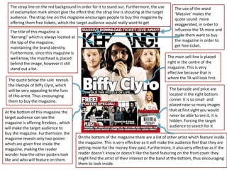
  • 1. The strap line on the red background in order for it to stand out. Furthermore, the use The use of the word of exclamation mark almost give the effect that the strap line is shouting at the target ‘Massive’ makes the audience. The strap line on this magazine encourages people to buy this magazine by quote sound more offering them free tickets, which the target audience would really want to get exaggerated, in order to The title of this magazine is influence the TA more and ‘Kerrang!’ which is always located at make them want to buy the top of the magazine, the magazine in order to maintaining the brand identity. get free ticket. Furthermore, since this magazine is well know, the masthead is placed The main sell-line is placed behind the image, however it still right in the centre of the stand out a lot. magazine. This is very effective because that is The quote below the sale reveals where the TA will look first. the lifestyle of Biffy Clyro, which will be very appealing to the funs The barcode and price are of this artist. Thus encouraging located in the right bottom them to buy the magazine. corner. It is so small and placed near so many images At the bottom of this magazine the that at first sight you would target audience can see the never be able to see it, it is magazine is offering freebies , which hidden. Forcing the target will make the target audience to audience to search for it buy the magazine. Furthermore, the magazine reveals only two poster On the bottom of the magazine there are a list of other artist which feature inside which are given free inside the the magazine. This is very effective as it will make the audience feel that they are magazine, making the reader getting more for the money they paid. Furthermore, it also very effective as if the wonder how the other posters look reader doesn’t know or doesn’t like the band featuring on the front cover they like and who will feature on them. might find the artist of their interest or the band at the bottom, thus encouraging them to look inside.
  • 2. The masthead of this magazine is always placed in the same place each The band which features on edition, plus it is also always written in the same font, thus maintaining the front cover is a rock band, brand identity and making it easier for readers to recognise it. reflecting the genre of music this mag celebrates. The leader of the band is placed at The name of this magazine is the front showing that he is written in uppercase letters, using more dominant. In addition to big and bold font . Furthermore, that, he’s got his hood up the masthead is not written in making him look very serious solid later, in fact it has lines and almost evil, thus reflecting crossing it, giving it an effect of the dark genre of this music. shattered glass. At the bottom of the magazine the viewer can also see a The dominant colours which feature photo of another artist which on this front cover are red, black and will feature inside the white. The colour red is often magazine. This is a very associated with violence and effective way to lure in the destruction, thus reflecting that the target audience as if they target audience of this magazine don’t like the band on the could be very aggressive. front cover, they will always be Furthermore the combination of able to find the band which black and white creates the front they are interested in inside cover appear more masculine and the magazine. has a more serious tone. Furthermore, those dark colours also The sale line below the photo is very effective as it makes reflect the genre of music which this the reader wonder how and why this specific artist starts magazine celebrates i.e. Rock. the ‘riot’. Furthermore, as the word riot is placed in the speech marks, it makes it stand out more, it also mean that it might not be the riot that the target audience imagine. Making them question what sort of riot it is.
  • 3. The title of this magazine is The use of the word ‘Exclusive’ shows The strap line is written on the brown ‘Kerrang!’ which is always that this event doesn’t happen very background, which make it stand out located at the top stretching often, making the reader more in comparison to white background of from one end to another of interested and excited about this the masthead. Furthermore, the use the magazine, thus magazine, forcing them to buy it. of two exclamation mark gives the maintaining the brand effect that the fact that Fall Out Boy is identity. Furthermore, since playing on K show, is something the magazine is well known, extraordinary and not something you the masthead is placed will see often, encouraging people to behind the main image. buy this magazine. The main sell-line is placed on the On the right of the front cover the left so that it would not take away viewer can see that the magazine is the attention of the main image. offering freebies. Furthermore, the Furthermore, the main sell-line words ‘Free Posters’ is written on the features the name of the band which red background, making it stand out is presented on the main photo. in comparison to the other colours of the magazine. Moreover, the use of the exclamation mark almost gives The stars which can be seen next to the effect that this sell-line is the sell-line are almost like quotation shouting at the target audience. marks, making it look like ‘anything can happen’ was said by a member of a band The layout of ‘Kerrang!’ is always the same, thus The quote below the main sell-line is very The word ‘Plus!’ just like the ‘Free maintaining brand identity. effective as it makes the reader wonder posters!’ is written on the red This is very important what is going to happen. This quote only background, emphasising that there because the buyer will always tells half of the story keeping the best part is more inside of the magazine. The be able to recognise the for the reader to find out, thus forcing use of exclamation mark makes this magazine and relate to it them to buy magazine and to read it. word stand out more. more easily .
  • 4. The name of the magazine is written in uppercase letters, using big and bold The band which is featured on the font, thus making in stand out in comparison to all other writing present on main image has a very rebellious the cover. Furthermore, by keeping the colours simple, black letters on the look, emphasising the fact that they white background, the masthead looks even more appealing. Moreover, the are in control of their lives. This is masthead is not written in solid letters, in fact it has lines crossing it, giving it very effective as the target an effect of broken glass audience might be inspired by their attitude and their way of life The main colours of this magazine front cover are creamy brown, The band featured as a main image black and white. This combination reflect the genre of music this of colours is very unusual for a magazine celebrates i.e. rock. The magazine like ‘Kerrang!’. The leader of the band is placed in front reason for that is because of the masthead, whereas other band ‘Kerrang!’, celebrates rock music, members are placed behind, stating which is often associated with clearly who is the leader of the band. more dark colours, such as navy- Furthermore, the leader of the band blue, red, black etc. The use of is holding a card with the name of the creamy brown makes the magazine band, which creates the effect as if he appeal softer and friendlier. is giving a business card to the reader. However, those colours are still dark and masculine reflecting The barcode and the price are more male target audience located in the right bottom corner of the magazine, thus forcing the On the bottom of the magazine there is a list of artists which feature inside audience to search for the price. the magazine. This is very effective as it will make the audience feel that Furthermore, it is also very small they are getting more for the price they pay. Furthermore, it is also very and placed to the images which effective as if the reader doesn’t know the band featuring on the front stand out more in comparison to it, cover; they might find the artist or the band of their interest at the bottom, making it even harder to see thus encouraging them to look inside.