SlideShare une entreprise Scribd logo
1  sur  5
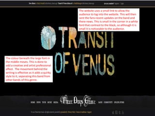
The website uses a small link to allow the
                                           audience to log into the website. This will then
                                           sent the fans recent updates on the band and
                                           there news. This is small in the corner in a white
                                           font that contrast to the black, so although it is
                                           small it is noticeable to the audience.


The colour beneath the large font in
the middle moves. This is done to
add a creative and artist professional
affect. The movement behind the
writing is effective as it adds a quirky
style to it, separating this band from
other bands of this genre.
There is small writing at the top of
                           the screen which tells audiences
                           about the recent updates.
                           However, I find it unusual that the
                           information is in small typeset at
                           the top. I feel the website designers
                           did this as the band concentrate on
                           the music rather than ‘gossip’.


The ripping effect along the bottom gives
the impression that the band are edgy
which is a stereotypical view of bands from
this genre.
The central image is of the bands new album
which covers most of the website. This also has a
link above which allows the audience to buy the
album. This is effective as it’s quick and easy for a
fan to buy the latest album.
The colour pallet of the website is
black, grey and white. These are
colours that link to the conventions of
my genre and are seen as stereotypical
colours.


                                          The links at the bottom are in a small
                                          typeset and are white, this contrasts to the
                                          grey meaning that although the typeset is
                                          small the audience are still able to see it
                                          easily and select an option without
                                          difficulty.
The small icons at the bottom of the screen allow the audience to
access and share the website to social networking sites. This allows
the band to reach the target audience through technological
convergence. For example, Twitter and Facebook are often on
mobiles and are easy to access. This means it more likely to be
seen as the sites are easy to get on to.

Contenu connexe

Similaire à Three days grace website analysis

Website analysis blink 182
Website analysis  blink 182Website analysis  blink 182
Website analysis blink 182PippahLarke
 
Estella Wadham_Research task 2,3,4_Generic codes, conventions and graphic ele...
Estella Wadham_Research task 2,3,4_Generic codes, conventions and graphic ele...Estella Wadham_Research task 2,3,4_Generic codes, conventions and graphic ele...
Estella Wadham_Research task 2,3,4_Generic codes, conventions and graphic ele...estellawadham2
 
codes and conventions artist websites.pptx
codes and conventions artist websites.pptxcodes and conventions artist websites.pptx
codes and conventions artist websites.pptxMollyPullen
 
codes and conventions artist websites.pptx
codes and conventions artist websites.pptxcodes and conventions artist websites.pptx
codes and conventions artist websites.pptxMollyPullen
 
Radiohead Website Analysis
Radiohead Website AnalysisRadiohead Website Analysis
Radiohead Website Analysislaurenbromley100
 
Poster Analysis
Poster AnalysisPoster Analysis
Poster Analysisgbhsasdrea
 
Digipak advertisment
Digipak advertismentDigipak advertisment
Digipak advertismentadelleclarke
 
Textual analysis 3
Textual analysis 3Textual analysis 3
Textual analysis 3AliceShort3
 
Florence and the machine analysis
Florence and the machine analysis Florence and the machine analysis
Florence and the machine analysis hampton college
 
Analysis of website convention (the killers)
Analysis of website convention (the killers)Analysis of website convention (the killers)
Analysis of website convention (the killers)Forbzy
 
Website Research
Website ResearchWebsite Research
Website Researchclwp_cloe06
 
Website Research
Website ResearchWebsite Research
Website Researchirazak333
 
Website Research
Website Research Website Research
Website Research ntorro1
 
Two Door Cinema Club
Two Door Cinema ClubTwo Door Cinema Club
Two Door Cinema Clubrianeades
 
Analysis of websites
Analysis of websitesAnalysis of websites
Analysis of websites08ATumbare
 

Similaire à Three days grace website analysis (20)

Website analysis blink 182
Website analysis  blink 182Website analysis  blink 182
Website analysis blink 182
 
3. research(1)
3. research(1)3. research(1)
3. research(1)
 
3. research(1) (1)
3. research(1) (1)3. research(1) (1)
3. research(1) (1)
 
Estella Wadham_Research task 2,3,4_Generic codes, conventions and graphic ele...
Estella Wadham_Research task 2,3,4_Generic codes, conventions and graphic ele...Estella Wadham_Research task 2,3,4_Generic codes, conventions and graphic ele...
Estella Wadham_Research task 2,3,4_Generic codes, conventions and graphic ele...
 
All album ads
All album adsAll album ads
All album ads
 
codes and conventions artist websites.pptx
codes and conventions artist websites.pptxcodes and conventions artist websites.pptx
codes and conventions artist websites.pptx
 
codes and conventions artist websites.pptx
codes and conventions artist websites.pptxcodes and conventions artist websites.pptx
codes and conventions artist websites.pptx
 
Radiohead Website Analysis
Radiohead Website AnalysisRadiohead Website Analysis
Radiohead Website Analysis
 
Poster Analysis
Poster AnalysisPoster Analysis
Poster Analysis
 
Auxiliary tasks
Auxiliary tasksAuxiliary tasks
Auxiliary tasks
 
Digipak advertisment
Digipak advertismentDigipak advertisment
Digipak advertisment
 
Textual analysis 3
Textual analysis 3Textual analysis 3
Textual analysis 3
 
Florence and the machine analysis
Florence and the machine analysis Florence and the machine analysis
Florence and the machine analysis
 
Analysis of website convention (the killers)
Analysis of website convention (the killers)Analysis of website convention (the killers)
Analysis of website convention (the killers)
 
Website Research
Website ResearchWebsite Research
Website Research
 
Website Research
Website ResearchWebsite Research
Website Research
 
Muse website
Muse websiteMuse website
Muse website
 
Website Research
Website Research Website Research
Website Research
 
Two Door Cinema Club
Two Door Cinema ClubTwo Door Cinema Club
Two Door Cinema Club
 
Analysis of websites
Analysis of websitesAnalysis of websites
Analysis of websites
 

Plus de PippahLarke

Plus de PippahLarke (6)

Tech
TechTech
Tech
 
Qtech evaluation
Qtech evaluationQtech evaluation
Qtech evaluation
 
Qtech inthemaking
Qtech inthemakingQtech inthemaking
Qtech inthemaking
 
Qtech research
Qtech  researchQtech  research
Qtech research
 
Foo fighters website analysis
Foo fighters website analysisFoo fighters website analysis
Foo fighters website analysis
 
Goodwins theory
Goodwins theoryGoodwins theory
Goodwins theory
 

Three days grace website analysis

  • 1. The website uses a small link to allow the audience to log into the website. This will then sent the fans recent updates on the band and there news. This is small in the corner in a white font that contrast to the black, so although it is small it is noticeable to the audience. The colour beneath the large font in the middle moves. This is done to add a creative and artist professional affect. The movement behind the writing is effective as it adds a quirky style to it, separating this band from other bands of this genre.
  • 2. There is small writing at the top of the screen which tells audiences about the recent updates. However, I find it unusual that the information is in small typeset at the top. I feel the website designers did this as the band concentrate on the music rather than ‘gossip’. The ripping effect along the bottom gives the impression that the band are edgy which is a stereotypical view of bands from this genre.
  • 3. The central image is of the bands new album which covers most of the website. This also has a link above which allows the audience to buy the album. This is effective as it’s quick and easy for a fan to buy the latest album.
  • 4. The colour pallet of the website is black, grey and white. These are colours that link to the conventions of my genre and are seen as stereotypical colours. The links at the bottom are in a small typeset and are white, this contrasts to the grey meaning that although the typeset is small the audience are still able to see it easily and select an option without difficulty.
  • 5. The small icons at the bottom of the screen allow the audience to access and share the website to social networking sites. This allows the band to reach the target audience through technological convergence. For example, Twitter and Facebook are often on mobiles and are easy to access. This means it more likely to be seen as the sites are easy to get on to.