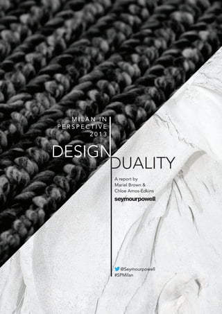
SlideShare une entreprise Scribd logo
1  sur  13
M I L A N I N
P E R S P E C T I V E
2 0 1 3
A report by
Mariel Brown &
Chloe Amos-Edkins
@Seymourpowell
#SPMilan
DESIGN
DUALITY
3A report by Mariel Brown and Chloe Amos-Edkins, Seymourpowell
Both inspirational and overwhelming, the annual design fair in
Milan is the largest show of its kind in the world, and as such
has been recognised for decades as the centre of the emerging
design universe.
In this, its 52nd edition, the overarching theme that struck
us, as we reflected on the show’s highlights, was that of
duality. We are currently moving through an age of great
contradiction; where the nightmare of political, environmental
and financial instability coincides with the fantastical dream
of rapidly advancing technology. As students, designers and
manufacturers attempt to navigate their way through this
chaos, a dichotomy of design responses were bubbling up at
the fair. These reflect the complexity of our current situation,
and the contradictory nature of the human condition.
Seymourpowell has highlighted this duality by arranging eight
key trends from the fair into four contradictory pairs.
M I L A N I N P E R S P E C T I V E 2 0 1 3
D E S I G N D U A L I T Y
A report by Mariel Brown and Chloe Amos-Edkins
Cover images: ‘Lana Mangas’ rug detail by Patricia Urquiola for Gan (top), whale bone detail from
the ‘Iceland Whale Bone Project’ by the University of Art and Design Lausanne (bottom).
5A report by Mariel Brown and Chloe Amos-Edkins, Seymourpowell4 Milan in Perspective 2013 - Design Duality
At the show this year, many designers
felt it was timely to focus in on only the
essential elements of a product, finding
comfort in this age of chaos through the
process of rationalisation.
Excitingly, this approach is creating a new
poetic simplicity, an example of which
could be seen in lighting manufacturer
Flos’ new String Lights designed by
Cypriot designer Michael Anastassiades.
The lights are comprised of an LED
bulb within a shade, which is connected
to metres and metres of thin black
electrical cabling. This cabling cord is
used to draw geometric shapes in the air
and was inspired by the electrical cables
found in city landscapes. We particularly
enjoyed the functional element of the
long cables that allow users to arrange
the design around their needs rather than
arranging their lifestyle around the design.
Anastassiades said, “ I love how human
ingenuity works around problems created
by everyday things in the house (like
switches and power points) that others
have chosen to position where we don’t
want them.”
Allowing a sense of flexibility through
modularity could also be seen from
Studio Vit, who presented their new
‘Globe Lights’ at the Salone Satellite.
The ‘Globe Lights’ are a deconstructed
assemblage consisting of small, matt
white, globe shaped pendants and large,
gloss white, steel reflectors. The ceramic
spheres can be used on their own,
grouped together, or used to cast light on
the reflectors.
The notion of ‘Essential Elements’ was
taken to the extreme by acclaimed French
architect Jean Nouvel, who made an
interesting diversion into footwear design
on behalf of Italian shoe brand Ruco Line.
His design, called ‘Pure’, was created with
the philosophy of reducing the concept
of a shoe to its purest form. The result
is a shoe made of rubber and leather
with an uncompromisingly monolithic
appearance. The only embellishment is a
serial number along the top of the boot,
making each one unique to their owner.
The Poetry of the Essential
Main image: ‘Globe Lights’ by Studio Vit
Top: ‘String Lights’ by Michael Anastassiades for Flos
Bottom: ‘Pure’ by Jean Nouvel for Ruco Line
“many designers felt it was timely to focus in
on only the essential elements of a product,
finding comfort in this age of chaos
through the process of rationalisation.
Excitingly, this approach is creating a new
poetic simplicity
”	 Mariel Brown
6 7Milan in Perspective 2013 - Design Duality A report by Mariel Brown and Chloe Amos-Edkins, Seymourpowell
Main image and left: ‘Job Office’ series by Studio Job for Lensvelt
Right: ‘Anomaly’ seat by Front for Moroso
Bottom: ‘Bucket’ lamp by Studio Job for Moooi
While some designers sought to
rationalise and focus in on the essential
during this time of great flux, others were
more inclined to be swept along in the
chaos of the moment and we witnessed
a burgeoning return to a more playful
aesthetic that has taken a back seat since
the global recession first hit in 2008, when
embellishments quickly became seen as
frivolous and unnecessary.
Belgian artists Studio Job are well
known for their witty aesthetic and
at this year’s fair they presented some
bold new pieces that built upon their
heritage of unapologetic individualism.
At the MOST exhibition they presented
their new ‘Job Office’ series for Dutch
brand Lensvelt, which was comprised
of stark achromatic objects brought to
life by bold gold dipped features such
as crassly oversized switches, comic
‘nose’ shaped handles, and giant toy-like
keys. Across town at the Dutch brand
Moooi’s exquisitely lavish exhibition ‘The
Unexpected Welcome’, we saw further
examples of Studio Jobs leanings towards
‘The Joyful Absurd’ as they presented
their ‘Bucket  Tub’ lamps which were,
as the name suggests, lamps shaped like
upturned buckets and bathtubs.
In fact, many of the pieces on show at
‘The Unexpected Welcome’ seemed to
signify that an art for arts’ sake approach to
design was on the rise once more. Studio
Job explains, “…we have rediscovered
a lost path. Consciously and carefully,
we are positioning decorative arts in
the twenty-first century. Is that design?
Whatever. Is that art? Whatever, really.”
An interesting aspect of ‘The Joyful
Absurd’ trend is that designers are
exploring the boundaries between the
bizarre and the beautiful. This could be
clearly witnessed in Swedish design group
Front’s new seat called Anomaly, which
has the look of a strange headless animal.
The seats polarised opinion, but for
Front that was exactly the intention. They
described the work as “Objects to awaken
your curiosity, your affection or perhaps
even repulsion.”
The Joyful Absurd
“we witnessed a burgeoning return to a
more playful aesthetic that has taken a
back seat since the global recession first
hit in 2008, when embellishments quickly
became seen as frivolous
”	 Mariel Brown
8 9Milan in Perspective 2013 - Design Duality A report by Mariel Brown and Chloe Amos-Edkins, Seymourpowell
Across Milan we felt that designers were
seeking to justify the value and relevance
of their work by focusing on precious yet
functional objects. In particular, there
was a noticeable interest in products with
which we form emotional attachments
through cultural or ritual use. These
are not intended to be passing style
statements, but instead something you
increasingly appreciate over time, cherish
for life and want to pass on to future
generations.
Business-savvy British designer Tom
Dixon spearheaded this trend with the
launch of his ‘eclectic’ range in 2012,
offering designs at prices the average
person might reasonably afford,
alongside his bigger ticket items. This
year he expanded the range that he hopes
will be “treasured by you or a loved one.”
The accoutrements of tea drinking were
spotted at numerous exhibits. Sebastian
Herkner’s Chado tea set for Verreum was
‘created for ritual’ whilst Tea With George
by Sholten and Baijings for George
Jensen, effortlessly fused Japanese tea
ceremony with Dutch coffee culture. The
trend for Heirloom Rituals continued at
Turkish brand Gaia  Gino’s show, where
hookah pipes were given a contemporary
makeover by Jamie Hayon, Karim Rashid
and Noé Duchaufour Lawrance.
A key facet of this trend is enduring
materials and handcrafted quality of
which could be seen in abundance at
the Japan Handmade exhibition, where
each of the Kyoto-based craftsmen was
on hand to demonstrate their skills and
knowledge. It felt particularly pertinent
that several of them were reinvigorating
skills that had been passed on by their
master-craftsmen fathers. We loved
the woven metal and wood-handled
magnifying glass by Kanaami-Tsuji, that
took a time honoured skill usually used to
make simple kitchen wares, and applied it
to a new category, creating a practical yet
precious result.
Heirloom Rituals
Main image: ‘HookHayon’ pipes by Jamie Hayon for Gaia  Gino
Left: 'Tea With George’ by Scholten  Baijings for George Jensen
Middle: Magnifying glass by Kanaami-Tsuji
Right: ‘Chado tea set’ by Sebastian Herkner for Verreum
“there was a noticeable interest in products
with which we form emotional attachments
through cultural or ritual use. These are
not intended to be passing style statements,
but instead something you increasingly
appreciate over time...
”	 Chloe Amos-Edkins
10 11Milan in Perspective 2013 - Design Duality A report by Mariel Brown and Chloe Amos-Edkins, Seymourpowell
Whilst some more established designers
sought to justify their premium price
tags with luxury materials and exclusive
craftsmanship, young designers and
students were challenging the accepted
notions of value and luxury, at times
even questioning the meaning of
consumerism itself.
A key aspect of the Redefining Value
trend is that it flips the commonly
accepted concept of material value on
its head. Precious metals and rare stones
suddenly seem gaudy and insubstantial,
and instead, beauty and meaning is crafted
from the unexpected – often uncovering
value in the waste materials from human
or natural activity.
We loved the Central St Martins Textile
Futures MA student exhibition. Moe
Nagata’s bold ‘From Creatures’ jewellery
was created using waste materials from
the food industry in London and harked
back to tribal animism that respects (and
makes use of) every part of an animal
- challenging today’s global problem of
waste and over-consumption. While
Emilie F. Grenier’s ‘Disquiet Luxurians’
project stood out, it took a thought-
provoking look at luxury. Interestingly
her collection focuses on the material
feldspar – the world’s most abundant
mineral. As she explains, she explores how
to transform this otherwise meaningless
mineral into a series of “post-luxurian
artefacts and in doing so challenge
concepts of rarity and value.”
There was also a sense of rejecting overly
perfect industrial materials and finishing
techniques and raising nature’s own
materials and finishes to a newly elevated
position. One lovely example was Matti
Syrjälä’s Säilö Container set – with
unfinished birch bark providing a unique
and jewel-like lid to each container.
Another academic group that impressed
was the University of Art and Design
Lausanne (ECAL). We were enchanted by
their ‘Iceland Whale Bone Project’ which
was focused around materials originating
from the Icelandic sea - all flotsam and
jetsam found on the beach. Charlotte
Baverel’s ‘Gríma’ mask for example was
composed from raw and primitive seal,
shark and whale skins and bone. The
material choice perfectly grounded the
design within the Icelandic landscape
from which it came, to create a piece that
felt primitive, yet simultaneously ancient
and significant.
Redefining Value
Main image: ‘Disquiet Luxurians’ by Emilie F. Grenier
Top: ‘Säilö’ container by Matti Syrjälä
Middle: ‘Gríma’ mask by Charlotte Baverel
Bottom: ‘From Creatures’ jewellery by Moe Nagata
“Precious metals and rare stones suddenly
seem gaudy and insubstantial, and instead,
beauty and meaning is crafted from the
unexpected – often uncovering value
in the waste materials from human or
natural activity.
”	 Chloe Amos-Edkins
13A report by Mariel Brown and Chloe Amos-Edkins, Seymourpowell12 Milan in Perspective 2013 - Design Duality
Our ‘always on’ digital culture is creating a
desire to escape from our hyper-
connected lives, and causing us to seek
refuge in safe comfort of familiarity. As a
result we are seeking moments of
sanctuary in our physical spaces, allowing
us to re-charge and re-gain our
equilibrium. The Soft Sanctuary trend
seems to offer a welcome and reassuringly
familiar break from the frenzy of the
modern age, with soft forms, calming
colours and inviting tactile surfaces seen
across Milan this year.
It’s unsurprising that design superstar
Patricia Urquiola seems to be at the
forefront of this trend, with her trademark
warmth and tactility apparent in almost
everything she does. Muted and
sometimes nostalgic pastel shades were
everywhere, with dusky pinks and greys
being a popular choice. Often these
palettes were kept fresh and modern with
more vivid accents in yellow or coral as
demonstrated in Patricia Urquiola’s Lana
Mangas collection for Gan, whose chunky
knitted textures remind us of cosy jumpers.
But this trend was also manifested in
physical form, with soft rounded furniture
a strong theme. Chairs and sofas with
ergonomic curves and seductive padding
seemed to want to embrace the sitter in a
generous hug. Jamie Hayon’s ‘Catch
Chair’ for Copenhagen-based Tradition
is a single piece, anthropomorphically
shaped chair that appears to be reaching
its arms out to you.
Furniture that ‘relaxes with you’ was
found at the Miyazaki Chair Factory’s
exhibit. Their pursuit of quality
craftsmanship and ergonomic pleasure
has resulted in a collection that is soft at
every imaginable touch point – the
curved armrests of the IS Lounge chair
were particularly pleasing.
The From Yuhang exhibition offered a
calming sanctuary from the bustle of
Zona Tortona. Their designs fuse
traditional Chinese crafts with
contemporary design. Their Lù Porcelain
tables were showcased in glossy pastel
colours, the forms of which were minimal
yet rounded, inviting you to run your
hands over their surface. Their soft edged
Gù Colour Chairs, made from formed
bamboo pulp and updated in calming
pastel shades for this year’s show, were
equally gentle and inviting.
Soft Sanctuary
Main image: Lù porcelain tables
Top: ‘Catch Chair’ by Jamie Hayon for Tradition
Middle: ‘Lana Mangas’ collection by Patricia Urquiola for Gan
Bottom: ‘IS Lounge’ chair by Miyazaki Chair Factory
“we are seeking moments of sanctuary in our
physical spaces, allowing us to re-charge
and re-gain our equilibrium.
”	 Chloe Amos-Edkins
14 15Milan in Perspective 2013 - Design Duality A report by Mariel Brown and Chloe Amos-Edkins, Seymourpowell
As digital inputs become an ever
more omnipotent part of our lives, the
boundaries of our physical and digital
worlds are blurring. In the same way
that screens are no longer a border
between us and our content, so our
content is beginning to bleed into our
physical spaces.
These digital forays into the physical
space often take the form of interactive
experiences that allow us to escape the
humdrum of daily life. In Milan we
observed this at Universal Everything’s
‘The Art and Science of Fit’ installation
for Nike, where “intricate multi coloured
woven patterns dance across the screens
intelligently conforming and fitting to the
silhouette of the visitor.” (Nike)
Artist/designer duo Carnovsky’s
‘Zigzagging’ for fashion house Missoni,
was another fantastical exhibit. An
immersive light, colour and sound
installation that felt a bit like walking
into a giant kaleidoscope. Whilst we felt
it would have been best suited to a party
venue, the innate sense of dream-like
fantasy was powerful.
Along with influencing our spaces, the
trend for Digital Fantasy is also having an
effect on the colour, material and finish of
the products. Across the fair we witnessed
optical effect fabrics, vivid and iridescent
surfaces and surreal graphic gradients
as seen in Droog’s ‘Family Vases’ and
the ‘Wood Bikini Chair’ by Werner
Aisslinger for Moroso. Powerful flashes of
impossibly vivid colour were everywhere,
as seen in Stefan Diez’s ‘This That Other’
seating series available in an eye-popping
neon pink.
Vivid colour was used to tell the time
at Spazio Rossana Orlandi, where we
spotted MA Student Jay Hyun Kim’s ‘A
Moment’. His experience of designing
digital user interfaces for smartphone
apps had inspired him to create more
intuitive 3D objects. His 55-minute timer
reveals a beautiful array of vivid colours as
time slowly passes.
Digital Fantasy
Main image: ‘Zigzagging’ installation by Carnovsky for Missoni
Top right: ‘Wood Bikini Chair’ by Werner Aisslinger for Moroso
Middle right: ‘Family Vases’ by Studio Droog
Bottom right: ‘This That Other’ seating series by Stefan Diez
Top left: ‘A Moment’ by Jay Hyun Kim
Bottom left: ‘The Art and Science of Fit’ installation by Universal Everything for Nike
“the boundaries of our physical and digital
worlds are blurring. In the same way that
screens are no longer a border between
us and our content, so our content is
beginning to bleed into our physical spaces.
”	 Chloe Amos-Edkins
17A report by Mariel Brown and Chloe Amos-Edkins, Seymourpowell16 Milan in Perspective 2013 - Design Duality
Great global unrest and upheaval, along
with maturing wireless and cloud
technologies, are driving many people to
lead a more nomadic lifestyle. At this
year’s show we saw many examples of
designers creating pieces that responded
to this growing human desire for
spontaneity, transformation and movement.
A compelling example of this trend was
the collaboration between influential
designer Tom Dixon and Adidas, which
had generated much pre-show
anticipation. They presented ‘The
Capsule’ - a collection that they described
as “everything you can pack neatly in a bag
for a week away”. Fittingly, the exhibition
was housed in a former railway station
that had been brought to life with sounds
of steam trains and intermittent puffs of
smoke. A perpetual state of motion was
achieved with conveyor belts, which
rotated the collection past expectant
viewers. The range focused on the notion
of transformation and multifunctionality
by including items such as parkas that
transformed into sleeping bags and
backpacks that unfolded to form
makeshift wardrobes.
Whilst we enjoyed The Capsule
collection’s contemporary utilitarian
aesthetic, we also appreciated the more
folk embellished expression of Nomadic
Design on show from Beirut based
designers Bokja. They presented ‘The
Migration Collection’, which had been
inspired by “the hopes and fears of people
who make the decision to create a home
somewhere other than the place they were
born”. Their collection included ‘The
Migration Sofa’ which appeared to carry a
burden of rolled up rugs and bedding on
its ‘back’. ‘Migration Wallpaper and Rugs’
bore the motif of birds reflecting their
annual migration from one side of the
world to another, and plates and cups
were embellished with motifs of people
who have migrated because of war,
political instability and even love. We
were amused to see that the notorious
migration of film star Gérard Depardieu,
who has recently registered as a Russian
resident amid a tax row with France, was
also referred to.
Nomadic Design
Main image:‘The Capsule’ by Tom Dixon and Adidas
Top: ‘The Migration’ rug by Bokja
Middle: ‘The Migration’ sofa by Bokja
Bottom: ‘The Migration’ plates by Bokja
“At this year’s show we saw many examples
of designers creating pieces that responded
to this growing human desire for spontaneity,
transformation and movement.
”	 Mariel Brown
18 19Milan in Perspective 2013 - Design Duality A report by Mariel Brown and Chloe Amos-Edkins, Seymourpowell
As the mass migration to the world’s cities
continues and our hyper-connected lives
become more fast-paced, we increasingly
desire moments of contemplative stillness
and seek to take time out to re-connect
with the beauty of nature. Indeed, for the
last three years or so in Milan, one could
witness designers referencing nature
in both their form factor and material
choices. However, this year we felt that
something new was emerging and that the
love for all things natural had taken on an
almost spiritual or meditative meaning.
We were particularly drawn to those
designs that blended the technological
with the natural, as they seemed to hint
at a future where technology would
enhance our sense of wellbeing rather
than decrease it. An example of this could
be seen from Japanese technology giants
Toshiba, who had partnered with design
studio IXI to create an installation titled
‘Soffio’ which is the Italian for breath. The
installation was comprised of tiny LED
lights and crystals that hung in a darkened
room slowly fading from dark to half light.
As the lights’ brightness increased, the
crystals next to them created a halo effect
around the light, allowing ephemeral thin
rainbows to appear.
Similarly lifting our spirits through the
recreation of natural phenomena was
the Ripple Project by Studio Shiikai and
Poetic Lab. The Ripple Project lamp
casts out dappled shadow and light
that are reminiscent of those found on
surfaces of water. The pleasing effect
is created by projecting a beam of light
through a gently rotating mouth-blown
glass dome and offered a meditative
moment to passing show goers who took
the opportunity to sit down in front of it
as a break from the hustle and bustle of
the show.
The trend for ‘Reflection on Nature’ took
a celestial turn at Spazio Rossana Orlandi,
where Eindhoven based design duo OS
and OOS were exhibiting a clock/light
that was inspired by lunar eclipses. The
new piece is a build on their Syzygy range
of lights, which have been named after
the astrological term that describes the
alignment of three celestial bodies in the
same gravitational system. The clock/
light responds automatically to light levels
in a room; after dark the light increases
and during daylight the light output
decreases. What we particularly enjoyed
about the design was that it tapped into
our innate human desire to gaze up at the
sky and wonder…
Reflections on Nature
Main image: Ripple Project by Studio Shiikai and Poetic Lab
Top: ‘Syzygy’ lamp/clock by OS and OOS
Bottom: ‘Soffio’ installation by Studio IX for Toshiba
“this year we felt that something new was
emerging and that the love for all things
natural had taken on an almost spiritual
or meditative meaning.
”	 Mariel Brown
20 21Milan in Perspective 2013 - Design Duality A report by Mariel Brown and Chloe Amos-Edkins, Seymourpowell
Mariel Brown
Head of Trends at Seymourpowell
Mariel has over nine years of experience
working in design, technology, and
social trend forecasting. Since joining
Seymourpowell seven years ago she has
worked on a diverse range of projects
including user research, product strategy,
and global trend studies.
Mariel won a DAD Award for
Product Design and a DAD Award for
Environmental Design, before gaining an
MA in Design Products from the Royal
College of Art.
In her current role as Head of Trends,
she translates her trend, market and user
insights into tangible future directions
for numerous clients including Samsung,
Panasonic, LG, Dell, Ford, Unilever
and ASICS.
Mariel has contributed trend commentary
to numerous international publications,
most recently, Contagious and Viewpoint
Magazine.
Chloe Amos-Edkins
Design  CMF Researcher at Seymourpowell
With a multidisciplinary background
combining design and CMF research,
Chloe has eight years experience with
design innovation projects for clients
ranging from transport and consumer
electronics brands, through to FMCG.
Her skills combine design research and
consumer, lifestyle and design trends
analysis. These are used to inform future
focused design strategy, visual language
and CMF direction.
Chloe gained a first-class honours
degree in Design For Industry from
Northumbria University. Whilst
studying, Chloe won an RSA Student
Design Award for a public toilet concept,
which eventually lead to an interesting
discussion about toilets with The Queen!
Some of Chloe’s clients include Ford,
Dr. Martens, Unilever and LG.
A report by... and...
22 Milan in Perspective 2013 - Design Duality
Seymourpowell Ltd,
327 Lillie Road, London,
SW6 7NR,
UK
Tel: +44 (0) 207 381 6433
Email: nichola.rinks@seymourpowell.com
www.seymourpowell.com
blog.seymourpowell.com
twitter.com/seymourpowell
www.facebook.com/seymourpowell
Copyright Seymourpowell Ltd 2013

Contenu connexe

Similaire à Milan report-2013-seymourpowell

The trends of Salone Del Mobile Milan 2016
The trends of Salone Del Mobile Milan 2016 The trends of Salone Del Mobile Milan 2016
The trends of Salone Del Mobile Milan 2016 MILDBERRY
 
THE Stylemate issue 03|2021 - into the future
THE Stylemate issue 03|2021 - into the futureTHE Stylemate issue 03|2021 - into the future
THE Stylemate issue 03|2021 - into the futureTHE Stylemate
 
Aesthetic preference shift of the chinese young generation by yang design md
Aesthetic preference shift of the chinese young generation by yang design mdAesthetic preference shift of the chinese young generation by yang design md
Aesthetic preference shift of the chinese young generation by yang design mdYANG DESIGN
 
Milan in perspective 2011
Milan in perspective 2011Milan in perspective 2011
Milan in perspective 2011Seymourpowell
 
Seymourpowell milan in perspective 2011
Seymourpowell milan in perspective 2011Seymourpowell milan in perspective 2011
Seymourpowell milan in perspective 2011Seymourpowell
 
Milan fair report 2010
Milan fair report 2010Milan fair report 2010
Milan fair report 2010Seymourpowell
 
Your Key to EuroShop 2017
Your Key to EuroShop 2017Your Key to EuroShop 2017
Your Key to EuroShop 2017Marcy Goldstein
 
Milan in Perspective 2012
Milan in Perspective 2012Milan in Perspective 2012
Milan in Perspective 2012Seymourpowell
 
Monika_Auch_publications 2003-2013
Monika_Auch_publications 2003-2013Monika_Auch_publications 2003-2013
Monika_Auch_publications 2003-2013Monika Auch
 
Furniture design trends
Furniture design trendsFurniture design trends
Furniture design trendsdiradheera
 
Wanderlust: Furniture Design Trends 2009
Wanderlust: Furniture Design Trends 2009Wanderlust: Furniture Design Trends 2009
Wanderlust: Furniture Design Trends 2009finnmckenty
 
Brooklyn Brothers Brainfood - December 2011
Brooklyn Brothers Brainfood -  December 2011 Brooklyn Brothers Brainfood -  December 2011
Brooklyn Brothers Brainfood - December 2011 culturaljackdaw
 
The Fashion Designer Economy: New Relationships Between Manufacturers and Des...
The Fashion Designer Economy: New Relationships Between Manufacturers and Des...The Fashion Designer Economy: New Relationships Between Manufacturers and Des...
The Fashion Designer Economy: New Relationships Between Manufacturers and Des...UNIONE INDUSTRIALE PRATESE
 
Issue 1 - The Kooples Magazine | Produced by Mimi Gunn
Issue 1 - The Kooples Magazine | Produced by Mimi GunnIssue 1 - The Kooples Magazine | Produced by Mimi Gunn
Issue 1 - The Kooples Magazine | Produced by Mimi GunnMimi Gunn
 
15 promising korean fashion designer brands of 2014 Spring/Summer
15 promising korean fashion designer brands of 2014 Spring/Summer15 promising korean fashion designer brands of 2014 Spring/Summer
15 promising korean fashion designer brands of 2014 Spring/SummerFASHION IN KOREA
 
The Influence Report - Milan Design Week 2015
The Influence Report - Milan Design Week 2015The Influence Report - Milan Design Week 2015
The Influence Report - Milan Design Week 2015the projects*
 
THE Stylymate, Issue 02|2021 think! and then act rights
THE Stylymate, Issue 02|2021 think! and then act rightsTHE Stylymate, Issue 02|2021 think! and then act rights
THE Stylymate, Issue 02|2021 think! and then act rightsTHE Stylemate
 

Similaire à Milan report-2013-seymourpowell (20)

The trends of Salone Del Mobile Milan 2016
The trends of Salone Del Mobile Milan 2016 The trends of Salone Del Mobile Milan 2016
The trends of Salone Del Mobile Milan 2016
 
THE Stylemate issue 03|2021 - into the future
THE Stylemate issue 03|2021 - into the futureTHE Stylemate issue 03|2021 - into the future
THE Stylemate issue 03|2021 - into the future
 
Aesthetic preference shift of the chinese young generation by yang design md
Aesthetic preference shift of the chinese young generation by yang design mdAesthetic preference shift of the chinese young generation by yang design md
Aesthetic preference shift of the chinese young generation by yang design md
 
Milan in perspective 2011
Milan in perspective 2011Milan in perspective 2011
Milan in perspective 2011
 
Seymourpowell milan in perspective 2011
Seymourpowell milan in perspective 2011Seymourpowell milan in perspective 2011
Seymourpowell milan in perspective 2011
 
Milan fair report 2010
Milan fair report 2010Milan fair report 2010
Milan fair report 2010
 
Your Key to EuroShop 2017
Your Key to EuroShop 2017Your Key to EuroShop 2017
Your Key to EuroShop 2017
 
Interior Workplace Trend's 2016
Interior Workplace Trend's 2016Interior Workplace Trend's 2016
Interior Workplace Trend's 2016
 
Milan in Perspective 2012
Milan in Perspective 2012Milan in Perspective 2012
Milan in Perspective 2012
 
Monika_Auch_publications 2003-2013
Monika_Auch_publications 2003-2013Monika_Auch_publications 2003-2013
Monika_Auch_publications 2003-2013
 
Furniture design trends
Furniture design trendsFurniture design trends
Furniture design trends
 
Wanderlust: Furniture Design Trends 2009
Wanderlust: Furniture Design Trends 2009Wanderlust: Furniture Design Trends 2009
Wanderlust: Furniture Design Trends 2009
 
Brooklyn Brothers Brainfood - December 2011
Brooklyn Brothers Brainfood -  December 2011 Brooklyn Brothers Brainfood -  December 2011
Brooklyn Brothers Brainfood - December 2011
 
FOOD_productivity
FOOD_productivityFOOD_productivity
FOOD_productivity
 
The Fashion Designer Economy: New Relationships Between Manufacturers and Des...
The Fashion Designer Economy: New Relationships Between Manufacturers and Des...The Fashion Designer Economy: New Relationships Between Manufacturers and Des...
The Fashion Designer Economy: New Relationships Between Manufacturers and Des...
 
Issue 1 - The Kooples Magazine | Produced by Mimi Gunn
Issue 1 - The Kooples Magazine | Produced by Mimi GunnIssue 1 - The Kooples Magazine | Produced by Mimi Gunn
Issue 1 - The Kooples Magazine | Produced by Mimi Gunn
 
15 promising korean fashion designer brands of 2014 Spring/Summer
15 promising korean fashion designer brands of 2014 Spring/Summer15 promising korean fashion designer brands of 2014 Spring/Summer
15 promising korean fashion designer brands of 2014 Spring/Summer
 
The Influence Report - Milan Design Week 2015
The Influence Report - Milan Design Week 2015The Influence Report - Milan Design Week 2015
The Influence Report - Milan Design Week 2015
 
THE Stylymate, Issue 02|2021 think! and then act rights
THE Stylymate, Issue 02|2021 think! and then act rightsTHE Stylymate, Issue 02|2021 think! and then act rights
THE Stylymate, Issue 02|2021 think! and then act rights
 
Aesthetics Of Design
Aesthetics Of DesignAesthetics Of Design
Aesthetics Of Design
 

Plus de Seymourpowell

Cooking Up a Storm - Using Design in Food Innovation
Cooking Up a Storm - Using Design in Food Innovation Cooking Up a Storm - Using Design in Food Innovation
Cooking Up a Storm - Using Design in Food Innovation Seymourpowell
 
Many Routes, One Destination - The Sustainable Design Compass
Many Routes, One Destination - The Sustainable Design CompassMany Routes, One Destination - The Sustainable Design Compass
Many Routes, One Destination - The Sustainable Design CompassSeymourpowell
 
Wearable Technology - Learning, Connecting, Monitoring and Posing
Wearable Technology - Learning, Connecting, Monitoring and Posing Wearable Technology - Learning, Connecting, Monitoring and Posing
Wearable Technology - Learning, Connecting, Monitoring and Posing Seymourpowell
 
Key Trends from CES 2013
Key Trends from CES 2013Key Trends from CES 2013
Key Trends from CES 2013Seymourpowell
 
An Innovative Path To A Greener Future
An Innovative Path To A Greener FutureAn Innovative Path To A Greener Future
An Innovative Path To A Greener FutureSeymourpowell
 
Is the customer always right?
Is the customer always right?Is the customer always right?
Is the customer always right?Seymourpowell
 
How Good Designers Think
How Good Designers ThinkHow Good Designers Think
How Good Designers ThinkSeymourpowell
 
Authenticity in Fairy Tales
Authenticity in Fairy TalesAuthenticity in Fairy Tales
Authenticity in Fairy TalesSeymourpowell
 
Innovation in aviation
Innovation in aviationInnovation in aviation
Innovation in aviationSeymourpowell
 
Sustainability in brief
Sustainability in briefSustainability in brief
Sustainability in briefSeymourpowell
 
Seymourpowell Creates New Look for Nestlé Purina’s PRO PLAN catfood bran
Seymourpowell Creates New Look for Nestlé Purina’s PRO PLAN catfood branSeymourpowell Creates New Look for Nestlé Purina’s PRO PLAN catfood bran
Seymourpowell Creates New Look for Nestlé Purina’s PRO PLAN catfood branSeymourpowell
 
Seymourpwell Newsletter Spring 2010
Seymourpwell Newsletter Spring 2010Seymourpwell Newsletter Spring 2010
Seymourpwell Newsletter Spring 2010Seymourpowell
 
Seymourpowell Newsletter Autumn 2011
Seymourpowell Newsletter Autumn 2011Seymourpowell Newsletter Autumn 2011
Seymourpowell Newsletter Autumn 2011Seymourpowell
 
Seymourpowell Newsletter Autumn 2010
Seymourpowell Newsletter Autumn 2010Seymourpowell Newsletter Autumn 2010
Seymourpowell Newsletter Autumn 2010Seymourpowell
 
Future of the future
Future of the futureFuture of the future
Future of the futureSeymourpowell
 

Plus de Seymourpowell (20)

Cooking Up a Storm - Using Design in Food Innovation
Cooking Up a Storm - Using Design in Food Innovation Cooking Up a Storm - Using Design in Food Innovation
Cooking Up a Storm - Using Design in Food Innovation
 
Many Routes, One Destination - The Sustainable Design Compass
Many Routes, One Destination - The Sustainable Design CompassMany Routes, One Destination - The Sustainable Design Compass
Many Routes, One Destination - The Sustainable Design Compass
 
Wearable Technology - Learning, Connecting, Monitoring and Posing
Wearable Technology - Learning, Connecting, Monitoring and Posing Wearable Technology - Learning, Connecting, Monitoring and Posing
Wearable Technology - Learning, Connecting, Monitoring and Posing
 
Violence Of The New
Violence Of The NewViolence Of The New
Violence Of The New
 
Key Trends from CES 2013
Key Trends from CES 2013Key Trends from CES 2013
Key Trends from CES 2013
 
An Innovative Path To A Greener Future
An Innovative Path To A Greener FutureAn Innovative Path To A Greener Future
An Innovative Path To A Greener Future
 
Is the customer always right?
Is the customer always right?Is the customer always right?
Is the customer always right?
 
Becoming Dai-Sensei
Becoming Dai-SenseiBecoming Dai-Sensei
Becoming Dai-Sensei
 
How Good Designers Think
How Good Designers ThinkHow Good Designers Think
How Good Designers Think
 
Authenticity in Fairy Tales
Authenticity in Fairy TalesAuthenticity in Fairy Tales
Authenticity in Fairy Tales
 
Innovation in aviation
Innovation in aviationInnovation in aviation
Innovation in aviation
 
Sustainability in brief
Sustainability in briefSustainability in brief
Sustainability in brief
 
Seymourpowell Creates New Look for Nestlé Purina’s PRO PLAN catfood bran
Seymourpowell Creates New Look for Nestlé Purina’s PRO PLAN catfood branSeymourpowell Creates New Look for Nestlé Purina’s PRO PLAN catfood bran
Seymourpowell Creates New Look for Nestlé Purina’s PRO PLAN catfood bran
 
CES Key Trends 2012
CES Key Trends 2012CES Key Trends 2012
CES Key Trends 2012
 
Seymourpwell Newsletter Spring 2010
Seymourpwell Newsletter Spring 2010Seymourpwell Newsletter Spring 2010
Seymourpwell Newsletter Spring 2010
 
Seymourpowell Newsletter Autumn 2011
Seymourpowell Newsletter Autumn 2011Seymourpowell Newsletter Autumn 2011
Seymourpowell Newsletter Autumn 2011
 
Seymourpowell Newsletter Autumn 2010
Seymourpowell Newsletter Autumn 2010Seymourpowell Newsletter Autumn 2010
Seymourpowell Newsletter Autumn 2010
 
Optimistic futurism
Optimistic futurismOptimistic futurism
Optimistic futurism
 
Loving the aliens
Loving the aliensLoving the aliens
Loving the aliens
 
Future of the future
Future of the futureFuture of the future
Future of the future
 

Milan report-2013-seymourpowell

  • 1. M I L A N I N P E R S P E C T I V E 2 0 1 3 A report by Mariel Brown & Chloe Amos-Edkins @Seymourpowell #SPMilan DESIGN DUALITY
  • 2. 3A report by Mariel Brown and Chloe Amos-Edkins, Seymourpowell Both inspirational and overwhelming, the annual design fair in Milan is the largest show of its kind in the world, and as such has been recognised for decades as the centre of the emerging design universe. In this, its 52nd edition, the overarching theme that struck us, as we reflected on the show’s highlights, was that of duality. We are currently moving through an age of great contradiction; where the nightmare of political, environmental and financial instability coincides with the fantastical dream of rapidly advancing technology. As students, designers and manufacturers attempt to navigate their way through this chaos, a dichotomy of design responses were bubbling up at the fair. These reflect the complexity of our current situation, and the contradictory nature of the human condition. Seymourpowell has highlighted this duality by arranging eight key trends from the fair into four contradictory pairs. M I L A N I N P E R S P E C T I V E 2 0 1 3 D E S I G N D U A L I T Y A report by Mariel Brown and Chloe Amos-Edkins Cover images: ‘Lana Mangas’ rug detail by Patricia Urquiola for Gan (top), whale bone detail from the ‘Iceland Whale Bone Project’ by the University of Art and Design Lausanne (bottom).
  • 3. 5A report by Mariel Brown and Chloe Amos-Edkins, Seymourpowell4 Milan in Perspective 2013 - Design Duality At the show this year, many designers felt it was timely to focus in on only the essential elements of a product, finding comfort in this age of chaos through the process of rationalisation. Excitingly, this approach is creating a new poetic simplicity, an example of which could be seen in lighting manufacturer Flos’ new String Lights designed by Cypriot designer Michael Anastassiades. The lights are comprised of an LED bulb within a shade, which is connected to metres and metres of thin black electrical cabling. This cabling cord is used to draw geometric shapes in the air and was inspired by the electrical cables found in city landscapes. We particularly enjoyed the functional element of the long cables that allow users to arrange the design around their needs rather than arranging their lifestyle around the design. Anastassiades said, “ I love how human ingenuity works around problems created by everyday things in the house (like switches and power points) that others have chosen to position where we don’t want them.” Allowing a sense of flexibility through modularity could also be seen from Studio Vit, who presented their new ‘Globe Lights’ at the Salone Satellite. The ‘Globe Lights’ are a deconstructed assemblage consisting of small, matt white, globe shaped pendants and large, gloss white, steel reflectors. The ceramic spheres can be used on their own, grouped together, or used to cast light on the reflectors. The notion of ‘Essential Elements’ was taken to the extreme by acclaimed French architect Jean Nouvel, who made an interesting diversion into footwear design on behalf of Italian shoe brand Ruco Line. His design, called ‘Pure’, was created with the philosophy of reducing the concept of a shoe to its purest form. The result is a shoe made of rubber and leather with an uncompromisingly monolithic appearance. The only embellishment is a serial number along the top of the boot, making each one unique to their owner. The Poetry of the Essential Main image: ‘Globe Lights’ by Studio Vit Top: ‘String Lights’ by Michael Anastassiades for Flos Bottom: ‘Pure’ by Jean Nouvel for Ruco Line “many designers felt it was timely to focus in on only the essential elements of a product, finding comfort in this age of chaos through the process of rationalisation. Excitingly, this approach is creating a new poetic simplicity ” Mariel Brown
  • 4. 6 7Milan in Perspective 2013 - Design Duality A report by Mariel Brown and Chloe Amos-Edkins, Seymourpowell Main image and left: ‘Job Office’ series by Studio Job for Lensvelt Right: ‘Anomaly’ seat by Front for Moroso Bottom: ‘Bucket’ lamp by Studio Job for Moooi While some designers sought to rationalise and focus in on the essential during this time of great flux, others were more inclined to be swept along in the chaos of the moment and we witnessed a burgeoning return to a more playful aesthetic that has taken a back seat since the global recession first hit in 2008, when embellishments quickly became seen as frivolous and unnecessary. Belgian artists Studio Job are well known for their witty aesthetic and at this year’s fair they presented some bold new pieces that built upon their heritage of unapologetic individualism. At the MOST exhibition they presented their new ‘Job Office’ series for Dutch brand Lensvelt, which was comprised of stark achromatic objects brought to life by bold gold dipped features such as crassly oversized switches, comic ‘nose’ shaped handles, and giant toy-like keys. Across town at the Dutch brand Moooi’s exquisitely lavish exhibition ‘The Unexpected Welcome’, we saw further examples of Studio Jobs leanings towards ‘The Joyful Absurd’ as they presented their ‘Bucket Tub’ lamps which were, as the name suggests, lamps shaped like upturned buckets and bathtubs. In fact, many of the pieces on show at ‘The Unexpected Welcome’ seemed to signify that an art for arts’ sake approach to design was on the rise once more. Studio Job explains, “…we have rediscovered a lost path. Consciously and carefully, we are positioning decorative arts in the twenty-first century. Is that design? Whatever. Is that art? Whatever, really.” An interesting aspect of ‘The Joyful Absurd’ trend is that designers are exploring the boundaries between the bizarre and the beautiful. This could be clearly witnessed in Swedish design group Front’s new seat called Anomaly, which has the look of a strange headless animal. The seats polarised opinion, but for Front that was exactly the intention. They described the work as “Objects to awaken your curiosity, your affection or perhaps even repulsion.” The Joyful Absurd “we witnessed a burgeoning return to a more playful aesthetic that has taken a back seat since the global recession first hit in 2008, when embellishments quickly became seen as frivolous ” Mariel Brown
  • 5. 8 9Milan in Perspective 2013 - Design Duality A report by Mariel Brown and Chloe Amos-Edkins, Seymourpowell Across Milan we felt that designers were seeking to justify the value and relevance of their work by focusing on precious yet functional objects. In particular, there was a noticeable interest in products with which we form emotional attachments through cultural or ritual use. These are not intended to be passing style statements, but instead something you increasingly appreciate over time, cherish for life and want to pass on to future generations. Business-savvy British designer Tom Dixon spearheaded this trend with the launch of his ‘eclectic’ range in 2012, offering designs at prices the average person might reasonably afford, alongside his bigger ticket items. This year he expanded the range that he hopes will be “treasured by you or a loved one.” The accoutrements of tea drinking were spotted at numerous exhibits. Sebastian Herkner’s Chado tea set for Verreum was ‘created for ritual’ whilst Tea With George by Sholten and Baijings for George Jensen, effortlessly fused Japanese tea ceremony with Dutch coffee culture. The trend for Heirloom Rituals continued at Turkish brand Gaia Gino’s show, where hookah pipes were given a contemporary makeover by Jamie Hayon, Karim Rashid and Noé Duchaufour Lawrance. A key facet of this trend is enduring materials and handcrafted quality of which could be seen in abundance at the Japan Handmade exhibition, where each of the Kyoto-based craftsmen was on hand to demonstrate their skills and knowledge. It felt particularly pertinent that several of them were reinvigorating skills that had been passed on by their master-craftsmen fathers. We loved the woven metal and wood-handled magnifying glass by Kanaami-Tsuji, that took a time honoured skill usually used to make simple kitchen wares, and applied it to a new category, creating a practical yet precious result. Heirloom Rituals Main image: ‘HookHayon’ pipes by Jamie Hayon for Gaia Gino Left: 'Tea With George’ by Scholten Baijings for George Jensen Middle: Magnifying glass by Kanaami-Tsuji Right: ‘Chado tea set’ by Sebastian Herkner for Verreum “there was a noticeable interest in products with which we form emotional attachments through cultural or ritual use. These are not intended to be passing style statements, but instead something you increasingly appreciate over time... ” Chloe Amos-Edkins
  • 6. 10 11Milan in Perspective 2013 - Design Duality A report by Mariel Brown and Chloe Amos-Edkins, Seymourpowell Whilst some more established designers sought to justify their premium price tags with luxury materials and exclusive craftsmanship, young designers and students were challenging the accepted notions of value and luxury, at times even questioning the meaning of consumerism itself. A key aspect of the Redefining Value trend is that it flips the commonly accepted concept of material value on its head. Precious metals and rare stones suddenly seem gaudy and insubstantial, and instead, beauty and meaning is crafted from the unexpected – often uncovering value in the waste materials from human or natural activity. We loved the Central St Martins Textile Futures MA student exhibition. Moe Nagata’s bold ‘From Creatures’ jewellery was created using waste materials from the food industry in London and harked back to tribal animism that respects (and makes use of) every part of an animal - challenging today’s global problem of waste and over-consumption. While Emilie F. Grenier’s ‘Disquiet Luxurians’ project stood out, it took a thought- provoking look at luxury. Interestingly her collection focuses on the material feldspar – the world’s most abundant mineral. As she explains, she explores how to transform this otherwise meaningless mineral into a series of “post-luxurian artefacts and in doing so challenge concepts of rarity and value.” There was also a sense of rejecting overly perfect industrial materials and finishing techniques and raising nature’s own materials and finishes to a newly elevated position. One lovely example was Matti Syrjälä’s Säilö Container set – with unfinished birch bark providing a unique and jewel-like lid to each container. Another academic group that impressed was the University of Art and Design Lausanne (ECAL). We were enchanted by their ‘Iceland Whale Bone Project’ which was focused around materials originating from the Icelandic sea - all flotsam and jetsam found on the beach. Charlotte Baverel’s ‘Gríma’ mask for example was composed from raw and primitive seal, shark and whale skins and bone. The material choice perfectly grounded the design within the Icelandic landscape from which it came, to create a piece that felt primitive, yet simultaneously ancient and significant. Redefining Value Main image: ‘Disquiet Luxurians’ by Emilie F. Grenier Top: ‘Säilö’ container by Matti Syrjälä Middle: ‘Gríma’ mask by Charlotte Baverel Bottom: ‘From Creatures’ jewellery by Moe Nagata “Precious metals and rare stones suddenly seem gaudy and insubstantial, and instead, beauty and meaning is crafted from the unexpected – often uncovering value in the waste materials from human or natural activity. ” Chloe Amos-Edkins
  • 7. 13A report by Mariel Brown and Chloe Amos-Edkins, Seymourpowell12 Milan in Perspective 2013 - Design Duality Our ‘always on’ digital culture is creating a desire to escape from our hyper- connected lives, and causing us to seek refuge in safe comfort of familiarity. As a result we are seeking moments of sanctuary in our physical spaces, allowing us to re-charge and re-gain our equilibrium. The Soft Sanctuary trend seems to offer a welcome and reassuringly familiar break from the frenzy of the modern age, with soft forms, calming colours and inviting tactile surfaces seen across Milan this year. It’s unsurprising that design superstar Patricia Urquiola seems to be at the forefront of this trend, with her trademark warmth and tactility apparent in almost everything she does. Muted and sometimes nostalgic pastel shades were everywhere, with dusky pinks and greys being a popular choice. Often these palettes were kept fresh and modern with more vivid accents in yellow or coral as demonstrated in Patricia Urquiola’s Lana Mangas collection for Gan, whose chunky knitted textures remind us of cosy jumpers. But this trend was also manifested in physical form, with soft rounded furniture a strong theme. Chairs and sofas with ergonomic curves and seductive padding seemed to want to embrace the sitter in a generous hug. Jamie Hayon’s ‘Catch Chair’ for Copenhagen-based Tradition is a single piece, anthropomorphically shaped chair that appears to be reaching its arms out to you. Furniture that ‘relaxes with you’ was found at the Miyazaki Chair Factory’s exhibit. Their pursuit of quality craftsmanship and ergonomic pleasure has resulted in a collection that is soft at every imaginable touch point – the curved armrests of the IS Lounge chair were particularly pleasing. The From Yuhang exhibition offered a calming sanctuary from the bustle of Zona Tortona. Their designs fuse traditional Chinese crafts with contemporary design. Their Lù Porcelain tables were showcased in glossy pastel colours, the forms of which were minimal yet rounded, inviting you to run your hands over their surface. Their soft edged Gù Colour Chairs, made from formed bamboo pulp and updated in calming pastel shades for this year’s show, were equally gentle and inviting. Soft Sanctuary Main image: Lù porcelain tables Top: ‘Catch Chair’ by Jamie Hayon for Tradition Middle: ‘Lana Mangas’ collection by Patricia Urquiola for Gan Bottom: ‘IS Lounge’ chair by Miyazaki Chair Factory “we are seeking moments of sanctuary in our physical spaces, allowing us to re-charge and re-gain our equilibrium. ” Chloe Amos-Edkins
  • 8. 14 15Milan in Perspective 2013 - Design Duality A report by Mariel Brown and Chloe Amos-Edkins, Seymourpowell As digital inputs become an ever more omnipotent part of our lives, the boundaries of our physical and digital worlds are blurring. In the same way that screens are no longer a border between us and our content, so our content is beginning to bleed into our physical spaces. These digital forays into the physical space often take the form of interactive experiences that allow us to escape the humdrum of daily life. In Milan we observed this at Universal Everything’s ‘The Art and Science of Fit’ installation for Nike, where “intricate multi coloured woven patterns dance across the screens intelligently conforming and fitting to the silhouette of the visitor.” (Nike) Artist/designer duo Carnovsky’s ‘Zigzagging’ for fashion house Missoni, was another fantastical exhibit. An immersive light, colour and sound installation that felt a bit like walking into a giant kaleidoscope. Whilst we felt it would have been best suited to a party venue, the innate sense of dream-like fantasy was powerful. Along with influencing our spaces, the trend for Digital Fantasy is also having an effect on the colour, material and finish of the products. Across the fair we witnessed optical effect fabrics, vivid and iridescent surfaces and surreal graphic gradients as seen in Droog’s ‘Family Vases’ and the ‘Wood Bikini Chair’ by Werner Aisslinger for Moroso. Powerful flashes of impossibly vivid colour were everywhere, as seen in Stefan Diez’s ‘This That Other’ seating series available in an eye-popping neon pink. Vivid colour was used to tell the time at Spazio Rossana Orlandi, where we spotted MA Student Jay Hyun Kim’s ‘A Moment’. His experience of designing digital user interfaces for smartphone apps had inspired him to create more intuitive 3D objects. His 55-minute timer reveals a beautiful array of vivid colours as time slowly passes. Digital Fantasy Main image: ‘Zigzagging’ installation by Carnovsky for Missoni Top right: ‘Wood Bikini Chair’ by Werner Aisslinger for Moroso Middle right: ‘Family Vases’ by Studio Droog Bottom right: ‘This That Other’ seating series by Stefan Diez Top left: ‘A Moment’ by Jay Hyun Kim Bottom left: ‘The Art and Science of Fit’ installation by Universal Everything for Nike “the boundaries of our physical and digital worlds are blurring. In the same way that screens are no longer a border between us and our content, so our content is beginning to bleed into our physical spaces. ” Chloe Amos-Edkins
  • 9. 17A report by Mariel Brown and Chloe Amos-Edkins, Seymourpowell16 Milan in Perspective 2013 - Design Duality Great global unrest and upheaval, along with maturing wireless and cloud technologies, are driving many people to lead a more nomadic lifestyle. At this year’s show we saw many examples of designers creating pieces that responded to this growing human desire for spontaneity, transformation and movement. A compelling example of this trend was the collaboration between influential designer Tom Dixon and Adidas, which had generated much pre-show anticipation. They presented ‘The Capsule’ - a collection that they described as “everything you can pack neatly in a bag for a week away”. Fittingly, the exhibition was housed in a former railway station that had been brought to life with sounds of steam trains and intermittent puffs of smoke. A perpetual state of motion was achieved with conveyor belts, which rotated the collection past expectant viewers. The range focused on the notion of transformation and multifunctionality by including items such as parkas that transformed into sleeping bags and backpacks that unfolded to form makeshift wardrobes. Whilst we enjoyed The Capsule collection’s contemporary utilitarian aesthetic, we also appreciated the more folk embellished expression of Nomadic Design on show from Beirut based designers Bokja. They presented ‘The Migration Collection’, which had been inspired by “the hopes and fears of people who make the decision to create a home somewhere other than the place they were born”. Their collection included ‘The Migration Sofa’ which appeared to carry a burden of rolled up rugs and bedding on its ‘back’. ‘Migration Wallpaper and Rugs’ bore the motif of birds reflecting their annual migration from one side of the world to another, and plates and cups were embellished with motifs of people who have migrated because of war, political instability and even love. We were amused to see that the notorious migration of film star Gérard Depardieu, who has recently registered as a Russian resident amid a tax row with France, was also referred to. Nomadic Design Main image:‘The Capsule’ by Tom Dixon and Adidas Top: ‘The Migration’ rug by Bokja Middle: ‘The Migration’ sofa by Bokja Bottom: ‘The Migration’ plates by Bokja “At this year’s show we saw many examples of designers creating pieces that responded to this growing human desire for spontaneity, transformation and movement. ” Mariel Brown
  • 10. 18 19Milan in Perspective 2013 - Design Duality A report by Mariel Brown and Chloe Amos-Edkins, Seymourpowell As the mass migration to the world’s cities continues and our hyper-connected lives become more fast-paced, we increasingly desire moments of contemplative stillness and seek to take time out to re-connect with the beauty of nature. Indeed, for the last three years or so in Milan, one could witness designers referencing nature in both their form factor and material choices. However, this year we felt that something new was emerging and that the love for all things natural had taken on an almost spiritual or meditative meaning. We were particularly drawn to those designs that blended the technological with the natural, as they seemed to hint at a future where technology would enhance our sense of wellbeing rather than decrease it. An example of this could be seen from Japanese technology giants Toshiba, who had partnered with design studio IXI to create an installation titled ‘Soffio’ which is the Italian for breath. The installation was comprised of tiny LED lights and crystals that hung in a darkened room slowly fading from dark to half light. As the lights’ brightness increased, the crystals next to them created a halo effect around the light, allowing ephemeral thin rainbows to appear. Similarly lifting our spirits through the recreation of natural phenomena was the Ripple Project by Studio Shiikai and Poetic Lab. The Ripple Project lamp casts out dappled shadow and light that are reminiscent of those found on surfaces of water. The pleasing effect is created by projecting a beam of light through a gently rotating mouth-blown glass dome and offered a meditative moment to passing show goers who took the opportunity to sit down in front of it as a break from the hustle and bustle of the show. The trend for ‘Reflection on Nature’ took a celestial turn at Spazio Rossana Orlandi, where Eindhoven based design duo OS and OOS were exhibiting a clock/light that was inspired by lunar eclipses. The new piece is a build on their Syzygy range of lights, which have been named after the astrological term that describes the alignment of three celestial bodies in the same gravitational system. The clock/ light responds automatically to light levels in a room; after dark the light increases and during daylight the light output decreases. What we particularly enjoyed about the design was that it tapped into our innate human desire to gaze up at the sky and wonder… Reflections on Nature Main image: Ripple Project by Studio Shiikai and Poetic Lab Top: ‘Syzygy’ lamp/clock by OS and OOS Bottom: ‘Soffio’ installation by Studio IX for Toshiba “this year we felt that something new was emerging and that the love for all things natural had taken on an almost spiritual or meditative meaning. ” Mariel Brown
  • 11. 20 21Milan in Perspective 2013 - Design Duality A report by Mariel Brown and Chloe Amos-Edkins, Seymourpowell Mariel Brown Head of Trends at Seymourpowell Mariel has over nine years of experience working in design, technology, and social trend forecasting. Since joining Seymourpowell seven years ago she has worked on a diverse range of projects including user research, product strategy, and global trend studies. Mariel won a DAD Award for Product Design and a DAD Award for Environmental Design, before gaining an MA in Design Products from the Royal College of Art. In her current role as Head of Trends, she translates her trend, market and user insights into tangible future directions for numerous clients including Samsung, Panasonic, LG, Dell, Ford, Unilever and ASICS. Mariel has contributed trend commentary to numerous international publications, most recently, Contagious and Viewpoint Magazine. Chloe Amos-Edkins Design CMF Researcher at Seymourpowell With a multidisciplinary background combining design and CMF research, Chloe has eight years experience with design innovation projects for clients ranging from transport and consumer electronics brands, through to FMCG. Her skills combine design research and consumer, lifestyle and design trends analysis. These are used to inform future focused design strategy, visual language and CMF direction. Chloe gained a first-class honours degree in Design For Industry from Northumbria University. Whilst studying, Chloe won an RSA Student Design Award for a public toilet concept, which eventually lead to an interesting discussion about toilets with The Queen! Some of Chloe’s clients include Ford, Dr. Martens, Unilever and LG. A report by... and...
  • 12. 22 Milan in Perspective 2013 - Design Duality Seymourpowell Ltd, 327 Lillie Road, London, SW6 7NR, UK Tel: +44 (0) 207 381 6433 Email: nichola.rinks@seymourpowell.com www.seymourpowell.com blog.seymourpowell.com twitter.com/seymourpowell www.facebook.com/seymourpowell