
Recommandé
Contenu connexe
Plus de ShaniceLamara
Dernier
Dernier (20)
Analysing fonts & colour schemes
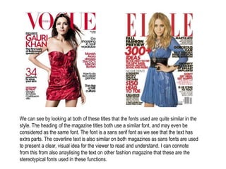
- 1. We can see by looking at both of these titles that the fonts used are quite similar in the style. The heading of the magazine titles both use a similar font, and may even be considered as the same font. The font is a sans serif font as we see that the text has extra parts. The coverline text is also similar on both magazines as sans fonts are used to present a clear, visual idea for the viewer to read and understand. I can connote from this from also anaylising the text on other fashion magazine that these are the stereotypical fonts used in these functions.
- 2. In the comparison between a fashion magazine and a student magazine, we can see that the fonts vary. The common fonts used in fashion magazines are sans serif fonts; however we are able to see there is no stereotypical font type in student magazines. The fonts seem to be more spontaneous and vary in the style and size to reflect the magazine itself. The fonts shown above are the complete opposites, where the one of the left gives a more formal approach and the one of the right presents a casual, relaxed approach.
- 3. There are a variety of colour schemes used within magazine covers, and I am able to conote from looking at a large variety that the colour white seems to a popular choice within the colour schemes. I can deduce that this may be because it can adapt well to other colours. It is also common for magazines to have a white background as it is clear canvas and can create a larger illusion for the other colours. However, there are some expectations which seem to work well within a colour scheme as it gives the cover a brighter background to stand out. The colour schemes also sometimes reflect what the magazine relates to as usually tend to be brighter to create a more youthful aspect.