
Recommandé
Contenu connexe
Tendances
Tendances (14)
En vedette
En vedette (16)
Similaire à How Our Products Develop an Artist's Consistent Style and Brand
Similaire à How Our Products Develop an Artist's Consistent Style and Brand (20)
Dernier
Dernier (20)
How Our Products Develop an Artist's Consistent Style and Brand
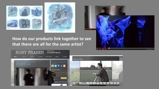
- 1. How do our products link together to see that there are all for the same artist?
- 2. Blue and grey colour scheme of music video integrated into website and digipack Photos de-saturated with a blue hint to them to link the main task and ancillary tasks together.
- 3. Artists style is similar in all products- dark clothing, jeans, shirts, tattoos on show. Indie artist style Helping to develop star-image.
- 4. Digipack font- chosen by focus group Website font- slightly different as couldn’t copy font onto Wix
- 5. Simple text font on website for main information. Similar to text on digipack. Text that looks hand drawn for the sub-headings on website Similar to hand drawn logo on digipack.
- 6. Aspects of Professionalism in our products Barcode and copyright details on digipack Merchandise and links to stores on website Gradually speeds up towards end; similar to professional music videos.