
Recommandé
Contenu connexe
Tendances
En vedette
En vedette (14)
Similaire à Double pagestead
Similaire à Double pagestead (20)
Double pagestead
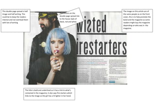
- 1. This double page spread is half The image on this article are of Image and half writing. This The colours on the the same people as on the front could be to keep the readers double page spread link cover, this is to help promote the interest and not overload them to the house style of band and the magazine as some with lots of writing black, red and white. readers might buy the magazine depending on who was in the magazine. The title is bold and underlined as it has a link to what’s contained in the magazine, it also says fire starters which links to the image as the girl has a lit lighter in her hand.
- 2. With this being a Halloween addition of the magazine This double page spread is 50/50 writing and images. This there is a recurring amount of Halloween based things. helps the reader as it doesn’t overload them with lots of Like the cobwebs. writing so that they don’t want to read it. Text and colours are the same as the house style. Red, black and white and the headline Is in bold spooky font which related to the Halloween theme of the magazine.