
Recommandé
Contenu connexe
Tendances
Tendances (20)
Similaire à Presentation Tips - Visual Aids
Similaire à Presentation Tips - Visual Aids (20)
Plus de Soongsil_FEP_John
Plus de Soongsil_FEP_John (20)
Presentation Tips - Visual Aids
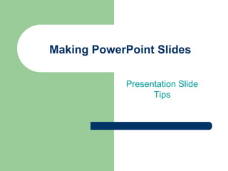
- 1. Making PowerPoint Slides Presentation Slide Tips
- 2. Slide Structure – Good Use 5 - 6 slides or about one slide per minute of your presentation – be sure to include a title slide, at least three visual aid slides, and a conclusion slide Use key words and phrases only Write in point form, not complete sentences
- 3. Slide Structure - Bad Do not use distracting animation Do not use too much animation Be consistent with the animation that you use
- 4. Fonts - Good Use different size fonts for main points and secondary points – this font is 24-point, the main point font is 28-point, and the title font is 36-point Use a standard font like Times New Roman or Arial
- 5. Fonts - Bad If you use a small font, your audience won’t be able to read what you have written CAPITALIZE ONLY WHEN NECESSARY. IT IS DIFFICULT TO READ Don’t use a complicated font
- 6. Color - Good Use a color of font that contrasts sharply with the background – Ex: blue font on white background Use color to emphasize a point – But only use this occasionally
- 7. Color - Bad Using a font color that does not contrast with the background color is hard to read Using color for decoration is distracting and annoying. Trying to be creative can also be bad
- 8. Background - Good Use backgrounds such as this one that are attractive but simple Use backgrounds which are light Use the same background consistently throughout your presentation
- 9. Background – Bad Avoid backgrounds that are distracting or difficult to read from Always be consistent with the background that you use
- 10. Visual Aids - Good Always title your graphs – Use a question – If you use a survey question, remember to change it Ex: What kind of music do you prefer? Make sure graphs, pie charts and diagrams are effective and helpful – Make sure each of your visual aids is clear, informative, simple to explain, understandable and attractive
- 11. Visual Aids - Good Always title your graphs – Use a question – If you use a survey question, remember to change it Ex: What kind of music do young people prefer? Make sure graphs, pie charts and diagrams are effective and helpful – Make sure each of your visual aids is clear, informative, simple to explain, understandable and attractive
- 12. Visual Aids - Bad January February March April Men 20.4 27.4 90 20.4 Women 30.6 38.6 34.6 31.6
- 13. Visual Aids - Bad Number of Smokers No Yes 50% 50%
- 14. Visual Aids - Good When do young people travel? 100 90 90% 80 70 60 Men 50 Women 40 30 20 10 0 January February March April
- 15. Visual Aids - Bad 90 Men Women 38.6 34.6 31.6 30.6 27.4 20.4 20.4 January February March April
- 16. Visual Aids - Bad Minor gridlines are unnecessary Font is too small Title is missing
- 17. Spelling and Grammar Edit your slides for: – speling mistakes – the use of of of repeated words – grammatical errors you might have make Have someone else check your slides before you do your presentation!
- 18. Conclusion Use an effective and strong closing – Your audience is likely to remember your last words Use a conclusion slide to: – Summarize the results of your presentation – Give a possible reason to explain your result – Make a recommendation, give advice or a suggestion
- 19. Good Luck! Final Tips – Be prepared – Know your information – Rehearse and practice thoroughly – Above all, relax and have fun
Notes de l'éditeur
- See page 28 in your textbook
- See page 28 in your textbook