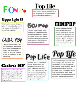
1. F ON T’ S I like this font because it is bold, but at
the same time it is not too childish so it
will attract my target audience.
I like this font because it is quite
plain it’s not too bold but then it’s
not too plain so it would suit my This would be a good font to
type of pop magazine. This font is very fun and quirky; use on my magazine cover
showing the same personalities because it is bold, not only this
that my target audience possess’, but it looks like the type of font
it’s also an unusual type of font you would usually find on a pop
so it will make my magazine front magazine. It quite a funky and
cover stand out from any other would be quite a good font to
music magazine front cover. use on my magazine front
I like this font because it is very cover.
girly and very pop like because
of the hearts and swirly writing,
but this may be a little too
childish for my target audience
as they are too mature for this
type of font.
This font is quite good as it looks more
I like this font it’s just the type feminine and is bold but not too bold
of font that would suit my so it would fit my type of magazine
target audience. It will look perfectly. But I don’t think this type of
good in different colours and font would look good in different
This font is very bold and like the colours as I think the black works best
will a bold outline colour so this
types of fonts you would see on the and I don’t think the colour black
will be more appealing for my
front of a pop magazine. But I find would appeal to my target audience if
target audience so they would
this font is too big and bold and I they were picking my magazine up.
be more likely to pick up the
don’t think it would appeal to my
magazine at first glance.
target audience.