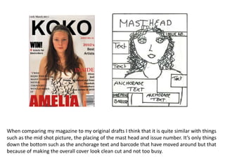
1. When comparing my magazine to my original drafts I think that it is quite similar with things such as the mid shot picture, the placing of the mast head and issue number. It’s only things down the bottom such as the anchorage text and barcode that have moved around but that because of making the overall cover look clean cut and not too busy.
2. My contents page is very similar to my original plan and I think I have stuck by it quite well. There is only a few slight changes such as the front cover being placed in as well as another picture and there not being any numbers on the pictures. Overall I am pleased with my similarities.
3. With my double page spread I think that I still have everything that I originally intended to have its just the layout is different. I did have to change things around because I thought that the picture would look best on the right so that the introduction would be read first rather than after. The quote also stand out more on the left as it replaces a title that other music magazines would have.