
Recommandé
Contenu connexe
Tendances
Tendances (16)
En vedette
En vedette (14)
Similaire à Creating the Digi-Pak
Similaire à Creating the Digi-Pak (20)
Dernier
Dernier (20)
Creating the Digi-Pak
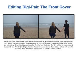
- 1. For the front cover of my Digi-Pak, I had taken photographs of the two characters from the music video whilst on set. I wanted to do this (instead of showing an artist on the cover) because it makes the Digi-Pak more ‘artistic’ and ‘interesting’. On set I took two photographs – The first with the Jessica (The Girl) holding no ones hand and the second, Josh (The Boy) holding her hand as she stays in her exact pose. This was done so I was able to make the fading effect of Josh more realistic when his ‘Ghost’ is holding her hand.
- 2. I started of by using the second image so I was able to cut around Josh’s body to place him within the first photograph of Jess on her own. To do this, I began by using the ‘Magnetic Lasso’ Tool (Left Image) which when I drew around him, it would automatically start tracing his body, every little detail (Right Image).
- 3. Then, I copied and pasted this layer of Josh into the second picture of Jess on her own – rendering and smoothing the edges of the cut so his body ‘intact’. Finally, I carefully placed Josh’s layers hand onto Jess’s, as though they were really holding hands.
- 4. After placing the ‘cut out’ of Josh’s body on the image of Jess on her own, I changed the opacity of the image to around 40%. I had experimented with a few percentages to see how much I wanted Josh to be seen, but wanted to show some of the beach in front of him. Overall, this is how I created the fading effect of Josh’s character to convey the title of the song – “Fade Away”.
- 5. After this I colour graded the image and added text. I had done some research into Jemma Pixie Hixon and in a lot of her own material (adverts, etc.) she uses a lot of purples and pinks – so I incorporated this within her name on the front cover and made the text more ‘stylish’ to fit here genre (pop and R&B). Also, I made the “FADE AWAY” title very bold and gritty to not contrast with the name text, as I wanted to refer to the song it’s self. This is the front cover in it’s final form.
- 6. For the back cover of the Digi-Pak, I used an image of Jess (The Girl) looking out to the beach. I changed the contrast and brightness of the image to fit with what I had changed (colour and light wise) on the Front cover. After doing so I cropped down the image to the correct size for a Digi-pak.
- 7. For the text on the back cover I tried to stick with the ‘purple’ theme I had going on to represent Jemma (the artist) and her genre which is Pop/R&B. I re-used the font for her full name which I placed at the top and did a more bold/3D font of the track title, sticking with the purple theme once again. Finally, I added a ‘Compact Disc Digital Audio” logo, her website address and a barcode as I had seen these on the CD’s I had researched. This was simply done y taking the background layer out and pasting onto the image (info parts).
- 8. The Image behind where the disc would be placed I had just cropped an image of the beach we had filmed on and colour graded it to much the others. I thought this was not to important to think about much, but needed it to stick with he beach theme of the digi-pak.
- 9. Lastly but not least, the inside cover I had decided to do something very different from my last concept. Instead of using a close up of Jessica’s (The Girl) face, I thought I would add the sky filled with blacked out birds to convey this idea of death, as some birds such as crows are used to represent it. I think it would be really effective. So I had taken an image of Photoshop drawn birds (copyright free) and using the ‘Magic Wand’ tool – cutted them out and added them onto the Inside Front Cover.
- 10. When I had finished doing so it looked great. But wanted to add more that could make the digi-pak more eerily. So I went through the lyrics and picked out certain parts and added them onto the inside front cover. I changed the opacity levels on the text so they weren't to “in your face” but more faded and ghostly.