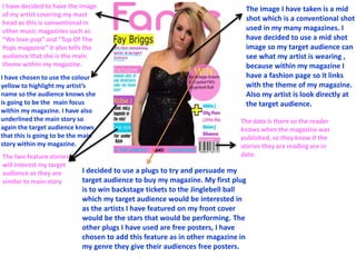
1. I decided to use a plugs to try and persuade my
target audience to buy my magazine. My first plug
is to win backstage tickets to the Jinglebell ball
which my target audience would be interested in
as the artists I have featured on my front cover
would be the stars that would be performing. The
other plugs I have used are free posters, I have
chosen to add this feature as in other magazine in
my genre they give their audiences free posters.
The image I have taken is a mid
shot which is a conventional shot
used in my many magazines. I
have decided to use a mid shot
image so my target audience can
see what my artist is wearing ,
because within my magazine I
have a fashion page so it links
with the theme of my magazine.
Also my artist is look directly at
the target audience.
I have chosen to use the colour
yellow to highlight my artist’s
name so the audience knows she
is going to be the main focus
within my magazine. I have also
underlined the main story so
again the target audience knows
that this is going to be the main
story within my magazine.
I have decided to have the image
of my artist covering my mast
head as this is conventional in
other music magazines such as
“We love pop” and “Top Of The
Pops magazine” it also tells the
audience that she is the main
theme within my magazine.
The two feature stories
will interest my target
audience as they are
similar to main story.
The date is there so the reader
knows when the magazine was
published, so they know if the
stories they are reading are in
date.
I placed the price of the magazine
here so the target audience can
see it straight away, because on
some magazine I feel the price is
difficult for the target audience to
find.
2. Similar conventions
I have highlighted some of the similar
conventions I have used within my
magazine . I have used different colours
when talking about a new artists to
show the target audience that it is
going to be a different story . I have
used the colour yellow to highlight the
most important stories like we love pop
magazine has. I have put the date and
barcode in the same place as this is
conventional, I didn’t want to break
conventions because I wanted my
magazine to be similar to existing
magazines. I have listed the other
artists that are going to be featured so
it encourages my target audience to
read other stories.
3. Similar conventions
As you can see here these
magazine all have the main
artists covering the mast
head of their magazine so I
have chosen to use this on
my magazine. The use of this
shows I have also stuck to
conventions.
4. Similar conventions
I have used another
convention from music
magazine and normal
magazines. I have told the
target audience about other
people and other feature
stories that are going to be
feature within the magazine.
5. LIIAR Analysis
Language
The use of only one image of my artists shows
she is going to be the main focus within the
magazine. I have also mentioned other artists
that are going to be featured within my
magazine, the artists I have mentioned are all
within the same genre of pop, and my target
audience will be fans of. My artists is looking
directly at the camera so it gives the impression
she is looking directly at the target audience,
which will draw them into wanting to read the
magazine. I have used pink, purple , blue and
yellow as these are the colours that most other
music magazines use, and these are
stereotypically more feminine colours. The plug
“Win backstage tickets to the Jinglebell ball” will
attract my target audience because the artists
featured in my magazine will be performing so
they will want to see them perform.
6. LIIAR Analysis
Institution
I would say if my magazine
was published it would be
published with Egmont,
they also publish We Love
Pop magazine. We would
have the same target
audience (13-16 year old
girls). And the style in
which my magazine is
designed is similar to
theirs.
7. LIIAR Analysis
Ideology
I have not stuck to convention as I
have used more than 3 colours
within my magazine. Pink, white,
black, yellow, blue and purple I have
not stuck to convention as I feel I
needed more colours to make my
magazine stand out to my target
audience. The price of my magazine
is £2.50 which is cheaper than
magazine in my genre, I have set my
magazine to this price because I feel
my target audience won’t have
much money and won’t want to
spend loads on a magazine.
8. LIIAR Analysis
Audience
The audience for
my magazine
would be 13-16
year olds, we can
see this with the
main story and
feature stories I
have used.
10. Differences
Unlike most pop magazines I
have chosen not to use a pull
quote for my main story, I
have just given a brief
overview on what the story
is going to be about. I have
chosen to do this as I want
my target audience to wait
until the double page spread
before they see the pull
quote.