1. The effects and defects of visualized figure of data analysis
*** 1. Introduction ***
The ways how to visualize the data have been attracted many researchers. The ambient
products like Ben Fry's data-based-visualization are known as a good way of visualizing data. Not
only the visual as itself, but also the code he made would have attracted a lot of people so far.
However, whether such a good-looking visualization would give viewers high
understandability or insights are not well known and the statistic data visualized by several methods
have not surveyed so far. It is also important to compare it's 'effectiveness' not only for viewers, but
also for creators since it cost a lot of time to making good-looking visualization so that it's
effectiveness should be considered at the stage of starting making visualized figures.
In this paper, survey was conducted for the purpose of clarifying whether visualized figures
have high understandability (Clustering-map in this paper) comparing that of normal figures (Table
figure in this paper). Adding, the understandability versus cost-consuming curve are discussed in
terms of 'What degrees and how much time should we devote in making visualized figure ?' for the
purpose of considering/clarifying 'Whether there should exist 'better figures' for 'better cases' which
give viewers high effectiveness and creators high efficiency'.
*** 2. Experiment ***
After counting the numbers of keywords through the API, New York Times served on the
web, We searched the relationship between keywords of each category in each country (for details
see the Table 1), by counting the registered keywords in the articles in New York Times published
on the web from 2005.01.01 to 2010.12.31.
country category
japan art
china business
france economy
india science
technology
politics
Table 1 Countries and Categories surveyed in this paper
Relationship between two keywords were evaluated as below,
First : Count the numbers of registered - keyword (here, we assumed the data
'nytd_des_facet' as a keyword of each article)
Second : Assuming that the keywords registered at the same articles (ex. Article 'Do you
love me?' has keywords 'love, friends and betray', love-friends, love-betray and friends-betray have
one counts of related-keyword) have a relationship, count the numbers of related-keywords of all
articles for each category.
2. Table based data were created after these two steps.
Third : Assuming the counts of each related-keywords as a 'distance' of relations in the
related-keywords, that is, as the count of related-keywords increases, the distance of them get
decrease. In this paper, distance was normalized as the most counted related-keyword distance are
to be ' 1 (one) '.
Forth : After normalizing the related-keyword distance, each keywords in each category
were positioned based on the method of 'multidimensional scaling method'.
Clustering maps were created after these four steps.
After creating two kinds of Visualized data, here Table figures and Clustering maps, and
then asking the watcher 'Which figures are easy to understand the relationship of each keyword ? '
and creator 'Which figures are easy to make and have high-cost ? '.
* Data analysis was promoted with Open-source programming tools 'Ruby on Rails' and MySQL *
*** 3. Results and Discussion ***
** 3.1 What viewer could acquire from each figure
Both kinds of figures could show the parameters as below.
+ Table …. Related Rank, Counted number.
+ Clustering map …. Related Rank, Counted number.
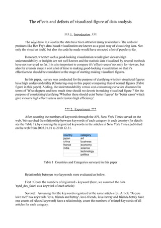
** 3.2 Understandability of Table and Clustering-Map (for viewer)
After surveying the 'understandability' of each figure, it is clarified that Table of registered-
keywords of each category in all-countries have less understandability comparing Clustering-map
of them between viewers. The reason why Clustering-map are easy to understand the relationships
between two keywords are such that 'Not only two items related-weight, but also many items
related weight I could understand at one sight.', 'Each position was easy to grasp the big view like
schematic diagram.' and 'Beauty of Clustering-map figures make it possible to understand the
relationships of some keywords.'
Here, it should be also reminded that showing a lot of items in Clustering-map has some
obstacles. The biggest one is that Clustering-map sometimes decrease the 'exactness' of the datas
with increasing the numbers of items and relations between items. Seeing the Clustering Maps
(Here, let's take 'Business' Category) for details, there are some 'miss-positioned' items, for
example, though the two keywords '' and '' does not has a 'dense-Relation' as Table result does
show, these two keywords are to be positioned as a 'Related-keyword' within Clustering-map
results.
This problem could be solved by developing 'Best-Practices Programming' as seen in the
book of 'Beautiful Visualization' to some extents. However, producing 'Best-Practices Programming'
cost a lot of time and highly-visualized figure need high-spec Computer machine that it is
3. unfavorable to try to make highly-visualized figures especially the occasions when instant
analyzing/calculating/evaluating data are needed. It is true for this paper that Clustering-map would
be suitable in case of clarifying and grasping the relationships among items 'largely', however it is
unsuitable in case of evaluating the each relationships of items 'exactly' and prompt results are
needed since it cost a lot of time for creating code and calculating data (details are mentioned next
term).
** 3.3 Producing Costs of Table and Clustering-Map (for creator)
The 'easiness' of creating table figures are much lower than that of Clustering-map. For table
making, it costs around 3 hours to get the table figure (here just only to get the data and construct
each relationships with counting-number), on the other hand, for clustering-map making, it costs
more than 30 hours since it is needed to produce the clustering-map code and run it's programming.
The relationship between understandability and Cost (like time-consuming) might be as
below figure.
Fig. Schematic figure of Understandability versus Cost curve
It is reasonable to some extent to make data as a visualized-one since the understandability
increase steeply as cost increase (Δunderstandability / Δcost are large one). However, as cost
increases, the degree of understandability becomes small one (Δunderstandability / Δcost become
small one) so that it sometimes results in 'inefficient work' considering it's effectiveness against
target viewer. Considering these factors, it is important to make it clear 'How much time
should/Could I cost for making visualized figure?' before starting creating figures especially the
case create data-based figures.
Adding, it should be also reminded that once creator could make 'highly visualized code', it
is possible to make 'highly visualized figure', the Understandability-Cost curve would be like Fig. .
Of course, there sometimes exists difficulties to adapt the data results into 'already made code'.
4. Fig. Schematic figure of Understandability versus Cost curve (Already create Code)
What is more, educating how to make visualized figures are of great important since
visualized figures help the viewer to understand and grasp 'what data shows?' with a lot of ease. It
should not be forgotten what visualized figures mean especially using some statistic method like
'method of least squares' or 'normal distribution'.
*** Summary ***
In this paper, 'Table figure' and 'Clustering-map' are created and evaluated their
understandability in terms of viewer and cost(time-consuming) in terms of creator. The survey
results show that Clustering-map have high-Understandability but have much difficulty and costs
for creating figures comparing that of Table figure. Understandability versus Cost consideration
shows that creators should consider and decide 'how much time should I/We cost for making
visualized figure' after clarifying Target Viewer and degree of it's effectiveness (like
understandability) before starting making visualized figures.
5. Art
Wo
rl dW Co Ca
ok rto
ar in o ns
Ch II ( ga
ildr Wo 19 nd an
d
en meE 39
- 45 Co Ca
an nxe ok rto
d Y c ut ) bo o ni s
Aw ou i ve ok
s ts Te
th s an Mu rro
ar d d Tra s
s, Ma ve eu r ism
D Au O l an ms
ec
ora cti per Res na
ge dV Ar
t
ti o on a t au me ac
ns s r an nt atio
an ts ns
dH Sc
on ulp F
An
tiq
ors tur ur nit
Int u Ph e u re
e es oto
S
rnato gra
ck Ne
Un tion a a s ws De Bo
p hy El
ite l nd Cu pa at h ok ec
d S R el a Bo ltu pe s( sa tro
nic Ga
t at tiond re rs Ob nd rde
Wo es nss itu Lit s Oly ns Su
rld Ec We Co ari era mp an bp
Cu on llec es dG
p( om dding
Gr tor ) t ur
e
ic
Ga ard
ri m
eM
So y aff sa sa me en or t
cc it i nd nd s( ing ga
er) En Co 20 ge
Ho ga l le 10
us ge ctio ) Cr
i ng Sh me Ja i sis
op nt s ns zz
pin
His ga
Air tor nd His Th
Int y Re t or ea
lin er t ai ic B Mu t er
es
an ior D l
Ar ui l
di n
s ic
Mo
dA es Vie ch t io
Corpla ign
i t na ite gs nP
Te m ctu an Ac
l ev mpu Fls w ne o
Co Wa re dS
ite
ict
ur e ad Ed
Sc Sio i
sco ter er Bu mi r s s em uc
i en cn er an s an dd c B yA at i
on
ce dV d hi s oo wa
an ide Pla m ks r ds an
dS
dT o G nts an (O
ec am dS De Bu sc ch
hn Tr e
es trip sig il d ars oo
olo es s Re Do ing ) ls
gy Wo tai Fa cu n s(
an me Wr mi me Ad St
dS na itin l Sto lies nta ve
rtis ruc
hr u ga res an F Fa ry Utur e
b s nd G nd an d Foo
Co
sh
ion Fil i ng ni t s ) A
i rls W dT amd ms an ed
Co
lleg riter r ad i ly mp an an dM Sta utom
Blo Ban Arm es s e Lif Nig ute dA
pp dP a rk tes obi
gs ks am an e htc rs are rog Ec eti Int les
an and en Re d l ub an ram on ng ern
d B B t, D An Po al Uni sa dt l Tra om ati
im Un Es v he Ro s
MoB ank efe
l og at e piu taers I nd Bla Int ck de ic Lux Ap on
al
gn
vaise i ng nse
iesg d F Rtes tiS te itie nter
ela o
d Int Ca
ba ck Da ern M Sh
ow
C o ur
ndy G
pa
rel Re
b(an an ilm torna
t t s na eri s et usic Ho itio oo lat
I llt
er n dM s ati es tio or
De
ret
sa
nc
i ng Te me Cs a n s ds ion
et) ilita on P
o
na s ig P
rk s
xti
lPo
es Fu lasnd F an s
ry T an l i t
d Rs ic
lT
rad na Ho etr rni sica air dT
Foea an Po Fi g sh l Ms r en
a
eh n ea nd usA d O li tic ure ya i ng u
rce ab Gd nd Fu inh
t gl t he s a nd s sic ds
s ilitaov Wo rni etn
a ic r R nd Sk Po Fe
tioern rld sh dsR G ati ets sti
ing aea ec ng va
n m
en Ma s ndl r ea ov e ls
t rke Sp
Es ti o rn
t oat
tr n A m en
e
s rea t
s
Fig. 1 Clustering-map of Keywords-Relations in Art Category