SlideShare une entreprise Scribd logo
1  sur  8
“ When a form has  multiple pages , there is the need for Next and Back buttons. Most web form guidelines say that the primary action button should be on the left, but in this case, it would seem to make more sense to have the  primary button  (Continue or Next) on the  right , with the  secondary button  (Back or Previous) on the  left .  Do you have any thoughts on this topic?” Previous & Next Actions
Actions ,[object Object],[object Object],[object Object]


Contenu connexe

Plus de UIEpreviews

Recruiting the Right Users to Get Real Results
Recruiting the Right Users to Get Real ResultsRecruiting the Right Users to Get Real Results
Recruiting the Right Users to Get Real ResultsUIEpreviews
 
Design as a Business Tool: From Research to Experience Roadmaps
Design as a Business Tool: From Research to Experience RoadmapsDesign as a Business Tool: From Research to Experience Roadmaps
Design as a Business Tool: From Research to Experience RoadmapsUIEpreviews
 
Designing with Remote Teams - www.uievs.com
Designing with Remote Teams - www.uievs.comDesigning with Remote Teams - www.uievs.com
Designing with Remote Teams - www.uievs.comUIEpreviews
 
Hiring the best ux designers preview
Hiring the best ux designers previewHiring the best ux designers preview
Hiring the best ux designers previewUIEpreviews
 
Research and Design for the UX Team of One
Research and Design for the UX Team of OneResearch and Design for the UX Team of One
Research and Design for the UX Team of OneUIEpreviews
 
Controlling the Pace of UX with Content Strategy
Controlling the Pace of UX with Content StrategyControlling the Pace of UX with Content Strategy
Controlling the Pace of UX with Content StrategyUIEpreviews
 
Voice and tone preview
Voice and tone previewVoice and tone preview
Voice and tone previewUIEpreviews
 
Building Trust with Your Users through Messaging & Copy
Building Trust with Your Users through Messaging & CopyBuilding Trust with Your Users through Messaging & Copy
Building Trust with Your Users through Messaging & CopyUIEpreviews
 
Sketching preview
Sketching previewSketching preview
Sketching previewUIEpreviews
 
Organizing mobile web experiences - preview
Organizing mobile web experiences - previewOrganizing mobile web experiences - preview
Organizing mobile web experiences - previewUIEpreviews
 
Solutions for a_world _of_countless_devices
Solutions for a_world _of_countless_devicesSolutions for a_world _of_countless_devices
Solutions for a_world _of_countless_devicesUIEpreviews
 
Microcopy with Des Traynor
Microcopy with Des TraynorMicrocopy with Des Traynor
Microcopy with Des TraynorUIEpreviews
 
The Kano Model with Jared Spool
The Kano Model with Jared SpoolThe Kano Model with Jared Spool
The Kano Model with Jared SpoolUIEpreviews
 
The Kano Model with Jared M. Spool
The Kano Model with Jared M. SpoolThe Kano Model with Jared M. Spool
The Kano Model with Jared M. SpoolUIEpreviews
 
Mobile First Responsive Web Design
Mobile First Responsive Web DesignMobile First Responsive Web Design
Mobile First Responsive Web DesignUIEpreviews
 
Mapping the Experience
Mapping the ExperienceMapping the Experience
Mapping the ExperienceUIEpreviews
 
SharePoint and the User Experience
SharePoint and the User ExperienceSharePoint and the User Experience
SharePoint and the User ExperienceUIEpreviews
 
Ratings & Reviews, UIE Virtual Seminar with Erin Malone
Ratings & Reviews, UIE Virtual Seminar with Erin MaloneRatings & Reviews, UIE Virtual Seminar with Erin Malone
Ratings & Reviews, UIE Virtual Seminar with Erin MaloneUIEpreviews
 
7 things to do with a persona
7 things to do with a persona7 things to do with a persona
7 things to do with a personaUIEpreviews
 

Plus de UIEpreviews (20)

Recruiting the Right Users to Get Real Results
Recruiting the Right Users to Get Real ResultsRecruiting the Right Users to Get Real Results
Recruiting the Right Users to Get Real Results
 
Design as a Business Tool: From Research to Experience Roadmaps
Design as a Business Tool: From Research to Experience RoadmapsDesign as a Business Tool: From Research to Experience Roadmaps
Design as a Business Tool: From Research to Experience Roadmaps
 
Designing with Remote Teams - www.uievs.com
Designing with Remote Teams - www.uievs.comDesigning with Remote Teams - www.uievs.com
Designing with Remote Teams - www.uievs.com
 
Hiring the best ux designers preview
Hiring the best ux designers previewHiring the best ux designers preview
Hiring the best ux designers preview
 
Research and Design for the UX Team of One
Research and Design for the UX Team of OneResearch and Design for the UX Team of One
Research and Design for the UX Team of One
 
Controlling the Pace of UX with Content Strategy
Controlling the Pace of UX with Content StrategyControlling the Pace of UX with Content Strategy
Controlling the Pace of UX with Content Strategy
 
Voice and tone preview
Voice and tone previewVoice and tone preview
Voice and tone preview
 
Building Trust with Your Users through Messaging & Copy
Building Trust with Your Users through Messaging & CopyBuilding Trust with Your Users through Messaging & Copy
Building Trust with Your Users through Messaging & Copy
 
Sketching preview
Sketching previewSketching preview
Sketching preview
 
Organizing mobile web experiences - preview
Organizing mobile web experiences - previewOrganizing mobile web experiences - preview
Organizing mobile web experiences - preview
 
Solutions for a_world _of_countless_devices
Solutions for a_world _of_countless_devicesSolutions for a_world _of_countless_devices
Solutions for a_world _of_countless_devices
 
Microcopy with Des Traynor
Microcopy with Des TraynorMicrocopy with Des Traynor
Microcopy with Des Traynor
 
The Kano Model with Jared Spool
The Kano Model with Jared SpoolThe Kano Model with Jared Spool
The Kano Model with Jared Spool
 
The Kano Model with Jared M. Spool
The Kano Model with Jared M. SpoolThe Kano Model with Jared M. Spool
The Kano Model with Jared M. Spool
 
Mobile First Responsive Web Design
Mobile First Responsive Web DesignMobile First Responsive Web Design
Mobile First Responsive Web Design
 
Mapping the Experience
Mapping the ExperienceMapping the Experience
Mapping the Experience
 
SharePoint and the User Experience
SharePoint and the User ExperienceSharePoint and the User Experience
SharePoint and the User Experience
 
Ratings & Reviews, UIE Virtual Seminar with Erin Malone
Ratings & Reviews, UIE Virtual Seminar with Erin MaloneRatings & Reviews, UIE Virtual Seminar with Erin Malone
Ratings & Reviews, UIE Virtual Seminar with Erin Malone
 
7 things to do with a persona
7 things to do with a persona7 things to do with a persona
7 things to do with a persona
 
Critique
CritiqueCritique
Critique
 

Web Form Luke W Preview

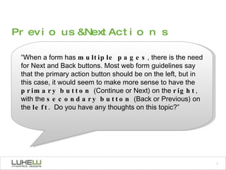
  • 1. “ When a form has multiple pages , there is the need for Next and Back buttons. Most web form guidelines say that the primary action button should be on the left, but in this case, it would seem to make more sense to have the primary button (Continue or Next) on the right , with the secondary button (Back or Previous) on the left .  Do you have any thoughts on this topic?” Previous & Next Actions
  • 2.
  • 3.  
  • 4.  
  • 5.  
  • 6.  
  • 7.  
  • 8.  

Notes de l'éditeur

  1. A few examples of primary and secondary actions
  2. All those labels, fields, and groups need to do something.. Label Field Action!
  3. I’ve been advocating this for years and finally decide to formalize the recommedations. So we ran some tests -Etre & I -Great usability testing company Tested 6 options with 23 people. Usability & eye tracking -don’t worry about the aside article is online as of yesterday.
  4. Fastest performing, least amount of fixations (shorter & fewer) = B But many people commented on C & A’s ability to slow them down & appreciated it. 8 more fixations in C than in A (on average) A actually performed the best.
  5. E performed worst - 6 people made a mistake out of 23. 6 seconds slower than B. F -required most fixations and longest fixations Though they successfully completed this design, were more efficient with others (according to eye-tracking)
  6. One of the most common questions I get is about prev & next. can an action which leads people to the previous step of a process be placed to the right of an action that leads users to the next step of a process? One side of the debate argues that there is a natural organization: actions that move you forward are on the right, actions that move you backward are on the left (in places where people read from left to right). The other side argues that the notion of “primary” actions (those that move people forward) outweigh this consideration and “secondary” actions (which are much less used) can be placed to the right of primary actions even if they allow people to access previous steps. The presence of a prominent primary action in the “line of fire” of people filling a Web form, allows them to land on the action they need to take as they finish answering the questions a form requires.
  7. the first option should be avoided because people may select “Previous” by default assuming it is the primary action on the form since it aligns directly with their path to completion. Providing a visual distinction between these actions but maintaining the same order (as illustrated in the image) helps prevent this issue. In situations where previous and next are both primary actions, don’t break the left to right order as shown in the two bottom-most examples.
  8. Top-aligned labels are especially prone to challenges of previous and next action positioning because they may lack screen space to the left of the label and input field. In these cases, maintaining a left to right ordering of previous and next actions could lead to inadvertent clicks on “Previous” as people complete the last question on a form. Perhaps the best solution is to think of these actions instead as “Continue” and “Go Back” to help people make forward progress In each of these examples a few simple considerations point to appropriate design solutions: ensuring there is a primary action that guides people forward; being careful not to introduce confusion by shifting the left to right order expected when moving between pages; and knowing when previous and next are both truly primary actions so they can be presented as such