

Recommandé
Contenu connexe
Similaire à Ecma visual identity_manual
Similaire à Ecma visual identity_manual (20)
Plus de ELF MACHINE
Plus de ELF MACHINE (20)
Dernier
Dernier (20)
Ecma visual identity_manual
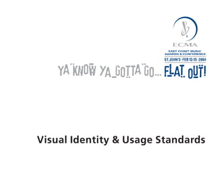
- 1. Visual Identity & Usage Standards
- 2. Table of Contents Logo and Usage 4 Event Signature and Logo 5 Space and Size Relationships 6 Event Colours 7 Applications on Backgrounds 8 Incorrect Uses 9 Merchandise Uses 2
- 3. The positive perception of the 2004 East Coast Music Awards and Conference depends to a large extent on the consistent application of its visual identity standards. Questions About the Visual Identity Standards Whether on business cards, stationery, signs, posters, brochures or in audio-visual presentations, each design use of the visual identity communicates and reinforces the 2004 ECMA image to its audiences. Original artwork of the ECMA 2004 logo and slogan can be obtained for use on Macintosh and PC computers. Following guidelines establish the basic look for each use of the identity. This way we will begin to build and strengthen awareness of our identity and event. Any questions concerning the use of the identification elements, or applications which are not standard, should be reviewed by the East Coast Music Association 2004 Event Committee. Address all inquiries to Len Walbourne Marketing and Communications Chair and Graphic Designer Tel. (709) 738-3490 or Email: lwalbourne@nf.sympatico.ca 3
- 4. The Event Signature and Logo Logo The 2004 event signature consisting of the logo “ECMA” and tagline is the event’s most important identification element. The two components form an inseparable unit with proportions which should not be altered. Both event signatures exist in English and French. The Logo Tagline - Option 1 The logo is custom-drawn and should not be used in text, or as part of a headline. When the event name is mentioned in a text, it should be written in the typeface that is being used. (e.g. 2004 East Coast Music Awards and Conference). The Tagline The tagline “YA KNOW YA GOTTA GO... FLAT OUT!” is drawn in outline based on the Decapot font. This enables the Mac and PC user to print the event signature as an EPS or TIFF file. Tagline Options Logo The logo/tagline may be used in its entirety or it may be used only with the words “FLAT OUT!” if space is restricted. Tagline - Option 2 4
- 5. Space and Size Relationships The first example shows specific construction proportions of the logo which may have to be referred to for special applications. The minimum space indicated around the logo, as shown opposite, should remain free of all additional elements so as not to compromise the visual appearance of the logo. Minimum Size 1” The second example indicates the minimum size of the event logo. Sizes smaller than this should be avoided. Exceptionally, the logo without the tagline, may be used such as on promotional items (e.g. T-shirt). For this purpose the logo may be further reduced. 5
- 6. Event Colours Preferred Colours The event signature is in two colours; Dark Blue PMS 288 and Metallic Silver PMS 877 . Metallic Silver PMS 877 Dark Blue PMS 288 If the corporate signature needs to be reproduced using four-colour process, colors are achieved as follows: Dark Blue Cyan Magenta Black 100% 65% 30% Metallic Silver Black 40% Dark Blue PMS 288 - 40%screen Other Accepted Colours When a two-colour signature is not practical or economical, a one-colour signature can be used as shown opposite. These colours can also be used with the shortened tagline logo version as well. Dark Blue PMS 288 Black - 40%screen Black 6
- 7. Applications on Backgrounds When applying the event signature or logo on light backgrounds the corporate colours may be used or alternatively the one-colour signature in either Dark Blue or Black. Dark backgrounds require the signature to be reversed out white as shown opposite. Light backgrounds - Full colour Light backgrounds - spot color Dark backgrounds 7
- 8. Incorrect Uses of the Event Logo and the Event Signature The signature and logo is the primary identifier of the event. Its presentation should always be consistent with the guidelines as described in this manual. Do not screen logo when using spot colour applications Do not use the full color logo when printing the signature on dark backgrounds Misuses of the event logo and signature as shown opposite are not permitted. This applies all logo and signature versions. Do not change the alignments of any of the elements Do not use the reversed logo when printing the signature on light backgrounds Do not substitute specified fonts Do not frame the signature Do not distort the logo Do not outline the logo 8
- 9. Merchandise Usage The corporate identification on hats, T-shirts and promotional items such as bags, banners and CDs, etc. should use the signature and/or logo in a solid format Depending on the background colour of the application, the logo may be used in Dark Blue PMS 288, as well as black or white as show here. 9