Open Enrollment 2020: Case Study and Trends Report
•
0 j'aime•1,759 vues

This document provides a summary report of open enrollment communication campaigns from 2020. It analyzes engagement results from nearly 200 employers that targeted approximately 750,000 employees. On average, campaigns saw a 72% employee engagement rate and 76% when using decision support tools. The report also breaks down results by industry and provides best practices for open enrollment communications, including using focused messaging, decision support tools, customized and mobile-friendly content, and active enrollment promotion. It analyzes the use of digital postcards, videos, and calls to action among successful campaigns.

Recommandé
Recommandé
Contenu connexe
Tendances
Tendances (20)
Similaire à Open Enrollment 2020: Case Study and Trends Report
Similaire à Open Enrollment 2020: Case Study and Trends Report (20)
Dernier
Dernier (10)
Open Enrollment 2020: Case Study and Trends Report
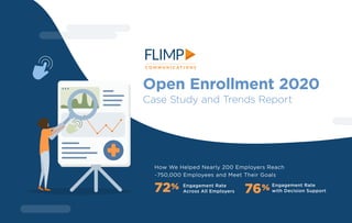
- 1. Open Enrollment 2020 Case Study and Trends Report How We Helped Nearly 200 Employers Reach ~750,000 Employees and Meet Their Goals 72% Engagement Rate Across All Employers 76% Engagement Rate with Decision Support
- 2. 2 In response to the COVID-19 pandemic, HR leaders and benefits brokers turned to digital communication solutions for benefits-enrollment support to meet the needs of dispersed and remote workforces. The lessons from last year can continue to help us improve OE results. This report provides an analysis of engagement results and Across nearly 200 benefits-enrollment campaigns in 2020, we saw some of the highest levels of employee engagement ever. American Diabetes Association Georgetown University Ken’s Foods Jostens NPR Stamps.com What is a Digital Postcard? SEE EXAMPLES See how customized videos, Digital Postcards, decision-support tools, and benefits communications were used to educate employees and drive them to action. offers best practices to help improve employee and client experiences for this year’s open enrollment and beyond. A sampling of organizations with campaign data included in this report are: Digital Postcards are branded video microsites with built-in viewer tracking and reporting. By combining custom videos, messaging and interactive elements, they educate readers around a targeted topic, and then drive them to take action.
- 3. 3 Total Videos 741 Aggregate Results 2020 OPEN ENROLLMENT Total Targeted Employees 749,213 Average Engagement Rate for Digital Postcards used during OE campaigns (and 76% when using decision support) 72% 1.86 Average Number of Actions Taken in Each View Total Video Views 421,272 Benefits Overview Videos 13 MIN 53 SEC average duration 50 Enrollment Intro Videos 2 MIN 33 SEC average duration 173 Supplemental Videos 518 Total Campaigns 196 all annual benefits enrollment, all in the 2020 calendar year Average Time on Content 3MIN 16SEC Total Actions Taken 689,345
- 4. 4 Results by INDUSTRY In this section, we break our data down by industry in order to establish some benchmarks to measure against your own open enrollment communication campaigns. Are you wondering what a good engagement rate, response rate, or average time on content is for your employees?
- 5. 5 Open Enrollment Engagement Rates BY INDUSTRY AGRICULTURE BANKING & FINANCIAL SERVICES BIOTECHNOLOGY CONSTRUCTION CONSUMER PRODUCTS & RETAIL EDUCATION ENERGY ENGINEERING HEALTHCARE HOSPITALITY & FOOD SERVICES HR SERVICES INFORMATION TECHNOLOGY INSURANCE LEGAL SERVICES MANUFACTURING REAL ESTATE SOFTWARE & TECHNOLOGY SPORTS & ENTERTAINMENT TELECOMMUNICATIONS TRANSPORTATION Industries represented 61% INFORMATION TECHNOLOGY 80% “OTHER” CONSTRUCTION 91% 54% HEALTHCARE 61% CONSUMER PRODUCTS AND RETAIL 66% MANUFACTURING
- 6. 6 INDUSTRY: Construction While more than half of the campaigns in the construction industry had passive enrollment, their engagement rate was over 90%. Many of our construction- industry campaigns featured educational videos from Flimp’s HR Benefits Video Library, which could indicate video-based education performs even more strongly in this sector. Campaigns 11 Total Targeted Employees 25,456 Engagement Rate 91% Mobile Views 17% Average Time on Content: 3MIN 4SEC Response Rate: 2.24 Actions per View
- 7. 7 INDUSTRY: Healthcare Healthcare-industry workforces are as diverse as their benefits and communication needs. Among the companies with campaigns in this section are medical centers, home-healthcare companies (with a significant portion of their workforces out in the field), substance-abuse-rehabilitation centers, medical equipment or transportation services, and more. Given the diverse patterns of employees even within the same company, a critical key for success is to have more touch points across different channels (email, texts, QR codes, etc.). Campaigns 26 Total Targeted Employees 179,138 Mobile Views 14% Average Time on Content: 3MIN 20SEC Response Rate: 2.14 Actions per View Engagement Rate 54%
- 8. 8 INDUSTRY: Consumer Products and Retail One of the broader industry categories, consumer products and retail, had a mobile-usage rate of 22%, significantly higher than the aggregate average. The campaigns in this industry also tended to have significant supplementary videos and resources to help with general employee benefits education. Campaigns 15 Total Targeted Employees 58,158 Mobile Views 22% Average Time on Content: 3MIN 40SEC Response Rate: 2.11 Actions per View Engagement Rate 61%
- 9. 9 INDUSTRY: Information Technology For the information technology industry, only 8% of content was viewed on a mobile device. This is 50% lower than the 16% average across all industries. For HR leaders working within the information technology industry, focusing on the desktop experience of your content-driven communications is a key to success. Engagement Rate 61% Campaigns 22 Total Targeted Employees 75,868 Mobile Views 8% Average Time on Content: 3MIN 34SEC Response Rate: 1.76 Actions per View
- 10. 10 INDUSTRY: Manufacturing Manufacturing employees were some of the most engaged across all of our industries. Not only did they take more actions and spend more time on content, but they made frequent use of mobile devices. This suggests that employers in this industry would benefit from more widespread deployment of mobile-friendly benefits videos, visual communications, and decision-support tools. Campaigns 20 Total Targeted Employees 102,715 Mobile Views 19% Average Time on Content: 3MIN 49SEC Response Rate: 2.03 Actions per View Engagement Rate 66%
- 11. 11 INDUSTRY: “Other” Among the campaigns listed in this report as “other” industries are agriculture, banking and financial services, education, hospitality, media and broadcasting, transportation, and utilities. While the breadth of industries represented is wide, the sample sizes are smaller than the other categories and, therefore, general insights into their annual enrollment communications trends are limited. We do know this category of “other” continues to grow year over year as Flimp reaches a larger and more diverse customer base. Connect with a Flimp Communications team member for a free strategic assessment here Are you ready? Campaigns 102 Total Targeted Employees 307,878 Mobile Views 16% Average Time on Content: 3MIN 7SEC Response Rate: 1.68 Actions per View Engagement Rate 80%
- 12. 12 Key Takeaways The report uncovered the following trends and best practices in benefits communications. From the OE 2020 Case Study Report
- 13. 13 Use focused messaging around specific education points to improve engagement and benefits knowledge. Overwhelm employees with messaging that covers too much information at once. Send a single email. You should send at least three emails: one before OE, another at the start of OE, and one a few days before the deadline. Want better results? Think small. The best communicators in 2020 sent more messages with less text and increased focus. While deadlines and enrollment- portal-access information were typically included in every message, supplemental information (benefits tips, explainer videos, information around voluntary benefits) was split across a longer communications effort. This focused approach resulted in better knowledge and improved results. Push Messaging with Updated Content Include the most essential information, like enrollment deadlines, in every message. Do: Don’t: Campaigns featuring a decision-support tool in 2020 showed a higher-than- average engagement rate (a 76% average for campaigns featuring decision-support tools vs the 72% aggregate average), and this number would be even higher once factoring in decision support that is embedded in places like corporate intranets. Employees find that a decision-support tool provides an “Amazon-like” benefits- shopping experience. This simplified approach to researching, evaluating options, and selecting plans successfully reduces stress and improves enrollment results. Decision-Support Tools Rely solely on benefits guides for benefit-plan education. Employees find the benefits- selection process confusing and intimidating,* but self-guided education and support tools remove stress and guesswork. Use a benefits decision-support tool to help employees make better medical and/or voluntary benefits selections based on their personal needs and circumstances. Do: Don’t: * Aflac Workforces Report, 2018
- 14. 14 More Resources and More Offerings in More Ways Visually compelling content and more frequent distribution of content was an overarching theme for open enrollment communications. The pandemic highlighted the need for benefits like telehealth options, mental health, wellness, and hospital-indemnity coverage. There was a greater emphasis on self-guided education around voluntary benefits, which requires more engaging visual content, like videos and Digital Postcards, with more frequent and focused distribution. Rely too heavily on email, particularly all-text email that is often ignored. Underestimate the power of video. It is, by far, the top method requested* for employee-benefits education. Include more opportunities for action on your content, linking out to enrollment portals, guides, videos, and other employee tools. Do: Don’t: Promote your content. Providing the tools and education is only half of the battle; the other half is promoting them and improving awareness. * Techsmith, Value of Visuals Report Customization of employee benefits and communication has become part of improving the employee experience. But this is typically time intensive, requiring a lot of one-on-one interactions. But today’s digital technology can allow teams to supplement (or even replace) many of their one-on-one benefits communications. Digital content, like Digital Postcards, for example, can easily be customized with unique messaging or different languages. Tailored Messaging to Match the Audience Take a one-size-fits-all approach to your benefits-communication strategy. Not only will a more customized approach improve your results, but it will also cut down on redundant meetings and questions. Tailor messaging based on employee segment (location, union, full time vs. part time, etc.) and interests (retirement planning, supplemental benefits, etc.). Do: Don’t:
- 15. 15 Of course, it’s expected that engagement is high during active-enrollment years. But how much higher? We found that campaigns that specified it was an active-enrollment period (either in text on the Postcard or within featured video content) saw an engagement rate almost 30% higher than those that were explicitly passive or where active/passive wasn’t specified at all (92% engagement rate compared to 63% engagement). Active Enrollment Skimp on communication campaigns during passive cycles. Passive campaigns still get over 60% engagement, and it’s a critical strategy to improve benefits awareness and satisfaction. Be extremely clear with employees if they have to make an active-enrollment decision this cycle, and the consequences if they don’t. Do: Don’t: Get a free consultation with Flimp to transform your open enrollment results Are you ready? Digital and Mobile-Friendly Print Materials QR code requests more than doubled, and were used in over 10% of campaigns. Mobile-device views were up 14%. Mobile and QR codes are traditionally great ways to reach workforces that are not often in front of their computers, such as retail, manufacturing, and construction. In those industries, we saw mobile-device views above the average. QR codes on printed materials in public spaces are also a great way to reinforce messaging and create additional benefits- communication touchpoints. Focus on a single channel for your open enrollment campaigns. Different channels will resonate with different employees, so a multi-channel approach is ideal. Optimize content for mobile devices and make it accessible. Use QR codes and other printed materials in public workspaces. Use employee texting to improve open rates on the most critical benefits communications, like approaching deadlines. Do: Don’t:
- 16. 16 Anatomy of High-Performing OE Communication Campaigns Flimp has helped hundreds of employers create and send thousands of content-driven communications to millions of employees. Over that time, we’ve learned a few techniques to improve your open enrollment results.
- 17. Decision Support When employers used a benefits decision- support tool, their average engagement rate jumped to 76%. In our own historical data, we’ve found that you can successfully migrate 15-25% of your employee population to an HDHP through the use of these tools. Decision-support tools, which collect all your key benefits information in one place, then use a questionnaire paired with a predictive algorithm to make plan recommendations, are exactly what employees are looking for in a more self-guided experience. In many ways, these tools reinforce your messaging and supplement the performance of your best HR team members by educating your employees on their benefits and helping them choose the plan that is right for them. Lowest Cost! Best Value! 17 LEARN MORE
- 18. 18 Digital Postcards All the campaigns examined for this report used Flimp’s Digital Postcards. Each of these multimedia microsites were customized with compelling visuals, videos, links, branding and copy to fulfill the client’s specific benefits- education and open enrollment needs. Digital Postcards are designed to address the biggest challenges benefits communicators face, particularly helping employees understand complicated and continually evolving subject matter. With the added concerns and changes due to the pandemic, many employers also communicated about new and expanded voluntary benefits programs.* Digital Postcards provide employees with resources, tools and education needed to make informed benefits decisions during the enrollment process. TRY IT FOR YOURSELF *https://www.shrm.org/resourcesandtools/hr-topics/benefits/pages/planning-2021-benefits-changes-for-the-covid-19-era.aspx
- 19. 19 Short-Form Video The most common videos included in a Digital Postcard were introductory announcements or an enrollment overview coupled with a long-form benefits presentation video. Almost half of all the 2020 campaigns featured more than two videos. Many of the supplemental videos were also short- form explainer videos (usually having a duration of three minutes or less). SEE EXAMPLES
- 20. SEE EXAMPLES 20 Long-Form Video Longer benefits presentation videos went into greater depth and more closely reflect the details of benefits guides. Some even included information about voluntary benefits. These videos are usually based on slide presentations and run longer than five minutes, with many running longer than 10 minutes. They’re often chaptered for viewer convenience and are not expected to be viewed in their entirety. Instead, they’re available on demand anytime employees have questions.
- 21. 21 An enrollment portal PDFs of benefits guides and/or Summaries of Benefits Coverage (SBCs) Benefits webinar or seminar registration pages Decision-support tools like: HR and provider contact information Health or financial-wellness portals Calls to Action Calls to action (CTAs) are usually buttons that link to additional resources employees need during the enrollment period to sign up for and best utilize their benefits. The most common CTA links are to: RESOURCES ENROLL CONTACT CONTACTS
- 22. 22 Connect with a Flimp Communications team member for a free strategic assessment here Are you ready? Engagement and Analytics Campaign data like that used to compile this report is available to all clients whose Digital Postcards are hosted on the Flimp platform. HR teams can look at engagement levels by content type and titles, geography, language, time spent on content, and device used. These valuable insights and analytics can help employers quickly assess what is working and what isn’t, so they can make changes on the fly and improve enrollment outcomes.
- 24. 24 Engagement Rate To calculate the aggregated engagement rate, we first calculated the engagement rates for the campaigns individually and then averaged those together. This ensured each campaign carried equal weight in the equation regardless of a company’s size. This data doesn’t include additional engagement from materials embedded in certain untrackable areas, like a company intranet or portal. The engagement rate indicates the rate at which a targeted employee audience access a Digital Postcard and other standalone campaign materials.
- 27. 27 Mobile Views The mobile-view percentage combines the number of views from smartphones and tablet devices to compare them to the total number of content views. Non-mobile views are comprised of views from desktop and laptop computers. One of the elements our platform tracks is the type of device used to view the Digital Postcard and video content.
- 28. TO LEARN MORE ABOUT HOW FLIMP CAN HELP WITH YOUR OPEN ENROLLMENT NEEDS? Connect with a Flimp Communications team member for a free strategic assessment here Get the Open Enrollment Playbook Are you ready 28
- 29. 29 Digital Postcard campaigns are hosted in Flimp’s content- communications platform, which includes extensive tracking and reporting. The platform tracks data for each URL used in a campaign and allows for compiling the data across multiple URLs. Beginning with a pool of all benefits open enrollment campaigns run during the 2020 calendar year, we first focused on determining which needed to be excluded from any aggregate results. For instance, in some cases, a client set the URL for the Digital Postcard as a default somewhere within an intranet, making it impossible to discern true content views (an employee from the targeted audience clicking the Digital Postcard) and which were triggered as part of a larger intranet page loading. For those campaigns, it’s impossible Methodology to accurately calculate the engagement rate and response actions per view. We also needed to exclude some campaigns where we were unable to verify the size of the targeted employee audience. Without having a reasonable idea of the size of the employee pool a campaign was shared with, we cannot accurately calculate engagement rates. Once we had our pool of open enrollment campaigns, we pulled the numbers for each campaign individually with an eye to the open enrollment windows. For many, the benefits information and links to supporting materials remain useful throughout the year so, in order to measure the effect of these campaigns on the annual open enrollment period itself, we gathered the data for each campaign about two weeks after the enrollment period’s scheduled end date (allowing for continued use of the campaign materials if there should have been any deadline extensions). We’d love to show you more schedule a demo now Let’s Talk Views Viewer interactions (links and videos clicked) Time spent on non-video content Time spent on video content Viewing device Viewer location Our platform gathers data based on:
- 30. 30 About Flimp Communications Flimp Communications is a leader in HR, benefits and employee communication and provides virtual communication solutions including software, decision-support tools, workforce texting and interactive digital content to employers, HR consultants, insurance carriers and healthcare providers. Flimp has four offices across the country in Boston, MA, Denver, CO, Vero Beach, FL, and Burlington, VT. Flimp works with over 700 corporate clients, including many Fortune 500 companies. For more information, please visit our website, www.flimp.net. WE’RE OE COMMUNICATION EXPERTS �