

Recommandé
Contenu connexe
Tendances
Tendances (20)
Similaire à 실무중심의모바일ui&ux설계디자인 김영아
Similaire à 실무중심의모바일ui&ux설계디자인 김영아 (20)
실무중심의모바일ui&ux설계디자인 김영아
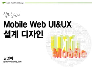
- 1. 실무중심의 Mobile Web UI&UX 설계 디자인 김영아 gun@ubizvalley.com
- 2. Hello!! Name. 김영아 Company. (주)유비즈밸리 SPD 서비스 기획팀 팀장
- 3. What is Mobile Web UI Design? It doesn’t start with Photoshop
- 4. WEB UI vs. Mobile Web UI VS.
- 5. WEB UI vs. Mobile Web UI 1. 화면이 작다. 2. 화면이 다양하다. 3. 다양한 화면이 계속 나온다. 4. 앞으로도 계속 나온단다. 쭈욱-
- 6. WEB UI vs. Mobile Web UI 심플 기능 터치 1 2 3 pivot 표준 Navigation 4 5 6 시선추적 템플릿 벤치마킹 7 8 9
- 7. Getting Started Mobile Web UI Design Rule 01 항상 심플하라 모든 것을 다 가져갈 순 없다
- 8. Getting Started Mobile Web UI Design Mobile Service IA
- 9. Getting Started Mobile Web UI Design Title Title Category category 추천 상품 Event Category my Mobile Event Event 및 기획젂 Event 및 기획젂
- 10. Getting Started Mobile Web UI Design Rule 02 기능을 알고 시작하라 단말기능, 브라우저 기능, 등등등…
- 11. Getting Started Mobile Web UI Design 브라우저의 기능 http://en.wikipedia.org/wiki/Comparison_of_web_browsers
- 12. Getting Started Mobile Web UI Design 단말의 기능 http://www.mobilexweb.com/emulators
- 13. Getting Started Mobile Web UI Design GUI
- 14. Getting Started Mobile Web UI Design Rule 03 터치를 고려하라 손가락 굵은 사람은 서럽다
- 15. Getting Started Mobile Web UI Design 스마트폰과 테블릿PC의 Icon Size Guide 114 110 72 72 114 55 [ iPhone4 ] [ iPhone4 ] [ iPad ] APP Store Icon Application Icon Spotlight Search Result and Setting Icon Document Icon 320 x 320 (iPad) 114 x 114 (iPhone 4) 58 x 58 (iPhone) 64 x 64 (iPad) 512 x 512 57 x 57 (Older iPhones) 50 x 50 (Spotlight results for iPad) 44 x 58 (iPhone4) 72 x 72 (iPad) 29 x 29 (Setting for iPad and older iPhones) 22 x 29 (older iPhones)
- 16. Getting Started Mobile Web UI Design Top bar 44px Touch Table view Touch 42px Tab bar 49px Safari bottom 44px
- 17. Getting Started Mobile Web UI Design Rule 04 Pivot을 고려하라 N-Screen은 뭔데??
- 18. Getting Started Mobile Web UI Design
- 19. Getting Started Mobile Web UI Design 뼈저린 시행착오의 기억들… ?
- 20. Getting Started Mobile Web UI Design 뼈저린 시행착오의 기억들… ?
- 21. Getting Started Mobile Web UI Design iPhone 3G/ HTC Magic 302 x480 iPhone 3G 3,5” 163 ppi Galaxy Tab 640 x 960 iPhone 4 3,5” 326 ppi iPad/ iPad2 1024 x 768 iPad/iPad 2 9,7” Google Nexus One 132 ppi 480 x 800 Google Nexus One 3,7” 254 ppi iPhone 4 320 x 480 HTC Magic 3,5” 181 ppi 1024 x 600 Galaxy Tab 7” 171 ppi
- 22. Getting Started Mobile Web UI Design Responsive web UI http://mediaqueri.es/
- 23. Getting Started Mobile Web UI Design Using Conditional CSS http://developer.apple.com/library/safari/#documentation/AppleApplications/Reference/SafariWebContent/Optimizingfor SafarioniPhone/OptimizingforSafarioniPhone.html#//apple_ref/doc/uid/TP40006517-SW1
- 24. Getting Started Mobile Web UI Design Using Conditional CSS http://css-tricks.com/examples/ResolutionDependantLayout/example-one.php <link rel="stylesheet" media="screen and (max-width: 700px)" href="css/narrow.css"> <link rel="stylesheet" media="screen and (min-width: 701px) and (max-width: 900px)" href="css/medium.css"> <link rel="stylesheet" media="screen and (min-width: 901px)" href="css/wide.css">
- 25. Getting Started Mobile Web UI Design Rule 05 표준을 참고하라 W3C에 다나오더라..
- 26. Getting Started Mobile Web UI Design http://www.w3c.or.kr/Translation/mwbp_flip_cards/
- 27. Getting Started Mobile Web UI Design Rule 06 Navigation을 제공하라 네비없인 한발짝도 움직일수 없다!
- 28. Getting Started Mobile Web UI Design 여긴 어디? 난 누구?
- 29. Getting Started Mobile Web UI Design 네비게이션이 뭐고 콘텐츠는 뭔가요?
- 30. Getting Started Mobile Web UI Design 집에는 어떻게 가죠? 홈 홈
- 31. Getting Started Mobile Web UI Design 정직한 네비게이션의 사례
- 32. Getting Started Mobile Web UI Design 네비게이션의 변화 http://m.airport.co.kr
- 33. Getting Started Mobile Web UI Design Rule 07 시선을 추적하라 나는 니가 1초젂에 본 것을 알고 있다…
- 34. Getting Started Mobile Web UI Design 웹사이트의 경우…
- 35. Getting Started Mobile Web UI Design 모바일웹은…
- 36. Getting Started Mobile Web UI Design UX 측면에서는…
- 37. Getting Started Mobile Web UI Design Rule 08 템플릿화 하라 당신만의 라이브러리가 있는가?
- 38. Getting Started Mobile Web UI Design portal > > > > Shopping < > community ▼
- 39. Getting Started Mobile Web UI Design 재밌는 Mockup http://iphonemockup.lkmc.ch/
- 40. Getting Started Mobile Web UI Design Rule 09 숨쉬듯 벤치마킹하라 시장조사? 할 줄 몰라서 안하는거 아니다
- 41. Getting Started Mobile Web UI Design
- 42. END
- 43. END UI는 U&I입니다. 너와 나의 관계를 만드는 것이 UI 입니다. - 관계디자인 中
- 44. Q&A