
Recommandé
Recommandé
Contenu connexe
En vedette
Similaire à Webpage Analysis - Water Aid
Similaire à Webpage Analysis - Water Aid (20)
Plus de Zahra06
Plus de Zahra06 (20)
Webpage Analysis - Water Aid
- 1. Website Analysis –Water Aid
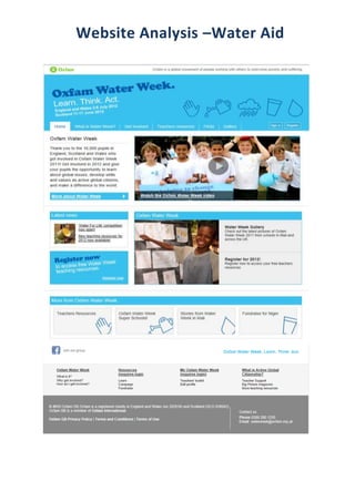
- 2. I have analysed Oxfam’s website in which they have created a webpage about the Oxfam Water Week. Within this webpage they have created many links to various other pages where you can find out a lot more about the Water Week and how you can get involved. These links are madevery clear at the top of the page making them easily accessible.Making my links at the top of the page is what I would like to do when creating my website with my group. The images that they have used are very child based and child friendly making it very clear to the target audience of parents and teachers that this campaign is purely about children in need of our help. They have also included simple clip art images, relating to the theme of the campaign which also helps to convey the message of the campaign. These images have been used at the bottom of the page to make it much clearer for the reader what they mean.Using images relating to the target audience is very important in order to keep my audience interested, this is something I should ensure when adding images into my website. As the target audience is predominantly at teachers they have included various access to resources that the teachers can get hold of in order to educate them a bit more on this top in order for them teach children in school about water week and that even their input can help make a difference.It is important to ensure that any resources I have included, they are aimed at my target audience and it is helpful for my audience to have resources to help them. The colours have been kept consistent throughout the webpage, using blue and white which associate with the image of water.I definitely would like to keep colours consistent throughout the website in order to not make anything look messy as a few colours relating to your topic looks much more professional. Under the bold title they have included a slogan ‘Learn, Think. Act.’ In which they have used a ‘Rule of 3’ a language technique which will help the reader understand the concept of the campaign and how they can help by following these three simple steps.I think a slogan is very important for the readers and for the campaign, but the slogan within this website isn’t made to stand out and I would try to make sure my slogan stands out much more. They have included a link to social networking site in which anyone can join the group that Oxfam have made for this topic, which they can keep track of what is going on within the campaign and it helps to promote the campaign and raise awareness.I think it is good to have links to social networking sites as it helps the audience keep track of any new updates within the campaign. They have a listing at the bottom of more links within the website and they have emphasised on the fact that people should ‘Register.’ I wouldn’t use the listing at the bottom of the page as I don’t feel many people will take any notice and I wouldn’t make registering an account that bold as it isn’t the point of the campaign even though it is quite important.