
Recommandé
Contenu connexe
Tendances
Tendances (20)
Similaire à 10 tips for making effective presentations
Similaire à 10 tips for making effective presentations (20)
Plus de Anastasiia Vialova
Plus de Anastasiia Vialova (14)
Dernier
Dernier (20)
10 tips for making effective presentations
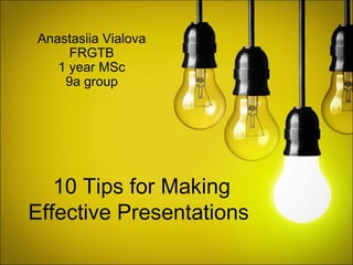
- 1. 10 Tips for Making Effective Presentations Anastasiia Vialova FRGTB 1 year MSc 9a group
- 2. Tip #1 KNOW YOUR GOAL Be clear about the goal of your presentation before your begin composition it.
- 3. Presentations fall into two main categories: Technical presentations teach people about a topic. The topic can be anything. Persuasive presentations make people see something (like your brand) a certain way.
- 4. Tip #2 PLAN IT OUT Create an outline or storyboard of the major topics you want to address.
- 5. Sketch the basics 3 Sequence your slides effectively 2 Add detail to your outline until you figure out what you want to say in each slide 1 Outline your main points
- 6. Make sure your presentation follows a logical or chronological sequence.
- 7. Show restraint Resist the urge to cram everything you know about your topic into your show. If you try and tell them everything, they won’t remember anything.
- 8. Tip #3 AVOID STOCK TEMPLATES Run away! Run away!
- 9. THE PROBLEMS WITHSTOCK TEMPLATES • They lead to infinite bullet point syndrome (IBPS) • They discourage graphics • Every slide ends up looking the same • The designs are usually bad • The presentation looks like every slideshow presentation you've ever seen • Your audience will lose interest and focus after slide number 1 • It reminds people of the 90s (that's bad)
- 10. Tip #4 CHOOSE A COLOR SCHEME Choose 5 colors that look good together and match the tone of your presentation.
- 11. Pick 5 colors and alternate them in your slides Choose one accent color that stands out from the rest.
- 12. Choose colors that reflect the tone of your presentation
- 13. Tip #5 CHOOSE A FONT SCHEME Don’t get too crazy with font. Pick 3 and stick to them.
- 14. Choose one font for titles. One font for body copy. One font for body copy. One font for body copy. And one font for accent.
- 15. Tip #6 CHOOSE A LAYOUT SCHEME Develop a few layouts and repeat them throughout the presentation for cohesion and clarity.
- 16. Use the same layouts for slides that have the same purpose. The layout tells your audience where the slide fits into the big picture. transition content
- 17. You can sometimes get away with just one layout, but in general, you'll need a few basic layouts: Transitional slides Image only slides Text only slides Mixed slides
- 18. Tip #7 USE IMAGES (WISELY) After 30-60 minute presentation, no one’s going to remember what you said; they’re going to remember meaningful imagery and quotes.
- 19. Let the images tell the story
- 20. If you’re using a full page image, find some room in the picture where the text can contrast against the background.
- 21. If an image is too “busy” add a semi-transparent background behind the text for contrast. Like this!
- 22. Use images where the background of the image blends into the background of the page. The white space around it makes it look clean and makes the image pop. In Google images, you can filter images by color in the left-hand column. Choose white and you're more likely to find images with white backgrounds. You can also try searching for "<query> white background." If you can see the background, the effect is ruined. (In this case, you might consider making the background black.)
- 23. Tip #8 15 WORDS OR LESS For live presentations.
- 24. In general, if you’re giving a presentation live keep your slides to 15 words or less.
- 25. Limit one main point per slide
- 26. or then your main point is lost Boo… Hey! What’s up? Bla bla bla
- 27. Tip #9 PLAY WITH TYPOGRAPHY It’s an easy way to spice up slides with text
- 28. Content is what the text says; typography is how it appears. By manipulating attributes like color, font,size, weight, and positionposition you can enhance the impact and visual interest of your slides and create hierarchy. Typography
- 29. Tip #10 DON’T OVERDO IT Remember white spice
- 30. Design like the Google Not like Yahoo
- 31. The white space that surround the object adds emphasis and gives the page a clean, fresh feeling.
- 32. The white space that surround the object adds emphasis and gives the page a clean, fresh feeling.
- 33. 1. Know your goal | make each slide count 2. Plan it out I in some detail 3. Avoid templates I they are uncomely 4. Choose a color scheme I 4 colors, 1 accent 5. Choose a font scheme I match tone 6. Choose a layout scheme I comprehension 7. Use images (wisely) I they re more memorable 8. 15 words per slide I this slide had 16 words 9. Play with typography I impact, interest, hierarchy 10.Don't overdo it I white space Summary
- 34. Anastasiia Vialova FRGTB 1 year MSc 9a group
Notes de l'éditeur
- O
- Design like the Google Not like Yahoo
- Summary