
Recommandé
Contenu connexe
En vedette
Dernier
Dernier (20)
Audience - Evaluation
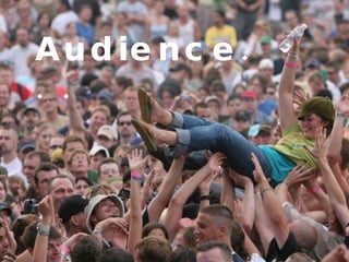
- 2. I would say the audience for my magazine are demographically between the age of 15 – 25. I originally intended for my audience range to go up to 30 but after looking at my final magazine it looks a bit more youthful than originally anticipated. Despite the fact that all of the artists featured in my magazine are boys I still maintain the view that the magazine appeals to a unisex audience (although the age range for the girls is probably smaller than that of the boys e.g. 15-18). I have this view because although the indie music industry is male dominated, teenage girls tend to idolise young male bands or singers (due to the groupie mentality) and this would make them want to by my magazine.
- 3. The psychographic grouping of the audience I see my magazine attracting has not changed from my original ideas. I still believe it will attract radicals and hedonists who like to enjoy life now and just be themselves. They like what they like and they know how to enjoy themselves. They probably see themselves as individuals although this is not always the case. On Jicnars scale I would say my target audience range between C1 and C2 (this only really applies to the adult audience over 20), they are probably a mixture of skilled manual workers who live for the weekend or are Supervisory, clerical, junior administrative or professional people who like their work but also like to enjoy themselves in their free time. Basically they are probably not at the peek of their career yet.
- 4. I attracted my audience using my mise en scene. I used black white and red as my colour scheme as these are the colours that are largely used across the indie scene. Black and white photographs are very popular within the indie scene as they are seen as retro and cool. I also used distressed fonts And hand drawn images as they connote Informality which appeals to my laid back target audience who like to enjoy life. On my double page spread I attracted my audience by having the feature article as an interview with a band instead of a long rambling article that criticises Everything. This challenges the conventions of some magazines but lads mags and other such easier reads often use this technique. . I did this as my audience are used to going to live shows and feeling close to the artists so they would much rather hear the artists points of view and what they have to say for themselves than what I have to say about them.
- 5. Below are some comments from my target audience about my magazine… “ I think the masthead of the magazine doesn’t stand out enough” “ Make magazine name a bit clearer” The only two negative comments I got were picking up on the same point which was about the clarity of the masthead. This was the only thing about my magazine that I wasn’t 100% sure about but in the end I decided to stick to the masthead being part of the border. On reflection I could have made it stand out more by laying it out in a more conventional way. “ Like The Fonts” There were loads of comments about good use of fonts which I was happy about. I got my decorative fonts from www.dafont.com and the font I used for the article was just a standard selection from the quark menu. I mixed an matched the fonts to give my magazine its edgy effect and this clearly came across. “ Photography is original and effective” Many people commented on my photos saying they were original and well edited. I am glad about this as I took a fare bit of time turning certain shots black and white and adding effects such as the radial blur on the double page spread and the Polaroid outlines on the contents and front cover. A lot of people said the cover shot was very effective and I must say this is my favourite because of the low angle I used. I feel it really fits the mise en scene I wanted for the magazine. . .