
Recommandé
Contenu connexe
Tendances
Tendances (20)
En vedette
En vedette (20)
Similaire à Evaluation of the re createsion mag
Similaire à Evaluation of the re createsion mag (20)
Plus de aigmu
Plus de aigmu (20)
Dernier
Dernier (20)
Evaluation of the re createsion mag
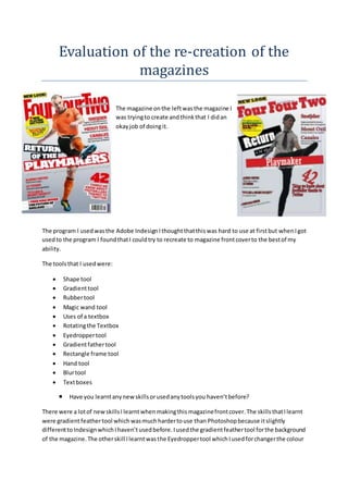
- 1. Evaluation of the re-creation of the magazines The magazine onthe leftwasthe magazine I was tryingto create andthinkthat I didan okayjob of doingit. The program I usedwasthe Adobe Indesign Ithoughtthatthiswas hard to use at firstbut whenI got usedto the program I foundthatI couldtry to recreate to magazine frontcoverto the bestof my ability. The toolsthat I usedwere: Shape tool Gradienttool Rubbertool Magic wand tool Uses of a textbox Rotatingthe Textbox Eyedroppertool Gradientfathertool Rectangle frame tool Hand tool Blurtool Textboxes Have you learntanynewskillsorusedanytoolsyou haven’tbefore? There were a lotof newskillsI learntwhenmakingthis magazinefrontcover.The skills thatIlearnt were gradientfeathertool whichwasmuchhardertouse than Photoshopbecause itslightly differenttoIndesignwhichIhaven’tusedbefore.Iusedthe gradientfeathertool forthe background of the magazine.The otherskill Ilearntwasthe Eyedroppertool whichIusedforchangerthe colour
- 2. of the textwhichalsowasdifferenttoPhotoshop.The final skill Ilearntwasthe Rectangle frame tool whichI usedforthe textboxesandalsothe backgroundshape thatneededtobe filledinwith the gradientfeathertool. Overall IlearntIa lotof new skill asIneverre-createdamagazine front coverbefore. Include pictures(stepbystep) togeta highergrade SelectAdobe Indesigntocreate the frontcover To create the backgroundyouhave to selectonthe rectangle frame tool.Then drag it overthe page. Her I selectthe gradientfeathertool and whenselecta colour Here I have gone on file andthenplace toselecta photo
- 3. Here I have selectmyphotohad I will use for mymagazine frontcover. Here I have written the FOUR FOUR TWO tittle whenIhighlighteditandcolouredinared Here I have usedthe ellipse andcoloredityellow andthenIaddedthe textthatwas added Here I useda textbox and coloured itto match the magazine. Here underthe textplaymakerthere isaveryfainttextI don’tlike thisbecause youcan’t not see it.
- 4. finallyaddedsome more textby selecting the texttool andthen rotatingit. Here is the overall front coverof my magazine. Strengthof the front coverare: Matching the magazinesfrontandtext Takingthe photo Organizing the magazinestogether Addingthe text My weaknessesof the frontcoverare: I couldhave beenmore organizedwhencreatingthe magazine I thinkthat the backgrounddoesnotmatch the magazinesfrontcoverand itneed to be lighter The picture of footballercouldbe bigger Overall Ithinkthatmy magazine re-creationwentverywellbecause Ithoughtthatthe fontand colourof the textmatch the real magazine frontcover.Alsowhat I likedaboutthisfrontcoverwas that the circle withthe textinside lookedreally eyecatchingbecause the textmatchedthe yellow backgroundreallywell alsoitstoodoutandwas one of the firstthingsyousee onthe magazine. The negative pointsof mymagazine were thatthe backgrounddidnotmatch the original magazine background.AlsowhatI didnotlike wasthat the picture of footballeronmyre-creationwasnot as
- 5. bigas the original footballersoitdidnot match the magazine picture. Andalsosome of the textwas a differentangle thenthe original frontcover. Doesit looklike the original cover? I thinkthat the magazine Imade was the same but ithad a few problemssuchasthe picture of the footballerbeingtoosmall whenitshouldbe coveringmostof the frontcoverand alsobeingone of the firstthingsyousee.Anotherpointwasthatthe backgroundwas a slightlydifferent colourthan original backgroundandthe anglesof the textcouldhave beenbetter. What wouldyouchange or do differentlyif youdidthisprojectagain? One of the mainthingsI wouldchange if Iwas to do thisprojectagainisthat I wouldlike tomake the footballerbiggerandcover more of the frontcover.AlsowhatI else Iwoulddo differentlyisthat the backgroundcouldhave beenmore shadow andthat wouldof made the cover standout more. Overall Ithinkthatthe frontcoverwas goodbut there couldhave beensome improvementtoit.