Creating Accessible Presentation Slides
•Télécharger en tant que PPTX, PDF•
1 j'aime•385 vues


Recommandé
Contenu connexe
En vedette
En vedette (19)
Plus de Ilene Dawn Alexander
Plus de Ilene Dawn Alexander (20)
Creating Accessible Presentation Slides
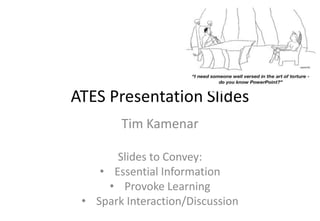
- 1. Cartoon image. In a cave, the devil sits behi desk and speaks to a demon sitting in a chai says…”I need someone well versed in the ar do you know PowerPoint?” ATES Presentation Slides Tim Kamenar Slides to Convey: • Essential Information • Provoke Learning • Spark Interaction/Discussion
- 3. What’s Essential? Visual Clutter m the publishers text that contains various tructure of certain medications. There are s essential information related to the e identified as visual clutter and the s circled in red.
- 4. he Vincristine molecule. There are no other s image is enlarged to fill the slide, however it is still uction of the molecule is not readable by a screen
- 5. CH2OH OH N CH2CH3 N H N CH3O C H O CH2CH3 CH3O N OCOCH3 Vincristine HO C OCH3 H C O O
- 7. the relationship between marketing strategy, d market share of a tobacco company’s effort to nese market. The image contains three columns market share). Each column highlights changes in cy and in column 3 the market share bar chart spired as a result. The image itself is grainy and ich limited clarity.
- 8. cess for school aged children: The image ustrates the process and bullet points that list in the process. edical providers listed at the top of the chart, r takes during a different part of the school o serves Year 9 students receives notice of
- 9. Set School Nurse Roles throughout the Health Transition Process Year 9 Red/Amber . The columns are labeled: Year 9 students identified, Red/Amber guide Year 9 Review held. There is a horizontal double ended arrow going across all students continuous process. Guide Education identified completed Review held ins a picture of smiling children. The Red/Amber column shows a picture of 9 Review, shows a picture of several teachers presenting information.
- 12. Non-Computer Data Use Worldwide
- 13. Mobile Phone = Mobile Learning One Bright side to the BlackBerry outage: discovering hidden features
- 14. QUESTIONS?
Notes de l'éditeur
- OUTCOME: DISPLAY AND DISCUSS WAYS IN WHICH POWERPOINT PRESENTATIONS CAN BECOME LEARNING PRESENTATIONS IN – AND BEYOND – THE CLASSROOM.All students find it difficult to look, listen, think and take notes at the same time. At what points in the course would it be easier for them to annotate a copy of a handout / in the text field of a PowerPoint?When would the presenting of detailed learning outcomes at the start of a lecture / within the body of a learning presentation be especially helpful to student preparation or engagement?How will you select examples to build on existing student knowledge? To reflect a broad, accurate range of society – people, issues, examples, experts?How might you use images to convey key ideas / concepts /points in different ways as part of planning for presentations involving difficult concepts, complex ideas, and new terminology in selecting clarifying examples, illustrations, and language.How do you signal to students that you are moving – transitioning – from one part of an idea to a next, moving next main points in a sequence of key ideas? How might you cue student preparation – thinking about and listening for - an especially important sequence of ideas in note taking? Where might you place pauses into your presentation to allow for synthesizing of notes taken and then maybe for students to talk to a neighbor to compare or compose questions?Ideas here are slightly expanded versions of information provided by Oxford Brookes University’s “Inclusive Lectures” module at http;//www.brookes.ac.uk/services/hr/eod/guides/lectures/html.Cartoon image. In a cave, the devil sits behind a stone desk and speaks to a demon sitting in a chair. The devil says…”I need someone well versed in the art of torture – do you know PowerPoint?”
- Slide from a publisherComplex and used as part of a discussion – but not all elements are part of the lesson/topic associated with this slideResolution of image is lowImage not enlarged to fit screen limiting observation by others in the class who may have impairments, or who are in the back of a room/hallDiscussion may be confusing to students regardless of ability/disability as there may be general references that are not immediately clear as to which image is being addressed.Projecting the image can result in greater pixilation and loss of clarity of descriptive wordsPrinting slides in a handout view (3-9 slides per page) can result in lost informationImage is not screen reader accessibleImage description: An image from the publishers text that contains various wire diagrams of the molecular structure of certain medications. There are four images but only one contains essential information related to the professor’s discussion. Three are identified as visual clutter and the essential molecule, Vincristine, is circled in red.
- Identify the Essential Elements of InstructionEssential element captured and enlargedResults in pixilation, but legibility is improved - but not for all with visual impairmentsStill not screen reader accessibleLarger image is better suited to bigger classrooms, or when some aspect of the image is germane to a discussion pointImage Description: An expanded image of the Vincristine molecule. There are no other molecules present. This image is enlarged to fill the slide, however it is still an image and the construction of the molecule is not readable by a screen reader.
- Cleaned up contentFocus is on the essential elements of the topic/discussion and the visual clutter is goneKey information is highlighted to make content more clear.Improved clarity for projection and printing which benefits all students in the class.Text elements can now be read, best for low vision student who can choose which elements to have readBlind student will need the slide fully described – all chemical relationships and linkages Allows for better interaction with the visual elements, especially if pointing/referencing portions of this diagramVincristine: cancer chemotherapy drug; basic info: http://en.wikipedia.org/wiki/Vincristine. Tips: Go back to the publisher. Publishers provide the user images in lower resolution in order to save file space and for quicker loading on a computer. If you need images, ask for the original files. For photographs or multicolor illustrations you may want high resolution raster graphics, for content such as the image on this slide you may want a vector graphic. Either way, ask the publisher. Determine what is essential then consider creating this wire diagram from within a drawing program. You can control the file type, image resolution, and leave text elements in a readable format. Where possible, don’t use a stock “image”, create your own diagram instead.If you have to use a stock image, clean it up as best as possible and then provide a written description. How to clean up a slide? If you don’t have an electronic image (jpeg is most common), you’ll need to create a scan or screen shot of the original image, which can then be cropped as part of saving the image. Follow up by making use of Text Boxes to replace scanned text (text elements in images are generally not ‘screen readable’ and quickly pixilate upon enlargement). Make sure the fill & line color of the text box is the same as the slide background; then position the new text box to cover over existing inadequate text.Creating a description of the slide begins with scripting. Regardless of the method, essential elements of an image need to be described. However, the ability to add descriptions vary markedly across MS Office for Mac or PC, Keynote, and other presentation programs. The bottom line is, type up a description and place it on the slide, or in a notes section of the slide. Some people are at ease with typing a description directly into the PowerPoint notes field, others may prefer to verbally describe – in this case – chemical relationships conveyed in the slide. Recording tools could include the native MS PowerPoint recorder, or recording software such as Audacity or Garage Band or AudioBoo. If you use a voice recorder, you still need to provide a written copy of the script.Additional consideration: Often in providing the verbal description of a slide, a teacher becomes aware of points of spoken emphasis or patterns of connection typically conveyed orally in class. These insights – in this case perhaps about which chemical markers / interactions a teacher asks students to attend to first – can be drawn on to further clarify the visual image. Perhaps through judicious use of typeface colors on this or a subsequent slide.
- An example of slide content that lacks clarity and limits an ability for people to learnThe first step to correct this slide is to identify the essential elements, what is most important for students to see or know, then emphasize these in a slide that adds clarity. For example, the professor may want to show the trend line created in column 3, which is market share over time and based on changing laws and marketing strategies. How might this be portrayed in a more informative manner as a slide?Issues with this slide: Too much text Text is too smallImages/columns overlap Bar charts are indistinctThere is a limited ability to provide instruction from this slide as content is not lined up across the screenPrinting this slide will not improve clarity. This slide limits visual access, processing access, and overall clarity of content/purposeSlide is an image, not screen reader accessibleContent does not use space afforded in the slide frameThe amount of information that is conveyed in this slide is far too great to create a comprehensive text description, unless the instructor chooses to input lecture points as the description.Image Description: A chart that shows the relationship between marketing strategy, policy changes, and market share of a tobacco company’s effort to penetrate the Japanese market. The image contains three columns (marketing, policy, market share). Each column highlights changes in marketing and policy and in column 3 the market share bar chart displays what transpired as a result. The image itself is grainy and not well formed which limited clarity.
- Describe basic layout – shift from unreadable to chartA fairly well constructed slide in terms of descriptive content and with features that enable learning and understanding.This slide improves the use of graphical content and text elements over the previous slide.While still complex, slide element are separated, identified with clear text, and describe a process that is easy to followText is related and tagged to points in the process. High contrast test in boxes aids in clarity of reading, especially at a distanceBased on the context of instruction, this slide is well prepared and conveys information in a descriptive and methodical manner which aids in understandingItems that still can be improvedThis is an image, so not screen reader accessible. In addition, enlarging/projecting can result in pixilationReduce the number of bulleted items so that font point size can be increased – take these text elements and put in a descriptive block in the notes portion of the slideImage Description: Description of the Health Transition Process for school aged children: The image contains two elements, a diagram the illustrates the process and bullet points that list descriptive elements of important points in the process.The process illustration has three key medical providers listed at the top of the chart, and then the actions steps each provider takes during a different part of the school year. In this chart, the School Nurse who serves Year 9 students receives notice of who those students are. Then…..
- In simplifying content from the previous slide, this slide removes the essential elements that relate to the role of the School Nurse. The simplified image can then be discussed, with text elements placed in the notes field or provided via a handout. Breaking down a more complex image allows the teaching and learning to focus on individual roles and responsibilities.An instructor may begin with the previous slide as an overview – to show the process in context, but by breaking out content into a slide such as this one the text elements are reduced which will allow the image to be presented in a larger format. Descriptions of images are still needed, but can be simplified and more direct.Image Description: three columns. The columns are labeled: Year 9 students identified, Red/Amber guide completed, and Year 9 Education Review held. There is a horizontal double ended arrow going across all three columns indicating this is a continuous process.The year 9 students column contains a picture of smiling children. The Red/Amber column shows a picture of books, and the final column, Year 9 Review, shows a picture of several teachers presenting information.Photo 1 - http://www.flickr.com/photos/foxcitiesbookfestival/4557938850/Photo 2 - http://www.flickr.com/photos/ilenedawn/6837055358/in/set-72157628670690355Photo 3 - http://www.flickr.com/photos/exakta/6712344653/sizes/m/in/photostream/AllphotoscarryCreativeCommonsattribution and non-commerciallicensingrequirements.
- A good example of a poor slide that intends to provide information to spark a discussion in a business classToo much text – should be summarizedWhat is essential?No indication of this as part of homework which would allow for presentation of key points/essential elements of instructionWill this be read in class? Is there a better way to convey this information? How to share with those who are visually impaired, sitting in the back of the room, have processing or reading difficulties, are English language learners?This is an image and not text which indicates it was most likely a screen shot. Default graphic quality for screen shots is fairly low. If text cannot be cut and pasted, then look for the source document. If necessary, retype the essential elements of the report to make a concise and direct document. Moreover, providing a text description of this image will result in retyping the content in its entirety, so it is best to look for source material.
- With a homework assignment to read about the US wireless cellular market quarterly report, you can then focus the discussion on the essential elements from that report.For example, this image shows a graph of worldwide data use. It could be related to a quarterly report but then goes on to identify type of use by country which can lead to a discussion of marketing strategy. Rather than compressed text in a grainy image, the chart brings out the key elements. Legibility is increased which improves the ability to project the image in a large classroom or in printing for later study.Image from http://www.onlinemarketing-trends.com/2011/06/mobile-internet-usage-patterns-us-and.html
- Images can generate additional learning opportunities beyond reading of image content. For example, a cartoon engage students to spark creative discussion in other directions. Basic images such as this can be accessible, clear, and simple but lead to broader learning outcomes.Image from http://www.theregister.co.uk/2011/10/28/smartphones_can_now_do_everything/