
Recommandé
Contenu connexe
Tendances
Tendances (20)
En vedette
Similaire à Fashion image bank
Similaire à Fashion image bank (20)
Plus de alicesoph96
Plus de alicesoph96 (20)
Dernier
Dernier (20)
Fashion image bank
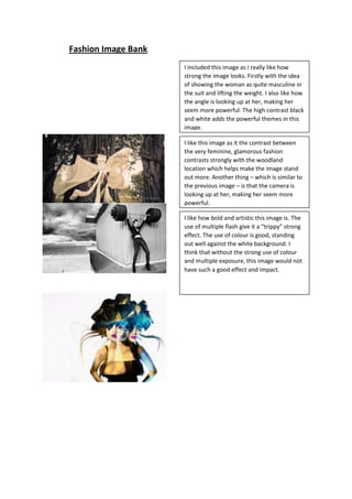
- 1. Fashion Image Bank I included this image as I really like how strong the image looks. Firstly with the idea of showing the woman as quite masculine in the suit and lifting the weight. I also like how the angle is looking up at her, making her seem more powerful. The high contrast black and white adds the powerful themes in this image. I like this image as it the contrast between the very feminine, glamorous fashion contrasts strongly with the woodland location which helps make the image stand out more. Another thing – which is similar to the previous image – is that the camera is looking up at her, making her seem more powerful. I like how bold and artistic this image is. The use of multiple flash give it a “trippy” strong effect. The use of colour is good, standing out well against the white background. I think that without the strong use of colour and multiple exposure, this image would not have such a good effect and impact.
- 2. What caught my eye about this image is the use of location. I really like how the grungy style of the dress is enhanced by the industrial, dark location. I also like the composition, as although the model is not filling it, her pose makes the viewer aware that she is the focus, and also helps link the location better. This image has a warped, Alice in Wonderland look due to the room making the model seem smaller and condensed. It also has a slightly vintage feel due to the wallpaper pattern and clothing style. Although this is a really bold and expressive image, it is a bit overpowering with the use of both the Alice in Wonderland and 60’s style themes.
- 3. I really like this image due to how the focus is directed onto what the model is wearing due to the simple white background. I like how the model is looking over her glasses slightly gives the impression she is looking at someone or something. I also like how she fills the composition. I like how simple and formal this image looks, but the bold use of purple give the image a bit of an edge. The composition of this is good as well with the model filling it. I like how simple but strong and effective this image, with the colours used helping creating a strong contrast.
- 4. What caught my eye with this image is how although there is three models, the one in the middle stands out due to the fact her dress stands out strongly against the background, whereas the other two dresses blend in more. I also like how the images makes it appeal they have been caught doing something rather than them just posing. I included this image as I like how the soft colour and style of the dress goes well with the shabby, Parisian style location. Although the dress is quite classy, it goes well with the location. If the train of the dress was not hanging down the centre of the composition, the image would not look full enough and the attention would not be on the model. What I like most about this image is the dark, desaturated colours as it goes well with accentuating the vintage styles show in the image. I also like the models pose as it makes her seem confident and adds a confrontational edge to the image.
- 5. I really like how bright and fun this image looks. The bright, bold colours used go well together in showing a slightly eccentric, and doll like fashion. I like how the model is looking down rather than at the camera as it does not make it so intense. I really like how this image is showing a grungy, messy masquerade style. The dark, off coloured background helps emphasise the style in this more than a white background that would make it appear too clean. I like how the model looks quite tired and is looking past the camera as it adds to the grimy twist shown in the image.
- 6. This image is really simple, but effective in showing casual fashion with pastel colours. What I like most about this is how natural and comfortable the image looks due to the model looking like she does not know the image is being taken. I also like how she is exactly central to the composition. What I like about this image is how the girly, floral background contrasts the street fashion shown in the image, which helps it to stand out. I also like how you can only see waist down roughly of the models in the background as it still shows fashion, yet it puts the focus on the girl sitting down. I like how informal and fun this image looks as well which is added to by the use of bright colours.
- 7. I like how dark and edgy this image is, but still looking a bit classy and feminine due to the models hair – although messy – and makeup . I also like how the model is looking quite bored and slouchy, this adds to the edgy look showing the biker fashion.
- 8. Although this is not directly showing fashion, I like how the use of the paper bag creates anonymity. I also like how the model is not necessarily the focus, but there to show off the sign. This image really shows off the use of a gas mask, with the models pose putting all the focus onto it. I really like how eerie this is, due to the models slightly tilted head.
- 9. What I like most about this is how the shoot has made a dress made out of newspaper. The model is wearing it in a confident, and strong way, showing the dress off which helps to give it a classy look. I really like how soft this image looks, as it helps add to the vintage style fashion. The white background shows up the darker, brown colours better than another colour as it keeps it quite simple and casual. What caught my eye with this image is the location. The use of the run down bathroom creates a more dangerous and punky theme that goes well with the model and clothes in this image. I also like how it is in black and white which gives it a more 80’s rock n roll feel.
- 10. What I like about this image is that it is just focusing on the shorts rather than the whole outfit. I also like how the model is slightly to the left of the composition rather dead centre as it makes the overall look not as harsh. I really like this image as it focuses on just shoes. The positions that the models are in almost makes them look like mannequins. This helps to enhance the shoes. I also like how the wall is pink which makes the legs and shoes stand out even more. I like this picture because the bold, bright colours help show off the simpler colours the model is wearing. The graffiti also helps to accentuate the street fashion. I also like how the background blurs towards the back, which helps keep the focus on the model.
- 11. What caught my eye about this image is that the smoke hides some of the models face which creates a bit of mystery which goes well with the fashion shown. The high contrast black and white edit of this image adds to the classy feel. I included this image as I really like how it shows classy, formal fashion. The fact that she is looking at the camera makes it seem more personal. I also like how the contrast is quite low, creating a more vintage effect.
- 12. I really like this image as it is quite simple, but stands out. What I like most about this image is that the model is turned away from the camera but is looking back at it. The fact that it is in black and white gives it a classier edge and helps the flag stand out more. I chose to include this image as the casual clothes, elegant sofa and misty forest location all clash but create a good image, that as a whole works very well together. This and the composition of the models filling the space well shows the models and fashion well. I have included this image as I like how shadowy and dark the model looks in comparison to the lighter background. This usually does not give a good effect, but in this case it creates a mysterious, silhouette look that goes well with the elegant ballet themes. I have chosen to include this as I want to look at the idea of fairy tales. I like how the model is laying down with the playing cards scattered around as it creates more of a story. I also like the angle as it shows from a different, slightly warped perspective.
- 13. I have chosen to include this image showing steam punk fashion as I like the heavy use of accessories which adds to the look making it seem heavier and creates more of an impact. I also like how the colours used are quite dark mainly which creates an old fashioned feel.