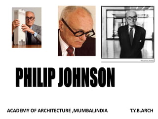
Philip johnson
•Télécharger en tant que PPTX, PDF•
34 j'aime•17,986 vues

WORKS OF PHILIP JOHNSON

Recommandé
Contenu connexe
Tendances
Tendances (20)
En vedette
En vedette (20)
Similaire à Philip johnson
Similaire à Philip johnson (20)
Dernier
Dernier (20)
Philip johnson
- 1. ACADEMY OF ARCHITECTURE ,MUMBAI,INDIA T.Y.B.ARCH
- 2. INTRODUCTION • PHILIP JOHNSON BORN IN 1906, IN CLEVELAND, OHIO . • AFTER GRADUATING FROM HIGH SCHOOL HE ATTENDED HARVARD COLLEGE, WHERE HE STUDIED CLASSICS. • AT THE AGE OF TWENTY-SIX HE BECAME THE DIRECTOR OF THE MUSEUM OF MODERN ART’S NEW ARCHITECTURE DEPARTMENT. • HE WAS THE FOUNDER OF THE INFLUENTIAL DEPARTMENT OF ARCHITECTURE AND DESIGN AT MOMA. AS CO-AUTHOR (WITH HENRY-RUSSELL HITCHCOCK JR.) OF THE MOMA EXHIBITION CATALOG "THE INTERNATIONAL STYLE: ARCHITECTURE SINCE 1922" JOHNSON IS CREDITED WITH INTRODUCING EUROPEAN MODERNISM TO AMERICA.
- 3. PHILOSPHY ACCORDING TO PHILIP JOHNSON ‘CRUTCHES’ BY WHICH ARCHITECTS EVADE THEIR REAL RESPONSIBILITIES ARE- HISTORY – I.E. JUSTIFYING ELEMENTS WHICH ARE EARLIER USED. UTILITY- I.E. IF UTILITY OF A BUILDING OVERCOMES ARTISTIC INVENTIONS ,THEN IT IS MERELY AN ASSEMBLAGE OF USEFUL PARTS.
- 4. ARCHITECTURAL STYLE • THOUGH HE BEGAN IN THE STARK STYLE OF MIES VAN DER ROHE’S WORK, BY THE 1960S HE HAD TURNED TO A MORE INDIVIDUAL STYLE THAT INCORPORATED HISTORICAL ELEMENTS. • HIS GREATEST INFLUENCE AS AN ARCHITECT WAS HIS USE OF GLASS. • JOHNSON WAS AMONG THE FIRST TO EXPERIMENT WITH ALL-GLASS FACADES, AND BY THE 1980S SUCH BUILDINGS HAD BECOME COMMONPLACE THE WORLD OVER. • HE EVENTUALLY REJECTED MUCH OF THE METALLIC APPEARANCE OF EARLIER INTERNATIONAL STYLE BUILDINGS, AND BEGAN DESIGNING SPECTACULAR, CRYSTALLINE STRUCTURES UNIFORMLY SHEATHED IN GLASS. • HE BELIEVES IN "ARCHITECTURE IS BASICALLY THE DESIGN OF INTERIORS, THE ART OF ORGANIZING INTERIOR SPACE." • WITH THE LATER WORK OF THE 1970S AND 1980S, JOHNSON BEGAN TO MANIPULATE BOTH TEXTURE AND COLOR ON THE EXTERIOR OF HIS LARGER BUILDINGS.
- 5. The Distinction in Plain Sight Modern architecture • The modernism style of architecture was actually birthed after the First World War, however, it swiftly became very famous at the end of the Second World War. • Its development was brought about by artisans’ hunger to have a style that deviates from the European and Victorian modes of architecture where opulent and extravagant appearances are common. Post-modern architecture • Postmodernism in architecture was realized during the last parts of the sixties. However, it was only during the eighties that it was able to establish a solid anchor and gained fame. • Postmodern, also called late modernism, is another style of architecture which was invented as opposed to the last prevailing style in modern architecture, by using classical and modern language together.
- 6. Modern architecture • There is a strong idea of creating the International style in modernism was to design prototypes and mass production so that all buildings would have a similar appearance in a certain way. • This had a negative side to it, which was repetition in design. • It is easy to find out that a building is ‘modern-inspired’ when it uses solely straight lines and rectangular shapes. • A structure is clearly modernist if it uses an elevated simplicity. Post-modern architecture • According to many critics, postmodernism is where reference and ornament returned to architecture. • In contrast to modern, postmodern style’s uses curves and other fanciful shapes. • Postmodernism, is known for its usage of more ornate styles that can be explained by it being influenced by the art- deco era.
- 7. Modern architecture • The principle here was “Less is more” This quotation means that the concept of design should be based on simplicity; In general, any part of any design has functionality and rationality rather than a form based on aesthetics. It also rejected any kinds of decoration. • Most modernists focused on function rather than form and they used simple form. In fact, an American modernist architect Louis Sullivan has a famous statement that “Form follows Function” The dictum explains that many modern architects, first started to think about function rather than form during the designing process and they preferred simple form like a box, where one form can serve multiple functions. Post-modern architecture • In contrast, American architect Robert Venturi, one of the founders of postmodernism had his own idea, “Less is a bore” which means postmodern buildings should break the simplicity of modernism. • On the other hand, Frank Lloyd Wright disagreed with that principle by saying both function and form are of equal value. This idea is clear in the Falling Water House where equal amounts of attention and thought have been given to both the form and the function. • In general, in postmodernism, form is adopted for its own sake and function has a strong combination with artistic form.
- 8. Modern architecture • One of modernism’s principle is to have the design be a direct result of a building’s intended purpose, and that materials ought not to be hidden but instead, highlighted as part of the overall look of the structure. • Buildings were built using lesser materials or a wiser use of it. • Utilizing natural light is also a notable trademark of modernist structures. Post-modern architecture • Postmodernism elevations contain ornamental and classical elements, which is recognized as an icon of postmodern architecture. • Architecturally, postmodern elevations have more aesthetic appearance than modernism because observers can find historical elements and a mixture of materials. • Part of the inspiration of the postmodern style came from Roman and Greek influences which are clearly seen in building designs where columns are brought back to existence.
- 9. The Common Ground • Modernism and postmodernism are both styles of architecture that has a tremendous respect on materials. Each style is geared to use minimal materials during construction and elects to not hide them from view. Doing the exact opposite, both styles are known to actually highlight the materials used in a building like steel, glass and concrete. The new construction materials such as steel, reinforced concrete and development of technology have mainly affected the façades and structures of modern and postmodern architecture. Both movements are similar in using these materials yet are different in their facades. • Both architectural style use lots of natural light to illuminate buildings. • While modernism use squares, rectangles and triangles and postmodernism use other such as cylinders, buildings created in either modernist or postmodernist method use geometric shapes, only in different ways.
- 10. Conclusion In conclusion, although the modernism phenomenon began over 100 years ago to spread new ideologies in terms of space, new design, functionality and façade, it could not provide the aesthetics for viewers because of repetitive design features, which led to it being dismissed by most people. As a result, postmodernism replaced it because each movement in architecture brings new ideas and covers the flaws of the former movements.
- 11. SONY TOWER AT&T Corporate Headquarters sold to the Sony Corporation in 1990 and renamed Sony Plaza . This thirty-four story office building (660 feet tall) is generally viewed as the first post-modern skyscraper, even though Philip Johnson had long been a leading American proponent of the International Style. It was designed by Philip Johnson, one of the masters of 20th century architecture.
- 12. •This historicist references became associated with Postmodern architecture, a style that this building helped to popularize. •Another characteristic of Postmodernism is the vertical banding on the facade that emphasizes the height of the building. • More like early skyscrapers of the 20th century than the modern buildings of the post-war period, the facade has stone cladding rather than a glass and steel skin. POSTMODERN ARCHITECTURE
- 13. •The entrance is a grand, glazed arch surmounted by porthole-shaped openings. •It as an open galleria at the back of the site contained restaurants, retail shops and an outdoor plaza carved out of the base under the shadow of the tower. •The triple division of the facade is emphasized by a large entrance and pedestrian arcade at the base, a tall shaft with regular windows, and a wide band of windows just below the building's crown.
- 14. •The base encloses a public plaza and features monumental entrances. •The towering arched portal (110 feet high) is flanked by three 60 foot high rectangular entrances.
- 15. •The Plaza, intended to be a public space, was never popular with the city and was converted into enclosed retail after Sony aquired the building. •The building is clad in gray and pink granite from the same quarry that supplied the facade for the landmark Grand Central Station a few blocks away. MATERIAL
- 16. The Bank of America Center (formerly Republic Bank Center, NCNB Center, and NationsBank Center) is one of the first significant examples of postmodern architecture built in downtown Houston. The building is reminiscent of Dutch Gothic architecture of canal houses in The Netherlands. The distinctive stair- stepped tower top helps define the skyline of downtown Houston, and its handsome façade of red granite and soaring bank lobby help make if one of the city’s most distinguished buildings. External view of the Head quarters The office tower is divided by two major set backs into three segments, giving it the appearance of three adjoining buildings. At the largest points it measures 777 feet high and 110 feet wide.
- 17. Bank of America Center lobby • In the design of Bank of America Center, they have struck a synthesis of past and present. • Architectural concepts have been borrowed from 17th century Dutch Renaissance architecture and applied in a modern context. • Completed in October of 1983, Bank of America Center is a 56 story office tower located at 700 Louisiana Street in downtown Houston. • The building encompasses 1.25 million square feet of office and retail space and is linked to the extensive Downtown Houston tunnel system. • The materials used are steel, glass and granite. The facade is made of red granite.
- 18. • The entrance from Louisiana Street seventy-five foot high, arched granite doorway. • The granite stonework soars upward to 102 feet, 10 stories, and is so intricate that specialists from Spain were brought to Houston to install the more than 100 pieces around the arch. • This archway continues through the center of the building to a second arched doorway that opens onto Smith Street. As an added feature, three of the lower office tower floors are bisected by the archway and connected by pedestrian bridges.
- 19. Bank of America Corporate Center Interior photo of lobby • The interior and exterior of the building is sheathed in rough textured Napoleon red granite, quarried in Sweden and finished in Italy. • Even the surrounding sidewalks are composed of the same granite used in the building. • The lobby is highlighted by an 18 foot high 1914 Seth Thomas clock, of which only 300 were ever built.
- 20. • The tower has a steeply pitched gabled roofline that is topped off with spires. • The sculpted metal obelisks, made from lead and coated copper, raise from every roof level creating a unique silhouette and dramatic coloring. • The obelisks may seem small but are actually eight feet tall on the gable ends, with the topmost finials a crowning 12 feet high. • In all, the building is topped with 86 obelisks. Rear view of the Head quarters
- 22. INTRODUCTION • It is a major office and residential project which stands astride the paseo da castellana , Madrid’s most important well-paved passage, on the north side of the plaza de castilla. • This is also known as “Pureta De Europa” and was completed in 1996. • This bold move creates a portal which being at the northern end of business district , becomes the gateway to Europe. • The buildings have plan dimensions of 35 mts. X 36 mts. • The towers have the hight of 114m and have 26 floors.
- 24. • Building slope is 14.3 degrees (Approx 15’) • Floor to floor height is 3.97 mts. • Symmetry is main governing principle. • Verticality dominates. • Central axis runs in plan.
- 25. Elevation
- 26. MATERIALS USED IN CONSTRUCTION • The main structure is combined with stainless steel • while the secondary structure is clad with red metal. • Also there is a lot of use of glass and granite. • The space between the structural elements has a dark reflective curtain that has charcoal mullions. • Usage of concrete is to just counteract the forces. GLASS CHARCOAL MULLION RED METAL
- 27. GRID FORMATION This structure is grid oriented, its supports and makes the structure able to stand.
- 28. OTHER ELEMENTS It is the structure which is in the middle of the towers, is a monument of the Jose Calvo who is the Spanish politician In the centre behind the sculpture there is pyramid which is made in granite
- 29. Chapel of St. Basil The Chapel of St. Basil is a chapel on the campus of the University of St. Thomas in Houston, TX, designed by Philip Johnson in 1997.
- 30. The Chapel of St. Basil is located at the North end of the University's Academic Mall. The mall itself is a series of buildings representing various academic disciplines and various forms of scholarly activity. The Chapel and Doherty Library are located at opposite ends of the Academic Mall to represent the dialogue between faith and reason, respectively. N
- 31. The structure of the Chapel is composed of three basic geometric forms: the cube, the sphere, and the plane. The cube comprises the majority of the building, including the main seating area, while the dome (a semi- sphere) rises high above the cube. The granite plane bisects the cube and opens up the chapel to light. The cube and plane interplay with the dome, creating a sense of the dome not being a closing vault on top of the Chapel, but rather an opening to the heavens.
- 32. The Chapel itself contrasts with all of the other buildings on campus, as it is composed of white stucco and black granite as opposed to the rose-colored brick that comprises the exterior of the other campus buildings. Through its height, the Chapel dominates the whole campus.
- 33. A setup of the architecture also shifts the focus of the building. The entry to the outdoor narthex of the Chapel is created with a tent-like flap extending over the entry, creating an enclosed space that is still outdoors. The entrances to the Chapel are faced away from the center of the building and towards the Tabernacle.
- 34. The Chapel includes a fascinating play on light, as there is no artificial light inside the main section of building during the daytime. There is sufficient sunlight to fully light the worship space, as a combination of smooth textures and reflective surfaces maximize all light shone in the building
- 35. On the west wall of the chapel is a slanted glass cross (in the picture below), etched into the wall so as to give a 3-dimensional feel.
- 36. CRYSTAL CATHEDRAL -Garden Grove, Orange County, California
- 37. Year of construction: 1977- 1980 Dimension : • The Crystal Cathedral spans a full 126.5 meters in length, 63 meters in width and 39 meters in height. Form: • The Crystal Cathedral is in the shape of an elongated star, a motif Johnson took from German expressionism. The design is a modification of the typical Latin cross plan, with a shortened nave and widened transept, to bring each seat closer to the chancel.
- 38. Materials: • Concrete and steel were used mainly because to support such a huge structure. • Glass he insisted to use because he wanted the building to be transparent so the people standing outside also could witness the procession taking place inside. Construction: • The size of the Cathedral is enhanced by the all-glass covering that encloses the entire building. More than 10,000 windows of tempered, silver- colored glass are held in place by a lace-like frame of white steel trusses. These 16,000 trusses were specifically fabricated for this engineering
- 39. • Huge, white concrete columns, the largest ever poured, hold the balconies in place. • About 10,000 yards of concrete, equal to 20,000 tons, were poured for the foundation of the structure. • All visible concrete has a white marbleized appearance. • The columns are hinged at the balcony, and/or foundation, to permit movement and to withstand an earthquake of the magnitude of 8.0 on the Richter Scale, and wind tunnel tests of 100-miles per hour.