The double page spread uses images and layout to tell the story across two pages. The main image of the artist spans both pages. The title is placed above this in white and red letters to indicate what the pages are about. Most of one page and part of the other are dominated by the central images, while the other page contains the body of text organized into four columns for easy reading.
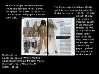
1. The main images and main feature of
The double page spread is not clearly
the double page spread crosses over
split into three sections as usual with
both pages. This shows the reader that
double page spreads. The title, the small
the contents of both pages is about the
amount of copy
same topic.
and to two less
important people
in the images on
the left, the two
main people in the
images in the
centre and the
large body of text
on the right. This
all makes the
pages organised
and easy for the
The title of the reader to read.
double page spread “Will He Wont He?”
is placed over the top of the main images
showing the reader this is what the
images is about.
2. This double page spread is The double page spread is very well organised
mostly dominated by images. with the main images on one page and the main
body of text on the other page. This makes the
page easy to read for the reader because there is
not bits of text scattered every were.
The double page The images on
spread has a the page are
three main in black and
colours, red, whit white. Not
e and black. This only does this
makes the page work well with
look simple and the colour
easy to read. scheme of
The main title of the pages but
the pages are in also works
white and red well with the
which stand out genre of the
well on the black magazine.
background.
3. This double page spread is split into This double page spread has only
three sections, one section is the three main colours which is the same
title, one is a image of the artist and the for most magazines. The colours are
other is the text. white, black and red.
The main image
of the double
page spread is of
the artist, this
image fills all of
one page and
spreads onto the
other. This shows
the two pages are
about the same
thing.
The main body of text is split into four
The main title looks like it is letters from a
columns like most articles in magazines
news paper, it also crosses both pages to
but this also makes the text easy for the
show both pages are about the same
reader to read.
content.