
Recommandé
Contenu connexe
Tendances
Tendances (18)
Similaire à Nme dizzee rascal double page spread analysis
Similaire à Nme dizzee rascal double page spread analysis (20)
Dernier
Dernier (20)
Nme dizzee rascal double page spread analysis
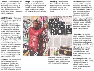
- 1. Layout – On the first half of the double page spread there is the main image which takes up all the page. On the second page there is an article that states ‘From tags to riches’. There is no grid to show layout. Use Of Images – The images used in the double page spread would be the main image which is placed on the left side, Dizzee Rascal is using the title ‘From Tags’ which refers to using graffiti to imply that he was not rich and more of a street style person. An images which shows the part of him being rich is on the second half of the page in the bottom right of the page is a beer and a speaker system which shows he turned wealthy later into his career. The Main image is not showing direct address however they may have done this for a reason to show how he has left his past life looking away from the graffiti. Colours – The colours used in the double page spread is following the theme of red throughout as Dizzee Rascals clothes are accenting the colour red which is the colour scheme. Use of Space – The Editor has used all the space on the magazine as it is laid out in a good way as the reader would find the images and the way it is laid out more fun to read. The column widths of the columns are positioned in a clever way as they are easy to read and wide enough to cover the bottom half of the page. The pages are not numbered this goes against codes and conventions however there maybe a reason for this. Language – The language used is quite formal throughout however it is informative for example in the middle of the right side there is a fact about Dizzee Rascal himself. The font style looks like street art which is trying to reflect on Dizzee Rascals life of him before. There are no visible grab quotes used on the double page spread. Overall Impression – The overall impression of the article is giving the audience an overview of what Dizzee Rascals life before he was a famous artist. Design – The design for the magazine is very street based which gives us the impression of Dizzee Rascals life an example maybe the graffiti on the walls this shows an action of the street. Drop Cap – A drop cap has been used on the start of the first paragraph and first column this is used to attract the attention to the start of the article. Branding – There is no branding used to show if it is from NME however it keeps the same house style throughout the magazine.