1. Colours – The colour scheme should be similar to the colour scheme on the cover, as this is helps the reader to identify it as the main article. This develops a sense of consistency, in order to build a house style. If the designers overuse a mix of colours, it can appear childish and detract the reader from the purpose of the article.
Page numbers – Due to the codes and conventions of magazine design, it is necessary for the main articles to be presented with a page number. This allows the reader to locate the feature, after looking at the contents page.
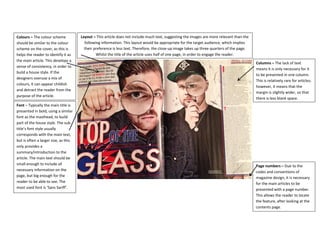
Layout – This article does not include much text, suggesting the images are more relevant than the following information. This layout would be appropriate for the target audience, which implies their preference is less text. Therefore, the close-up image takes up three quarters of the page. Whilst the title of the article uses half of one page, in order to engage the reader.
Columns – The lack of text means it is only necessary for it to be presented in one column. This is relatively rare for articles; however, it means that the margin is slightly wider, so that there is less blank space.
Font – Typically the main title is presented in bold, using a similar font as the masthead, to build part of the house style. The sub- title’s font style usually corresponds with the main text, but is often a larger size, as this only provides a summary/introduction to the article. The main text should be small enough to include all necessary information on the page, but big enough for the reader to be able to see. The most used font is ‘Sans Sariff’.