
Recommandé
Contenu connexe
Tendances
Tendances (20)
Similaire à Kerrang front cover analysis
Similaire à Kerrang front cover analysis (20)
Plus de asmediad14
Plus de asmediad14 (20)
Dernier
Dernier (20)
Kerrang front cover analysis
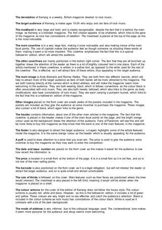
- 1. The denotation of Kerrang is a weekly, British magazine devoted to rock music. The target audience of Kerrang is males ages 15-24 who enjoy and are fans of rock music. The masthead is very large and bold, and is clearly recognisable, despite the fact that it is behind the main image, as Kerrang is a branded magazine. The font chosen appears to be shattered, which links to the gene of the magazine as rock has connotations of rebellion. The masthead is placed at the top of the page as this is the most noticeable. The main coverline is in a very large font, making it more noticeable and also making intone of the main focal points. The use of capitals makes the audience feel as though someone os shouting these words at them, making it seem a lot more impotent. This coverline emphasises the fact that this is a special hallowe’en edition, which will attract the audience. The other coverlines are mainly positioned in the bottom right corner. The fact that they are all bunched up together draws the attention of the reader as there is a lot of brightly coloured text in one place. Each of the artists mentioned in these coverlines is written in a yellow font, as opposed to the white used for the rest of the coverline. This is effective as it will attract fans of these artists, thus appealing to the target audience. The main image is Andy Biersack and Ronnie Radke. They are both from two different bancds, which will help to attract more of the target audience as fans of both bands will be more attracted to the magazine. The are both looking directly at the camera which is direct address and will make the magazine seem more welcoming to the audience. They are both wearing black, which is follows conventions as the colour black is often associated with rock music. They are also both heavily tattooed, which also links to the genre as body modifications also have connotations of rock music. They are each carrying a pumpkin bucket, which links to the fact that this is a hallowe’en edition of the magazine. Other images placed on the front cover are sneak peaks of the posters included in the magazine. The posters are included as they give the audience an extra incentive to purchase the magazine. These images also contain a lot of black, which again links to the genre. The header contains information about one of the other main articles in the magazine. The fact that this coverline is placed in the header makes it one of the main focal points on the page, and the bright orange colour used as the background draws the attention of the audience. Fans of Paramore will see this and will be more likely to buy this magazine as they know that this band is one of the main features in the magazine. The footer is also designed to attract the target audience, s it again highlights some of the artists featured inside the magazine. It is the same orange colour as the header which is visually appealing for the audience. A puff is used to draw attention to a prize that you scan win. The prize is used to give the audience extra incentive to buy the magazine as they may want to enter the competition. The date and issue number are placed on the front cover as this makes it easier for the audience to see how recent the information is. The price is located in a small front at the bottom of the page. It is in a small font as it is not free, and so is not one of the main selling points. The barcode is also positioned on the front cover as it is a legal obligation, but will not interest the reader or attract the target audience, and so is quite small and almost unnoticeable. The rule of thirds is followed on this cover. Main features such as their faces are positioned where the lines would intersect. The masthead is also placed in the left third, meaning it would still be visible when the magazine is placed on a shelf. The colour scheme for the cover of this edition of Kerrang does not follow the house style. The colour scheme is usually red, white and black. However, as this is the hallowe’en edition, it includes a lot of green and yellow. These colours are very bright and so are effective and catch the audience’s attention. Black is included in the colour scheme as rock music has connotations of the colour black. White is used as it contrasts with a lot of the dark backgrounds. The mode of address is very informal, due to the colloquial language used. The conversational tone makes it seem more personal for the audience and alsop seems more welcoming.
- 2. The overall impression of this magazine cover is very busy. This impression is created due to the amount of content on the page. It is also created because a lot of the text and images are positioned at an angle, making the content look less organised. The number of different colours used also adds to this effect. Header Masthead Selection of images (preview of posters) Date Issue number Price Barcode Main image Puff Main coverline Other coverlines Footer