1. 1. In what ways does your media
product use, develop or challenge
forms and conventions of real media
products?
2. What have you learnt about the
technologies from the process of
constructing this product?
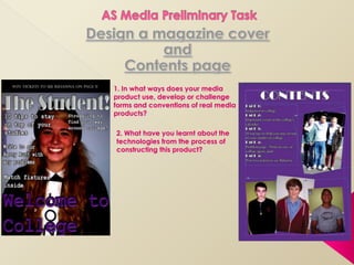
2. 1. The heading of the magazine
is big and bold and stands
out to the reader.
2. Both magazines contain
cover lines, in addition they are
on placed on the same sides, this
is because this is the first thing the
reader will look at this first.
3. The two magazines both
have a main sell line – Glamour’s
is; ‘The hair issue’ and The
students is; ‘Welcome to college’
4. The main image on both
magazines are in the centre and
are middle close up shots of the
females being photographed.
3. 1. Glamour magazines front
cover does not contain a
masthead or a footer, this
may be because everything
that has to be said on the
cover is written on the cover
lines.
2. The main sell line of the
magazines are in different
places – Glamour’s is in the
top left hand corner and The
Students is on the bottom of
the magazine, this may be
because the first thing you will
see is that cover line.
3. The cover lines on The
Glamour magazine contains
more colour and is brighter than
The Students cover, this will
attract attention to the
audience.
4. The size of text on the cover
lines vary on Glamour magazine
compared to The students where
they are all the same size, font
and cover.
4. To create my magazine I had to use various pieces of technology and editing
programmes to make my final pieces.
InDesign Digital Camera
Photoshop
To create my contents I took the photos on both
I used Photoshop to make my front cover and
the front cover of the page I used InDesign, the
reason for this is that you contents page using a
magazine. I used this digital camera and then
programme because you are able to place photos
and create a professional imported them on to the
are able to edit photos computer so I could edit
and create layers which looking contents page.
them and make them look
makes the magazine look more professional.
professional.
5. 1. There is a small article on
the top of the pictures on
Heat magazines contents
page where as on The
students contents page
there is no small article.
2. On Heat magazines
contents page the pictures
at the bottom have the
page numbers on them
and references as to what
page the article on them
will be on. This makes it
easier for the reader to just
go straight to the page
they want to read.
3. In ‘The Student’ the
contents page, the page
numbers are made bold as
a sub heading before the
information as to what is on
the page.
6. 1. Both contents pages
contain smaller and larger
images, this gives the
magazines an interesting
feel.
2. The page numbers are
written on the left hand side
of the page, this is probably
because this is the side that
the reader will look at first.
3. The title of the contents
page is at the top of the
page so that the reader
knows that it is a contents
page.
4. The pages have got the
page numbers written
before them this helps the
reader and they know
which page they have to
go to, without having to
read through the other
things on the page.