![1. In what ways does your media product use, develop or challenge forms
and conventions of real media products?
Front cover- Similarities
Header
Masthead
Price
Cover lines
Dominant Image
[rule of thirds]
Flash
Issue date
Barcode](data:image/gif;base64,R0lGODlhAQABAIAAAAAAAP///yH5BAEAAAAALAAAAAABAAEAAAIBRAA7)
Recommandé
Contenu connexe
Tendances
En vedette
En vedette (20)
Similaire à Preliminary Task evaluation
Similaire à Preliminary Task evaluation (20)
Plus de asmediag12
Plus de asmediag12 (20)
Preliminary Task evaluation
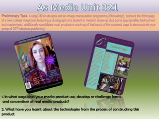
- 1. Preliminary Task- Using DTP(in design) and an image manipulation programme (Photoshop), produce the front page of a new college magazine, featuring a photograph of a student in medium close-up plus some appropriately laid-out text and masterhead. additionally candidates must produce a mock-up of the layout of the contents page to demonstrate your grasp of DTP (desktop publishing). 1. In what ways does your media product use, develop or challenge forms and conventions of real media products? 2. What have you learnt about the technologies from the process of constructing this product
- 2. 1. In what ways does your media product use, develop or challenge forms and conventions of real media products? Front cover- Similarities Header Masthead Price Cover lines Dominant Image [rule of thirds] Flash Issue date Barcode
- 3. Differences with Front Covers Use of colour schemes, bold and bright colours to attract my audience of both genders. There are more cover lines on the right-hand side magazine then on mine, they included a lot of box text whereas I haven’t The use of colours on the professional magazine looks like it is targeted at just females, whereas the colours I used looks like it is targeted at both genders
- 4. 1. In what ways does your media product use, develop or challenge forms and conventions of real media products? Contents Page- Similarities Name of Magazine [Masthead] Page numbers Reviews Layout out of columns for features within the magazine and categorised Picture[s]
- 5. Differences with Contents Page Initial of magazine masthead The use of columns and the layout of the text I haven't included sub heading whereas the professional one has They included cover lines [an closed short story] I have included more pictures than the other magazine
- 6. 2. What have you learnt about the technologies from the process of constructing this product Using microsoft word to familiarise myself with creating a magazine cover, helping put my ideas down Using Photoshop to manipulate my images used for my magazine Using moodle to collect any useful resources that links in with my magazine Using adobe indesign to help create my contents page which I also learned how to use
- 7. Stages of development for front page on Photoshop I started off by experimenting on a word Final image document, this was to familiarizes myself when designing a front cover, learning the basic and how to structure my work; here is a screen shot of my original image I then moved on to Photoshop were I decided to change my main image, were I began to recreate a different front cover idea from the one I did on the word document. I then finally decided on what colours to go for and where I will place my cover lines, masthead etc. I edited the main image to main it stand out more also so that my box text writing will stand out.
- 8. Stages of development for contents page on InDesign My overall concept for my contents page was to make sure the colours were similar to my front cover and to make sure that it is still relevant to the task. For the layout I decided to have a review on one side from the principal which welcomes the reader to the college, and having the contents in the middle which you can clearly be able to read it, also having it right in the centre of the page will grab the readers attention because it lets you know what will be in the magazine. I wanted to make it look more of a college magazine so I then decided to add a few pictures of students around the college studying, sitting relaxing which helps create an atmosphere the college has on the students. Indesign helped me create the contents page I wanted a nd designed before on paper, it was tricky to use because I haven't previously used this software so find the right tools also adding me images was a little bit difficult for me