Tile-based Navigation & Analytics-White Paper
•
0 j'aime•739 vues

The document discusses tile-based navigation and analytics as a solution for business users to intuitively analyze and explore complex quantitative data without needing extensive technical training. It describes how information tiles can densely display multiple dimensions of data and how dynamically rendering tiles in structured sets allows intuitive decision tree-style navigation through hierarchies of data. Tiles represent discrete pieces of information and metadata that compartmentalize and structure large amounts of data in a simple and consistent way for business users to navigate.

Recommandé
Recommandé
Contenu connexe
Similaire à Tile-based Navigation & Analytics-White Paper
Similaire à Tile-based Navigation & Analytics-White Paper (20)
Plus de Axis Technology, LLC
Plus de Axis Technology, LLC (20)
Dernier
Dernier (20)
Tile-based Navigation & Analytics-White Paper
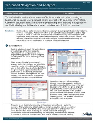
- 1. Tile-based Navigation and Analytics A front-end solution for both navigating and analyzing complex quantitative data using information-dense tiles May, 2012 A USER EXPERIENCE SERIES WHITEPAPER By DAN WILCOMB | Axis Information Architect Today’s dashboard environments suffer from a chronic shortcoming – functional business users cannot easily interact with complex information. Common solutions lack a method of presenting and allowing navigation of sophisticated quantitative data in a consistent and intuitive manner. www.axistechnologyllc.com Boston | Dallas | Charlotte | New York Existing solutions typically fall victim to one of two failings: either they separate information from navigation and over- engineer the application, or they integrate the navigation but fail to provide guidance and context. Billed as user-friendly “sophisticated” analysis tools, the interfaces are often little more than neutered renditions of the power user toolset rather than a solution built from the ground up to support the target user community. A functional business user requires extensive training to use the tool properly, and seldom carries that training beyond the classroom into practical use. Dashboard and portal environments are increasingly directing sophisticated information to business-level users. At the intersection of pre-canned executive reporting and ad-hoc analytics is a lack of tools that allow business users to intuitively conduct analysis and exploration without detailed technical knowledge of a complicated analytics toolset. The resulting lack of enthusiasm and sustained adoption by the business community has marginalized the potential power of executive information systems Introduction Current Solutions Microstrategy More often than not, office assistants become experts by necessity, and then spend the majority of their time in the tool developing reports for the group originally targeted as the primary user community. This shift eliminates one of the greatest potential benefits of business analytics – the ability for those tasked with business goals to easily conduct the analysis that informs and enables their strategies. The point is not that the functionality of these tools is insufficient – quite the contrary. The functionality is too broad and complex, resulting from a generalized product design effort that starts with a power user application and retools it for a lower denominator. What is lacking is a simple, consistent, and highly customizable paradigm for representing and navigating information in a way that is intuitive to functional business users with little or no need for formal training. Cognos
- 2. Tile-based Navigation and Analytics A USER EXPERIENCE SERIES WHITEPAPER By DAN WILCOMB | Axis Information Architect …for navigating and analyzing complex quantitative data www.axistechnologyllc.com Boston | Dallas | Charlotte | New York Introducing Information Tiles Tiles are a clean method of displaying a primary piece of information with additional metadata readily available to the user. In this example, Total Revenue is the primary metric. Visible metadata includes planned revenue, actual revenue, variance in dollars, variance as a percentage, direction of variance and degree of variance (color). Containing over 4 dimensions of data in a space as small as 50 pixels², tiles are concise, descriptive, information dense, and visually simplified. Metric title Plan variance as absolute value and percentage Plan and actual values for context Direction of variance (ADA compliant) Direction and degree of variance (color gradient) Use of Tiles to represent and navigate complex data structures Tiles themselves are nothing extraordinary, nor are they an entirely novel concept. Tile-based information is not uncommon in dashboard environments that lend themselves to compartmentalized data. Their unrealized value becomes evident when they are rendered dynamically in structured sets, a powerful example of which is the representation and navigation of complex, multi-hierarchical relationships. The following sequence of dashboard screens demonstrates the power of structured tile sets. “Flip tile” navigation for contextual detail By expanding the tile, components in the top layer of each supporting hierarchy are visible – also rendered as tiles. Users can easily and intuitively scan through the supporting hierarchies and decide how to proceed based on the context and additional information provided. This is effectively a form of decision-tree analytics. The paradigm is simple: a tile contains a discreet piece of quantitative data, supported by multiple hierarchies. In this case, a total revenue number can be broken down by geography, business unit, customer segment, or account activity.
- 3. Tile-based Navigation and Analytics A USER EXPERIENCE SERIES WHITEPAPER By DAN WILCOMB | Axis Information Architect …for navigating and analyzing complex quantitative data www.axistechnologyllc.com Boston | Dallas | Charlotte | New York Clicking on a supporting tile adds it to an enhanced breadcrumb at the top of the view, and places all supporting hierarchies in the new context of the selected tile. Notice that the context of the current view stays persistent in the breadcrumb, as does the return path back up the decision tree. In the given example, the scope of the inquiry has been narrowed by selecting a geographic region, and then a market within that region. The other three hierarchies remain unchanged – except that they are now additives to the selected market. The geographic axis, however, has narrowed to display offices within the market, keeping the dimension viable and in context, allowing further analysis along any of the supporting hierarchies. Use of Tiles to represent and navigate complex data structures …continued from page 2
- 4. Tile-based Navigation and Analytics A USER EXPERIENCE SERIES WHITEPAPER By DAN WILCOMB | Axis Information Architect …for navigating and analyzing complex quantitative data www.axistechnologyllc.com Boston | Dallas | Charlotte | New York OLAP analytics solution, the largest hurdles to overcome lie not in the supporting technology, but in the highly ordered information, rationalized business logic, and structured metadata needed for broad sets of detailed, drill-through analytics. The concept of tile-based navigation and analysis warrants serious consideration when delivering large amounts of structured data to a functional level user community. The use of tiles to represent discreet pieces of information in dashboard environments is a concept that has been traditionally underutilized. The power lies in using a single paradigm to both compartmentalize and structure information with visible context and high information density, allowing easy decision-tree navigation that would otherwise be too complicated for a functional level user. The ability for the same visual paradigm to compartmentalize functionality and metadata at the tile level is equally powerful. While no packaged implementations exist, custom development is a simple matter in any number of languages and technologies, although they are most feasible using custom UI code on top of existing business intelligence and application server APIs. As is true with any In Closing Tile Functionality An additional benefit of tiles in structured sets is the ability to view detailed information and establish system behaviors at any level in the data structure, from the highest point (e.g., total revenue) to the lowest (e.g., individual sales). Methods of accessing additional data and functionality for each tile are variable based on implementation and usability considerations. In basic client-server models, a mouse click can return a detail window. In rich environments such as Flex or Lazlo, a mouseover, click, or area drag may flip and/or magnify a tile. The example to the right would be a typical action result in either traditional or RIA environments. In addition to charts and detailed data supporting the tile metric, the “backside” of the tile contains links to relevant static reports and documents, relevant news and systems, contact information for the metric including e-mail and contact list access, and print functionality. The backside of the example tile also provides customized subscription options for alerts and notifications based on system or user-defined tolerances (such as min/max slider selection) as well as alert preferences. Example of an expanded or “flipped” tile showing additional information and functionality