Writing and Producing For Mobile Platforms
•Télécharger en tant que PPTX, PDF•
1 j'aime•486 vues


Recommandé
Contenu connexe
Plus de The University of Alabama
Plus de The University of Alabama (20)
Dernier
Dernier (20)
Writing and Producing For Mobile Platforms
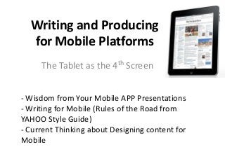
- 1. Writing and Producing for Mobile Platforms The Tablet as the 4th Screen - Wisdom from Your Mobile APP Presentations - Writing for Mobile (Rules of the Road from YAHOO Style Guide) - Current Thinking about Designing content for Mobile
- 2. TV’s “3-screen” STRATEGY • Screen 1: The TV • Screen 2: The Web • Screen 3: Mobile -- Fewer people are watching SCHEDULED over-the-air newscasts --- Advertisers are buying less commercial time --- TV has competition from WEB, other outlets with news & information 2009-2010 SLIDE --- Solution: Provide as much CONTENT where viewers are (online, on phone, on the go)
- 3. 4th screen? • Television operations, just like their counterparts at newspapers and magazines are trying to figure how to program for tablet PCs 2009-2010 SLIDE
- 4. What we know NOW about tablet readers 1. Editors have to rethink how the audience consumes content 2. Plan/Produce for “pop-up” moments (“If all you do is turn the pages, your readers are not going to be happy”) 3. Element of discovery is one of the joys of the tablet 4. People read at greater length on tablets than on other devices (70% more pages) 5. Look for more “editioning (the creation of mini-newspapers and mini-magazines on smartphone” 2013 Source: “Lean Forward, Lean Back: Tablet News Experience” (Presented at South by Southwest March 2013)
- 6. Mobile Web pages UA Mobile Web site (for Smartphones) rolled out in Nov. 2009 UA launched its mobile app in April 2011 “UA Mobile Web delivers content, services, and features that allow you to access and interact with The University of Alabama on the go using your iPhone, Blackberry, PDA, or other Smartphone.”
- 7. “The Mobile First” Philosophy Luke Wroblewski “LukeW” “More often than not, the mobile experience for a Web application or site is designed and built after the PC version is complete. Here's three reasons why Web applications should be designed for mobile first instead: 1. Mobile is Exploding 2. Mobile Forces You to Focus 3. Mobile extends your capabilities
- 9. RESPONSIVE WEB DESIGN • Responsive Web Design- philosophy built on flexible grid-based layout; building Web sites that can adapt to the constraints of the browser Window, responding to users needs • Fluid images- modern browsers have evolved to the point where they resize the images proportionally (as our flexible container resizes itself, shrinking or enlarging our image, the image’s aspect ratio remains intact) • Resolution breakpoints- horizontal widths needed to accommodate, based on devices most commonly used by the audience
- 10. What’s a Fluid Image? Regardless of how wide or small its flexible container becomes, the image resizes proportionally. Magic? Who can say.
- 11. Examples of Resolution Breakpoints 320 pixels For small screen devices, like phones, held in portrait mode. 480 pixels For small screen devices, like phones, held in landscape mode. 600 pixels Smaller tablets, like the Amazon Kindle (600 x800) and Barnes and Noble Nook (600 x 1024) held in portrait mode. 768 pixels Ten-inch tablets like the iPad (768x1024) held in portrait mode 1024 pixels Tablets like the iPad (1024x768) in landscape mode, as well as certain laptop, netbook, and desktop displays. 1200 pixels For widescreen displays, primarily laptop and desktop browsers This table appears in RESPONSIVE WEB DESIGN by Ethan Marcotte GEORGE’S TAKEAWAYS- The smaller the device, the lower the resolution The larger the device, the higher the resolution Whether or not one is using the device in portrait or landscape mode MAKES A DIFFERENCE
- 12. Coming up on Wednesday Latest numbers of iPad/Tablet purchases New study on College students & content on tablets WHY tablet magazines have been declared a FAILURE