The Future of Responsive Design Standards
•
0 j'aime•2,726 vues

The document discusses future standards for responsive design that will better adapt to users' needs and environments. It proposes evolving HTML, CSS, and JavaScript to utilize new browser APIs that detect things like connection speed, location, ambient light, and other environmental factors to optimize content delivery and layout. This would allow sites to serve high resolution video only to fast connections, increase text size for distant users, and adapt layouts and fonts based on a user's detected region, among other things.

Recommandé
Recommandé
Contenu connexe
En vedette
En vedette (17)
Similaire à The Future of Responsive Design Standards
Similaire à The Future of Responsive Design Standards (20)
The Future of Responsive Design Standards
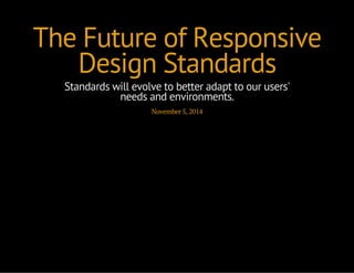
- 1. The Future of Responsive Design Standards Standards will evolve to better adapt to our users' needs and environments. November 5, 2014
- 2. Brian Fegan Associate Director of Creative Development
- 3. How would you... include additional HTML at larger breakpoints? serve high resolution video based on a user's connection speed? increase text size based on a user's distance to the screen? adapt layouts and fonts based on a user's region?
- 4. One Site Fits All
- 5. User Agent Detection if((navigator.userAgent.match(/iPhone/i)) || (navigator.userAgent.match(/iPod/i))) { $('body').addClass('mobile'); } else { $('body').addClass('desktop'); } .desktop .button { height:1em; } .mobile .button { height:2em; }
- 6. Viewport CSS Classes var $body = $('body'); $(window).resize(function(){ var width = $body.width() if (width < 480) { $body.addClass('mobile'); } else { $body.addClass('desktop'); } }); .desktop .button { height:1em; } .mobile .button { height:2em; }
- 7. Media Queries! @media only screen and (max-width: 480px) { /* insert magic here */ }
- 8. Now What? Reduce Javascript Evolve HTML and CSS Think Beyond the Browser
- 9. Reduce JavaScript Managing input device Geolocation Retrieving additional content and images Interfacing with SDKs and HTML5 Device APIs
- 10. Evolving HTML
- 11. Responsive Images Adaptive Images (.htaccess, PHP) Cookie-based solution (JS, PHP) Pure JavaScript Replacement $('div.img').responsiveImages( {large:'1025px', medium:'481px'} ); <div class="img" data-src-lg="lg.jpg" data-src-md="md.jpg" data-src="def.jpg"></div> <noscript><img src="default.jpg" alt="SEO Alt Tag" /></noscript>
- 12. The <picture> Element <picture> <source srcset="large.jpg" media="(min-width:1025px)"> <source srcset="medium.jpg" media="(min-width:481px)"> <source srcset="small.jpg"> <img src="fallback.jpg" alt="SEO Alt Tag"> </picture>
- 13. How would you... ...include additional HTML at larger breakpoints?
- 14. AJAX var hasSidebar = false; var $body = $(body); var $window = $(window); function addSidebar() { if ($body.hasClass('desktop')) { hasSidebar = true; $window.off('resize.sidebar'); $.ajax({ url: 'sidebar.html', success: function(html) { $('#sidebar').append(html); } }); } } $window.on('resize.sidebar', addSidebar); addSidebar();
- 15. Link tags could work for HTML <link href="sidebar.html" for="sidebar" rel="html" media="(min-width: 40em)"> <aside id="sidebar">...</aside> A link tag plus media query could include an HTML file Search engines would be able to access it
- 16. Evolving CSS
- 17. Level 4 Media Queries scripting: enabled, none, or intitial-only hover/any-hover: none, hover, or on-demand pointer/any-pointer: none, coarse or fine light-level: dim, normal or washed
- 18. <noscript> <head> <noscript> <link href="noscript.css" rel="stylesheet" /> </noscript> </head> <body> <div class="js-content"> <!-- Some content injected via JavaScript --> </div> <noscript> Oops, no JavaScript for you. </noscript> </body>
- 19. Scripting Media Query <!-- compliment a noscript tag here --> <link href="noscript.css" rel="stylesheet" media="not (scripting)"> <!-- or replace noscript tags --> <link href="noscript.html" for="sidebar" rel="html" media="not (scripting)"> <aside id="noscript">...</aside>
- 20. Has Touch? if ('ontouchstart' in window) { $('body').addClass('has-touch'); } else { $('body').addClass('no-touch'); } .no-touch { /* hover styles */ }
- 21. Hover Media Query @media only screen and (any-hover) { /* hover styles */ }
- 22. Pointer Media Query @media only screen and not (any-pointer) { /* touch input styles */ } @media only screen and (pointer:coarse) { /* wii controller styles */ }
- 23. Ambient Light Events API $(window).on('devicelight', function(e) { if (e.value < 50) { $('body').addClass('dim'); } else if (e.value < 10000) { $('body').addClass('normal'); } else { $('body').addClass('bright'); } }); body.bright { /* bright styles */ }
- 24. Light-Level Media Query @media screen and (light-level: washed) { /* washed styles */ }
- 25. Device & Network APIs as Media Queries connection-metered: none or connection-metered connection-bandwidth: measured in Mbs proximity: meters from sensor user-media: none, audio, or video network-discovery: none or network-discovery
- 26. How would you... ...serve high resolution video based on a user's connection speed?
- 27. Dirty Network Speed Check // load a 2MB image and check the time diff var ts = new Date().getTime(); $('<img>').attr('src','test.jpg').on('load', function(){ var diff = (new Date().getTime()) - ts; if (diff < 1000) { // slow } else { // fast } });
- 28. Network Information API var connection = (navigator.connection || navigator.mozConnection || navigator.webkitConnection); if (connection && !connection.metered && connection.bandwidth > 2) { $('body').addClass('hi-rez'); } else $('body').addClass('low-rez'); }
- 29. Connection Media Queries @media screen and not connection-metered and (min-connection-bandwidth: 2Mbs) { /* hi-rez media */ }
- 30. How would you... ...increase text size based on a user's distance to the screen?
- 31. Proximity Events API $(window).on('deviceproximity', function(e) { if ( (e.value / 100) > 3 ) { $(body).addClass('distant'); } else { $(body).addClass('near'); } });
- 32. Proximity Media Query @media screen and (min-proximity: 3m) { /* far from screen styles */ }
- 33. Get User Media API if (navigator.getUserMedia) { navigator.getUserMedia ( { video:true, audio:true }, function(localMediaStream) { var video = document.querySelector('video'); video.src = window.URL.createObjectURL(localMediaStream); // Do something with the video here, e.g. video.play() }, function(err) { console.log("The following error occured: " + err); } ); } else { console.log("getUserMedia not supported"); }
- 34. User Media Media Query <link href="video.css" rel="stylesheet" media="(user-media: video)"> <link href="audio.css" rel="stylesheet" media="(user-media: audio)">
- 35. Network Service Discovery API function showServices( services ) { // Show a list of all the services provided for(var i = 0, l = services.length; i < l; i++) console.log( services[i].name + '(' + services[i].type + ')' ); } navigator.getNetworkServices([ 'zeroconf:_boxee-jsonrpc._tcp', 'upnp:urn:schemas-upnp-org:service:ContentDirectory:1' ]).then(showServices);
- 36. Network Discovery Media Query .remote-control { display: none; } @media screen and (network-discovery) { .remote-control { display: block; } }
- 37. Evolving Media Queries region: country codes speed: meters per second sound-level: normal, loud, or headset
- 38. How would you... ...adapt layouts and fonts based on a user's region?
- 39. navigator.geolocation if (navigator.geolocation) { navigator.geolocation.getCurrentPosition(function (position) { console.log('Latitude: ' + position.coords.latitude); console.log('Longitude: ' + position.coords.longitude); // inject google maps... // call reverse geocode service to obtain country code... }); } else { console.log('No geolocation for you!); }
- 40. IP Detection Service <script src="http://ip-detection.com/service.js"></script> ... var country = geoip_country_code(); if (country == 'RU') { $('head').append('<link href="russian.css" rel="stylesheet">'); }
- 41. Region Media Query <!-- only include russian language styles --> <link href="russian.css" rel="stylesheet" media="(region: RU)">
- 42. Speed Media Query @media screen and (min-speed: 3m/s) { /* if walking, jogging or running */ }
- 43. Sound Level Media Query @media screen and (sound-level: loud) { /* hide media or prompt user to plug in headphones */ }
- 45. Emotion Markup Language @media screen and emotion and (emotion-level: happy) { /* rainbow and unicorn styles */ }
- 46. Be Curious
- 47. Thank You @feganb brian.fegan@akqa.com www.linkedin.com/in/feganbrian/