
Recommandé
Contenu connexe
Similaire à Double Page Spread - 50/50
Similaire à Double Page Spread - 50/50 (20)
Plus de caitlinosul
Dernier
Dernier (20)
Double Page Spread - 50/50
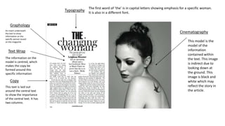
- 1. Graphology Typography Cinematography Copy Text Wrap The first word of ‘the’ is in capital letters showing emphasis for a specific woman. It is also in a different font. An insert underneath the text to show information on the specific person issued on the magazine The information on the model is centred, which makes the copy be formed around this specific information This text is laid out around the central text to show the importance of the central text. It has two columns. This model is the model of the information contained within the text. This image is indirect due to looking down at the ground. This image is black and white which may reflect the story in the article.
- 2. Typography The main headline changes boldness and colour throughout. The colour theme throughout the magazine is black and red which may also be related to school colours. Parts of different writing are in different fonts, as ‘Corey Taylor’ may be noticed as a form of handwriting to go with the theme of school. There are two separate columns which a reversed in red and black. Graphology the layout is set out in a school form like a text book or a revision guide. This makes it effective as it is about being a teacher Mode of Address Direct as the model is looking directly at the camera, facing the audience Mise en scene Props are in colour to go with the theme