SlideShare une entreprise Scribd logo
1  sur  5
This poster introduces all the characters to us well with the selection of different photographs, to bring them all together there is a small amount of snow flowing from one photograph to another. A clever element of the poster is the bow tying the whole thing together and connotes love at Christmas time. All the colours also represent love and Christmas with golden reds. The idea of bringing a photograph together using something like a big bow intrigues me. I like the effect of having red to represent love and how the film automatically looks like a romance without reading any background information about it.
Although I love how the two photographs come together as they both contain the same tones with a soft glow I think the font of the title really ties the poster together. It gives away all the clue that it is an old style romance film and makes it become very classical. The two photographs merged together on this poster are extremely romantic with the gold glow. The way the two photographs come together with the Title in the middle is extremely clever and works well with the dark horizon underling the title.
Although this poster is extremely simple this element works well as the woman model is centre frame indicating she is the main character. Once again the title is coloured red symbolising love, by it being this colour it also stands out against the warm tones of the photograph.  I think this idea could work well with our own story idea as it’s simple but effective with the bold red title. The photo is intimate and brings the audience of romance in well.
The title stands out well with the short sentence above summing up the feelings of the main characters and the whole moto of the film. The photo at the top is intimate with the tip of the ship between them which is very clever as it relates to the storyline. I like the idea of the front cover explaining the story line in such a hidden way. The colours of the two characters are very warm compared to the dark colours of the boat.
Ihave analysed posters which link to romance films. They all show a sign of typical romance ideas to give away what genre the film is, for example a photograph of a couple and red fonts. We are going to experiment with this idea and apply it to our own short film to see what we can create. Therefore in the poster for our short film we plan to photograph our main character and try editing them using different colours tones for example soft, or a glow. We also plan to use a red font for the title. When the audience see our poster we want them to instantly know that it is a romance.

Contenu connexe

En vedette

my3P: ways to participate & WiiiFM
my3P: ways to participate & WiiiFMmy3P: ways to participate & WiiiFM
my3P: ways to participate & WiiiFM3P Ventures
 
Vincent&aldo mosses
Vincent&aldo mossesVincent&aldo mosses
Vincent&aldo mosseskertas99
 
Slideshot.pptx
Slideshot.pptx Slideshot.pptx
Slideshot.pptx kertas99
 
Uses & gratification theory
Uses & gratification theoryUses & gratification theory
Uses & gratification theorycamilleproyart
 

En vedette (9)

Snake
SnakeSnake
Snake
 
Short Film Review
Short Film Review Short Film Review
Short Film Review
 
Evaluation
EvaluationEvaluation
Evaluation
 
my3P: ways to participate & WiiiFM
my3P: ways to participate & WiiiFMmy3P: ways to participate & WiiiFM
my3P: ways to participate & WiiiFM
 
Storyboard
Storyboard Storyboard
Storyboard
 
Short Film Review
Short Film ReviewShort Film Review
Short Film Review
 
Vincent&aldo mosses
Vincent&aldo mossesVincent&aldo mosses
Vincent&aldo mosses
 
Slideshot.pptx
Slideshot.pptx Slideshot.pptx
Slideshot.pptx
 
Uses & gratification theory
Uses & gratification theoryUses & gratification theory
Uses & gratification theory
 

Ancillary Tasks- Poster research

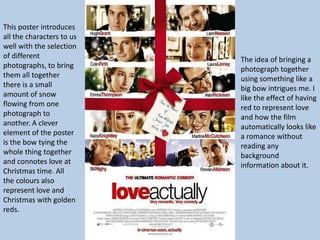
  • 1. This poster introduces all the characters to us well with the selection of different photographs, to bring them all together there is a small amount of snow flowing from one photograph to another. A clever element of the poster is the bow tying the whole thing together and connotes love at Christmas time. All the colours also represent love and Christmas with golden reds. The idea of bringing a photograph together using something like a big bow intrigues me. I like the effect of having red to represent love and how the film automatically looks like a romance without reading any background information about it.
  • 2. Although I love how the two photographs come together as they both contain the same tones with a soft glow I think the font of the title really ties the poster together. It gives away all the clue that it is an old style romance film and makes it become very classical. The two photographs merged together on this poster are extremely romantic with the gold glow. The way the two photographs come together with the Title in the middle is extremely clever and works well with the dark horizon underling the title.
  • 3. Although this poster is extremely simple this element works well as the woman model is centre frame indicating she is the main character. Once again the title is coloured red symbolising love, by it being this colour it also stands out against the warm tones of the photograph. I think this idea could work well with our own story idea as it’s simple but effective with the bold red title. The photo is intimate and brings the audience of romance in well.
  • 4. The title stands out well with the short sentence above summing up the feelings of the main characters and the whole moto of the film. The photo at the top is intimate with the tip of the ship between them which is very clever as it relates to the storyline. I like the idea of the front cover explaining the story line in such a hidden way. The colours of the two characters are very warm compared to the dark colours of the boat.
  • 5. Ihave analysed posters which link to romance films. They all show a sign of typical romance ideas to give away what genre the film is, for example a photograph of a couple and red fonts. We are going to experiment with this idea and apply it to our own short film to see what we can create. Therefore in the poster for our short film we plan to photograph our main character and try editing them using different colours tones for example soft, or a glow. We also plan to use a red font for the title. When the audience see our poster we want them to instantly know that it is a romance.