This document summarizes a music magazine from 2012 featuring Arctic Monkeys frontman Alex Turner on the cover. The magazine's house style uses the colors red, white, and sky blue. The cover aims to attract Arctic Monkeys fans by featuring Turner holding the record that changed his life. Inside, the magazine's layout and use of the masthead in the top left corner follow standard conventions for music magazines.
2. •
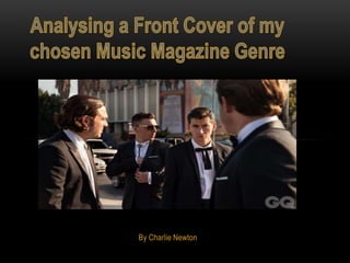
Here is a NME magazine I bought from 2 years ago, It is a special edition about record store day
from April 2012 with Alex Turner of the Arctic Monkeys on the front cover.
•
Indie Rock is my chosen Magazine Genre as I would normally read a magazine on this genre of
music such as the NME or Q magazine
The house style of the magazine are the colours Red, White
& Sky Blue, this is quite normal for the magazine as the
NME's house style are the colours Red and White. The
concept behind the cover is that the record Alex Turner is
holding has changed his life and made him what he is today.
The cover attracts its target with the use of bright colours
such as Red and Blue, the cover attracts its audience also
because of the Arctic Monkeys frontman Alex Turner being
on the cover so Arctic Monkeys fans will buy the magazine.
3. •
The mise en scene of the magazine matches the cover as the Front Cover’s headline is
‘The Record That Changed My Life’ and Alex Turner is holding a record in his left hand.
•
The masthead takes up the whole of the top left hand side of the magazine, the
masthead is there so that people can see it when it is in a shop as other magazines may
block the sight of it, it is also a code and convention that the masthead of a music
magazine is on the top left hand side.
There is different sizes of text used and
also the colours Red, Blue and White
are used on the cover these colours
are successful as they attract the
audience to the magazine.
Work that has been done to the main
image is Alex Turner’s face has been
photoshopped to reduce his wrinkles
and make him more youthful looking.