
Recommandé
Contenu connexe
Tendances
Tendances (19)
Similaire à Changes to design - Posters
Similaire à Changes to design - Posters (20)
Plus de charliewhitmore
Plus de charliewhitmore (20)
Dernier
Dernier (20)
Changes to design - Posters
- 1. Changes To Design Of Posters
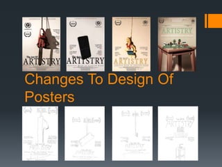
- 2. Why make changes Due to differences from our original designs to what was presented to us in reality a few changes have had to be made. However this is not a bad thing. Instead we welcome these changes as we feel that it has improved our overall designs. The changes that we made are only very small but altogether are worthy of talking about.
- 3. The Chainsaw Poster The biggest difference from our original design to the rough cut is the layout of the review quotes and award logos. We felt that the equal amount of information on each rule of third section as discussed before hand in reality crated a messy design and took away the minimalistic look that we are trying to achieve. Due to this we have instead moved all of the review quotes to the right hand side of the page to and the two award logos to the left. This minor change has created more space around the subject and gives more impact to the title. The title is another thing that we have changed. Instead of placing “The Art Of” in the center we have had to move it to the left of the section in the rule of thirds. We have had to do this because otherwise you would not have been able to see the writing due to the dark colours of the chainsaw. A change that we have had to make to all of the posters is removing our names from the top as they looked out of place and took the attention away from the title at the bottom of the page.
- 4. Lego Poster Due to the size of the Lego modals we had to zoom the camera further in than our design suggested. This meant that we have had to do a bit of reorganizing with the layers of text. Instead of having the institutional information below the title we have instead placed it at the top of the page. This works better as it gives more attention to the title. With the title we have colour matched it with the green of the Lego base to connote a sense of connection between the creativity that Lego gives and our production. Instead of having the quote in the side we have instead moved then either side of “The Art Of” to make way for the tagline that we have made bigger on the page due to moving the institutional information further up the page.
- 5. Smaller changes to Phone Poster and 2nd Lego poster Both the phone poster and the 2nd Lego poster we made very little changes to because we felt that the designs worked very well. The only changes we made to the phone poster was having the screen turned on to reveal the documentary name as we felt that this was a nicer than just a black screen. This was a change that we made while actually on the shoot! During post production took the image into Photoshop and selected the phone only and then placed it over the original phone as a new layer to give the 3d effect over the text. We felt that this gave more attention to the phone than our original design suggested. Due to this change we have moved “The Art Of” to the left section in the rule of thirds so the viewer can read part of the title. With the Lego poster we have just given the hanging Lego man more of a presence on the page. And then matched the colour of the Lego man with the colour of the title.
- 6. Overall We are very pleased with the posters so far. There are some very small changes we need to make to the posters such as a little bit of colour correction on the Lego posters to get rid of that yellow tinge that the lights we used gave. We will fix this problem using a colour correction tool in Photoshop.