➥🔝 7737669865 🔝▻ Bangalore Call-girls in Women Seeking Men 🔝Bangalore🔝 Esc...
Digi pack conventions usage
1. How my product uses, develops
and challenges conventions of
genre – Digi Pack
Evaluation Question 1
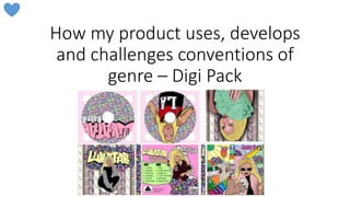
2. The three Digi Packs from the Hip Hop genre
which I analysed are pictured below. I analysed
the conventions of these images in comparison
to the techniques I used in my own.
3. Sans Serif Text
In the three Digi Packs, sans serif fonts are mostly used. Although Sans Serif fonts are
conventional, serif can also be used. I chose to conform to the convention of using
Sans Serif font as it is considered the most informal therefore would attracts a C2DE
social class or a young target audience. I also believe that the sans serif font is easiest
to read.
Sans Serif
Sans Serif
Sans Serif
Sans Serif
Sans Serif
Sans Serif
Sans Serif
4. Sans Serif Text
On the back of the Digi Pack it was particularly important to use a Sans
Serif font because it had small writing on. Such as the copyright
information and the track lists.
Due to the small text size, Sans Sarif means that the words are easier to
read.
5. Text Colour
Conventionally, the colours used on the text vary, from the
conventional red, to feminine pink, to classy black. Usually bright to
stand out.
On the cover, I conformed to the convention of having brightly coloured
text. The album name ‘Lukatar’ was written in rainbow colours to stand out
and fit in with the rest of the Bright colour scheme. Baby B was also written
in a hot pink font, contrasting the baby blue background so it stands out and
is attention grabbing. The pink is also feminine, which would attract a
female target audience.
6. Text
Positioning
In the Hip Hop genre, the album and artist name are generally across the top of the Digi Pack, often large,
central to make them noticeable.
I challenged this convention, I chose to position Baby B’s name in the top right hand corner, however it was not
large nor central.
I chose to challenge this convention because having a large, central name
would impede the complex cartoon designs seen on my cover. I believe that
these designs (which are very bright) are more attention grabbing than
having Baby B’s name large and central. To ensure ‘Baby B’ was attention
grabbing despite not being large and central, I coloured it in a ht pink
colour, and gave it a thick black outline. ‘Lukatar’ was placed at the bottom
of the design, however, I still believe it is noticable as I chose to colour it in
rainbow colours with a think black outline, put it in capitals and it is also
right next to the image of the artist.
7. Text Features
Conventionally, other features are used to
make the album or artist name stand out
more, illuminating colour, a diagonal tilt. I
conformed to this convention adding a
black outline to the majority of the text on
my digi pack, and ‘Lukatar’ on the cover is
skewed, and gets gradually smaller to make
it look like its written on the road/floor
behind Baby B. This complements the rest
of the design making it a striking feature,
and looks similar to the diagonal tilt used
on Nicki Minaj’s ‘Anaconda’.
8. Graffiti
An unconventional text type I chose to
include was graffiti. I chose to include
graffiti as I believe that it represents the
urban and low social class which I am
aiming my product at. They would be able
to relate to this text type so would be
more likely to buy the product.
Furthermore, it fits with my narrative of
the music video, with Baby B originating
from an urban background, therefore adds
continuity between the digi pack and
video.
9. Sports Wear
On Digi packs in the Hip Hop genre, sports
wear is seen often. I conformed to this
convention and included sports wear. I believe
that sports wear’s connotations of power and
prowess match Hip Hop’s ideologies, and my
artist’s attitude (particularly at the start and
end of the music video).
Sports wear is often brightly coloured, and the
red backet ball top matches the bright colour
scheme in my digi pack.
In the image of my artist street dancing I
believe the sports wear reinforces the
10. Revealing
Outfits
Outfits may be revealing or sexual, conforming to the male gaze theory
and Hip-Hop’s convention to sexualise women. I chose to challenge this
convention. Sexualised outfits are not seen in my music video, so
including them on my digi pack would be damaging to the house style I
am creating. Furthermore, I believe outfits with connotations of wealth
better represent ideologies in female Hip Hop of power and money,
and sports gear is better at targeting an urban audience. A female
target audience are unlikely to wish to buy an album because there is a
sexualised female, had I been aiming it at a male audience, I probably
would have used sexualised outfits to link back to Mulvey’s ‘male gaze’
theory.
11. Costume
Outfits are often striking to make the
digi pack stand out and be noticeable.
I conformed to this convention. For
example the sunglasses on the cover
are a noticable accessory like Lady
Leshur’s red cap. And on the disk
Baby B’s top is red, an attention
grabbing colour, like Lady Leshur’s red
cap.
12. Costume
Connotations
Outfits may represent wealth e.g. a fur
coat. I used this convention as my artist is
seen wearing a fur waistcoat which
connotes value and wealth, and also
sunglasses which are the stereotypical
celebrity dress. These portray her as
desirable, confident and powerful,
conventional representations in Hip Hop,
and link to the narrative of my music video
for continuity.
13. Angles
The conventional angle to use is a
Low angle to represent status and
power. Making the artist seem
influential and important. I chose to
use a low angle in one of my images
for the same reasons.
14. Framings
Conventional framings are Medium Long
Shots which means we feel close to the
artist, and the artist is recognisable,
without taking up too much of the cover
leaving room for text etc. and still allowing
mise en scene e.g. costume, to be seen
and appreciated. I used medium close ups
e.g. on the cover. It meant that the artist
was large enough to be dominant, but the
framing allowed for the phone / pose to
still be seen.
15. Framings
Or a long shot which allows for body parts
e.g. the legs, to be seen and appreciated.
Conforming to Mulvey’s male gaze theory.
I chose to use a long shot in this image so
that Baby B’s whole stance could be seen,
as I believe the crouch is casual – this will
attract a low social class audience and
also reflects the confident, laid back
representation of Baby B which I have
used throughout my three products.
16. Framings
I used the unconventional framing of a medium
long shot, this meant that the image took up
less room on the back cover (as the image was
slimmer) to make room for the track list, and
made it obvious that she was dancing, as her
body shape can be seen in the medium long
shot.
17. Colour
Scheme
There are three colour schemes which are seen in female Hip-Hop. Dark and red,
Bright and Girly and Monochrome. This variation is not seen in make Hip hop which is
typically dark and red colours. I chose to use a bright colour scheme, I believe this is
exciting, fresh and attention grabbing and would also appeal to a young and female
target audience. It reflects my vibrant video with many colour changes and props, and
the exciting but dramatic lives lived by celebrities.
18. Location/
Background
The location or background used varies in real hip-
hop Digi packs. It is usually an urban background or
a white background. I chose to challenge this
convention by having a background of cartoon
images and patterns on my cover. I believe this is
effective as cartoon will attract a young target
audience. The variety of objects and patterns
incorporated into the design make a hectic product,
reflecting the busy and complicated lives lived by
celebrities (an ideology in my products). The
childlike patterns e.g polka dot and stripes, and
bright colours will attract a young target audience.
19. Location/
Background
I used an unconventional bright pink background
as I believed it would attract my target female
audience, the bright green background on the
track list is also unconventional, but I believe it is
attention grabbing making the lists stand out,
and the jagged shape with many angles
conforms to the rough feel of hip hop.
20. Location/
Background
The cartoon images incorporated into the design
all link to fame e.g. the spotlight, money, star,
newspaper and many of them conform to Hip-
Hop’s tendency to explore taboo subjects. E.g.
the wine, cocktail, syringe and marijuana leaves.
The headphones are a characteristic of Hip Hop.
Therefore despite being unconventional, I
believe this cartoon design for the background
of my Digi Pack is very effective.
21. Cartoon
Having cartoon images on digi packs is
unconventional in the Hip Hop genre. However,
I chose to include all cartoon images, including
the images of the artist. I believe that despite
being unconventional, this is effective as it will
attract a young target audience who may liken
it to comics or cartoons on TV from their
youth. I also believe that it partially mimics
graffiti and street art, which would attract an
urban audience. Cartoon being unusual in the
genre will mean that amongst other albums
e.g. on a shelf, Baby B’s will stand out.
22. Themes
In my opinion, the majority of Digi packs in the genre have no real
themes. They seem to be style over substance. My digi pack challenges
this convention, it has integrated themes of fame, drug use, alcohol
and wealth. I think this makes my Digi Pack far more interesting than
the majority in the genre.
23. Poses
Having an artist taking a selfie on the
cover of a digi pack is unconventional, so
in using this image I have challenged the
conventions of Hip Hop. However, I
believe it is effective as my young target
audience will relate to the social media /
technology reference. I also believe it
portrays Baby B as being concerned with
her appearance (linking to the narrative
of the video) but also confident and self
assured, which are desirable traits.
24. Poses
On the back of the Digi Pack I included an action
shot of the artist street dancing. Action shots are
conventional in Hip Hop (Beyonce’s album
contains images of her walking). I think my
particular use of this convention is successful as it
makes the digi pack visually exciting. Street dance
is seen in the music video, adding continuity
between the products. Street dance will also
attract an urban audience, and connotes
confidence – aiding the powerful representation I
wished to achieve. The unusual stance makes the
image striking and attention grabbing making the
back of my Digi Pack stand out.
25. Poses
This is an action shot of the artist rapping,
again similar to a shot on Lady Leshur’s album
(on the cover). You can see her muscly arms
which combined with the sporting attire
portrays power and prowess. This confident
and powerful pose suits the Hip Hop genre
very well.
26. Flower Motif
The flower motif I used on my digi
pack is unconventional in Hip Hop.
Usually such girly designs are not
used however, I believe that it adds
to the light hearted tone of the
pack, complementing the cartoon
designs. It will also help to attract a
young, female target audience.
27. Props
After looking at the Digi packs in the genre, I
have realised that it is conventional for no
props to be present on the digi pack. I chose
to challenge this convention and used an
iPhone as a prop on the cover of the Digi
Pack. This complements my artist’s pose of
taking a selfie. Furthermore, it will attract a
young target audience who will be able to
relate to the prop which is a piece of modern
technology.
28. Money
Money as a prop is conventional in Hip Hop
videos but seen less on Digi Packs. I chose to
use it as both a background and a prop. I think
in this image she looks as though she is
flaunting her wealth by the way she is fanning
herself with the money, her serious facial
expression supporting this. The money in the
background confirms that her life is dictated by
wealth (a conventional theme in Hip Hop).