SlideShare une entreprise Scribd logo
1  sur  3
Overview of Double Page Spreads
These double page spreads are from ‘Vibe’ and ‘XXL’ magazine and have all been designed to use key
general and layout conventions to appeal to the readers of the magazines. By comparing these two
magazines we can identify the conventions used within these double page spreads.

They all feature typical double page spread conventions including general and layout conventions
including the artist being on the left page and the main text on the right page.

Additionally we see other conventions that are typical of Hip-Hop/Rap music magazine double page
spreads. The usual iconography of Hip-Hop/Rap magazines are still used including the snapbacks
and golden jewellery. These items make the artist look rich and they make the artist stand out. The
artists themselves have typical mise-en-scene elements such as their costume and their facial
expression. A few artists wear the typical hoody and baggy jeans. Their facial expressions are
conventional as well with the snarly and angry facial expression directed towards the camera to give
direct address. An interesting featured used for ‘Vibe’s Wiz Khalifa double page spread is the smoke
next to his face. Wiz Khalifa has a reputation for smoking Weed and the smoke in the main image
helps to drive his star image. Taking drugs is also commonly associated with the Hip-Hop/Rap genre
so this is added iconography so the reader knows exactly what genre the magazine represents.

The colours used within these double page spreads are conventional too with the use of black, white
and red. Yellow is used as well because it can be used within Hip-Hop/Rap magazines. This creates a
common look throughout the magazine and helps the brand identity of ‘Vibe’ and ‘XXL’.

A lot of close ups are used in these double page spread and while this camera shot is frequently
used, it is not conventional and other camera shots can be used such as long shots and medium-long
shots. These shots are used to make the image of the artist fill the frame and be as eye catching as
possible.

The colours that are used mainly are black and white. This is to create a formal look to the page and
that the article is clear and easy to read. Red is used in some cases to make the page more visually
appealing but to also draw attention to the key words written in that colour. Gold is used in the first
two pages to make them more visually appealing but to also connote the fact that the artists shown
on these pages are rich and successful. This is because the colour gold is associated with wealth and
riches.

The headline is usually a quote from the artist that is featured on the double page spread e.g. “Life
of a shooting star”. The text itself is usually very large and in a bold display font. Different colours
other than the conventional black, white and red are used to make the headline stand out on the
page. The body text’s colour contrasts the background to make the text stand out and easy to read.
A lot of text is printed to make sure the reader is looking at the page for as long as possible without
boring them. This is achieved by separating the text into columns. Standfirsts are also used to give
added information to the reader. This is placed under the headline and smaller than it too.
Sometimes the standfirst is in a different colour to the headline and the body text to help it stand
out on the page.

The layout of the double page spreads is consistent across both ‘Vibe’ and ‘XXL’. The main artist is
on the left page and fills the frame while the text is on the right page. The headline is placed at the
top of the right page with the strapline placed directly under it. The main text is broken up into two
columns. The page number and the name of the magazine itself is placed at the top right or the
bottom fight of the page.

By creating this overview, it is clear that ‘Vibe’ and ‘XXL’ follow key conventions of double page
spreads and the Hip-Hop/Rap genre. This creates a brand identity for the magazine that readers can
easily identify.

Contenu connexe

Plus de Chris Donnellan (8)

Filming Schedule
Filming ScheduleFilming Schedule
Filming Schedule
 
Call Sheet 5
Call Sheet 5Call Sheet 5
Call Sheet 5
 
Call Sheet 4
Call Sheet 4Call Sheet 4
Call Sheet 4
 
Call Sheet 3
Call Sheet 3Call Sheet 3
Call Sheet 3
 
Call Sheet 2
Call Sheet 2Call Sheet 2
Call Sheet 2
 
Call Sheet 1
Call Sheet 1Call Sheet 1
Call Sheet 1
 
Call Sheet 6
Call Sheet 6Call Sheet 6
Call Sheet 6
 
Overview of contents pages
Overview of contents pagesOverview of contents pages
Overview of contents pages
 

Overview of double page spreads

  • 1. Overview of Double Page Spreads
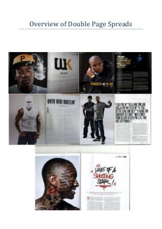
  • 2. These double page spreads are from ‘Vibe’ and ‘XXL’ magazine and have all been designed to use key general and layout conventions to appeal to the readers of the magazines. By comparing these two magazines we can identify the conventions used within these double page spreads. They all feature typical double page spread conventions including general and layout conventions including the artist being on the left page and the main text on the right page. Additionally we see other conventions that are typical of Hip-Hop/Rap music magazine double page spreads. The usual iconography of Hip-Hop/Rap magazines are still used including the snapbacks and golden jewellery. These items make the artist look rich and they make the artist stand out. The artists themselves have typical mise-en-scene elements such as their costume and their facial expression. A few artists wear the typical hoody and baggy jeans. Their facial expressions are conventional as well with the snarly and angry facial expression directed towards the camera to give direct address. An interesting featured used for ‘Vibe’s Wiz Khalifa double page spread is the smoke next to his face. Wiz Khalifa has a reputation for smoking Weed and the smoke in the main image helps to drive his star image. Taking drugs is also commonly associated with the Hip-Hop/Rap genre so this is added iconography so the reader knows exactly what genre the magazine represents. The colours used within these double page spreads are conventional too with the use of black, white and red. Yellow is used as well because it can be used within Hip-Hop/Rap magazines. This creates a common look throughout the magazine and helps the brand identity of ‘Vibe’ and ‘XXL’. A lot of close ups are used in these double page spread and while this camera shot is frequently used, it is not conventional and other camera shots can be used such as long shots and medium-long shots. These shots are used to make the image of the artist fill the frame and be as eye catching as possible. The colours that are used mainly are black and white. This is to create a formal look to the page and that the article is clear and easy to read. Red is used in some cases to make the page more visually appealing but to also draw attention to the key words written in that colour. Gold is used in the first two pages to make them more visually appealing but to also connote the fact that the artists shown on these pages are rich and successful. This is because the colour gold is associated with wealth and riches. The headline is usually a quote from the artist that is featured on the double page spread e.g. “Life of a shooting star”. The text itself is usually very large and in a bold display font. Different colours other than the conventional black, white and red are used to make the headline stand out on the page. The body text’s colour contrasts the background to make the text stand out and easy to read. A lot of text is printed to make sure the reader is looking at the page for as long as possible without boring them. This is achieved by separating the text into columns. Standfirsts are also used to give added information to the reader. This is placed under the headline and smaller than it too. Sometimes the standfirst is in a different colour to the headline and the body text to help it stand out on the page. The layout of the double page spreads is consistent across both ‘Vibe’ and ‘XXL’. The main artist is on the left page and fills the frame while the text is on the right page. The headline is placed at the top of the right page with the strapline placed directly under it. The main text is broken up into two
  • 3. columns. The page number and the name of the magazine itself is placed at the top right or the bottom fight of the page. By creating this overview, it is clear that ‘Vibe’ and ‘XXL’ follow key conventions of double page spreads and the Hip-Hop/Rap genre. This creates a brand identity for the magazine that readers can easily identify.