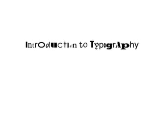
SlideShare une entreprise Scribd logo
1  sur  36
Télécharger pour lire hors ligne
Introduction to TypogrAphy
Type is …
•  A valuable communication tool.
•  Speech made visible. LISTEN TO IT.
•  Tone of voice. Emphasis, loudness,
   whispering, dialect.
Type Classes
•    Serif
•    Sans Serif
•    Decorative/Display
•    Monospaced
•    Script/Hand-Lettered
•    Symbols/Ornaments
Serif vs. Sans Serif
•    Sans Serif – Arial
• 
• 
     Sans Serif – Gill Sans	

     Sans Serif - Helvetica!
                                 Abc
•    Serif – Times	

• 
• 
     Serif – Adobe Garamond
     Serif – Adobe Caslon        Abc
Font weights
•    Interstate Hairline
•    Interstate Thin
•    Interstate Extra Light
•    Interstate Light
•    Interstate Regular
•    Interstate Regular Italic
•    Interstate Bold
•    Interstate Black
•    Interstate Ultra Black
Font variations
•  Interstate Regular
•  Interstate Regular Compressed
•  Interstate Regular Condensed
Anatomy of a typeface
Designer’s challenge:
•  How to organize letters, words, sentences
   on blank page, screen or space
  –  What font?
  –  What size? What weight?
  –  How aligned, spaced, ordered, shaped,
     colored, or otherwise manipulated?
Spacing

•  Design is an act of spacing and an act
   of marking
•  Space in typography: negative gaps
   between and around letters
   –  Characters, leading, margins
   –  Space makes words readable
Tryreadingalineoftextwithoutspacingtoseehowimportanthisis.
Typographic Hierarchy
•  Organizational system for content
•  Emphasizes some data, diminishes
   others
•  Helps readers scan text, know where
   to enter/exit, how to pick and choose
•  Cues can be:
  –  Spatial (indent, line spacing, placement
     on page
  –  Graphic (size, style, color)
Types of Type
•  Display
  –  Describes content
  –  Lures reader
  –  Sans serif
•  Text
  –  Where the content is
  –  Serif
Types of Type
•  Primary Type -- i.e. Headline
  –  Draws attention to itself
  –  Stops “browser”
  –  Leads to…
•  Secondary Type -- The Payoff
  –  Explains the headline, hooks the reader
  –  Mid-level prominence
  –  Subhead, deck, caption
Dominance


What is primary?
What is secondary?
Types of Type

•  Guidelines for Use
  –  Use no more than two families of type
  –  Two weights
  –  Add italics to make six voices
•  Size Affects Space
  –  Display type, above 18 point, shows off
     misspacing
  –  Line breaks are critical to the meaning
Types of Type
Line breaks are critical to the meaning/readability

Bus plunge kills 3 Lee students

Bus plunge kills 3
Lee Students

Bus plunge
kills 3
Lee Stu-
dents
Using Space in Text
Using Space in Text
Using Space in Text


•  Space Should Make Reading the Type
   Effortless
•  It is done right if it is not noticeable
Readability of type

  6 factors to consider
1. Typeface Readability
•  Reader Should Not Be Aware of the Form
•  All-caps harder to read than lowercase
  –  Caps look like bricks (no more than two lines)
  –  Whitespace around lowercase distinguishes letters
•  Sans serif may be harder to read than serif
  –  Serifs aid horizontal eye movement
  –  Italics harder than Roman because they are lighter
  –  Shaded, outline & inline for Display only
2. Type size, weight
•  10-pt. is the smallest readable size
•  Use weightier or larger face on longer
   measure
•  Limit use of heavy/bold faces to special
   display, features (16 point and higher)
•  Reverse type
  –  increase size and weight
  –  use sans serif font
3. Letterspacing
•  Kerning and tracking, but also space
   between lines of type (leading)
•  Be consistent
•  Proportions:
  –  Wide letters need more space
  –  Caps need more than lowercase
4. Word Spacing
•  Should Be Invisible
•  Justified      type   forces     spacing
   throughout the line of type … be
   careful
•  Justified left/ragged right gives best
   spacing, provides rhythm
•  Hyphenation should never be used in
   Display type
5. Line Spacing
•  Narrow widths of type hurt flow
  –  Eye jerks around to keep up with narrow columns
•  Too-wide widths of type hurt rhythm
  –  Readers lose track of line they’re scanning
•  Rule of thumb: Width of line (in picas) should
   be no more than twice the size of type (in
   points)
  –  A line of 12-pt type should not be wider than 24
     picas
  –  Approx. 40-50 characters per line
6. Format
•  Readers Follow Visual Signals
  –  Paragraphing (announce new idea)
  –  Punctuation (pause or stop)
  –  White Space (relative connectedness)
  –  Position on the Page (importance)
•  Ragged-left is harder to read than
   ragged-right and justified
•  Be consistent
More Type Tips
•     Print vs. Electronic
     •    In Print, Display type should be sans serif,
          text should be serif
     •    In Electronic, Display type should be serif,
          text should be sans serif
More Type Tips

       4.  Avoid placing
           type over
           illustrations,
           tinted areas
         •  Background
            must provide
            clean,
            contrasted field
            for text
More Type Tips
•     Break up long runs of type
     •    Paragraph indentation
     •    Greater leading between
          grafs
     •    Subheads of contrasting
          size, weight
     •    Boldface or italic for special
          emphasis within text
More Type Tips

•    Finally, keep it simple and
     expressive.
     –  Communication won’t happen just
        because something looks interesting
     –  Communication won’t happen just
        because something is legible

Contenu connexe

Tendances

Tendances (20)

Outsiders Intro And Background
Outsiders Intro And BackgroundOutsiders Intro And Background
Outsiders Intro And Background
 
typography
 typography typography
typography
 
A crash course in typography
A crash course in typographyA crash course in typography
A crash course in typography
 
Tipografía Franklin Gothic
Tipografía Franklin GothicTipografía Franklin Gothic
Tipografía Franklin Gothic
 
Graphic design 101
Graphic design 101 Graphic design 101
Graphic design 101
 
Typography - Graphic Design
Typography - Graphic DesignTypography - Graphic Design
Typography - Graphic Design
 
1.01 Typography
1.01 Typography1.01 Typography
1.01 Typography
 
Typography ppt
Typography pptTypography ppt
Typography ppt
 
Robert indiana 4th grade
Robert indiana   4th gradeRobert indiana   4th grade
Robert indiana 4th grade
 
Tipografía básica
Tipografía básicaTipografía básica
Tipografía básica
 
8 secrets of the truly rich
8 secrets of the truly rich8 secrets of the truly rich
8 secrets of the truly rich
 
Basics of typography kerning
Basics of typography kerningBasics of typography kerning
Basics of typography kerning
 
Magazine Layout Design
Magazine Layout DesignMagazine Layout Design
Magazine Layout Design
 
Magazine design
Magazine designMagazine design
Magazine design
 
Unit.1.2.interpretation of data . verbal to visual
Unit.1.2.interpretation of data . verbal to visualUnit.1.2.interpretation of data . verbal to visual
Unit.1.2.interpretation of data . verbal to visual
 
Publication Design Chapter 02
Publication Design Chapter 02Publication Design Chapter 02
Publication Design Chapter 02
 
Context
Context Context
Context
 
Graphic Design Overview
Graphic Design OverviewGraphic Design Overview
Graphic Design Overview
 
Typography presentation
Typography presentationTypography presentation
Typography presentation
 
How to design an infographic in 9 simple steps
How to design an infographic in 9 simple stepsHow to design an infographic in 9 simple steps
How to design an infographic in 9 simple steps
 

En vedette

Social Media in Local Government What Works
Social Media in Local Government What WorksSocial Media in Local Government What Works
Social Media in Local Government What Workspodnosh
 
Tatekuro(20141220)
Tatekuro(20141220)Tatekuro(20141220)
Tatekuro(20141220)真 岡本
 
Is Forum(20070222)
Is Forum(20070222)Is Forum(20070222)
Is Forum(20070222)真 岡本
 
OIST(20140121)
OIST(20140121)OIST(20140121)
OIST(20140121)真 岡本
 
県立図書館の再整備に向けた基本的な考え方 素案__に対する神奈川の県立図書館を考える会の意見
 県立図書館の再整備に向けた基本的な考え方 素案__に対する神奈川の県立図書館を考える会の意見 県立図書館の再整備に向けた基本的な考え方 素案__に対する神奈川の県立図書館を考える会の意見
県立図書館の再整備に向けた基本的な考え方 素案__に対する神奈川の県立図書館を考える会の意見真 岡本
 

En vedette (6)

Kdu(20081112)
Kdu(20081112)Kdu(20081112)
Kdu(20081112)
 
Social Media in Local Government What Works
Social Media in Local Government What WorksSocial Media in Local Government What Works
Social Media in Local Government What Works
 
Tatekuro(20141220)
Tatekuro(20141220)Tatekuro(20141220)
Tatekuro(20141220)
 
Is Forum(20070222)
Is Forum(20070222)Is Forum(20070222)
Is Forum(20070222)
 
OIST(20140121)
OIST(20140121)OIST(20140121)
OIST(20140121)
 
県立図書館の再整備に向けた基本的な考え方 素案__に対する神奈川の県立図書館を考える会の意見
 県立図書館の再整備に向けた基本的な考え方 素案__に対する神奈川の県立図書館を考える会の意見 県立図書館の再整備に向けた基本的な考え方 素案__に対する神奈川の県立図書館を考える会の意見
県立図書館の再整備に向けた基本的な考え方 素案__に対する神奈川の県立図書館を考える会の意見
 

Similaire à Typography (20)

1.01 Typography Usability and Readability
1.01 Typography Usability and Readability1.01 Typography Usability and Readability
1.01 Typography Usability and Readability
 
Font new edit
Font new editFont new edit
Font new edit
 
Day01 design final
Day01 design finalDay01 design final
Day01 design final
 
Typography Basics for DTP
Typography Basics for DTPTypography Basics for DTP
Typography Basics for DTP
 
11959189.ppt
11959189.ppt11959189.ppt
11959189.ppt
 
Typography, A Presentation
Typography, A PresentationTypography, A Presentation
Typography, A Presentation
 
Science of font
Science of fontScience of font
Science of font
 
Typography3 bh
Typography3 bhTypography3 bh
Typography3 bh
 
Lettering
LetteringLettering
Lettering
 
10 typeface basics.fi_xed
10 typeface basics.fi_xed10 typeface basics.fi_xed
10 typeface basics.fi_xed
 
Text
TextText
Text
 
How to make presentations
How to make presentationsHow to make presentations
How to make presentations
 
Typography
TypographyTypography
Typography
 
Course Content Considerations
Course Content ConsiderationsCourse Content Considerations
Course Content Considerations
 
Chapter 2
Chapter 2Chapter 2
Chapter 2
 
Chapter 2 : TEXT
Chapter 2 : TEXTChapter 2 : TEXT
Chapter 2 : TEXT
 
LETTERING STYLES.pptx
LETTERING STYLES.pptxLETTERING STYLES.pptx
LETTERING STYLES.pptx
 
Typography class 2
Typography class 2Typography class 2
Typography class 2
 
Typography
TypographyTypography
Typography
 
Typography manual2pages
Typography manual2pagesTypography manual2pages
Typography manual2pages
 

Plus de Chris Snider

Video Workshop March 2022
Video Workshop March 2022Video Workshop March 2022
Video Workshop March 2022Chris Snider
 
Creating Compelling Social Media Visuals
Creating Compelling Social Media VisualsCreating Compelling Social Media Visuals
Creating Compelling Social Media VisualsChris Snider
 
Social Media Workshop: Get Ready for 2020
Social Media Workshop: Get Ready for 2020Social Media Workshop: Get Ready for 2020
Social Media Workshop: Get Ready for 2020Chris Snider
 
From YouTube to TikTok - How to Create Compelling Social Media Videos
From YouTube to TikTok - How to Create Compelling Social Media VideosFrom YouTube to TikTok - How to Create Compelling Social Media Videos
From YouTube to TikTok - How to Create Compelling Social Media VideosChris Snider
 
Video Workshop - Oct. 2019
Video Workshop - Oct. 2019Video Workshop - Oct. 2019
Video Workshop - Oct. 2019Chris Snider
 
New Technology for High School Journalism
New Technology for High School JournalismNew Technology for High School Journalism
New Technology for High School JournalismChris Snider
 
Creating Great Branded Videos With Your Smarthphone
Creating Great Branded Videos With Your SmarthphoneCreating Great Branded Videos With Your Smarthphone
Creating Great Branded Videos With Your SmarthphoneChris Snider
 
Digital Media Skills to Master to Get a Job in 2019
Digital Media Skills to Master to Get a Job in 2019Digital Media Skills to Master to Get a Job in 2019
Digital Media Skills to Master to Get a Job in 2019Chris Snider
 
Building a Social Media Strategy Beyond Facebook
Building a Social Media Strategy Beyond FacebookBuilding a Social Media Strategy Beyond Facebook
Building a Social Media Strategy Beyond FacebookChris Snider
 
Beyond Facebook: Building a Social Media Strategy for 2018
Beyond Facebook: Building a Social Media Strategy for 2018Beyond Facebook: Building a Social Media Strategy for 2018
Beyond Facebook: Building a Social Media Strategy for 2018Chris Snider
 
Alternatives to Facebook for your 2018 Digital Marketing
Alternatives to Facebook for your 2018 Digital MarketingAlternatives to Facebook for your 2018 Digital Marketing
Alternatives to Facebook for your 2018 Digital MarketingChris Snider
 
Quad Cities Video Presentation
Quad Cities Video PresentationQuad Cities Video Presentation
Quad Cities Video PresentationChris Snider
 
Social Media Strategy for 2018
Social Media Strategy for 2018Social Media Strategy for 2018
Social Media Strategy for 2018Chris Snider
 
How to Make Great Videos
How to Make Great VideosHow to Make Great Videos
How to Make Great VideosChris Snider
 
Social Media Strategy Workshop - 2017
Social Media Strategy Workshop - 2017Social Media Strategy Workshop - 2017
Social Media Strategy Workshop - 2017Chris Snider
 
Tips for shooting and editing smartphone video
Tips for shooting and editing smartphone videoTips for shooting and editing smartphone video
Tips for shooting and editing smartphone videoChris Snider
 
Snapchat for Business 2015
Snapchat for Business 2015Snapchat for Business 2015
Snapchat for Business 2015Chris Snider
 
Social Media Strategy Workshop - 2015
Social Media Strategy Workshop - 2015Social Media Strategy Workshop - 2015
Social Media Strategy Workshop - 2015Chris Snider
 
Drake SJMC curriculum overview
Drake SJMC curriculum overviewDrake SJMC curriculum overview
Drake SJMC curriculum overviewChris Snider
 
Social Media Frameworks 2014
Social Media Frameworks 2014Social Media Frameworks 2014
Social Media Frameworks 2014Chris Snider
 

Plus de Chris Snider (20)

Video Workshop March 2022
Video Workshop March 2022Video Workshop March 2022
Video Workshop March 2022
 
Creating Compelling Social Media Visuals
Creating Compelling Social Media VisualsCreating Compelling Social Media Visuals
Creating Compelling Social Media Visuals
 
Social Media Workshop: Get Ready for 2020
Social Media Workshop: Get Ready for 2020Social Media Workshop: Get Ready for 2020
Social Media Workshop: Get Ready for 2020
 
From YouTube to TikTok - How to Create Compelling Social Media Videos
From YouTube to TikTok - How to Create Compelling Social Media VideosFrom YouTube to TikTok - How to Create Compelling Social Media Videos
From YouTube to TikTok - How to Create Compelling Social Media Videos
 
Video Workshop - Oct. 2019
Video Workshop - Oct. 2019Video Workshop - Oct. 2019
Video Workshop - Oct. 2019
 
New Technology for High School Journalism
New Technology for High School JournalismNew Technology for High School Journalism
New Technology for High School Journalism
 
Creating Great Branded Videos With Your Smarthphone
Creating Great Branded Videos With Your SmarthphoneCreating Great Branded Videos With Your Smarthphone
Creating Great Branded Videos With Your Smarthphone
 
Digital Media Skills to Master to Get a Job in 2019
Digital Media Skills to Master to Get a Job in 2019Digital Media Skills to Master to Get a Job in 2019
Digital Media Skills to Master to Get a Job in 2019
 
Building a Social Media Strategy Beyond Facebook
Building a Social Media Strategy Beyond FacebookBuilding a Social Media Strategy Beyond Facebook
Building a Social Media Strategy Beyond Facebook
 
Beyond Facebook: Building a Social Media Strategy for 2018
Beyond Facebook: Building a Social Media Strategy for 2018Beyond Facebook: Building a Social Media Strategy for 2018
Beyond Facebook: Building a Social Media Strategy for 2018
 
Alternatives to Facebook for your 2018 Digital Marketing
Alternatives to Facebook for your 2018 Digital MarketingAlternatives to Facebook for your 2018 Digital Marketing
Alternatives to Facebook for your 2018 Digital Marketing
 
Quad Cities Video Presentation
Quad Cities Video PresentationQuad Cities Video Presentation
Quad Cities Video Presentation
 
Social Media Strategy for 2018
Social Media Strategy for 2018Social Media Strategy for 2018
Social Media Strategy for 2018
 
How to Make Great Videos
How to Make Great VideosHow to Make Great Videos
How to Make Great Videos
 
Social Media Strategy Workshop - 2017
Social Media Strategy Workshop - 2017Social Media Strategy Workshop - 2017
Social Media Strategy Workshop - 2017
 
Tips for shooting and editing smartphone video
Tips for shooting and editing smartphone videoTips for shooting and editing smartphone video
Tips for shooting and editing smartphone video
 
Snapchat for Business 2015
Snapchat for Business 2015Snapchat for Business 2015
Snapchat for Business 2015
 
Social Media Strategy Workshop - 2015
Social Media Strategy Workshop - 2015Social Media Strategy Workshop - 2015
Social Media Strategy Workshop - 2015
 
Drake SJMC curriculum overview
Drake SJMC curriculum overviewDrake SJMC curriculum overview
Drake SJMC curriculum overview
 
Social Media Frameworks 2014
Social Media Frameworks 2014Social Media Frameworks 2014
Social Media Frameworks 2014
 

Typography

  • 2. Type is … •  A valuable communication tool. •  Speech made visible. LISTEN TO IT. •  Tone of voice. Emphasis, loudness, whispering, dialect.
  • 3.
  • 4. Type Classes •  Serif •  Sans Serif •  Decorative/Display •  Monospaced •  Script/Hand-Lettered •  Symbols/Ornaments
  • 5. Serif vs. Sans Serif •  Sans Serif – Arial •  •  Sans Serif – Gill Sans Sans Serif - Helvetica! Abc •  Serif – Times •  •  Serif – Adobe Garamond Serif – Adobe Caslon Abc
  • 6. Font weights •  Interstate Hairline •  Interstate Thin •  Interstate Extra Light •  Interstate Light •  Interstate Regular •  Interstate Regular Italic •  Interstate Bold •  Interstate Black •  Interstate Ultra Black
  • 7. Font variations •  Interstate Regular •  Interstate Regular Compressed •  Interstate Regular Condensed
  • 8.
  • 9. Anatomy of a typeface
  • 10. Designer’s challenge: •  How to organize letters, words, sentences on blank page, screen or space –  What font? –  What size? What weight? –  How aligned, spaced, ordered, shaped, colored, or otherwise manipulated?
  • 11.
  • 12. Spacing •  Design is an act of spacing and an act of marking •  Space in typography: negative gaps between and around letters –  Characters, leading, margins –  Space makes words readable Tryreadingalineoftextwithoutspacingtoseehowimportanthisis.
  • 13.
  • 14. Typographic Hierarchy •  Organizational system for content •  Emphasizes some data, diminishes others •  Helps readers scan text, know where to enter/exit, how to pick and choose •  Cues can be: –  Spatial (indent, line spacing, placement on page –  Graphic (size, style, color)
  • 15.
  • 16.
  • 17. Types of Type •  Display –  Describes content –  Lures reader –  Sans serif •  Text –  Where the content is –  Serif
  • 18.
  • 19. Types of Type •  Primary Type -- i.e. Headline –  Draws attention to itself –  Stops “browser” –  Leads to… •  Secondary Type -- The Payoff –  Explains the headline, hooks the reader –  Mid-level prominence –  Subhead, deck, caption
  • 21. Types of Type •  Guidelines for Use –  Use no more than two families of type –  Two weights –  Add italics to make six voices •  Size Affects Space –  Display type, above 18 point, shows off misspacing –  Line breaks are critical to the meaning
  • 22. Types of Type Line breaks are critical to the meaning/readability Bus plunge kills 3 Lee students Bus plunge kills 3 Lee Students Bus plunge kills 3 Lee Stu- dents
  • 25. Using Space in Text •  Space Should Make Reading the Type Effortless •  It is done right if it is not noticeable
  • 26. Readability of type 6 factors to consider
  • 27. 1. Typeface Readability •  Reader Should Not Be Aware of the Form •  All-caps harder to read than lowercase –  Caps look like bricks (no more than two lines) –  Whitespace around lowercase distinguishes letters •  Sans serif may be harder to read than serif –  Serifs aid horizontal eye movement –  Italics harder than Roman because they are lighter –  Shaded, outline & inline for Display only
  • 28. 2. Type size, weight •  10-pt. is the smallest readable size •  Use weightier or larger face on longer measure •  Limit use of heavy/bold faces to special display, features (16 point and higher) •  Reverse type –  increase size and weight –  use sans serif font
  • 29. 3. Letterspacing •  Kerning and tracking, but also space between lines of type (leading) •  Be consistent •  Proportions: –  Wide letters need more space –  Caps need more than lowercase
  • 30. 4. Word Spacing •  Should Be Invisible •  Justified type forces spacing throughout the line of type … be careful •  Justified left/ragged right gives best spacing, provides rhythm •  Hyphenation should never be used in Display type
  • 31. 5. Line Spacing •  Narrow widths of type hurt flow –  Eye jerks around to keep up with narrow columns •  Too-wide widths of type hurt rhythm –  Readers lose track of line they’re scanning •  Rule of thumb: Width of line (in picas) should be no more than twice the size of type (in points) –  A line of 12-pt type should not be wider than 24 picas –  Approx. 40-50 characters per line
  • 32. 6. Format •  Readers Follow Visual Signals –  Paragraphing (announce new idea) –  Punctuation (pause or stop) –  White Space (relative connectedness) –  Position on the Page (importance) •  Ragged-left is harder to read than ragged-right and justified •  Be consistent
  • 33. More Type Tips •  Print vs. Electronic •  In Print, Display type should be sans serif, text should be serif •  In Electronic, Display type should be serif, text should be sans serif
  • 34. More Type Tips 4.  Avoid placing type over illustrations, tinted areas •  Background must provide clean, contrasted field for text
  • 35. More Type Tips •  Break up long runs of type •  Paragraph indentation •  Greater leading between grafs •  Subheads of contrasting size, weight •  Boldface or italic for special emphasis within text
  • 36. More Type Tips •  Finally, keep it simple and expressive. –  Communication won’t happen just because something looks interesting –  Communication won’t happen just because something is legible