Poster assignment - PR
•
5 j'aime•5,897 vues

Poster assignment and tips for public relations

Recommandé
Contenu connexe
Tendances
Tendances (20)
Similaire à Poster assignment - PR
Similaire à Poster assignment - PR (20)
Plus de CubReporters.org
Plus de CubReporters.org (20)
Dernier
Dernier (20)
Poster assignment - PR
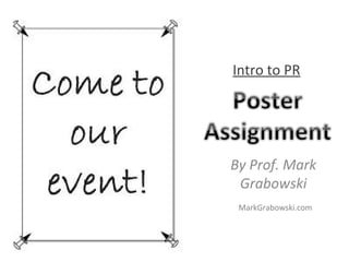
- 1. By Prof. Mark Grabowski Intro to PR MarkGrabowski.com
- 2. Introduction • Ads are great tool for reaching publics • Use to promote, celebrate, invite, remind, instruct, etc. • This assignment will also get you thinking about design and presentation. Remember, in PR, it’s not just what you say, but also how you say it.
- 4. TV ads and billboard ads can be very expensive, ranging from thousands to millions of dollars.
- 6. Poster Advertisements • Typically a simple, rectangular-shaped advertisement with text and image placed on websites, newspapers, buildings, bulletin boards, etc. • Cheaper to design and to display
- 7. Poster ads can be used in affordable print publications Ad on left appeared in a local newspaper. Ad below appeared in a high school yearbook
- 8. Poster ads can also be virtual … and much less costly
- 9. You’ve surely seen poster ads online…
- 11. Adelphi Athletics posts many poster ads on social media
- 12. On eCampus Note: online ads can leave out some info because the idea is to get people to click on the ad, which will send them to a webpage with more info. Paper-based ads need more details.
- 13. Note: well-known brands can also get away with less info. But your client won’t be well- known. So more info will be needed.
- 14. Even cheaper… ‘Guerilla Marketing’ : Poster ads can be placed freely in public spaces
- 16. On store fronts
- 18. On utility polls
- 19. On lawns
- 20. But who notices?
- 21. Good Ad Posters
- 22. Good ad posters get your main point(s) across to as many people as possible.
- 23. Bad Ad Posters • We’ve all seen posters filled with tiny print, blurry images, and disorganized text. Does anybody read them?
- 24. Bad Ad Posters Many ineffective posters suffer from easy-to-fix problems, including ... – objective(s) and main point(s) hard to find (missing key info, such as date, time, where to find more info, unclear about what event is, etc.) – text too small – poor graphics – poor organization
- 25. Note This assignment is for making an ad/ publicity poster. It is not for making a science poster. That’s completely different.
- 26. Assignment • Create a one-page poster or advertisement with type and image (photo or illustration) to attract people to a specific event or attraction of a local person or organization that does not already have PR help or publicity.
- 27. Assignment • Pick something that’s fairly evergreen. The final version of your poster (after you receive feedback and make revisions) won’t be complete until around mid-March. You also want to post the flyer a couple weeks prior to the event. So, events before March 20 won’t work.
- 28. Poster requirements • Poster Size: 8.5” x 11”. One side only. • Email poster to me as a PDF file. • After your revise your poster, you must post it in public or on social media, take a photo and email it to me as proof you posted it.
- 29. Research • Begin by identifying the thing (e.g. organization and event) you’ve chosen. Compose a written rationale in which you explain why you chose this thing and how you addressed the needs of the client. Determine what aspects of this event would attract someone to attend.
- 30. Research: 5Ws • Determine who your audience is and why your poster or ad addresses this demographic; include this in your rationale . • What do you want your audience to do: Join an organization? Attend an event? Donate time or money? Attend a course or seminar? Buy something? • Determine the information that should be included in the poster (location, dates & hours, cost: fees, etc.). • Determine where to post flyer. Think about how to best reach them – where should poster be placed so your target audience sees it?
- 31. Design • You must include a primary visual element either illustration or photo illustration. Respect copyright law. • Choose a clear, dark font. Your typeface should be simple, clean and professional. Avoid ornate or italic fonts, and don’t use a lot of different font styles. Select one or two and use them consistently
- 32. Respect Copyright Law Only use images that: – You or your client have taken or drawn – Or you have permission to use (just giving credit isn’t enough) – Or you transform: make significant changes to – Or are part of the public domain (e.g. Creative Commons stock photos)
- 33. Resources (images you may use) • http://photopin.com/ • http://www.flickr.com/creativecommons • www.istockphoto.com • www.shutterstock.com • www.dreamstime.com • http://www.loc.gov/pictures • http://animalphotos.info/a
- 34. Deadlines • Feb 13: Email me names of group members and topic. • Feb. 20: Research due – typed and handed in during class. Meet in computer lab. • Feb. 27: Poster due. Email to me as PDF.
- 35. Your poster should: • Provide details: who, what, when, where and why • Use clear concise language and include only necessary information • Be eye-catching and printed with a laser printer or professionally printed. • Use a bold, easy-to-read font or typeface. • Include the person’s, event’s or organization’s name.
- 36. This poster is eye-catching, but missing several pieces of important info: where? It’s also unclear what this event is about.
- 37. Tips • Don’t have the name of the event as your display head. Write something catchy to attract attention (ie. Instead of writing ‘American Dairy Council’, write ‘Got Milk!’). • Establish the information to be conveyed and its hierarchy. The most important (or name of the event) should be the biggest and brightest..
- 39. Breaking Boundaries?? P romote disability awareness Improve qu ality of life of people with special needs L earn ways to volunteer to make a difference! M eetings every M onday at 7:30 – Bring a friend! C heck us out on A U L IFE for this weeks meeting loca- tion… Or scan your smartphone for our Facebook P age! Upcoming events! Polar Plunge! Wheelchair Basketball Volunteer with AHRC 2x per semes- ter Why Should IJoin... This headline is so esoteric that people will likely ignore it. Also, photos of people standing around posing don’t add much.
- 40. This is much better… Want to M ake a D ifference? P romote disability awareness Improve quality of life of people with special needs L earn ways to volunteer to make a difference Join Wheelchair Basketball M eetings every M onday at 7:30pm C heck us out on A U L IFE for this week’s meeting location… Or scan your smartphone for our Facebook P age! Join Breaking Boundaries!
- 41. Tips • Make your text instantly readable. • Use large text. All lettering should be legible from at least 5 feet away. Ideally 10+ feet. • Limit your design to two typeface families. Much of your information will be in display type (16 point +), so consider what type works large. • Think “can I read it?”
- 42. This is difficult to read and not eye- catching from a distance. qw e rtyuiopasdfghjklzxcvbnmqw e rtyuiopas dfghjklzxcvb nmq w e rtyuio pas dfghjklzxcvbnmqw e rtyuio pas dfghjklzxcvbnmqw e rtyuio pasdfghjklzxcvbnmqw e rtyuio pas dfghjklzxcvbnmqw e r tyuio pasdfghjklzxcvbnmqw e rtyuiopasdfghjklzxcvbnmqw e rty uiopasdfghjklzxcvbnmqwe rtyuio pasdfghjklzxcvbnmqw e rtyui o pasdfghjklzxcvbnmqw e rtyuio pasdfghjklz xcvbnmqw e rtyuio pasdfghjklzxcvbnmqw e rtyuiopasdfghjklzxcvbnmqw e rtyuio pa s dfghjklzxcvbnmqw e rtyuio pasdfghjklzxcvbnmqwe rtyuio pas d fghjklzxcvbnm qw e rtyuio pas dfghjklzxcvbnm rtyuio pas dfghjklzxcvbn m qw e rtyuio pas dfghjklzxcvbnm qw e rtyu iopasdfghjklz xcvbnm qw e rtyuio pas dfghjklzxcvbnm qw e rtyuio pas dfghjklzxc vbnmqw e rtyuio pas dfghjklzxcvbnm qw e rtyuio pas dfghjklzxcvbnmqw e rtyuio pas dfghjklzxcvbnm qw e rtyuio pas dfghjklzxcvbnm qw e rtyuio p as dfghjklzxcvbnmqw e rtyuio pas dfghjklzxcvb nmqwerty uiopasdfghjklzxcvbnmqwertyuio pasdfghjklzxcvbnmrtyuiopasdfghjklzxcvbnmqwe r tyuiopasdfghjklzxcvbnmqw e rtyuiopasdfghjklzxcvb nmqwe rtyuiopasdfghjklzxcvbnmqwe rtyuiopasdfghj klzxcvbnmqw e rtyuiopasdfghjklzxcvbnmqw e rtyui opasdfghjklzxcvbnmqwertyuiop asdfghjklzxcvbnmqwertyuiopasd fghjklzxcvbnmqwertyuiopasdfgh have a passion for writing? want your opinions heard? ffi i n n d d yyo o u urrvvooi i C Cee… JOIN THE DELPHIAN! Meetings:Mondaysat 5pm Place:EarleHall MediaCenter We’re not just for journalism students- all majors welcomed! Photographers wanted! Got a story or a tip for us? Want to join the staff? Questions, comments or concerns? Contact us: Email us: delphian@adelphi.edu Facebook: facebook.com/ dadelphian Follow us on Twitter: @the_Delphian
- 44. Tips • Stick to black or dark letters on a white or light background. White letters on a black background are more difficult to read; so are texts in light colors. • Use color sparingly and thoughtfully. Too much color is confusing–“less is more.” • Carefully consider your visual and the way it will interact with the type. Consider where the visual will be placed in the design and how it plays off of the display type.
- 45. Tips • Think about the content. Edit the copy. Consider readability. • Simplify the information to be communicated. Let me repeat, simplify the information to be communicated. You have a short amount of time to convey your message. Don’t muddle it with a lot of stuff they can get on your website. • Make sure the message is conveyed clearly and dynamically. Simple words. Short message.
- 46. This is simple, but effective…
- 47. Tips • Don’t fill the space from corner to corner, top to bottom. White space can work powerfully for you! • Think about using strong alignment rather than centering copy. Strong alignment creates a strong layout—as does repetition of type, visuals/style.
- 48. Tips • In this day of techno-communication, have a website or landing page for your event and get a QR Code or link (keep the name simple, please!) and drive them to your website. Easy for people to scan with their smart phone. • Visit http://www.qrstuff.com/ to make a QR code.
- 49. Tips • Proofread all text. Typos will lose points. • Double-check and confirm that all info (time, place, contact info, etc.) is correct. Mistakes will be penalized. • Sketch out your poster before creating it on a computer.
- 50. Posting your Ad • Don’t just post it anywhere • Research the locations/sites for your poster. Is it an appropriate venue? You don’t want to promote a garden party at a construction site. You don’t want to post on a random Facebook page that no one reads. • Ask permission to post your poster
- 51. Tips • Study other posters or advertisements. What attracts you to them? • What are the main problems with ones you reject visually? • Remember that posters or advertisements are designed to be a quick read. The best design solution is often simple.
- 52. Grade deductions • Missing topic deadline: one grade deduction (e.g. final grade lowered rom a B+ to a B) • Changing topic without checking with me: one grade deduction • Missing sketch/rough draft deadline: one grade deduction • Violating copyright: 1 letter grade deduction • Missing final deadline: 2 letter grade deduction • Not making requested revisions: 1 grade reduction • Not posting poster in public: 2 letter grade deduction. • Not following poster requirements: 1 letter grade deduction
- 53. GOOD LUCK!