
Recommandé
Contenu connexe
Tendances
Tendances (20)
Similaire à Q1,2 and 6 for media evaluation
Similaire à Q1,2 and 6 for media evaluation (20)
Q1,2 and 6 for media evaluation
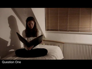
- 1. Question One
- 2. Q1~ In what ways does your media product use, develop or challenge forms and conventions of real media products? The genre of our opening sequence is supernatural horror. We deliberately formed to the conventions of this horror so that it would be evident and understandable to the audience. We conformed to the conventions through our use of: > STOCK CHARACTERS The protagonist is a young girl that we decided would be American. We took inspiration from films such as Mr. Boogie from Sinister (Scott Derrickson, 2012) and the old lady in Insidious (James Wan, 2010) When we were deciding on how the film narrative would continue after the opening, we decided the plot would make more sense being set in America. This meant that the character would have to be American The protagonist is a seemingly normal girl without any significant individual differences about her appearance. Her appearance conforms to the societal perception of normality amongst feminine beauty and therefore uses the character to represent and relate to all audiences, thus broadening their target market and revenue from large audiences. The antagonist is a spirit of a mentally disturbed young girl who is given the appearance of a hollowed out face, much like that of a skull’s, so that it is bringing forth the visual acknowledgment that she is dead and separates her from the other characters in the film.
- 3. > PLOT The iconography of a photo album left behind by the spirit to imbed the idea to research who it belongs to into the mind of the main character. The actions leading up to the protagonist gaining more knowledge and understanding of the owner of the music box and photo album would increase in intensity as the antagonist tries to torment them. I have written about this briefly on the blog before. > LOCATION The house is isolated and the protagonist is completely alone. Although the house in which the opening takes place isn’t completely isolated – because of accessibility of locations causing limitations – the suggestion of isolation is connoted through her solitude and barren furnishings within the set. The normality of the house creates verisimilitude which is important in our sub-genre because the action would be too unrelatable without it and would break the audience away from the plotline as they focus on the film’s unrealistic nature. An isolated house is used in The Others (Alejandro Amenabar, 2001) as well. We were inspired specifically by the plotline of Sinister (Scott Derrickson, 2012)
- 4. > TYPOGRAPHY The credits are written in a scrawled, hand written style appearing to be sinister and relevant to the genre. The title is similar except that it is written out slowly to reveal itself creating tension and suspense. > SOUND A song from the music box is played to hypnotize the protagonist and used to anchor the sound to the image of the music box. It creates tension because the pace of it begins to slow down as the song progresses slowing down the pace of the sequence and creating an ominous atmosphere as the pitch becomes deeper with its loss of pace. The sound mix of the screeching, scratchy, sharp and high pitched non-diegetic sounds are conventional in a supernatural horror film because they are sounds that make the audience uncomfortable from their unnatural presence. Have a listen to some of the background sound we used in our clip. https://www.youtube.com/watch?v=PWTZ MClick on this link to see how we used sound to create tension in specific situations. CLICK to watch the title clip.
- 5. > MISE-EN-SCENE Costume ~ Neutral coloured, plain clothing was conventional because it connotes a neutral or drained emotion thus creating an ominous atmosphere. Hannah’s clothes are casual and her make-up is simple because it adds verisimilitude to an otherwise unrealistic situation. Jane’s black cape makes her look like the grim reaper adding to her fear factor. Lighting ~ We used the convention of low-key lighting that created shadows from the characters movement. By lighting the behind the doorway when Hannah was entering the garage it created a silhouette that made Hannah look increasingly foreboding. Camera ~ The reveal swish pan bringing Jane into view when the audience wouldn’t have expected her to appear is conventional because it is creating tension through the anxiety, unknown nature of the film and awkward positioning they are put in. We got inspiration for the rotational camera shot from Donnie Darko (Richard Kelly, 2001)
- 6. > MISE-EN-SCENE cnt. Editing ~ A montage of shots presenting the action juxtaposed with filler shots is ideal because it allows us to present the credits on a screen with minimal distraction from the credited individual whilst simultaneously introducing the narrative for our film – this is vital and a convention we followed when creating our opening sequence. The flickering images of the spirit is conventional because it gives the appearance that everything is not as it seems and differentiates the antagonist from the protagonist. An example of one of our filler shots with a credit on. Although supernatural horror films contain some vivid and gruesome violence it isn’t usually to the extreme level that we took it in our opening sequence. We challenged this convention because we thought the blood would have the appropriate and elevated effect on the audience from the sinister action that is being inflicted upon the protagonist in the sequence. The Mothman Prophecies (Mark Pellington, 2002) used fillers as well. We challenged conventions by:
- 7. Question Two
- 8. Q2~How does your media product represent particular social groups? The stereotypical conventional characters in a horror film would involve: an athletic, brave male, who is seen as the 'Hero' character and his companion who is a female in need of his protection and timid, who provides a constant supply of shrill screams of fear and panic. The male character being all macho and protective in The Cabin in the Woods (Drew Goddard, 2012). The residual ideology between the genders has created a binary opposition between the hero and the victim to so that there is an unconscious association that masculinity = hero and femininity = victim. A conventional character is often a female who is made weak through her indecisiveness and has an inability to control herself or help other characters when in a stressful and terrifying situation. This leads to the audience viewing her in a negatively stereotypical way. We barely conform to the stereotype of an over-emotional female role but we do conform to the passive and weak residual ideology towards women. We did this because we thought that it would suit the narrative and that it would be an easily achievable representation for us to portray in the shots. Part of the brief we were given stated that we needed to research and imitate conventions of a Horror genre and these ideologies and stereotypes are the most common stock characters. This concept was developed by Lévi- Strauss, a French anthropologist. Binary oppositions are used frequently in films, especially in the horror genre – particularly in the form of good and evil, sane and insane, rational and irrational and human and supernatural. CONVENTIONS
- 9. In the ECU from our sequence there is a shot of a tear rolling down Hannah’s face. The purpose of this was to show that her consciousness was trying to fight the possession and that she was desperately trying not to kill herself. However, it comes across as though she is completely helpless and weak and as though she has given up. It looks as know she is not trying to fight back and has instead given in to the spirit. The tear makes her seem over- emotional falling into the conventional residual ideology constantly portrayed in horror films. We were inspired to do this shot from the ECU of the victim’s face in Amityville Horror (Andrew Douglas, 2005) DECONSTRUCTION OF A SHOT
- 10. Due to that fact that there is no speech from Hannah throughout the opening sequence the audience feel a lack of sympathy for her and the horror she is facing. She is distanced from the audience and the human quality of speech is taken away from her. This effect acts as another way of creating fear and tension because there are no characters for the audience to feel secure with. We made the spirit female with the intention that her character will subversively challenge patriarchy by proving she can successfully control and achieve in a position of power without the aid of a man. During the opening sequence the ghost becomes an enigma, meaning that no information about her gender, age or ethnicity are made apparent. However, when we were coming up with the concept of how the film would continue we established that the protagonist would find out about the identity of the spirit’ and information about when she was alive.As a group of women it was important to us that, although we needed to conform to typical horror film conventions, we challenged the dominant patriarchy that pervades the media industry to try and conquer the inequalities between the genders. LACK OF SPEECH THE ENIGMA OF THE SPIRIT
- 11. Young people are the only people that are represented in our opening sequence. This is constructed by the character’s age in the sequence. This is very similar to the majority of horror films because the main age demographic that the film is aimed towards is the 18-24 range and by providing characters at the same age, the audience can relate to the characters more. We bring forth the binary opposition between different cultures by exploring the idea of sane vs insane. The Japanese mythology (represented with the paper cranes) is presented as a dangerous, unsafe and associated with the protagonist’s insanity. The Western culture, in our opening sequence, is seen as the safe haven and presented as if the character would have stayed sane and impervious had she not been associated with the foreign culture. The main social group that is represented is White American – an ideologically loaded choice of ethnicity and one that is used consistently in Hollywood films because they want to appeal to their largest target audience and therefore have created a white-centric convention for their films. A very white-centric Hollywood. Horror Film Age Demographics
- 12. Question Six
- 13. Q6~ What have you learnt about technologies from the process of constructing this product? We were able to create professional looking presentations using Prezi. We used Prezi specifically for expressing our concept development. It’s clear presentation made it easy for us to communicate our ideas to anyone following the progress of our film production on the blog but also to each other. The format of Prezi meant that it was easy to link it to the blog. We started off with using blogger - to document our progression in understanding the task given to us and enabling us to develop it into our own concept that transformed into the opening sequence. We could create text posts to discuss the things that we’d discovered; add inspirational video clips and our clips of our own creations from YouTube; post pictures; and link to other websites such as: Prezi and Slide Share. The blog allows us to reach out to various media forms because not only can it be accessed on the internet but there is also a free app that people can purchase in the App store.You can click on this links to go to our Blog ~http://twgsbmedia14asgroup4.blogspot.c o.uk
- 14. When we were completing our audience research we used https://www.surveymonkey.com/home/ to come up with questions we wanted to ask people. We could send it to a selected number of people electronically (saving paper and further costs) and it was easy and quick for them to reply. Social Networking sites allowed us to reach out to our target audience and a much wider audience. It is free which makes it easy for us to use. We created an official twitter page and posted the sequence on Facebook to increase Posting online meant that we could get feedback on how to improve it and their opinions on the finishing project. You can click on this links to go to our Twitter Page ~ https://twitter.com/possess eduk
- 15. YouTube was a very important part in progressing through all stages of production in our opening sequence. We used it to put up small clips that we had taken on our location reccies on the blog as documentation of our progression. We have put the rough cuts and final pieces of all our completed projects thanks to YouTube (The Juice Slamdown, The Sound of the Wind and Possessed). Once the clips were on YouTube we could export them to various other forms of media: - We could post a link to the video on numerous forms of social media such as Facebook, the official Possessed twitter site and any future social media networking sites that we branch out to. - YouTube was incredibly important when it came to researching the horror genre and opening sequences. Without it we would have struggled to view so many examples and taken inspiration from them. We could post the inspirational clips onto the blog so that we could communicate concept development to each other in the beginning stages of pre-production. We attempted to create an interesting Blog through multiple media forms, much like The Hobbit’s (Peter Jackson, 2012) Blog that documents the progression of each movie to involve the audience in every aspect of production and distribution. Here is a link to the blog ~ http://www.thehobbitblog.com
- 16. We used Alex’s Cannon 60D camera to film the whole of our opening sequence because it was the highest quality camera that we had available to us and we thought that it would enable use to create a better looking product. We used a Tri-Pod to make sure all of the shots we wanted remained completely steady. The tri-pod was easily adjustable and, because I’d never used one before AS Media Studies, it was a fantastic learning experience. The adjustability also enabled us to achieve a huge variety of shots we were inspired to recreate and thought would be visually impeccable. We used a steadicam frame for the shot of Hannah in the doorway. Using it meant that the turning movement from angled to straight would be smooth. The smoothness would mean that the audience would concentrate on the action within the shot rather than be drawn to the fact that it isn’t real. We used lamps to make sure that the lighting was bright enough to avoid blurring or an unintended grainy appearance of the footage, keeping it at a high quality for us to edit with. We knew that we could edit the lighting and colouring afterwards so we didn’t worry about the atmosphere that the bright lighting created. We focused on creating the perfectly crisp shadows that gave an extra quality of sinister to the sequence. Hard at work. Alex is using the Tri- Pod to film Hannah folding the newspaper article.
- 17. In Premier we stretched the time frame of Hannah dropping the knife because we thought the action was too quick for the audience to pick up on its significance. We did this by slowing down the pace of the shot so that the knife would be released and fall in slow motion. In the preliminary task we were introduced to the 180º rule meaning that the camera stays on one side of the action to ensure the creation of verisimilitude. Original: After we had finished and screened the rough cut to our classmates, we were informed that we had failed to abide by the 180º rule and it retracted their interest in the action. Thankfully we had taken the mid-shot from a different angle that we could use to successfully abide by the rule. In Final Sequence:
- 18. AFTER EFFECTS~ We wanted to create a more obvious look that the protagonist in the opening sequence was possessed because we didn’t think that we made it clear enough in the narrative. We decided that we would be able to achieve this by blackening out her eyes. I took on the challenge to learn how to create this effect in AfterEffects. It was very time consuming because the eyes had to be edited frame by frame. Instead of just placing a customised blackened-out shape on top of the eye, I added a layer over the top of the original film and darkened her eyes so that there was an element of her humanity visible on screen. We are all very happy with the outcome and have been given positive feedback .In the TV series Supernatural they use a similar technique to distinguish between the humans and demons.
- 19. Me and Alex discoloured the shots because the orange-yellow light that was created by the lamps didn’t create the kind of atmosphere that we were trying to portray. BEFORE: AFTER: After researching different films and their colour grading, I got inspiration from The Road (John Hillcoat, 2009) and it’s complete desaturation and removal of almost all of its colour; and the extreme deep shadows shown in Sweeny Todd: The Demon Barber of Fleet Street (Tim Burton, 2007). We tried to imitate these combined colour gradings in our opening sequence. We used the image adjustment in Premier to achieve the colour grading that we desired .
- 20. CONTINUITY EDITING We made a significant effort to achieve fluid continuity throughout our opening sequence because we hadn’t been as successful in our previous attempts, for example there were some continuity errors in our Preliminary task. We achieved this by cutting on action and checking that the action within the shots synced-up frame by frame. An example of when we cut on action can be seen when Hannah places the photo album on the bed. The shot quickly cuts from a LS of her putting it down to a CU of her hands placing it fully on the bed. OVERLAYING It took a relatively long time and many shots for Hannah to fold the newspaper into a perfect crane. The actions were quite boring on screen as well because they were very repetitious. To conquer this we decided to use a select few clips and overlay them on top of each other to create the sense of time passing whilst keeping the audience with the knowledge of what Hannah is doing over the period of elapsed time. We changed the opacity of the clips so that you could see each shot more or less depending on the other shot over the top of it.
- 21. SOUND We used sound to anchor the visuals in our opening sequence. When Hannah is slitting her throat a cutting sound is heard that we added on during the editing stage of production in Premier. We made sure that the sound lined up perfectly with the action portrayed on the screen so that we could maintain verisimilitude and maintain the audiences perception of the constructed reality of the narrative. TITLES We edited on the individual titles using Premier. We imported the font, Suicide Draft, from DaFont because we thought that it’s scrawled, hand-written qualities would continue well with our theme of insanity. We where inspired by the titles in the opening sequences from Evil Dead (Fede Alvarez, 2013) and Shutter Island (Martin Scorsese, 2010). Our originally idea was to have blood red titles but, after applying the effect, it didn’t match the theme and colour grading of our sequence and looked out of place and unprofessional. We changed it to more of a rusty coloured red so that it could blend whilst being noticeable.