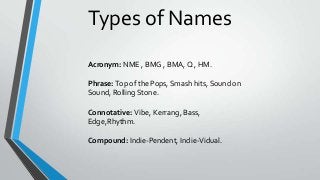
3. The acronym 'NME' is a shortened version of ‘New Musical
Express’, which the magazine claims to give to it readers. The
name has been shortened to make it more memorable and to
fit better on to a front cover rather than a long-winded phrase.
Even though the audience may not know what the acronym
stands for it still will be very catchy and make the magazine
very recognisable. The masthead 'NME' uses bright red font
against a white and black outline makes the masthead
dominant amongst a busy front cover as it is one of the first
things to catch the eye. Also using complimentary colours
makes the masthead recognisable The font is very simple and
bold portraying power and targeting a mature audience. The
use of the white outline the sharp font and emphases the
masthead to the audience.
4. Analysing the name “Kerrang” Kerrang may sound like a
strange, random word which doesn’t fit into the English
language – but in actual fact, it’s an incredibly clever and smart
name for a music magazine. “Kerrang” is an onomatopoeic
word/sound for the sound that a guitar makes when strung by
the user. This instantly brings the audience into the world of
genre of Rock music, as the affect of reading the name almost
sounds like they are listening to the genre that the magazine is
based on. Not only is the name itself clever, but the font type is
also extremely affective. The font type and size are big, bold
and stand out from the rest of the front cover. The bold writing
expresses how Rock music can be very loud. The font type is
unique and will instantly stand out on the shelves at
supermarkets and newsagents
5. The phrase ‘Vibe’ links in with the association of up to date and
trendy music which portrays the genre of the music being
R&B/Hip Hop. This highlights there target audience of young
people and they are up to date with everything trendy and
new in music. This phrase also suggests that there will be good
‘vibes’ to the music listed in the magazine and this will attract
the audience to read the magazine. Masthead: The masthead
'Vibe' uses a similar house style to ‘NME’&'Q' as they only use
simple colours such as white black and red to maintain a
professional standard and to ensure that it doesn’t look too
complex or tacky. The connotations of both red and black
show danger, violence or power which is the typical stereotype
of R&B/Rap music. The font also used is very simple yet serious
which highlights the magazines formal and trusted
information.