1. 13
2.2 The Character Design Pipeline
This section covers the work process that I have used when working with my production (the
case studies) and explain how I have approached the task in each step of the production
pipeline. The section is followed by the case studies and ends with the results of the survey.
2.2.1 Work Process
There are many ways to create a character design and there is no set formula. It is essentially
up to the artist how they decide to approach the task, but it is sometimes constrained to the
nature of the project: If you are designing characters for a smartphone screen it is important to
focus on creating characters that are able to read on a small screen; or if the character is very
stubborn and constantly crosses their arms, it is important that the design makes that action
possible.
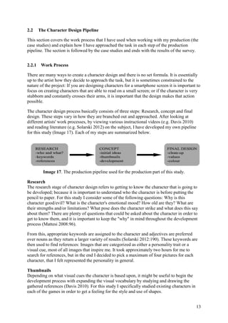
The character design process basically consists of three steps: Research, concept and final
design. These steps vary in how they are branched out and approached. After looking at
different artists' work processes, by viewing various instructional videos (e.g. Davis 2010)
and reading literature (e.g. Solarski 2012) on the subject, I have developed my own pipeline
for this study (Image 17). Each of my steps are summarized below.
Image 17. The production pipeline used for the production part of this study.
Research
The research stage of character design refers to getting to know the character that is going to
be developed; because it is important to understand who the character is before putting the
pencil to paper. For this study I consider some of the following questions: Why is this
character good/evil? What is the character's emotional mood? How old are they? What are
their strengths and/or limitations? What pose does the character strike and what does this say
about them? There are plenty of questions that could be asked about the character in order to
get to know them, and it is important to keep the "why" in mind throughout the development
process (Mattesi 2008:96).
From this, appropriate keywords are assigned to the character and adjectives are preferred
over nouns as they return a larger variety of results (Solarski 2012:190). These keywords are
then used to find references: Images that are categorized as either a personality trait or a
visual cue, most of all images that inspire me. It took approximately two hours for me to
search for references, but in the end I decided to pick a maximum of four pictures for each
character, that I felt represented the personality in general.
Thumbnails
Depending on what visual cues the character is based upon, it might be useful to begin the
development process with expanding the visual vocabulary by studying and drawing the
gathered references (Davis 2010). For this study I specifically studied existing characters in
each of the games in order to get a feeling for the style and use of shapes.
2. 14
Based on the references I think about the major shape of the character and get some initial
ideas out prior to doing any thumbnails. Once I have some ideas on paper I switch between
exploring the design in thumbnails, with focus on shape and proportion, and sketching out
further ideas. I look for ways to work tilts and opposing angles into the pose, in order to create
more visual interest (Bancroft 1996:71). I regularly cast an eye on the silhouettes of the
original game characters and strive towards designing a character that maintains the overall
style. I also take some time to explore the character's face, as it is an important aspect of the
character. I lay out previous design ideas in front of me in order to make sure that I am on the
right path and that I am not neglecting any good ideas (Davis 2010).
Concept
Once I feel that I have explored the character enough (or that time is running out) I pick my
favourite ideas and combine them in a final rough concept. This step focuses on pushing the
design and exaggerating important areas in order to enhance the character's traits. More
details may be added and a clear silhouette is sought. I try not to be arbitrary with any of my
design decisions, and keep in mind to not just draw the various elements that shape the
character but actually designing them (Colman 2010).
Value and colour studies could be done in this step of the process, but since my focus is on
the element of shape and how it conveys specific personality traits, I will not be doing it for
this study.
Final Design
I create a clean version of the final design in Adobe Photoshop, a digital image manipulator
and drawing software. I do not trace the final rough, but try to keep it loose in order to avoid
that the drawing becomes too stiff. The idea is not to copy the final rough but always keep
working on the design; to refine and further enhance it.
This step would preferably also involve creating a final coloured version of the character
design, but as stated before: This study focuses on shapes and I have limited myself to only
creating the final line art.
3. 15
2.3 Case Studies
2.3.1 Case Study A
Background
Team Fortress 2 (2007), developed by Valve Corporation, is a team-based first-person
shooter (FPS) with a vintage setting. The opposing teams consist of the same characters but in
different colours, there are no protagonists or antagonists. They have different skills, which
are communicated clearly in the visuals. Being a team-based FPS it is important for the
players to be able to quickly identify a character in order to determine whether to run or
attack, and the distinguished silhouettes make that possible. Angles between elements such as
shoes, hats and clothing folds are very sharp and adds to visual clarity. Above all, the
character design emphasizes shapes and silhouettes rather than details and texture.
Image 18. Three different characters - a soldier, scout and heavy - from Team Fortress 2.
The graphics are cartoon-like and shape, posing and proportions are used to communicate
personality, attitude and skill: The heavy weapons guy is part of the defence and slow but
powerful; his stability is shown in his major shape of a big square - he will not fall over in the
first place. The scout has a more slick appearance and is part of the offense. His small feet
communicate speed but also make him seem more susceptible to damage. The pose of the
soldier (weight in his torso) compared to the sniper (weight in his pelvis) also shows that he is
more head-on in combat. The characters are based on quite rectangular shapes and their big
hands and feet give them a strong sense of weight. The most sinister-looking character
appears to be the spy, who is somewhat based on a triangular concept compared to the others.
Image 19. Silhouettes of the nine player classes in Tam Fortress 2.
To summarize: Team Fortress 2 is a militaristic game in a cartoon-like and vintage style. The
characters have distinct, generally rectangular-based shapes, and angles between different
elements are very acute. Hands and feet are generally big to create a sense of weight. Large
shapes are emphasized over details. I have assembled a moodboard to reference this style in
appendix A.
4. 16
2.3.1.1 Character 1A - the Soldier
Summary:
Character 1A is a British youngster with no worries; a generally easygoing and laid-back
character, but a lazy soldier who often spends his time snoozing in a foxhole instead of
engaging in combat.
Keywords:
Personality: Cheerful, clumsy, lazy, afraid of conflict. Visually: Rectangular, vintage, tall.
The references I have gathered are: A British soldier outfit, the youngster Marty McFly from
Back to the Future, a laid-back dopey in a relaxed pose and the ever-lazy private Bailey from
Mort Walker's comic strip Beetle Bailey.
Image 20. References for character 1A - the soldier.
Work process:
My main impression of character 1A is that he is lazy, lanky and laid-back, so I focus much
on expressing this in his pose and silhouette. I take a lot of inspiration from the soldier class
in Team Fortress 2, but in order to create a distinguished look I make use of an overall
different shape and attitude. The British helm is also unique for my character and a shape that
stands out well. To keep with the visual style of the game I try to maintain the concept of big
hands and feet and acute angles between elements. However, to reveal the character's friendly
nature I make use of circular shapes whenever possible, most prominent are his shoes, hat and
nose.
6. 18
2.3.1.2 Character 2A - the General
Summary:
Character 2A is an imperious general, characterized by his aggressive and domineering social
behaviour. He is a perfectionist who takes pride in his job and commands his men like dogs.
Keywords:
Personality: Proud, dominant, loud, Napoleon-complex. Visually: Triangular, angular, heavy.
The references I have gathered are: A cartoon version of Napoleon, the angular Arnold
Schwarzenegger, a military officer outfit and a corporal with a seemingly loud and bossy
personality.
Image 22. References for character 2A - the general.
Work process:
When visualizing Character 2A I see a short but very loud man of proud stature, which makes
the Napoleon-complex a natural reference for me and something which I try to work into the
design. I make him the shortest of the characters to express this, but I also make use of the
characteristic hand gesture for a more immediate reference to this trait. His main shape is a
box, like a sturdy brick that will not fall over, but I strive to work in an altogether triangular
look and make constant use of angular shapes throughout the visual cues, in order to
communicate his aggressive nature. His dominance and pride is something that I try to reveal
in his pose, to make it noticeable in his silhouette.
8. 20
2.3.2 Case study B
Background
The Walking Dead (2012), developed by Telltale Games, is set in a contemporary world and
takes place shortly after the onset of a zombie apocalypse, which make the zombies the
obvious enemies. With their limp posture and decaying bodies, their silhouettes are easily
recognizable. However, this game does not focus on fighting enemies but rather revolves
around story and character development within a group of survivors.
It is a semi-realistic game that is based on a comic book and imitates a similar style. There is
no use of exaggerated shapes in the characters' bodies; they are of realistic proportions and
anatomy, but their faces are somewhat exaggerated.
Image 24. Some of the character faces from The Walking Dead.
There are some visual cues that hint about personality: Larry appears early in the game and is
generally very blunt and constantly distrusts and antagonizes the playable character - Lee. We
look at Larry's face and we expect trouble - "what is beautiful is good". His body is that of a
large, sturdy square and his rigorous physique, exaggerated jaw and restrictive body language
all support his personality.
Image 25. The silhouettes of a zombie and the main character; Lee and Larry from The
Walking Dead.
To summarize: The Walking Dead is a semi-realistic game that is set in contemporary time. It
imitates the graphics of the original comic book. The bodies are of realistic proportions but
faces are somewhat exaggerated. I have assembled a moodboard to reference the style in
appendix B.
9. 21
2.3.2.1 Character 1B - the Biker
Summary:
Character 1B is a large biker, but in spite of his rough appearance his personality is gentle and
almost shy. He is not comfortable being in the centre and is happiest alone with his bike. He
prefers solitude, or the company of cuddly animals, over human beings.
Keywords:
Personality: Gentle, passive, quiet, soft. Visually: Biker, large square.
The references I have gathered are: Drawing of a biker with a cuddly animal, a common biker
outfit, Ferdinand the bull and the gentleman Edward Blom.
Image 26. References for character 1B - the biker.
Work process:
My main idea for character 1B is that he has a rough appearance, a quite classical biker. The
major shape is instinctively a large, sturdy square, but in order to reveal his friendly nature I
have worked to make his appearance soft and circular and have consistently avoided sharp
angles in his silhouette. His headgear, sloping shoulders, belly and shoes all have deliberately
rounded shapes. Given the semi-realistic style, I avoid exaggerated proportions except for in
the face which has a more cartoony feel. I try to reveal his introvert personality in his pose
and keep a closed up body language in mind. Santa Claus has been recurring in my thoughts
when working with this character, but I have strived to make him seem large and intimidating
at first glance, instead of jolly and open.