
Recommandé
Contenu connexe
Tendances
Tendances (18)
En vedette
En vedette (19)
Similaire à Media digipak analysis
Similaire à Media digipak analysis (20)
Media digipak analysis
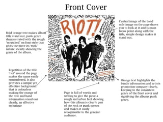
- 1. Front Cover Central image of the band only image on the page draws you to look at it and is main focus point along with the Bold orange text makes album title, simple design makes it title stand out, punk genre stand out. demonstrated with the rough ‘scratched’ on font style that gives the piece its ‘rock’ nature, clearly showing the genre of the album. Repetition of the title ‘riot’ around the page makes the name easily remembered. It also Orange text highlights the provides a simple yet bands information and artists effective background promotion company clearly. that is colourless Keeping to the consistent making the orange of Page is full of words and genre of the front cover and the title and band writing to give the piece a signifying the albums punk information stand out rough and urban feel showing genre. clearly, an effective how this album is clearly part technique of the rock or punk scenes and makes it easily recognisable to the general audience.
- 2. Back Cover Production credits Title names in are put into simple, bright orange to plain writing to contrast with signify the dark black importance of this background and information. It is make the key controversial to the information rest of the piece stand out. and makes this However song information seem timings are not relevant and included on the important. back cover. Repetition of the title ‘riot’ around the page makes the name easily remembered. It also provides a simple yet effective background that is colourless Large image of the band on making the orange of the back co insides with the the title and band imagery on the front of the information stand out digipak. Only picture on the clearly, an effective back makes it stand out and technique instantly recognisable as a paramore album.
- 3. Spine Band and albums names only things shown on spine of digipak. Plain black writing with white text to make it stand out. ‘riot’ is still however shown in the scratched on effect to work with the majority of the pieces font styles and band name is in the usual logo format. However the ‘fueled by ramen’ the record company however is also shown on the left hand side with the cd’s id number is displayed in the top right hand corner.
- 4. Inside Pages Inside pages with information displays main songs lyrics such as ‘that’s what you get’ and ‘misery business’ the most successful singles from the album itself. Also shows a photo of each band member and the lyrics are set out Back page of digipak around these. Also uses the same ‘scratched’ on font and has a punk like feel shows no information using only black and white showing synergy with the product as the font has except the repetition become instantly recognisable as the riot font. of the album title ‘riot’ There is one large and brightly orange coloured ‘riot’ however to stand out and make the album title significant and easily remembered once again. Front of the inside pages shows no real information again just highlights the riot front and uses this as a background once again. It however does include the record label and band information such as website’s etc. However the rest of the information is just repeated.