Responsive Web Design Process

Responsive and Device-Agnostic Design Peter Sena II, Digital Surgeons The world has gone mobile. But has your web experience? We’ve all been there pinching, zooming, scrolling and squinting - never knowing what you’re going to get. A brands web experience these days is the experience. Peter will take a look at some key user behaviors on mobile and talk about how to go from rigid to responsive with a device-agnostic strategy that focuses on design systems and shows some practical ways to plan and execute a responsive design project. Pete Sena is the founder of Digital Surgeons, a digital marketing agency located in the heart of New Haven, CT. A hybrid designer/developer who lives to create unique and powerful experiences for brands. Digital Surgeons responsive framework, Gumby, is in use by over 20,000 developers worldwide, and has been leveraged in scale for global brands and fortune 500 organizations.

Recommandé
Recommandé
Contenu connexe
En vedette
En vedette (15)
Plus de Digital Surgeons
Plus de Digital Surgeons (20)
Dernier
Dernier (20)
Responsive Web Design Process
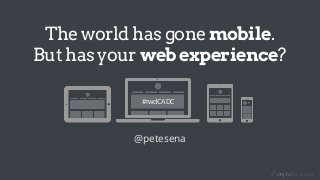
- 1. The world has gone mobile. But has your web experience? @petesena #rwdCADC
- 2. A little about me.
- 3. Hi there. I’m @petesena You would expect a fancy bio of me to go here or something but that would just be douchey. You should follow me on twitter. I tweet about the intersection of design and technology in marketing. Cool tools, trends, tutorials and all that jazz. If this presentation has been useful for you please share it with someone.
- 6. This is the web today.
- 7. 77% of people use smart phones as their preferred medium for searching. -Google / Nielsen mobile search moments march 2013
- 8. WTF! I just want to get information on admissions.
- 9. Where did responsive design come from?
- 10. So what the hell is responsive design? flexible grid flexible media media queries
- 11. It means you are device agnostic!
- 12. Why responsive? • One application to maintain which runs everywhere • Improve SEO and user confusion with one set of URLs • Such a variety of devices, platforms and browsers • Mobile and desktop simply isn’t enough • Don’t discriminate, one site for all devices • Future proof and ready for the next device
- 13. Breaking some old habits.
- 14. The old waterfall web design process Discovery Strategy & Planning Design Development Optimize
- 15. It’s time to evolve.
- 16. Evolving to a new iterative process Project Planning! Discovery (Immersion)! Strategy! Content Strategy! UX & IA! Design! Development! Post Launch!
- 17. A new web design process
- 18. A new web design process Strategy
- 19. A new web design process Sketching Review Validate Prototyping DesignWireframe Strategy
- 20. A new web design process Sketching Review Validate Prototyping DesignWireframe Strategy Outcome
- 23. Not content first. Not mobile first.
- 24. Not content first. Not mobile first. Context first.
- 25. sketchearly.
- 31. Design systems. Not comps.
- 32. What makes up a design system? •Content •Grid & Visual Hierarchy •Typography •Color Palette •Iconography / Shape / Form •Imagery
- 33. What makes up a design system? •Content •Grid & Visual Hierarchy •Typography •Color Palette •Iconography / Shape / Form •Imagery
- 34. What makes up a design system? •Content •Grid & Visual Hierarchy •Typography •Color Palette •Iconography / Shape / Form •Imagery
- 35. Responsive web design resources • Style Tiles (http://styletil.es/) • Gumby grid & UI Kit templates (gumbyframework.com) • Sketchsheets (sneakpeekit.com) • Modular Scale (balanced typography)
- 36. A photoshop UI kit A photoshop user interface kit can be very helpful as a starting place. It will contain virtually all HTML elements which will be a great reference asset for when it comes time for building the markup/css. Gumby Framework includes all the grid photoshop files as well as the interface elements.
- 37. Analog & digital grids
- 38. Resources for web typography Fonts
- 39. Resources for front-end development
- 40. The best advice ever.
- 41. wait for it...
- 43. Where to learn front-end development ?
- 44. If you enjoyed this gimme a shout on twitter @petesena. Go make something.