SlideShare une entreprise Scribd logo
1  sur  30
AS MEDIASTUDIESFOUNDATION PORTFOLIORESEARCH & PLANNINGCENTRE NO: 11049ST FRANCIS XAVIER COLLEGE
My name is: Duschan NembhardCandidate No: 1387
Preliminary Project – Research & Planning As my task was to create a school or college magazine, I decided to make it combined with both concepts so that it targeted students in year 9 (13/14 years of age) to those in the sixth form (16-18 years of age). I did this because I didn’t want the lower band of the college to feel segregated from the magazine Due to my target audience range being so wide it meant that I have to ensure I designed my magazine so it didn’t appear too childish but also no so mature. I made sure my magazine was visually attractive to the different ages by making it bright using the right colours. In terms of language, I used words that all would understand, so the language isn't very formal, neither informal but more on the colloquial side During the process of my project, I learnt about the wonders Adobe Photoshop can do to your image, from changing the background using layers to editing the images effects to make it brighter or darker. The key points learnt were that layers help a great deal in terms of setting a background and practice using the lasso tool is essential as it will help my images look more professional.
Preliminary Project College Cover College Contents
Reflections & Feedback What would you do differently next time? I would do a lot better next time then I did on this task as I lacked in effort and essential research in order to produce a good product.I would ensure I didn't cut corners and finish the project properly. What kind of feedback did you get that might influence you? My peers told me that the contents page was rather plain which alerted me that there needed to be more in order to keep more readers interested. My tutor also told me that my contents page lacked colour, and impact. What aspects of your understanding of Adobe Photoshop & InDesign do you need to improve? I am yet to use Adobe InDesign, BUT because of Adobe Photoshop, I understood more as we went along but I still next improve of my usage of the tools. I also need to improve the understanding of how the use of layers can help us a great deal. 
The music genre of my music magazine is: http://www.youtube.com/watch?v=Yd60nI4sa9A BLUES Genre :  My chosen title is “Southern Comforts” because of the fact that Blues originated in Deep South of the United States and I wanted my title to reflect Blues in a different way of  just having the word “blues” in it.  I thought the word “comforts” would link right back to the root of Blues as it was used as comfort to those singing it. This would also let the reader think that they can be comfortable reading my magazine.
So I researched this genre of music publication and studied: Model 1 Model 2
What I learned from this was….. Cover Design Musician with an instrument on the front Title contains the word “Blues” Colours- Bright, most times, quite mellow with reflects audience Quite plain, not eye catching in some cases Gender- not specific; men and women feature Cover Lines ALL INVOLVE ARTISTS- all cover lines involve an artist Just music?- most of the cover lines I have seen relate to music itself  Plain?- not enticing especially with examples I have used.
For my music magazine…. Target Audience:  Men and Women aged 25 and over because this genre does not have a dominant sex and the age of the artists tend to be mature. Frequency: Fortnightly- this would enable the reader to have something to look forward too and ensure that the magazine gives them something different each time. Cover price: £1.60- this would ensure the magazine appears to be value for money and make the reader want to continue purchasing the magazine. Publisher: Rhinegold Unique Selling Point: Brings the comfort back into Blues- this links to the title and puts out the message that this magazine is all about true Blues
This is the face of the magazine Front cover This is how it works Black and white vs. colour- I wanted to change the conventionsI have seen of using coloured images on the front cover Keeps the conventions- artist with instrument, which is trait most examples show. Link to Blues- the fact it is in black and white links to time when Blues started, which gives it an authentic look and appeal.
Here are the 4 original photographs I shot for the project……
I modified each photograph; here is the original next to the final version:  Final 1 Raw 1 Here is how I changed the photograph and why  I cropped the image but didn't do much else because it looks as though it wasn't necessary.
And the second one:  Raw 2 Final 2 Here is how I changed the photograph and why -I cropped the image and blurred it slightly, well attempted to blur the background to ensure the main focus was on the featured person.
And the third one:  Raw 3 Final 3 Here is how I changed the photograph and why -Again, I did what I did on the second image for this one, in order for the model to stand out from the background .
And the last one:  Raw 4 Final 4 Here is how I changed the photograph and why -I cropped this image and feathered it, in order to give it a priceless look of an antique image.
Here are a couple of research models for my contents page…
This is my contents page Contents Page These are key features… BOLD NUMBERS- to identify where the features can be found without the reader struggling to look for it CLEAR HEADINGS- to alert the audience of what section of the magazine they are looking at so they know what they will find LINKS TO PICTURES- the images link back to writing alongside the images so the audience is able to identify what and what and who is who. CONSISTENCY- The fonts are the same as and reflect the fonts of the cover page and the colours are consistent also. Colour schemes.
How does the contents page link back to the cover page? My contents page highlights the mentioned people on the cover i.e. Miquel Smith. His picture is the biggest picture on the page which identifies his importance and the fact that he is the main feature. The fact the artist is recognizable in both images also links. Same fonts- On both contents and cover page the fonts are the same. I did this for consistency so that my mature looked professional and would assure the reader of good standards. Colors- the colour scheme remains the same (red, black, grey and white) another colour was added to the contents but it still goes well with the cover page and doesn't distract to the reader SAME FONT COVER STORY COLOURS
Key points of contents page  How have you made the reader want to read on? – PICTURES & WORDING: I’ve used images that grab the readers attention and make them question what interest the article would bring to them. In terms of wording, I used little teasers to entice the reader to read on after first being drawn in. What are the links between images and words?- POSITIONING & RELATION: The positioning of the image in a huge link between them and the words. I placed the images close together and ordered the wording in so that all the images would be next to there particular section of writing for the contents page. What determines the dominant stories?- COLOUR & SIZE: The size of the image is bigger than the rest and is the first image of the contents page. I also decided to use a different colour for the title of the story to make it stand out amongst the other stories. How have you gone about ordering the information on the page?- IN ORDER OF APPEARANCE: I ordered the information in terms of how I laid out the cover page so it went in the order of appearance which links to how the images were.
How does the contents page flag up your double page spread? My double page spread is based on the main image of the front cover and contents page; Miquel Smith. I have ensured that this artist stood out on the contents pages to clearly show he is the cover story and the main feature of the magazine The colours, style and type of fonts remain consistent throughout to keep the reader alert and interested.
Here’s an example of an inspiring double page spread…
This is why I think that double spread works This double page spread uses traits that I aim to have on my own double page spread; simplicity and effectiveness. The use of the black and white theme with the red, highlights significant information and creates authenticity. The layout isn’t over crowded which is exactly what I need for my audience to be attracted and intrigued to read on. My music genre being Blues means my magazine has to have a relaxed theme which I think this double page spread represents clearly.
This is my double-page spread
This is how my double page spread works My double page spread uses the same simplistic features which my cover page and contents use.  Colour schemes show a clear link to the cover page and the contents page I have changed the model for my magazine so it would appear that there is no link to my front cover but my re-drafted cover page & contents page uses images that link clearly to this double page to indentify with the audience that is my main story.
This is how all three components are linked together…. Baring in mind the fact that the models are different because during my feedback for my re-draft of the cover and contents I was told to change my model which is why the double page spread has the final model.
This is my re-drafted cover page COVER LINES Key modifications from feedback Cover Page Improve on image Tasters to stand out more Differentiate cover lines Reconsider mise en scene MAIN COVER LINE IDENTIFIED BETTER IMAGE WITH NEW MODEL TASTER
This is my re-drafted contents page Contents Page Key modifications from feedback Include tasters Background More contents Images  MORE CONTENTS TASTERS REVELANT IMAGES
This is my re-drafted double spread Interesting heading QUOTES 2nd IMAGE IMPROVEMENT ON COLOURS VISUALLY INTERESTING CLEAR NUMBERING
Key modifications to double spread from feedback Include quotes from text Colour schemes Include more than one image Ensure all text is within it More visually interesting
Evaluation You can find my blog here: (URL) http://duschla.blogspot.com/ And  You can find my evaluation with responses to the 7 questions here: (URL) http://duschla.blogspot.com/2010/12/music-magazine-front-cover.html

Contenu connexe

Tendances

Media powerpoint
Media powerpointMedia powerpoint
Media powerpointGenesisA
 
Evaluation - Question 1
Evaluation  - Question 1Evaluation  - Question 1
Evaluation - Question 1beccaweight16
 
Evaluation question 1
Evaluation   question 1Evaluation   question 1
Evaluation question 1beccaweight16
 
Task 2 analysis of nme music magazine
Task 2  analysis of nme music magazineTask 2  analysis of nme music magazine
Task 2 analysis of nme music magazineasmediab15
 
Choices Made When Creating my Music Magazine
Choices Made When Creating my Music MagazineChoices Made When Creating my Music Magazine
Choices Made When Creating my Music Magazinekhalfyard
 
Evaluation 1- In what ways does your media product use, develop or challenge ...
Evaluation 1- In what ways does your media product use, develop or challenge ...Evaluation 1- In what ways does your media product use, develop or challenge ...
Evaluation 1- In what ways does your media product use, develop or challenge ...Daisy Birchall
 
As research planning
As research planningAs research planning
As research planningKeleisha123
 
Question one
Question oneQuestion one
Question oneaishak22
 
How I have used, developed and challenged media conventions
How I have used, developed and challenged media conventionsHow I have used, developed and challenged media conventions
How I have used, developed and challenged media conventionsaishak22
 
Evaluation ...
Evaluation ...Evaluation ...
Evaluation ...ryanb1994
 
As media-evaluation1
As media-evaluation1As media-evaluation1
As media-evaluation1Ellie_Coyle
 
Presentation1
Presentation1Presentation1
Presentation1eliroddy
 
Drafting the evaluation answers
Drafting the evaluation answersDrafting the evaluation answers
Drafting the evaluation answersgexrgie_
 
AS EVALUATION - In what ways does your media product use, develop and challen...
AS EVALUATION - In what ways does your media product use, develop and challen...AS EVALUATION - In what ways does your media product use, develop and challen...
AS EVALUATION - In what ways does your media product use, develop and challen...khalfyard
 
Evaluation Presentation
Evaluation PresentationEvaluation Presentation
Evaluation PresentationLaurie Brown
 

Tendances (20)

Media powerpoint
Media powerpointMedia powerpoint
Media powerpoint
 
Evaluation - Question 1
Evaluation  - Question 1Evaluation  - Question 1
Evaluation - Question 1
 
Evaluation question 1
Evaluation   question 1Evaluation   question 1
Evaluation question 1
 
Evaluation 7
Evaluation 7Evaluation 7
Evaluation 7
 
Task 2 analysis of nme music magazine
Task 2  analysis of nme music magazineTask 2  analysis of nme music magazine
Task 2 analysis of nme music magazine
 
Choices Made When Creating my Music Magazine
Choices Made When Creating my Music MagazineChoices Made When Creating my Music Magazine
Choices Made When Creating my Music Magazine
 
Evaluation 1- In what ways does your media product use, develop or challenge ...
Evaluation 1- In what ways does your media product use, develop or challenge ...Evaluation 1- In what ways does your media product use, develop or challenge ...
Evaluation 1- In what ways does your media product use, develop or challenge ...
 
Magazine Analysis
Magazine Analysis Magazine Analysis
Magazine Analysis
 
Sofia1234x2
Sofia1234x2Sofia1234x2
Sofia1234x2
 
Magazine analysis
Magazine analysisMagazine analysis
Magazine analysis
 
As research planning
As research planningAs research planning
As research planning
 
Question one
Question oneQuestion one
Question one
 
How I have used, developed and challenged media conventions
How I have used, developed and challenged media conventionsHow I have used, developed and challenged media conventions
How I have used, developed and challenged media conventions
 
Evaluation ...
Evaluation ...Evaluation ...
Evaluation ...
 
Holiouytrfgvhj
HoliouytrfgvhjHoliouytrfgvhj
Holiouytrfgvhj
 
As media-evaluation1
As media-evaluation1As media-evaluation1
As media-evaluation1
 
Presentation1
Presentation1Presentation1
Presentation1
 
Drafting the evaluation answers
Drafting the evaluation answersDrafting the evaluation answers
Drafting the evaluation answers
 
AS EVALUATION - In what ways does your media product use, develop and challen...
AS EVALUATION - In what ways does your media product use, develop and challen...AS EVALUATION - In what ways does your media product use, develop and challen...
AS EVALUATION - In what ways does your media product use, develop and challen...
 
Evaluation Presentation
Evaluation PresentationEvaluation Presentation
Evaluation Presentation
 

Similaire à My Media Presentation

Michael m mag_media presentation final
Michael m mag_media presentation finalMichael m mag_media presentation final
Michael m mag_media presentation finalstriderldn
 
Evaluation
EvaluationEvaluation
EvaluationOubahh
 
As research planning_updated_2010-11
As research planning_updated_2010-11As research planning_updated_2010-11
As research planning_updated_2010-11abdulyusuff
 
Media question 7-progression
Media question 7-progressionMedia question 7-progression
Media question 7-progressionLibby Wallis
 
In what ways does your media product use, develop or challenge forms and conv...
In what ways does your media product use, develop or challenge forms and conv...In what ways does your media product use, develop or challenge forms and conv...
In what ways does your media product use, develop or challenge forms and conv...RyanDenner
 

Similaire à My Media Presentation (20)

AS Media Presentation
AS Media PresentationAS Media Presentation
AS Media Presentation
 
Evaluation
EvaluationEvaluation
Evaluation
 
Media Presentation
Media PresentationMedia Presentation
Media Presentation
 
Michael m mag_media presentation final
Michael m mag_media presentation finalMichael m mag_media presentation final
Michael m mag_media presentation final
 
Evaluation 2
Evaluation 2Evaluation 2
Evaluation 2
 
Question 45
Question 45Question 45
Question 45
 
Evaluation
EvaluationEvaluation
Evaluation
 
Evaluation
EvaluationEvaluation
Evaluation
 
Evaluation
EvaluationEvaluation
Evaluation
 
Evaluation
EvaluationEvaluation
Evaluation
 
Katys Evaluation
Katys EvaluationKatys Evaluation
Katys Evaluation
 
As research planning_updated_2010-11
As research planning_updated_2010-11As research planning_updated_2010-11
As research planning_updated_2010-11
 
Media Evaluation
Media EvaluationMedia Evaluation
Media Evaluation
 
Question 1
Question 1Question 1
Question 1
 
QUESTION 1
QUESTION 1QUESTION 1
QUESTION 1
 
Evaluation
EvaluationEvaluation
Evaluation
 
Evaluation q5
Evaluation   q5Evaluation   q5
Evaluation q5
 
Media question 7-progression
Media question 7-progressionMedia question 7-progression
Media question 7-progression
 
In what ways does your media product use, develop or challenge forms and conv...
In what ways does your media product use, develop or challenge forms and conv...In what ways does your media product use, develop or challenge forms and conv...
In what ways does your media product use, develop or challenge forms and conv...
 
Evaluation
Evaluation Evaluation
Evaluation
 

Dernier

Grant Readiness 101 TechSoup and Remy Consulting
Grant Readiness 101 TechSoup and Remy ConsultingGrant Readiness 101 TechSoup and Remy Consulting
Grant Readiness 101 TechSoup and Remy ConsultingTechSoup
 
Arihant handbook biology for class 11 .pdf
Arihant handbook biology for class 11 .pdfArihant handbook biology for class 11 .pdf
Arihant handbook biology for class 11 .pdfchloefrazer622
 
microwave assisted reaction. General introduction
microwave assisted reaction. General introductionmicrowave assisted reaction. General introduction
microwave assisted reaction. General introductionMaksud Ahmed
 
CARE OF CHILD IN INCUBATOR..........pptx
CARE OF CHILD IN INCUBATOR..........pptxCARE OF CHILD IN INCUBATOR..........pptx
CARE OF CHILD IN INCUBATOR..........pptxGaneshChakor2
 
PSYCHIATRIC History collection FORMAT.pptx
PSYCHIATRIC   History collection FORMAT.pptxPSYCHIATRIC   History collection FORMAT.pptx
PSYCHIATRIC History collection FORMAT.pptxPoojaSen20
 
Kisan Call Centre - To harness potential of ICT in Agriculture by answer farm...
Kisan Call Centre - To harness potential of ICT in Agriculture by answer farm...Kisan Call Centre - To harness potential of ICT in Agriculture by answer farm...
Kisan Call Centre - To harness potential of ICT in Agriculture by answer farm...Krashi Coaching
 
mini mental status format.docx
mini    mental       status     format.docxmini    mental       status     format.docx
mini mental status format.docxPoojaSen20
 
Call Girls in Dwarka Mor Delhi Contact Us 9654467111
Call Girls in Dwarka Mor Delhi Contact Us 9654467111Call Girls in Dwarka Mor Delhi Contact Us 9654467111
Call Girls in Dwarka Mor Delhi Contact Us 9654467111Sapana Sha
 
Organic Name Reactions for the students and aspirants of Chemistry12th.pptx
Organic Name Reactions  for the students and aspirants of Chemistry12th.pptxOrganic Name Reactions  for the students and aspirants of Chemistry12th.pptx
Organic Name Reactions for the students and aspirants of Chemistry12th.pptxVS Mahajan Coaching Centre
 
18-04-UA_REPORT_MEDIALITERAСY_INDEX-DM_23-1-final-eng.pdf
18-04-UA_REPORT_MEDIALITERAСY_INDEX-DM_23-1-final-eng.pdf18-04-UA_REPORT_MEDIALITERAСY_INDEX-DM_23-1-final-eng.pdf
18-04-UA_REPORT_MEDIALITERAСY_INDEX-DM_23-1-final-eng.pdfssuser54595a
 
The Most Excellent Way | 1 Corinthians 13
The Most Excellent Way | 1 Corinthians 13The Most Excellent Way | 1 Corinthians 13
The Most Excellent Way | 1 Corinthians 13Steve Thomason
 
A Critique of the Proposed National Education Policy Reform
A Critique of the Proposed National Education Policy ReformA Critique of the Proposed National Education Policy Reform
A Critique of the Proposed National Education Policy ReformChameera Dedduwage
 
Introduction to ArtificiaI Intelligence in Higher Education
Introduction to ArtificiaI Intelligence in Higher EducationIntroduction to ArtificiaI Intelligence in Higher Education
Introduction to ArtificiaI Intelligence in Higher Educationpboyjonauth
 
Paris 2024 Olympic Geographies - an activity
Paris 2024 Olympic Geographies - an activityParis 2024 Olympic Geographies - an activity
Paris 2024 Olympic Geographies - an activityGeoBlogs
 
Accessible design: Minimum effort, maximum impact
Accessible design: Minimum effort, maximum impactAccessible design: Minimum effort, maximum impact
Accessible design: Minimum effort, maximum impactdawncurless
 
“Oh GOSH! Reflecting on Hackteria's Collaborative Practices in a Global Do-It...
“Oh GOSH! Reflecting on Hackteria's Collaborative Practices in a Global Do-It...“Oh GOSH! Reflecting on Hackteria's Collaborative Practices in a Global Do-It...
“Oh GOSH! Reflecting on Hackteria's Collaborative Practices in a Global Do-It...Marc Dusseiller Dusjagr
 
Mastering the Unannounced Regulatory Inspection
Mastering the Unannounced Regulatory InspectionMastering the Unannounced Regulatory Inspection
Mastering the Unannounced Regulatory InspectionSafetyChain Software
 
Sanyam Choudhary Chemistry practical.pdf
Sanyam Choudhary Chemistry practical.pdfSanyam Choudhary Chemistry practical.pdf
Sanyam Choudhary Chemistry practical.pdfsanyamsingh5019
 

Dernier (20)

Grant Readiness 101 TechSoup and Remy Consulting
Grant Readiness 101 TechSoup and Remy ConsultingGrant Readiness 101 TechSoup and Remy Consulting
Grant Readiness 101 TechSoup and Remy Consulting
 
TataKelola dan KamSiber Kecerdasan Buatan v022.pdf
TataKelola dan KamSiber Kecerdasan Buatan v022.pdfTataKelola dan KamSiber Kecerdasan Buatan v022.pdf
TataKelola dan KamSiber Kecerdasan Buatan v022.pdf
 
Arihant handbook biology for class 11 .pdf
Arihant handbook biology for class 11 .pdfArihant handbook biology for class 11 .pdf
Arihant handbook biology for class 11 .pdf
 
microwave assisted reaction. General introduction
microwave assisted reaction. General introductionmicrowave assisted reaction. General introduction
microwave assisted reaction. General introduction
 
CARE OF CHILD IN INCUBATOR..........pptx
CARE OF CHILD IN INCUBATOR..........pptxCARE OF CHILD IN INCUBATOR..........pptx
CARE OF CHILD IN INCUBATOR..........pptx
 
PSYCHIATRIC History collection FORMAT.pptx
PSYCHIATRIC   History collection FORMAT.pptxPSYCHIATRIC   History collection FORMAT.pptx
PSYCHIATRIC History collection FORMAT.pptx
 
Kisan Call Centre - To harness potential of ICT in Agriculture by answer farm...
Kisan Call Centre - To harness potential of ICT in Agriculture by answer farm...Kisan Call Centre - To harness potential of ICT in Agriculture by answer farm...
Kisan Call Centre - To harness potential of ICT in Agriculture by answer farm...
 
mini mental status format.docx
mini    mental       status     format.docxmini    mental       status     format.docx
mini mental status format.docx
 
Call Girls in Dwarka Mor Delhi Contact Us 9654467111
Call Girls in Dwarka Mor Delhi Contact Us 9654467111Call Girls in Dwarka Mor Delhi Contact Us 9654467111
Call Girls in Dwarka Mor Delhi Contact Us 9654467111
 
Model Call Girl in Tilak Nagar Delhi reach out to us at 🔝9953056974🔝
Model Call Girl in Tilak Nagar Delhi reach out to us at 🔝9953056974🔝Model Call Girl in Tilak Nagar Delhi reach out to us at 🔝9953056974🔝
Model Call Girl in Tilak Nagar Delhi reach out to us at 🔝9953056974🔝
 
Organic Name Reactions for the students and aspirants of Chemistry12th.pptx
Organic Name Reactions  for the students and aspirants of Chemistry12th.pptxOrganic Name Reactions  for the students and aspirants of Chemistry12th.pptx
Organic Name Reactions for the students and aspirants of Chemistry12th.pptx
 
18-04-UA_REPORT_MEDIALITERAСY_INDEX-DM_23-1-final-eng.pdf
18-04-UA_REPORT_MEDIALITERAСY_INDEX-DM_23-1-final-eng.pdf18-04-UA_REPORT_MEDIALITERAСY_INDEX-DM_23-1-final-eng.pdf
18-04-UA_REPORT_MEDIALITERAСY_INDEX-DM_23-1-final-eng.pdf
 
The Most Excellent Way | 1 Corinthians 13
The Most Excellent Way | 1 Corinthians 13The Most Excellent Way | 1 Corinthians 13
The Most Excellent Way | 1 Corinthians 13
 
A Critique of the Proposed National Education Policy Reform
A Critique of the Proposed National Education Policy ReformA Critique of the Proposed National Education Policy Reform
A Critique of the Proposed National Education Policy Reform
 
Introduction to ArtificiaI Intelligence in Higher Education
Introduction to ArtificiaI Intelligence in Higher EducationIntroduction to ArtificiaI Intelligence in Higher Education
Introduction to ArtificiaI Intelligence in Higher Education
 
Paris 2024 Olympic Geographies - an activity
Paris 2024 Olympic Geographies - an activityParis 2024 Olympic Geographies - an activity
Paris 2024 Olympic Geographies - an activity
 
Accessible design: Minimum effort, maximum impact
Accessible design: Minimum effort, maximum impactAccessible design: Minimum effort, maximum impact
Accessible design: Minimum effort, maximum impact
 
“Oh GOSH! Reflecting on Hackteria's Collaborative Practices in a Global Do-It...
“Oh GOSH! Reflecting on Hackteria's Collaborative Practices in a Global Do-It...“Oh GOSH! Reflecting on Hackteria's Collaborative Practices in a Global Do-It...
“Oh GOSH! Reflecting on Hackteria's Collaborative Practices in a Global Do-It...
 
Mastering the Unannounced Regulatory Inspection
Mastering the Unannounced Regulatory InspectionMastering the Unannounced Regulatory Inspection
Mastering the Unannounced Regulatory Inspection
 
Sanyam Choudhary Chemistry practical.pdf
Sanyam Choudhary Chemistry practical.pdfSanyam Choudhary Chemistry practical.pdf
Sanyam Choudhary Chemistry practical.pdf
 

My Media Presentation

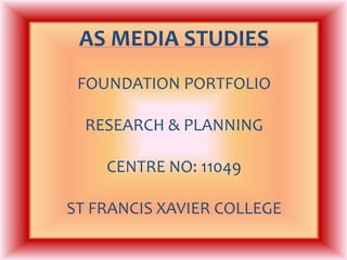
  • 1. AS MEDIASTUDIESFOUNDATION PORTFOLIORESEARCH & PLANNINGCENTRE NO: 11049ST FRANCIS XAVIER COLLEGE
  • 2. My name is: Duschan NembhardCandidate No: 1387
  • 3. Preliminary Project – Research & Planning As my task was to create a school or college magazine, I decided to make it combined with both concepts so that it targeted students in year 9 (13/14 years of age) to those in the sixth form (16-18 years of age). I did this because I didn’t want the lower band of the college to feel segregated from the magazine Due to my target audience range being so wide it meant that I have to ensure I designed my magazine so it didn’t appear too childish but also no so mature. I made sure my magazine was visually attractive to the different ages by making it bright using the right colours. In terms of language, I used words that all would understand, so the language isn't very formal, neither informal but more on the colloquial side During the process of my project, I learnt about the wonders Adobe Photoshop can do to your image, from changing the background using layers to editing the images effects to make it brighter or darker. The key points learnt were that layers help a great deal in terms of setting a background and practice using the lasso tool is essential as it will help my images look more professional.
  • 4. Preliminary Project College Cover College Contents
  • 5. Reflections & Feedback What would you do differently next time? I would do a lot better next time then I did on this task as I lacked in effort and essential research in order to produce a good product.I would ensure I didn't cut corners and finish the project properly. What kind of feedback did you get that might influence you? My peers told me that the contents page was rather plain which alerted me that there needed to be more in order to keep more readers interested. My tutor also told me that my contents page lacked colour, and impact. What aspects of your understanding of Adobe Photoshop & InDesign do you need to improve? I am yet to use Adobe InDesign, BUT because of Adobe Photoshop, I understood more as we went along but I still next improve of my usage of the tools. I also need to improve the understanding of how the use of layers can help us a great deal. 
  • 6. The music genre of my music magazine is: http://www.youtube.com/watch?v=Yd60nI4sa9A BLUES Genre : My chosen title is “Southern Comforts” because of the fact that Blues originated in Deep South of the United States and I wanted my title to reflect Blues in a different way of just having the word “blues” in it. I thought the word “comforts” would link right back to the root of Blues as it was used as comfort to those singing it. This would also let the reader think that they can be comfortable reading my magazine.
  • 7. So I researched this genre of music publication and studied: Model 1 Model 2
  • 8. What I learned from this was….. Cover Design Musician with an instrument on the front Title contains the word “Blues” Colours- Bright, most times, quite mellow with reflects audience Quite plain, not eye catching in some cases Gender- not specific; men and women feature Cover Lines ALL INVOLVE ARTISTS- all cover lines involve an artist Just music?- most of the cover lines I have seen relate to music itself Plain?- not enticing especially with examples I have used.
  • 9. For my music magazine…. Target Audience: Men and Women aged 25 and over because this genre does not have a dominant sex and the age of the artists tend to be mature. Frequency: Fortnightly- this would enable the reader to have something to look forward too and ensure that the magazine gives them something different each time. Cover price: £1.60- this would ensure the magazine appears to be value for money and make the reader want to continue purchasing the magazine. Publisher: Rhinegold Unique Selling Point: Brings the comfort back into Blues- this links to the title and puts out the message that this magazine is all about true Blues
  • 10. This is the face of the magazine Front cover This is how it works Black and white vs. colour- I wanted to change the conventionsI have seen of using coloured images on the front cover Keeps the conventions- artist with instrument, which is trait most examples show. Link to Blues- the fact it is in black and white links to time when Blues started, which gives it an authentic look and appeal.
  • 11. Here are the 4 original photographs I shot for the project……
  • 12. I modified each photograph; here is the original next to the final version: Final 1 Raw 1 Here is how I changed the photograph and why I cropped the image but didn't do much else because it looks as though it wasn't necessary.
  • 13. And the second one: Raw 2 Final 2 Here is how I changed the photograph and why -I cropped the image and blurred it slightly, well attempted to blur the background to ensure the main focus was on the featured person.
  • 14. And the third one: Raw 3 Final 3 Here is how I changed the photograph and why -Again, I did what I did on the second image for this one, in order for the model to stand out from the background .
  • 15. And the last one: Raw 4 Final 4 Here is how I changed the photograph and why -I cropped this image and feathered it, in order to give it a priceless look of an antique image.
  • 16. Here are a couple of research models for my contents page…
  • 17. This is my contents page Contents Page These are key features… BOLD NUMBERS- to identify where the features can be found without the reader struggling to look for it CLEAR HEADINGS- to alert the audience of what section of the magazine they are looking at so they know what they will find LINKS TO PICTURES- the images link back to writing alongside the images so the audience is able to identify what and what and who is who. CONSISTENCY- The fonts are the same as and reflect the fonts of the cover page and the colours are consistent also. Colour schemes.
  • 18. How does the contents page link back to the cover page? My contents page highlights the mentioned people on the cover i.e. Miquel Smith. His picture is the biggest picture on the page which identifies his importance and the fact that he is the main feature. The fact the artist is recognizable in both images also links. Same fonts- On both contents and cover page the fonts are the same. I did this for consistency so that my mature looked professional and would assure the reader of good standards. Colors- the colour scheme remains the same (red, black, grey and white) another colour was added to the contents but it still goes well with the cover page and doesn't distract to the reader SAME FONT COVER STORY COLOURS
  • 19. Key points of contents page How have you made the reader want to read on? – PICTURES & WORDING: I’ve used images that grab the readers attention and make them question what interest the article would bring to them. In terms of wording, I used little teasers to entice the reader to read on after first being drawn in. What are the links between images and words?- POSITIONING & RELATION: The positioning of the image in a huge link between them and the words. I placed the images close together and ordered the wording in so that all the images would be next to there particular section of writing for the contents page. What determines the dominant stories?- COLOUR & SIZE: The size of the image is bigger than the rest and is the first image of the contents page. I also decided to use a different colour for the title of the story to make it stand out amongst the other stories. How have you gone about ordering the information on the page?- IN ORDER OF APPEARANCE: I ordered the information in terms of how I laid out the cover page so it went in the order of appearance which links to how the images were.
  • 20. How does the contents page flag up your double page spread? My double page spread is based on the main image of the front cover and contents page; Miquel Smith. I have ensured that this artist stood out on the contents pages to clearly show he is the cover story and the main feature of the magazine The colours, style and type of fonts remain consistent throughout to keep the reader alert and interested.
  • 21. Here’s an example of an inspiring double page spread…
  • 22. This is why I think that double spread works This double page spread uses traits that I aim to have on my own double page spread; simplicity and effectiveness. The use of the black and white theme with the red, highlights significant information and creates authenticity. The layout isn’t over crowded which is exactly what I need for my audience to be attracted and intrigued to read on. My music genre being Blues means my magazine has to have a relaxed theme which I think this double page spread represents clearly.
  • 23. This is my double-page spread
  • 24. This is how my double page spread works My double page spread uses the same simplistic features which my cover page and contents use. Colour schemes show a clear link to the cover page and the contents page I have changed the model for my magazine so it would appear that there is no link to my front cover but my re-drafted cover page & contents page uses images that link clearly to this double page to indentify with the audience that is my main story.
  • 25. This is how all three components are linked together…. Baring in mind the fact that the models are different because during my feedback for my re-draft of the cover and contents I was told to change my model which is why the double page spread has the final model.
  • 26. This is my re-drafted cover page COVER LINES Key modifications from feedback Cover Page Improve on image Tasters to stand out more Differentiate cover lines Reconsider mise en scene MAIN COVER LINE IDENTIFIED BETTER IMAGE WITH NEW MODEL TASTER
  • 27. This is my re-drafted contents page Contents Page Key modifications from feedback Include tasters Background More contents Images MORE CONTENTS TASTERS REVELANT IMAGES
  • 28. This is my re-drafted double spread Interesting heading QUOTES 2nd IMAGE IMPROVEMENT ON COLOURS VISUALLY INTERESTING CLEAR NUMBERING
  • 29. Key modifications to double spread from feedback Include quotes from text Colour schemes Include more than one image Ensure all text is within it More visually interesting
  • 30. Evaluation You can find my blog here: (URL) http://duschla.blogspot.com/ And You can find my evaluation with responses to the 7 questions here: (URL) http://duschla.blogspot.com/2010/12/music-magazine-front-cover.html

Notes de l'éditeur

  1. How did you think about target audience?How did awareness of that audience impact upon your visual design and choice of language?What key points did you learn about Adobe Photoshop and InDesign in constructing your artefacts?