The geopolitics of supply chains-interactive infographic guide
•Télécharger en tant que PPTX, PDF•
1 j'aime•591 vues

Explore interactive infographic: http://growthcrossings.economist.com/infographic/geopolitics/ About The geopolitics of supply chains: Emerging-market firms are finding that their supply chains are just as susceptible as their Western rivals to geopolitical risks. How are they managing these risks and anticipating challenges in a time of increasing complexity? About the interactive infographic tool: This tool enables users to compare amongst 5 possible geopolitical scenarios and their implications. Users may select up to two scenarios for a side-by-side comparison. Country analysis is also available by using the map tool.

Recommandé
Contenu connexe
En vedette
En vedette (18)
Plus de The Economist Media Businesses
Plus de The Economist Media Businesses (20)
Dernier
Dernier (20)
The geopolitics of supply chains-interactive infographic guide
- 1. THE GEOPOLITICS OF SUPPLY CHAINS: INTERACTIVE INFOGRAPHIC TOOL USER JOURNEY GUIDE
- 2. THE GEOPOLITICS OF SUPPLY CHAINS AT A GLANCE In today’s increasingly interconnected world, the fortunes of countries both large and small are being influenced by events occurring far beyond their borders. In this interactive infographic created for senior business leaders around the world, The Economist Intelligence Unit forecasts the fate of several global powers based on hypothetical geopolitical scenarios. From a new cold war to a major oil- price shock, these scenarios reveal how much is at stake when nothing goes according to plan.
- 3. USER JOURNEY GUIDE MAPPING THE SCENARIOS 1. Begin the adventure by clicking here 2. Select a scenario from the drop-down list 3
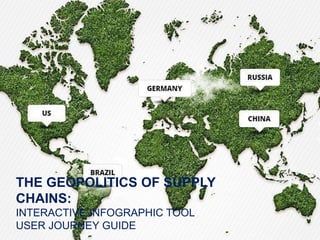
- 4. USER JOURNEY GUIDE THE SCENARIOS AND WORLD MAP 3. Depending on the scenario, different countries will highlight on the world map below Brazil China Germany South Africa US Brazil China Germany South Africa US Brazil China Germany Singapore US China Germany Saudi Arabia US Iran Brazil China Germany Russia US 4
- 5. USER JOURNEY GUIDE COUNTRIES 4. Select up to two countries from those highlighted 5. The countries will appear below, with an explanation of how the scenario will affect them 5
- 6. USER JOURNEY GUIDE INDICATORS 6. Click on “Indicators”. A list of different macroeconomic indicators drops down 6
- 7. 7. Historical and forecast data are plotted on a chart. The coloured lines show the scenarios’ impact on the indicators. The grey baselines show the indicators’ performance under a neutral scenario. The shaded zone is the future and shows our forecasts. 7 USER JOURNEY GUIDE MANIPULATING THE CHART
- 8. 8. Click on the words “Baseline” or “Indicator” on top to toggle them on or off the chart: 8 USER JOURNEY GUIDE MANIPULATING THE CHART on off
- 9. 9. Hover your mouse over the chart to view individual data points by year: 10. Expand or contract the timeline by sliding the knobs along the grey bar on top: 9 USER JOURNEY GUIDE MANIPULATING THE CHART
- 10. 11. Move to an alternative scenario screen by clicking the arrow button on the side: 12. Compare scenarios by toggling back and forth: 10 USER JOURNEY GUIDE COMPARING SCENARIOS
- 11. THE GEOPOLITICS OF SUPPLY CHAINS EXPERIENCE IT NOW Click to experience it online