SlideShare une entreprise Scribd logo
1  sur  6
My products related to others, making
them conventional and possibly more
appealing, as they are identifiable. In order
to notice key differences, I must directly
compare them with other existing
products.

Image of the CD so that
the audience can identify
the product when it is
released onto shelves of
music stores.

Record company on
display so the
audience can
identify their genre
and
popularity.Websites
to direct the
audience to the
product and further
information.

Image of the band/
identifiable logo to
connect the audience
to the artists. May
cause sexual interest
or allow the audience
to observe similarities
between them and the
band.

Clear display of the band
name, so that the audience
can recognise them, as
they may be familiar with
the name already.
Cantered to appeal to the
eye.

Both promotional posters are central to the
page so it is appealing on the eye. Everything is
easier for the audience to see because the
layout is simple and tidy, meaning that the
audience can digest the information quickly.
This is significant because posters would be
usually placed in magazines and readers are
usually only reading for the articles, so they
may pay little attention to the poster.Therefore
if it is a tidy layout they can quickly view
important information.
As the audience would need to view
information rather quickly, there is an
important route of the eye to pay attention
to.
Firstly, the band name is viewed. If they are a
popular band, an audience would quickly
recognise them. Next, the audience can notice
the word ‘new’. It is a trend for any audience
to consume the latest products, so this will be
a likely way of drawing their attention. After
which, the audience then view band artwork.
Many members of the audience may not
recall the band name, but may recognise the
band logo from elsewhere, meaning that
there is a greater chance of an audience
recalling the band. If they aren’t already
aware of the band, they may find the logo
appealing, and be able to label the band’s subgenre within the genre, as there are many
different types and all of these various sounds
appeal to different members. There are also
names of some songs, suggesting to the
audience that these names should already be
heard of, as they are popular enough to be
mentioned, meaning that the audience may
feel as if they need to listen to the tracks,
which could spark interest.
Next, the band album is viewed, meaning that
the audience may recognise it if they see it in
music stores.
Finally, the audience would then see the record label, which would allow them to realise how popular that band is
and what sub-genre the band belong to. They could then see further links to direct them to additional information
about the album if the poster has sparked an interest.

In order to recognise how effective my promotional album poster is, I must
use the route of the eye strategy on mine.
Like the Alter Bridge poster, the first thing
recognised is the band name, so an
audience immediately know who the band
is. Next they would notice the hazard
strips, which connote danger. However, as
they are a bold colour on a greyscale, black
and white poster, they may actually draw
attention before anything else.
They would then recognise the image of
the band in their individual stances. The
audience could then most likely identify
that they belong to the punk genre, as they
appear rather bold and their costume and
style, such as the hairstyle, identifies them
with that genre. If they are then interested
by the punk genre, they would then notice
the details, such as the name and the
release date. The release date acts like the
word ‘latest’ or ‘new’, as it displays future
trends. As stated before, it is a trend to
consume the latest products.
The audience can then notice the CD,
which is, as stated before, important for an
audience as they may come across it in
stores. They may then view large names in
the media within the genre and realise
how well acclaimed and anticipated the
album is.
Finally, they would, like the other
promotional album poster, notice the
record label and be able to possibly
distinguish the sub-genre of the heavy
category and then if they are interested,
they could use the websites to find
additional information.
By applying the route of the eye to posters can determine the success of its purpose. By comparing it to similar
products, I can also determine how positively it would be consumed by an audience, and how simple it would
be for them to identify it. For example, if it does not appear like similar products, the target audience may not
be familiar with it and may dismiss its information as they may feel that they cannot relate to it.
The main factors of a promotional album poster that I took into account and applied were the band name and
album title (with a significant focus on the page by making the font larger or dedicating a separate part of the
poster to them), an image of the band so the audience can identify them, an image of the CD so that the
audience can recognise their products, a release date to cause a hype within the target audience, reviews to
create expectation within the audience and a record label so the audience may know what sub-genre they
belong to. There are many factors that can contribute to a poster’s success. However, these are commonly
applied to posters within the heavier genre of music, such as punk and rock. Therefore, by paying attention to
these that are frequent within the genre, I can create a brand that is identifiable within the genre.
These two album front
covers have several
similarities. For example,
there is a large image
central to the page,
dominating the eye.
Both CDs have three main
parts; a bold image, the
band name and the album
title. The band name is
used to identify the artists,
the album name is to
display a different set of
the band’s work and the
image offers various
information, such as a
‘taster’ of what the album
contains content-wise, or
to create brand identity.
The fonts are serif; very
messy in appearance and
in bold, which makes them
seem aggressive. It
reflects the words such as
‘DISORDER’ and
‘RESISTANCE’, which relate
to dangerous and
aggressive situations.
Using images appropriate
to the genre allows the
audience to familiarise my
product with the correct
genre.

The images both connote rebellion
and a breakdown of the system.
For example, my front cover
contains graffiti. ‘The Casualties’
have the use of skulls and bullets,
symbolising death and war. As for
the gas mask, it symbolises danger
and serious situations.

The use of colour makes
both albums appear very
bold, which means that
they would stand out in a
shop. This takes into
account the entire genre,
and the members of it, as
these individuals are very
extravagant and the genre
is associated with bold
beliefs and statements
against the usual flow of
society, concerning mass
consumption and
hegemony. The use of the
colours in ‘The Casualties’
is effective, because it is a
bold colour, such as red
(connoting danger and
death) and black and
white is used over it, so
that they stand out against
it. It also creates this
cartoon effect, reflecting
the personality of the
artists and creating irony
alongside their work; as
though the punk genre is
considered bold, crazy and
dangerous, they fight for
peace in most cases.
Therefore, it relates as
they are using cartoon
images to depict the
seriousness of their
messages. My font cover,
due to the black and white
contrast shares this
cartoon style, reflecting
the same irony.
Both of these bands, ‘The Distillers’
and ‘Damaged’, have the ‘Hellcat
Records’ emblem on their back cover.
If the target audience were to only
know one of these bands, they could
identify the other by the record label.
As ‘The Distillers’ are a successful punk
band and other bands such as them
belong to that record label, it would
allow ‘Damaged’ to become successful,
as the label becomes more popular as
it aids bands into success.

Both album back covers have a main image
dominating the cover that also relate to the front
cover, via the same colour filter or visual effects.
To make it appealing on the eye, the one image is
used so the CD isn’t broken up and doesn’t
appear too busy, which would make it likely to
look unappealing. The images contain the band
members, so that the audience can identify them.
It also may show that it relates to another
product, such as a music video, as does my own
product.

Conventional additions, such as a
barcode for consumption purposes and
a copyright notice for the purpose of
appropriate artist credit, which makes
my product appear genuine and
conventional.
The fonts are once again bold and
serif, relating to their front covers and
their genre.
The layout is very tidy so that it is
appealing on the eye, though there is
no blank space in either of these front
covers so that it does appear rather
busy and disorganised. However, their
tidy layout ensures that though it is
conventional of the genre, it is also
appealing enough for consumption.
By carefully considering the
conventions, I have created a back
cover much alike other existing and
successful products, meaning that my
own may be successful if it were to
actually be sold and distributed, as its
conventions are recognisable.
Here are some examples of
band artwork alongside my
own. Many of the bands use
a black and white effect, so
mine relates to similar
products in that way. Also,
they’re easy to label,
through their hairstyle and
clothing.

Contenu connexe

Tendances

Magazine analysis blink
Magazine analysis blinkMagazine analysis blink
Magazine analysis blinkSnowfairy007
 
Album poster analysis
Album poster analysisAlbum poster analysis
Album poster analysiskelsey ry
 
Album poster analysis
Album poster analysisAlbum poster analysis
Album poster analysiskelsey ry
 
Funeral party poster analysis 2
Funeral party poster analysis 2Funeral party poster analysis 2
Funeral party poster analysis 2Ben Jolley
 
Magazine advert analysis
Magazine advert analysisMagazine advert analysis
Magazine advert analysisccapricec
 
SOUNDWAVE Evaluation Presentation
SOUNDWAVE Evaluation PresentationSOUNDWAVE Evaluation Presentation
SOUNDWAVE Evaluation Presentation2005059Media
 
Green day – american idiot
Green day – american idiotGreen day – american idiot
Green day – american idiotSnowfairy007
 
Music magazines
Music magazinesMusic magazines
Music magazines014365
 
Ancillary Research Task - Analysis of Advertisements and Digipaks
Ancillary Research Task - Analysis of Advertisements and DigipaksAncillary Research Task - Analysis of Advertisements and Digipaks
Ancillary Research Task - Analysis of Advertisements and DigipaksJerard Ocitti
 

Tendances (16)

A2 advert mag
A2   advert magA2   advert mag
A2 advert mag
 
Magazine analysis blink
Magazine analysis blinkMagazine analysis blink
Magazine analysis blink
 
Evaluation
EvaluationEvaluation
Evaluation
 
Question 1
Question 1Question 1
Question 1
 
Evaluation
EvaluationEvaluation
Evaluation
 
Album poster analysis
Album poster analysisAlbum poster analysis
Album poster analysis
 
Album poster analysis
Album poster analysisAlbum poster analysis
Album poster analysis
 
Poster analysis
Poster analysisPoster analysis
Poster analysis
 
Funeral party poster analysis 2
Funeral party poster analysis 2Funeral party poster analysis 2
Funeral party poster analysis 2
 
Magazine advert analysis
Magazine advert analysisMagazine advert analysis
Magazine advert analysis
 
SOUNDWAVE Evaluation Presentation
SOUNDWAVE Evaluation PresentationSOUNDWAVE Evaluation Presentation
SOUNDWAVE Evaluation Presentation
 
Green day – american idiot
Green day – american idiotGreen day – american idiot
Green day – american idiot
 
Adverts
AdvertsAdverts
Adverts
 
Music magazines
Music magazinesMusic magazines
Music magazines
 
Evaluation2
Evaluation2Evaluation2
Evaluation2
 
Ancillary Research Task - Analysis of Advertisements and Digipaks
Ancillary Research Task - Analysis of Advertisements and DigipaksAncillary Research Task - Analysis of Advertisements and Digipaks
Ancillary Research Task - Analysis of Advertisements and Digipaks
 

En vedette

AMWA Presentation
AMWA Presentation AMWA Presentation
AMWA Presentation OnFrame Ltd
 
We Need to Talk about MAM
We Need to Talk about MAMWe Need to Talk about MAM
We Need to Talk about MAMOnFrame Ltd
 
Ovum Presentation on Defining and Sizing the Media Logistics Market
Ovum Presentation on Defining and Sizing the Media Logistics MarketOvum Presentation on Defining and Sizing the Media Logistics Market
Ovum Presentation on Defining and Sizing the Media Logistics MarketOnFrame Ltd
 
Workflow and Collaboration: Working Faster, Smarter, Cheaper
Workflow and Collaboration: Working Faster, Smarter, CheaperWorkflow and Collaboration: Working Faster, Smarter, Cheaper
Workflow and Collaboration: Working Faster, Smarter, CheaperOnFrame Ltd
 
Delivery to the Internet: Reaching Audiences Any Time, Any Place
Delivery to  the Internet: Reaching Audiences Any Time, Any PlaceDelivery to  the Internet: Reaching Audiences Any Time, Any Place
Delivery to the Internet: Reaching Audiences Any Time, Any PlaceOnFrame Ltd
 
Between Creation and Consumption: The Muddle in the Middle
Between Creation and Consumption: The Muddle in the MiddleBetween Creation and Consumption: The Muddle in the Middle
Between Creation and Consumption: The Muddle in the MiddleOnFrame Ltd
 
How I linked my products
How I linked my productsHow I linked my products
How I linked my productsEllie Fleming
 
Shot listing planning
Shot listing  planningShot listing  planning
Shot listing planningEllie Fleming
 
Stuart hall encoding decoding
Stuart hall encoding decodingStuart hall encoding decoding
Stuart hall encoding decodingEllie Fleming
 

En vedette (14)

AMWA Presentation
AMWA Presentation AMWA Presentation
AMWA Presentation
 
We Need to Talk about MAM
We Need to Talk about MAMWe Need to Talk about MAM
We Need to Talk about MAM
 
Ovum Presentation on Defining and Sizing the Media Logistics Market
Ovum Presentation on Defining and Sizing the Media Logistics MarketOvum Presentation on Defining and Sizing the Media Logistics Market
Ovum Presentation on Defining and Sizing the Media Logistics Market
 
Workflow and Collaboration: Working Faster, Smarter, Cheaper
Workflow and Collaboration: Working Faster, Smarter, CheaperWorkflow and Collaboration: Working Faster, Smarter, Cheaper
Workflow and Collaboration: Working Faster, Smarter, Cheaper
 
Delivery to the Internet: Reaching Audiences Any Time, Any Place
Delivery to  the Internet: Reaching Audiences Any Time, Any PlaceDelivery to  the Internet: Reaching Audiences Any Time, Any Place
Delivery to the Internet: Reaching Audiences Any Time, Any Place
 
How I used iMovie
How I used iMovieHow I used iMovie
How I used iMovie
 
Between Creation and Consumption: The Muddle in the Middle
Between Creation and Consumption: The Muddle in the MiddleBetween Creation and Consumption: The Muddle in the Middle
Between Creation and Consumption: The Muddle in the Middle
 
History of punk
History of punkHistory of punk
History of punk
 
How I linked my products
How I linked my productsHow I linked my products
How I linked my products
 
Brand identity
Brand identityBrand identity
Brand identity
 
Intelligence emotionnelle
Intelligence emotionnelleIntelligence emotionnelle
Intelligence emotionnelle
 
Ethnomethodology
EthnomethodologyEthnomethodology
Ethnomethodology
 
Shot listing planning
Shot listing  planningShot listing  planning
Shot listing planning
 
Stuart hall encoding decoding
Stuart hall encoding decodingStuart hall encoding decoding
Stuart hall encoding decoding
 

Similaire à Promoting Albums Through Posters

Advert Analysis
Advert AnalysisAdvert Analysis
Advert Analysis2033x
 
Music advertisement poster analysis x3
Music advertisement poster analysis x3Music advertisement poster analysis x3
Music advertisement poster analysis x3VictoriaCowburn
 
Student ancillary analysis
Student ancillary analysisStudent ancillary analysis
Student ancillary analysisjparker98
 
Digipak Analysis - Idols and Upsets - Chasing Tigers
Digipak Analysis - Idols and Upsets - Chasing TigersDigipak Analysis - Idols and Upsets - Chasing Tigers
Digipak Analysis - Idols and Upsets - Chasing Tigersalexhester
 
Analysis of magazine adverts
Analysis of magazine advertsAnalysis of magazine adverts
Analysis of magazine advertsgarrett001
 
Digipak advertisment
Digipak advertismentDigipak advertisment
Digipak advertismentadelleclarke
 
Pendulum research
Pendulum researchPendulum research
Pendulum researchlucygiles1
 
Intro2musicadverts
Intro2musicadvertsIntro2musicadverts
Intro2musicadvertssparkly
 
4. fmp proposal
4. fmp proposal4. fmp proposal
4. fmp proposalchrislaw34
 
investigation 1.pptx for the promo brief
investigation 1.pptx for the promo briefinvestigation 1.pptx for the promo brief
investigation 1.pptx for the promo briefKenzieBlenkinsopp
 
G324: Magazine Research
G324: Magazine ResearchG324: Magazine Research
G324: Magazine ResearchAlice Denmark
 
Florence and the machine analysis
Florence and the machine analysis Florence and the machine analysis
Florence and the machine analysis hampton college
 
Textual analysis of magazine adverts
Textual analysis of magazine advertsTextual analysis of magazine adverts
Textual analysis of magazine advertslsuttie9
 

Similaire à Promoting Albums Through Posters (20)

Recovered file 1
Recovered file 1Recovered file 1
Recovered file 1
 
Advert Analysis
Advert AnalysisAdvert Analysis
Advert Analysis
 
Music advertisement poster analysis x3
Music advertisement poster analysis x3Music advertisement poster analysis x3
Music advertisement poster analysis x3
 
Student ancillary analysis
Student ancillary analysisStudent ancillary analysis
Student ancillary analysis
 
Album ad
Album adAlbum ad
Album ad
 
Analysis of posters.
Analysis of posters.Analysis of posters.
Analysis of posters.
 
Digipak Analysis - Idols and Upsets - Chasing Tigers
Digipak Analysis - Idols and Upsets - Chasing TigersDigipak Analysis - Idols and Upsets - Chasing Tigers
Digipak Analysis - Idols and Upsets - Chasing Tigers
 
A2 advert mag
A2   advert magA2   advert mag
A2 advert mag
 
Analysis of magazine adverts
Analysis of magazine advertsAnalysis of magazine adverts
Analysis of magazine adverts
 
Digipak advertisment
Digipak advertismentDigipak advertisment
Digipak advertisment
 
Digipak 2
Digipak 2Digipak 2
Digipak 2
 
Eval q2
Eval q2Eval q2
Eval q2
 
Evaluation 1.2
Evaluation 1.2Evaluation 1.2
Evaluation 1.2
 
Pendulum research
Pendulum researchPendulum research
Pendulum research
 
Intro2musicadverts
Intro2musicadvertsIntro2musicadverts
Intro2musicadverts
 
4. fmp proposal
4. fmp proposal4. fmp proposal
4. fmp proposal
 
investigation 1.pptx for the promo brief
investigation 1.pptx for the promo briefinvestigation 1.pptx for the promo brief
investigation 1.pptx for the promo brief
 
G324: Magazine Research
G324: Magazine ResearchG324: Magazine Research
G324: Magazine Research
 
Florence and the machine analysis
Florence and the machine analysis Florence and the machine analysis
Florence and the machine analysis
 
Textual analysis of magazine adverts
Textual analysis of magazine advertsTextual analysis of magazine adverts
Textual analysis of magazine adverts
 

Plus de Ellie Fleming

Plus de Ellie Fleming (16)

How i edited my images
How i edited my imagesHow i edited my images
How i edited my images
 
Phenomonology
PhenomonologyPhenomonology
Phenomonology
 
Documents
DocumentsDocuments
Documents
 
Labelling theory
Labelling theoryLabelling theory
Labelling theory
 
Promotional Package Analysis
Promotional Package Analysis Promotional Package Analysis
Promotional Package Analysis
 
Props and costume
Props and costumeProps and costume
Props and costume
 
Damaged poster
Damaged posterDamaged poster
Damaged poster
 
History of punk
History of punkHistory of punk
History of punk
 
Screenplay
ScreenplayScreenplay
Screenplay
 
Risk assessment
Risk assessmentRisk assessment
Risk assessment
 
Route of the eye punk
Route of the eye punkRoute of the eye punk
Route of the eye punk
 
Presentationpitch
PresentationpitchPresentationpitch
Presentationpitch
 
Punk thing
Punk thingPunk thing
Punk thing
 
Audience feedback on results
Audience feedback on resultsAudience feedback on results
Audience feedback on results
 
Sociology work
Sociology workSociology work
Sociology work
 
Institutions mac
Institutions macInstitutions mac
Institutions mac
 

Promoting Albums Through Posters

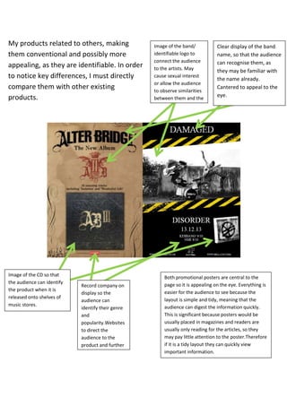
  • 1. My products related to others, making them conventional and possibly more appealing, as they are identifiable. In order to notice key differences, I must directly compare them with other existing products. Image of the CD so that the audience can identify the product when it is released onto shelves of music stores. Record company on display so the audience can identify their genre and popularity.Websites to direct the audience to the product and further information. Image of the band/ identifiable logo to connect the audience to the artists. May cause sexual interest or allow the audience to observe similarities between them and the band. Clear display of the band name, so that the audience can recognise them, as they may be familiar with the name already. Cantered to appeal to the eye. Both promotional posters are central to the page so it is appealing on the eye. Everything is easier for the audience to see because the layout is simple and tidy, meaning that the audience can digest the information quickly. This is significant because posters would be usually placed in magazines and readers are usually only reading for the articles, so they may pay little attention to the poster.Therefore if it is a tidy layout they can quickly view important information.
  • 2. As the audience would need to view information rather quickly, there is an important route of the eye to pay attention to. Firstly, the band name is viewed. If they are a popular band, an audience would quickly recognise them. Next, the audience can notice the word ‘new’. It is a trend for any audience to consume the latest products, so this will be a likely way of drawing their attention. After which, the audience then view band artwork. Many members of the audience may not recall the band name, but may recognise the band logo from elsewhere, meaning that there is a greater chance of an audience recalling the band. If they aren’t already aware of the band, they may find the logo appealing, and be able to label the band’s subgenre within the genre, as there are many different types and all of these various sounds appeal to different members. There are also names of some songs, suggesting to the audience that these names should already be heard of, as they are popular enough to be mentioned, meaning that the audience may feel as if they need to listen to the tracks, which could spark interest. Next, the band album is viewed, meaning that the audience may recognise it if they see it in music stores. Finally, the audience would then see the record label, which would allow them to realise how popular that band is and what sub-genre the band belong to. They could then see further links to direct them to additional information about the album if the poster has sparked an interest. In order to recognise how effective my promotional album poster is, I must use the route of the eye strategy on mine.
  • 3. Like the Alter Bridge poster, the first thing recognised is the band name, so an audience immediately know who the band is. Next they would notice the hazard strips, which connote danger. However, as they are a bold colour on a greyscale, black and white poster, they may actually draw attention before anything else. They would then recognise the image of the band in their individual stances. The audience could then most likely identify that they belong to the punk genre, as they appear rather bold and their costume and style, such as the hairstyle, identifies them with that genre. If they are then interested by the punk genre, they would then notice the details, such as the name and the release date. The release date acts like the word ‘latest’ or ‘new’, as it displays future trends. As stated before, it is a trend to consume the latest products. The audience can then notice the CD, which is, as stated before, important for an audience as they may come across it in stores. They may then view large names in the media within the genre and realise how well acclaimed and anticipated the album is. Finally, they would, like the other promotional album poster, notice the record label and be able to possibly distinguish the sub-genre of the heavy category and then if they are interested, they could use the websites to find additional information. By applying the route of the eye to posters can determine the success of its purpose. By comparing it to similar products, I can also determine how positively it would be consumed by an audience, and how simple it would be for them to identify it. For example, if it does not appear like similar products, the target audience may not be familiar with it and may dismiss its information as they may feel that they cannot relate to it. The main factors of a promotional album poster that I took into account and applied were the band name and album title (with a significant focus on the page by making the font larger or dedicating a separate part of the poster to them), an image of the band so the audience can identify them, an image of the CD so that the audience can recognise their products, a release date to cause a hype within the target audience, reviews to create expectation within the audience and a record label so the audience may know what sub-genre they belong to. There are many factors that can contribute to a poster’s success. However, these are commonly applied to posters within the heavier genre of music, such as punk and rock. Therefore, by paying attention to these that are frequent within the genre, I can create a brand that is identifiable within the genre.
  • 4. These two album front covers have several similarities. For example, there is a large image central to the page, dominating the eye. Both CDs have three main parts; a bold image, the band name and the album title. The band name is used to identify the artists, the album name is to display a different set of the band’s work and the image offers various information, such as a ‘taster’ of what the album contains content-wise, or to create brand identity. The fonts are serif; very messy in appearance and in bold, which makes them seem aggressive. It reflects the words such as ‘DISORDER’ and ‘RESISTANCE’, which relate to dangerous and aggressive situations. Using images appropriate to the genre allows the audience to familiarise my product with the correct genre. The images both connote rebellion and a breakdown of the system. For example, my front cover contains graffiti. ‘The Casualties’ have the use of skulls and bullets, symbolising death and war. As for the gas mask, it symbolises danger and serious situations. The use of colour makes both albums appear very bold, which means that they would stand out in a shop. This takes into account the entire genre, and the members of it, as these individuals are very extravagant and the genre is associated with bold beliefs and statements against the usual flow of society, concerning mass consumption and hegemony. The use of the colours in ‘The Casualties’ is effective, because it is a bold colour, such as red (connoting danger and death) and black and white is used over it, so that they stand out against it. It also creates this cartoon effect, reflecting the personality of the artists and creating irony alongside their work; as though the punk genre is considered bold, crazy and dangerous, they fight for peace in most cases. Therefore, it relates as they are using cartoon images to depict the seriousness of their messages. My font cover, due to the black and white contrast shares this cartoon style, reflecting the same irony.
  • 5. Both of these bands, ‘The Distillers’ and ‘Damaged’, have the ‘Hellcat Records’ emblem on their back cover. If the target audience were to only know one of these bands, they could identify the other by the record label. As ‘The Distillers’ are a successful punk band and other bands such as them belong to that record label, it would allow ‘Damaged’ to become successful, as the label becomes more popular as it aids bands into success. Both album back covers have a main image dominating the cover that also relate to the front cover, via the same colour filter or visual effects. To make it appealing on the eye, the one image is used so the CD isn’t broken up and doesn’t appear too busy, which would make it likely to look unappealing. The images contain the band members, so that the audience can identify them. It also may show that it relates to another product, such as a music video, as does my own product. Conventional additions, such as a barcode for consumption purposes and a copyright notice for the purpose of appropriate artist credit, which makes my product appear genuine and conventional. The fonts are once again bold and serif, relating to their front covers and their genre. The layout is very tidy so that it is appealing on the eye, though there is no blank space in either of these front covers so that it does appear rather busy and disorganised. However, their tidy layout ensures that though it is conventional of the genre, it is also appealing enough for consumption. By carefully considering the conventions, I have created a back cover much alike other existing and successful products, meaning that my own may be successful if it were to actually be sold and distributed, as its conventions are recognisable.
  • 6. Here are some examples of band artwork alongside my own. Many of the bands use a black and white effect, so mine relates to similar products in that way. Also, they’re easy to label, through their hairstyle and clothing.